kage
kage
together.ai
Design analysis
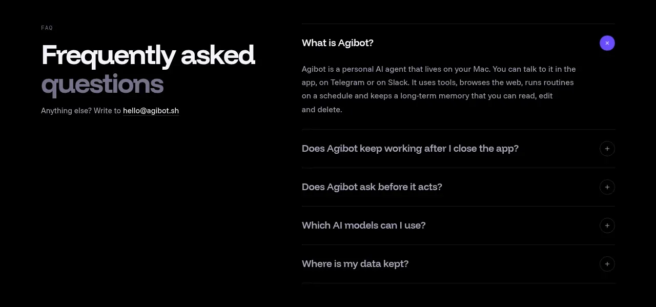
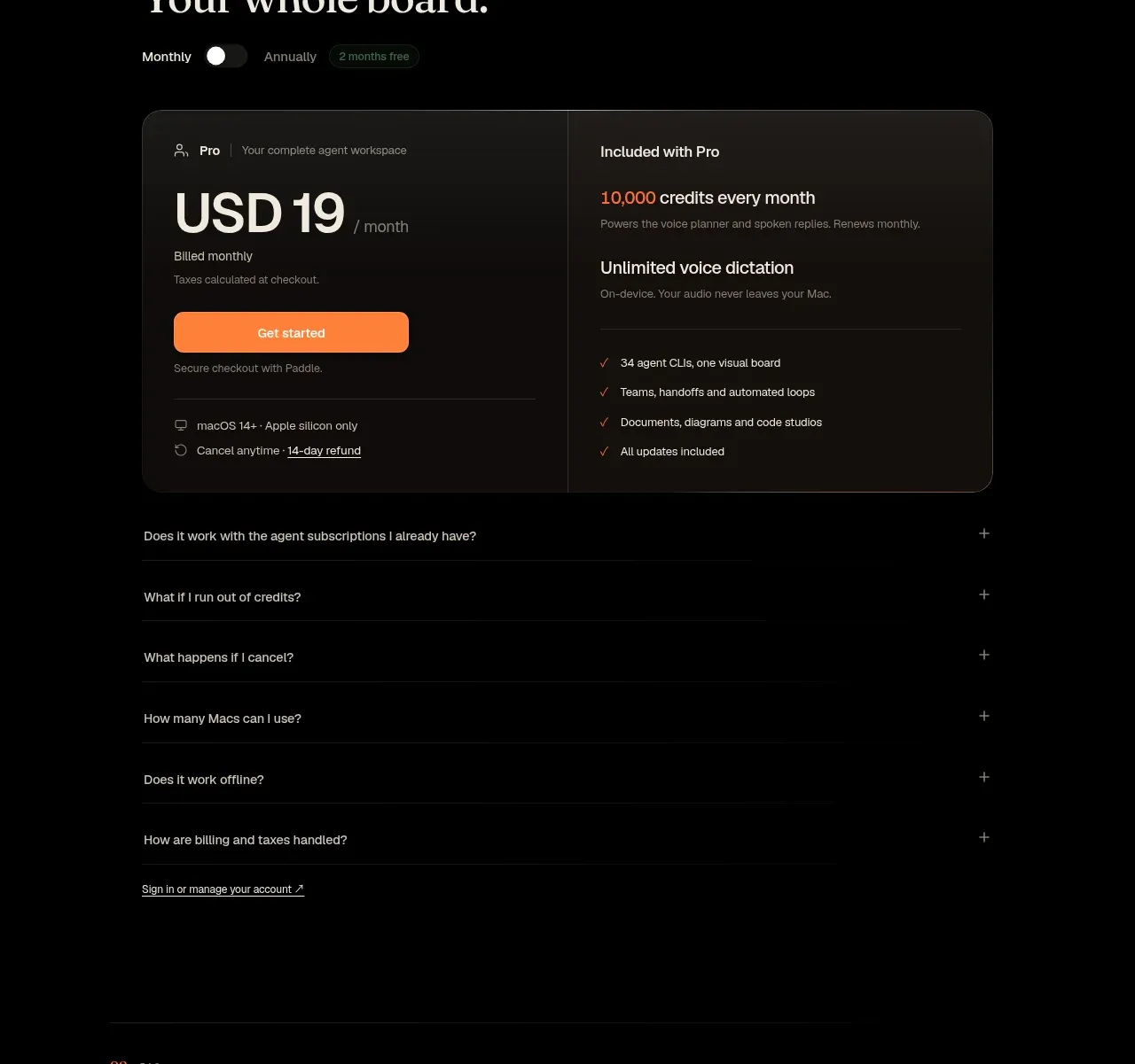
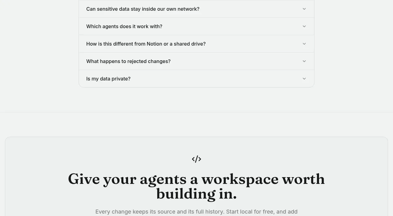
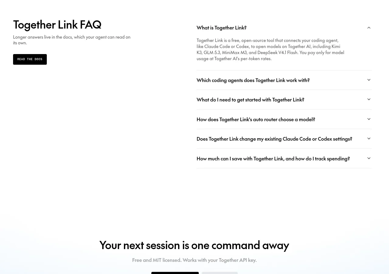
The FAQ is split into a left intro and documentation action and a right accordion list, with one answer expanded and the others collapsed.
Prompt preview
## Reference images

Study these alongside the description below: hierarchy, rhythm, spacing, colour. Build for the product you are asked about, using this design language.

- Component: https://kage-design-assets.t3.tigrisfiles.io/components/together-link/c83e90db-1751-48ac-9cb1-70c29bd77b17-1791612070-6.webp
- Full page it was cut from: https://kage-design-assets.t3.tigrisfiles.io/screenshots/together-link/c83e90db-1751-48ac-9cb1-70c29bd77b17-1791612038251-full.webp
- Component on Kage: https://kage.design/component/together-link-faq

## Before you start
Ask what questions prevent adoption of the user's product and what documentation destination should support the FAQ, then apply this structure.

Build a two-column FAQ section with a large left heading, short muted description, and a dark documentation button. On the right, render a vertical accordion list with thin gray separators, bold question rows, and a small chevron aligned to the far edge. Show one answer expanded by default while keeping the remaining rows collapsed. Use white background, black `#111111` text, muted gray `#707070`, 1px borders around `#e5e5e5`, and 16–20px row padding. Animate height and chevron rotation gently, support keyboard navigation and clear focus rings, and stack the intro above the accordion on narrow screens.

Never: use logos, product names, copy, illustrations, or imagery from the reference.