 kage
kage
crewtower.app

Design analysis
The closing banner returns to the atmospheric gradient, repeats the core promise in a softer editorial voice, and presents the download and purchase actions together.
Prompt preview
## Reference images

Study these alongside the description below: hierarchy, rhythm, spacing, colour. Build for the product you are asked about, using this design language.

- Component: https://kage-design-assets.t3.tigrisfiles.io/components/crewtower-mod-for-claude-code/6a95b5f4-2bf6-41f9-aa93-70409ededf43-1792303421-7.webp
- Full page it was cut from: https://kage-design-assets.t3.tigrisfiles.io/screenshots/crewtower-mod-for-claude-code/6a95b5f4-2bf6-41f9-aa93-70409ededf43-1792303277739-full.webp
- Component on Kage: https://kage.design/component/crewtower-mod-for-claude-code-cta

## Before you start
Ask what final action the user's product needs visitors to take and what reassurance belongs immediately above it. Apply that to an original closing message.

Build a full-width closing CTA with a dusky lavender gradient, centered editorial headline, two short lines of reassurance, and two paired buttons. Use a high-contrast dark primary button and a warm white secondary button, both 12px rounded with 14–16px horizontal padding. Keep the headline around 34–46px, optionally using an italic display face for emphasis, while supporting text remains 13–15px. Add a tiny payment/update reassurance line below the buttons. Maintain 64–80px vertical padding and preserve strong contrast for text and focus states.

Never use logos, product names, copy, illustrations, or imagery from the reference.
More components
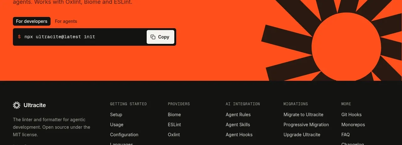
 Bright installation call to action
Ultracite v8 · Call to action
Bright installation call to action
Ultracite v8 · Call to action
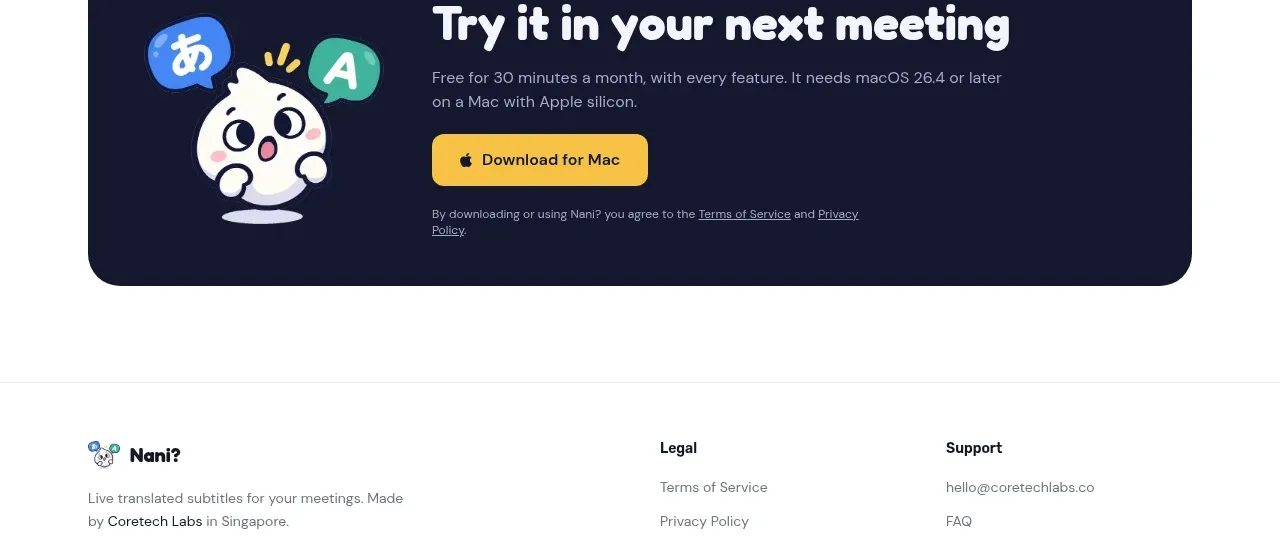
 Download call to action
NANI??? · Call to action
Download call to action
NANI??? · Call to action

 Marble-backed final CTA
Maybloc · Call to action
Marble-backed final CTA
Maybloc · Call to action
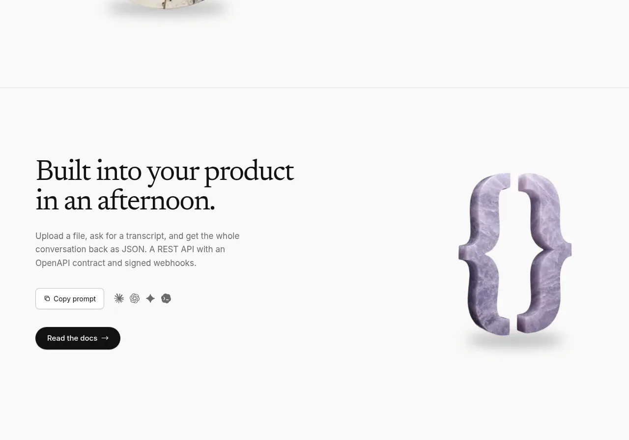 Developer integration CTA
Maybloc · Call to action
Developer integration CTA
Maybloc · Call to action
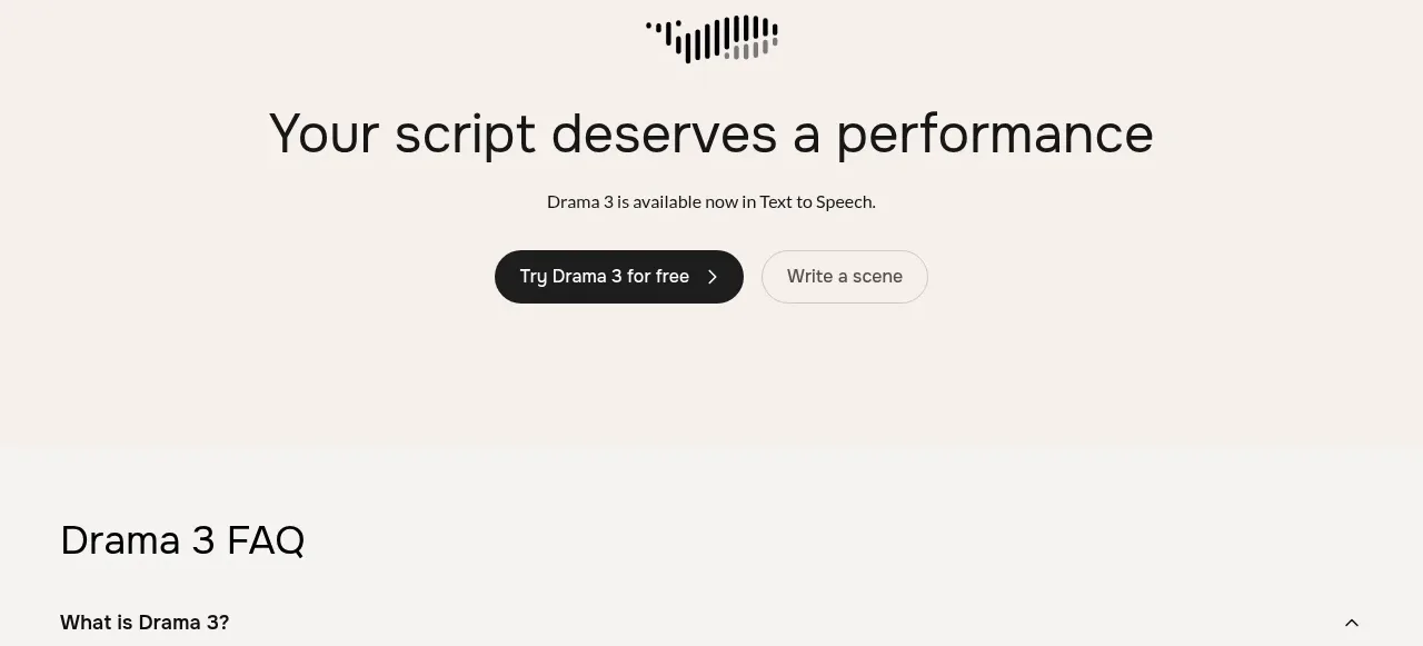
 Centered conversion call to action
Fish Audio Drama 3 · Call to action
Centered conversion call to action
Fish Audio Drama 3 · Call to action
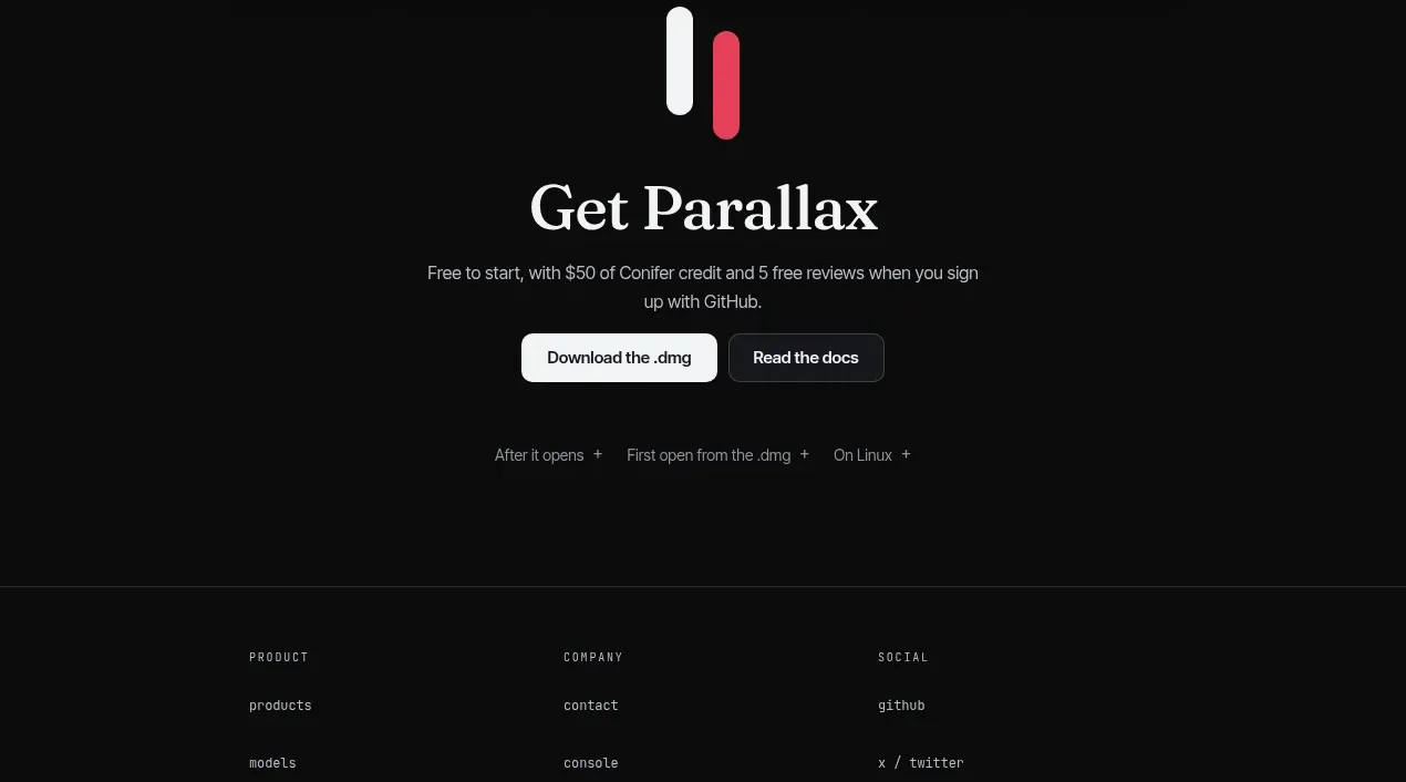
 Download-focused closing call to action
Parallax · Call to action
Download-focused closing call to action
Parallax · Call to action