 kage
kage
coretechlabs.co
Design analysis
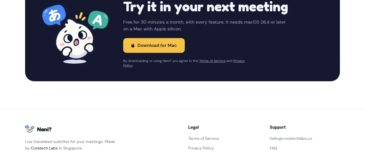
A compact dark CTA closes the persuasive flow with a friendly visual, one direct action, platform reassurance, and legal microcopy.
Prompt preview
## Reference images

Study these alongside the description below: hierarchy, rhythm, spacing, colour. Build for the product you are asked about, using this design language.

- Component: https://kage-design-assets.t3.tigrisfiles.io/components/nani/f548445b-7dd2-48a7-847f-0684381711f2-1792217071-7.webp
- Full page it was cut from: https://kage-design-assets.t3.tigrisfiles.io/screenshots/nani/f548445b-7dd2-48a7-847f-0684381711f2-1792217012251-full.webp
- Component on Kage: https://kage.design/component/nani-cta

## Before you start
Ask what conversion action the user's product needs and what illustration or visual device fits its own brand. Then build an original CTA.

Create a wide, centered, dark rounded CTA panel with a small abstract product-related visual on the left and copy on the right. Use a strong white heading, one short supporting line, a bright primary download/signup button, and tiny terms/privacy consent text beneath it. Keep the panel visually self-contained with generous padding and a 24–28px radius. Use deep navy #17192f, warm yellow #f5c33b for the button, white heading text, and muted lavender-gray supporting text. On mobile, stack the visual above or beside the copy and keep the action prominent. Include hover, pressed, and focus states for the button.

Never: reuse logos, product names, copy, illustrations, or imagery from the reference.
More components

 Final conversion banner
CrewTower Mod for Claude Code · Call to action
Final conversion banner
CrewTower Mod for Claude Code · Call to action
 Bright installation call to action
Ultracite v8 · Call to action
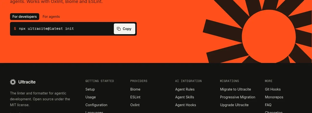
Bright installation call to action
Ultracite v8 · Call to action

 Marble-backed final CTA
Maybloc · Call to action
Marble-backed final CTA
Maybloc · Call to action
 Developer integration CTA
Maybloc · Call to action
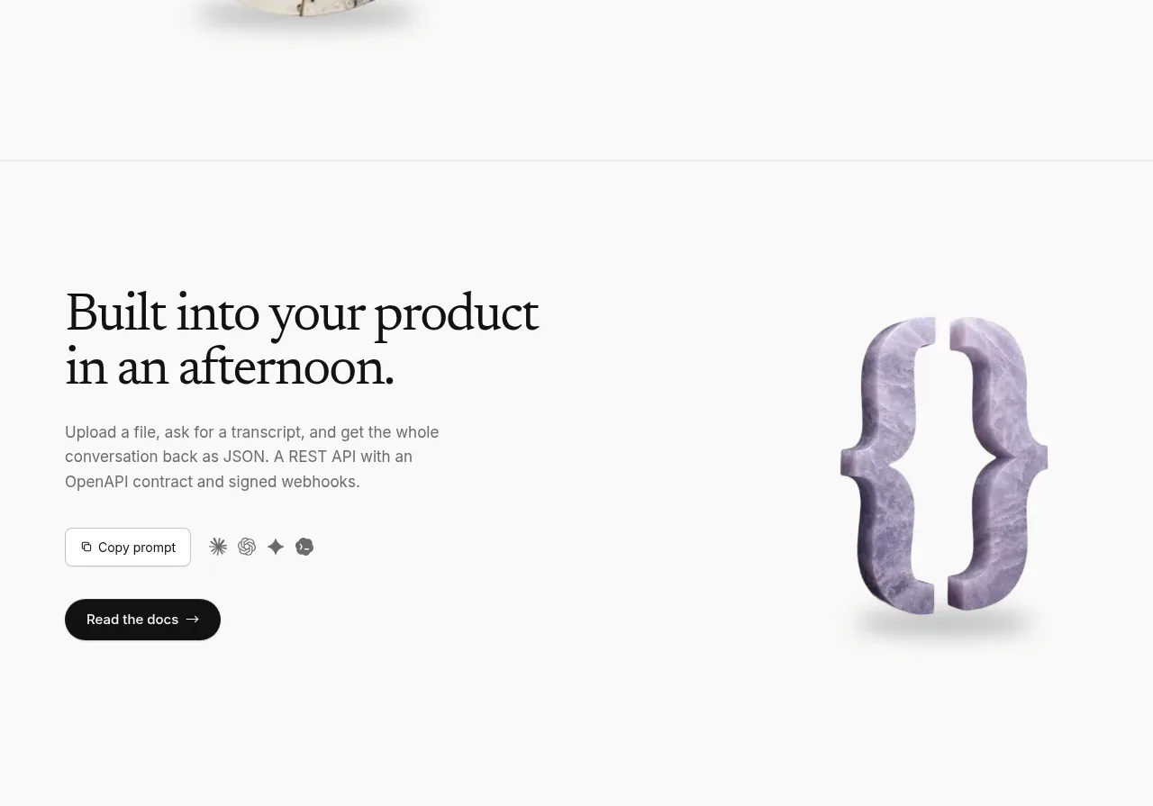
Developer integration CTA
Maybloc · Call to action
 Centered conversion call to action
Fish Audio Drama 3 · Call to action
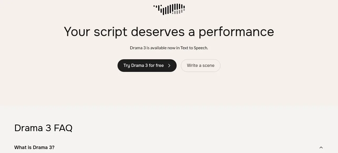
Centered conversion call to action
Fish Audio Drama 3 · Call to action
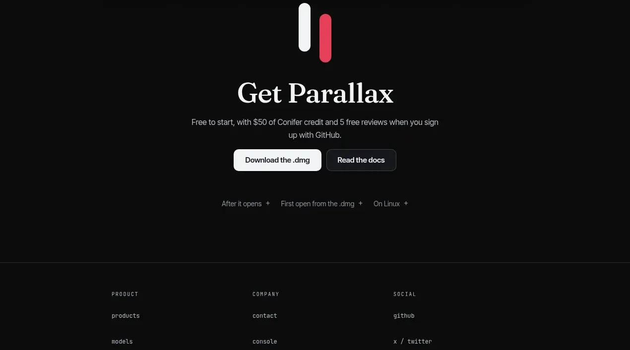
 Download-focused closing call to action
Parallax · Call to action
Download-focused closing call to action
Parallax · Call to action