 kage
kage
fish.audio
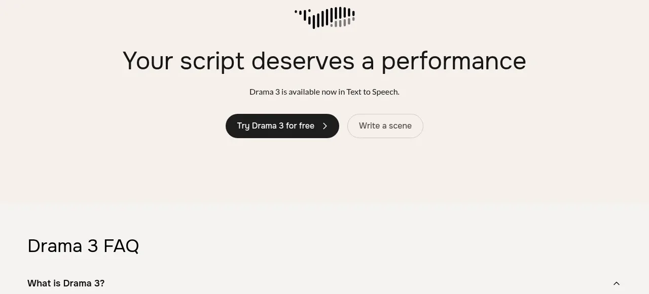
Design analysis
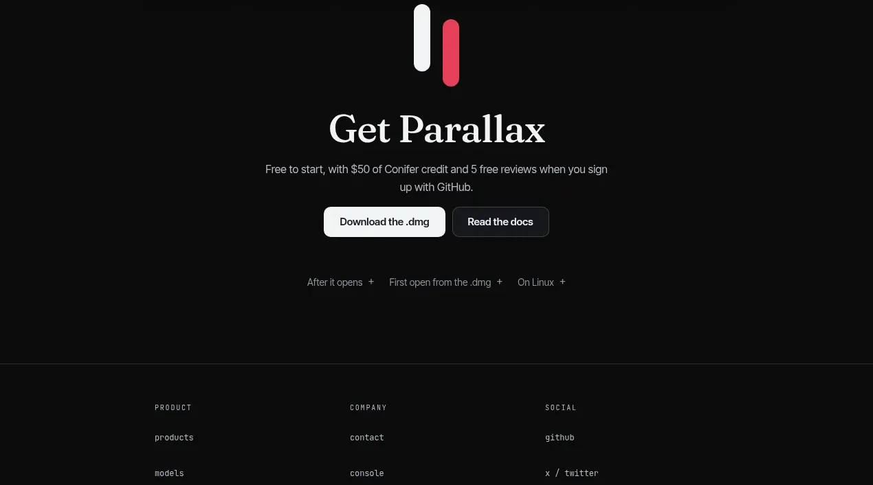
A calm, centered CTA section uses a small decorative mark, a strong headline, brief supporting copy, and paired primary/secondary actions to close the product story before the FAQ.
Prompt preview
## Reference images

Study these alongside the description below: hierarchy, rhythm, spacing, colour. Build for the product you are asked about, using this design language.

- Component: https://kage-design-assets.t3.tigrisfiles.io/components/fish-audio-drama-3/b8b3d5d8-1af1-45c3-b814-ec39ae20de20-1792217028-6.webp
- Full page it was cut from: https://kage-design-assets.t3.tigrisfiles.io/screenshots/fish-audio-drama-3/b8b3d5d8-1af1-45c3-b814-ec39ae20de20-1792216963457-full.webp
- Component on Kage: https://kage.design/component/fish-audio-drama-3-cta

## Before you start
Ask what the user's product, audience, and brand voice are. Apply this conversion pattern to that product with original content.

Build a centered CTA band with generous top and bottom padding. Add a small abstract decorative brand-neutral mark, a large one-line headline, a short supporting sentence, and two pill buttons: one filled primary action and one outlined secondary action. Keep the content vertically stacked and centered within a constrained max-width.

Use a slightly warmer cream background around `#f5f0e8`, near-black text, a black primary button with white text, and an off-white outlined secondary button. Use 24–32px spacing between major elements, soft 999px button radii, and responsive type that scales down without wrapping awkwardly. Add a subtle hover lift or colour transition while preserving strong focus rings.

Never: use logos, product names, copy, illustrations, or imagery from the reference.
More components

 Final conversion banner
CrewTower Mod for Claude Code · Call to action
Final conversion banner
CrewTower Mod for Claude Code · Call to action
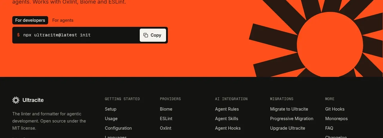
 Bright installation call to action
Ultracite v8 · Call to action
Bright installation call to action
Ultracite v8 · Call to action
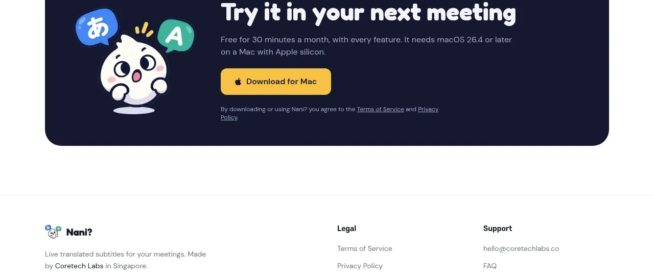
 Download call to action
NANI??? · Call to action
Download call to action
NANI??? · Call to action
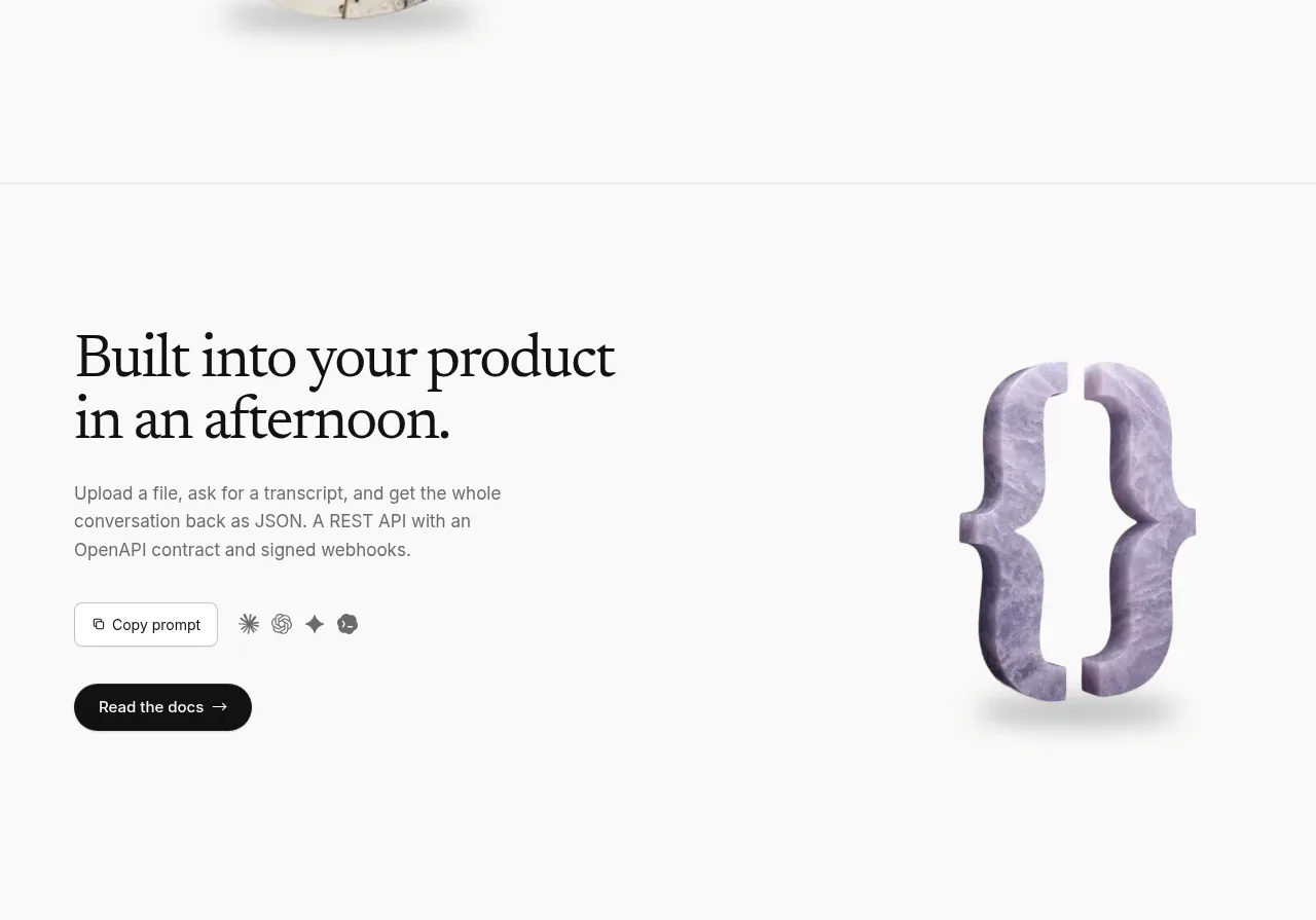
 Developer integration CTA
Maybloc · Call to action
Developer integration CTA
Maybloc · Call to action
 Marble-backed final CTA
Maybloc · Call to action
Marble-backed final CTA
Maybloc · Call to action
 Download-focused closing call to action
Parallax · Call to action
Download-focused closing call to action
Parallax · Call to action