kage
kage
crewtower.app

Design analysis
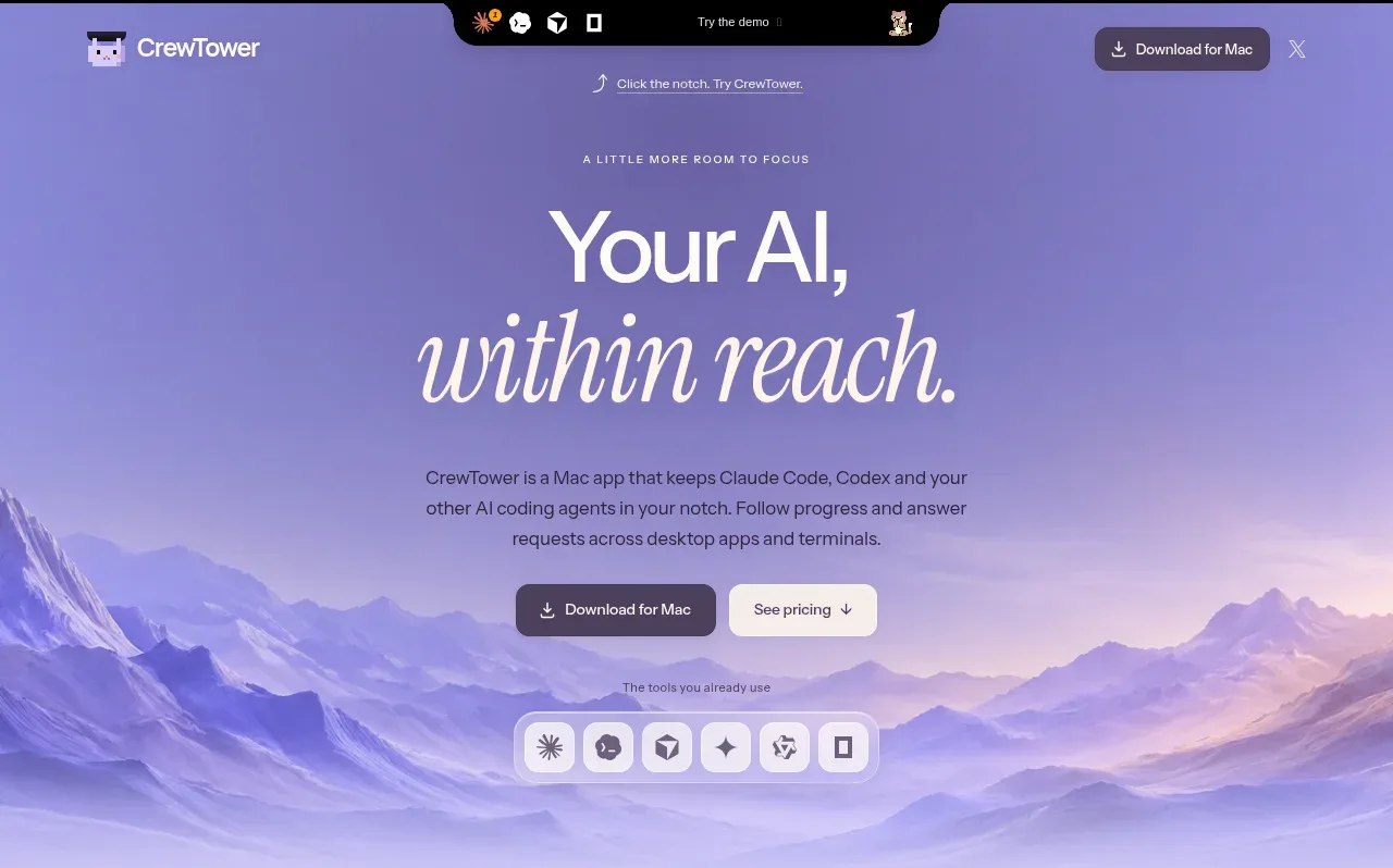
A long-form product landing page built around a pale lavender-to-mountain hero that resolves into a quiet off-white feature area, then returns to lavender for integrations, FAQs, and the closing CTA. The typography pairs a clean sans-serif for functional copy with oversized italic serif emphasis, while thin dividers, restrained shadows, rounded media cards, and black notch-style product previews keep the page refined rather than glossy. Below the hero, the rhythm moves from a three-column workflow explanation to a dense 3-by-4 feature gallery, a compact icon benefit grid, integration pills, a split purchase card, comparison links, FAQ rows, and a final gradient CTA/footer.
Prompt preview
## Reference images

Study these alongside the description below: hierarchy, rhythm, spacing, colour. Build for the product you are asked about, using this design language.

- Full page: https://kage-design-assets.t3.tigrisfiles.io/screenshots/crewtower-mod-for-claude-code/6a95b5f4-2bf6-41f9-aa93-70409ededf43-1792303277739-full.webp
- Above the fold: https://kage-design-assets.t3.tigrisfiles.io/screenshots/crewtower-mod-for-claude-code/6a95b5f4-2bf6-41f9-aa93-70409ededf43-1792303272737.webp
- Design on Kage: https://kage.design/designs/crewtower-mod-for-claude-code-landing-page

## Before you start
Ask the user what they are building, who it is for, and what brand assets they already have, including the product name, colours, type choices, logo, imagery, and any existing UI screenshots. Wait for their answers before designing. Apply the system below to their product, not to the reference product, and use their brand assets wherever they exist.

## Page structure
1. **Top navigation and notch demo:** Place a small brand mark and name at the upper left, a centered black floating notch-like demo strip with tiny status icons and a “try the demo” affordance, and a compact download button at the upper right.
2. **Hero:** Use a tall lavender atmospheric background with layered illustrated mountain silhouettes. Center a small uppercase eyebrow, a very large sans-serif headline split across lines with an italic serif phrase for emphasis, a short explanatory paragraph, two CTA buttons, and a row showing compatible tools.
3. **Workflow introduction:** Transition into a lighter lavender section with generous vertical space. Center an eyebrow, the “less checking / more doing” style headline, supporting copy, and a three-column row of small session examples with statuses, task titles, and descriptions.
4. **Features heading:** Start the white/off-white content section with a left-aligned uppercase eyebrow and a concise headline introducing the feature set.
5. **Feature gallery:** Build a 3-column by 4-row gallery. Each card has a softly coloured rounded image panel containing a black floating desktop/notch UI preview, followed by a bold feature title and two or three lines of explanatory text. Vary the panel tint between lavender, blush, and pale blue while maintaining consistent card dimensions.
6. **Supporting benefits grid:** After a divider, add a 3-column by 3-row grid of compact benefits. Each item begins with a tiny black rounded-square icon, followed by a short bold title and muted explanatory copy. Keep this section text-led and much denser than the feature gallery.
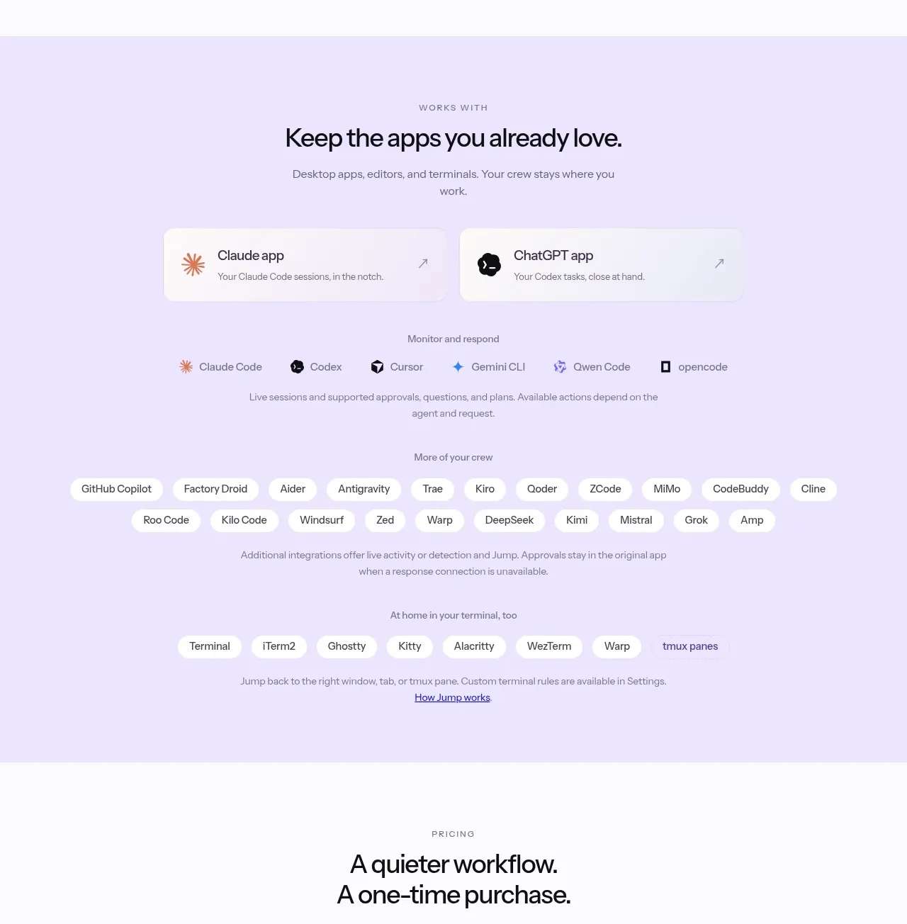
7. **Integrations section:** Return to a centered lavender panel. Introduce supported desktop apps with an eyebrow, heading, and short description, then show two prominent integration cards, a row of primary agent/app pills, a larger wrapped set of additional integration pills, and a terminal compatibility row with a small explanatory link.
8. **Pricing section:** On an off-white background, center a pricing eyebrow and two-line headline. Add a wide split card: a subtly lavender-tinted purchase panel with product-neutral pricing, early-offer badge, primary button and secondary links on the left, and a white ownership/benefits list on the right. Follow it with a small licence note, an italic testimonial, and a 2-by-2 grid of related comparison/resource cards.
9. **FAQ section:** Use a full-width lavender block with a left-aligned eyebrow and heading. Present a long stack of horizontal accordion rows, each with a question on the left and a small plus control on the right, separated by fine rules.
10. **Closing CTA:** Use a darker, hazy lavender gradient with centered italic serif headline, short copy, two buttons, and a small note about payment or updates.
11. **Footer:** Finish on white with a row of related comparison links, a compact footer navigation containing the brand placeholder, guides/changelog/privacy/terms/social links, author and copyright text, and a final row of small monochrome credibility badges.

## Design language
- Build hierarchy through scale and type contrast: use a neutral grotesk sans for navigation, body, buttons, and headings; reserve an italic editorial serif for a few emotional headline fragments, the closing CTA, and testimonial. Use tight, large display type in the hero and more restrained 32–48px section headings below it.
- Make the page change rhythm deliberately: the hero is spacious and atmospheric, the workflow section is calm and explanatory, the feature gallery is visual and repetitive, the benefit grid is dense and scannable, integrations use centered grouped pills, pricing is transactional, and the FAQ is a long low-contrast list.
- Use a restrained palette based on pale lavender `#e8e3ff`, deeper lavender haze around `#a9a0d2`, off-white `#fbfafc`, near-black `#111015`, muted gray-lavender `#777286`, soft blush `#f1d9d3`, and pale blue `#c9e4ec`. Keep most text near-black and use colour primarily in backgrounds, media panels, and selected buttons.
- Treat the hero and closing CTA as soft environmental gradients rather than flat fills. Layer blurred lavender, blue, pink, and cream shapes or abstract landscape forms behind content, but preserve strong text contrast.
- Pair rounded UI preview cards with crisp text layouts. Use medium corner radii around 12–18px for panels and cards, pill radii for buttons and integration tags, and very subtle shadows only on floating previews and purchase cards.
- Use thin, low-contrast dividers such as `rgba(30,25,45,.10)` between columns, benefits, FAQ rows, and footer groups. Avoid heavy borders and avoid excessive glass effects.
- Keep buttons compact and tactile: dark charcoal primary buttons with white text, warm off-white secondary buttons with dark text, moderate padding, and small arrow/download affordances. Use hover states that slightly lift or darken controls without changing the layout.
- Product mockups should look like small black macOS/notch surfaces with compact status labels, coloured dots, progress indicators, approval controls, and terminal-like rows. Keep these previews self-contained and readable at a glance, without copying any reference branding or content.
- Use a centered max-width container for hero, integrations, pricing, FAQ, and CTA content; use a wider grid for the 3-column feature gallery. On smaller screens collapse grids to one column, preserve the large hero type at a reduced scale, stack the pricing card, and turn long pill rows into wrapping groups.
- Add restrained motion only where useful: gently shift atmospheric background layers, fade or lift cards on entry, animate button hover states, and let FAQ rows expand smoothly. Do not use loud parallax, constant floating, or distracting transitions.

## Never
- Do not copy the reference product’s logo, wordmark, name, tagline, exact copy, screenshots, icons, illustrations, mountain artwork, or app names.
- Do not reproduce the reference product as a branded clone or present the result as CrewTower.
- Use original placeholder content, original abstract backgrounds, and the user’s product-specific terminology and assets instead.
Components from this page
All components
 Top navigation bar
CrewTower Mod for Claude Code · Navigation
Top navigation bar
CrewTower Mod for Claude Code · Navigation
 Focus-oriented hero
CrewTower Mod for Claude Code · Hero
Focus-oriented hero
CrewTower Mod for Claude Code · Hero
 Workflow features and capabilities
CrewTower Mod for Claude Code · Feature grid
Workflow features and capabilities
CrewTower Mod for Claude Code · Feature grid
 Supported apps and integrations
CrewTower Mod for Claude Code · Logo cloud
Supported apps and integrations
CrewTower Mod for Claude Code · Logo cloud
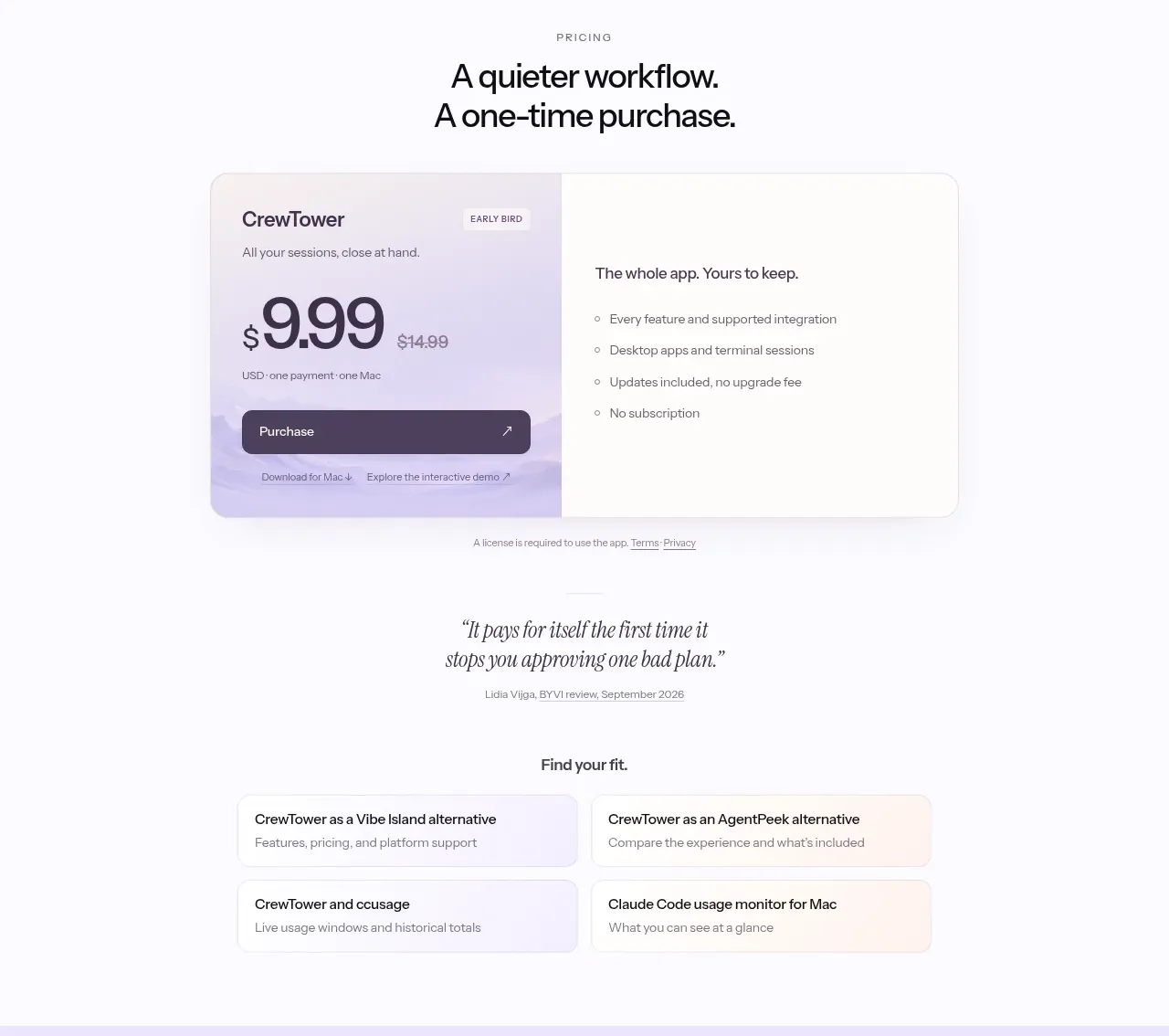 One-time purchase pricing
CrewTower Mod for Claude Code · Pricing table
One-time purchase pricing
CrewTower Mod for Claude Code · Pricing table
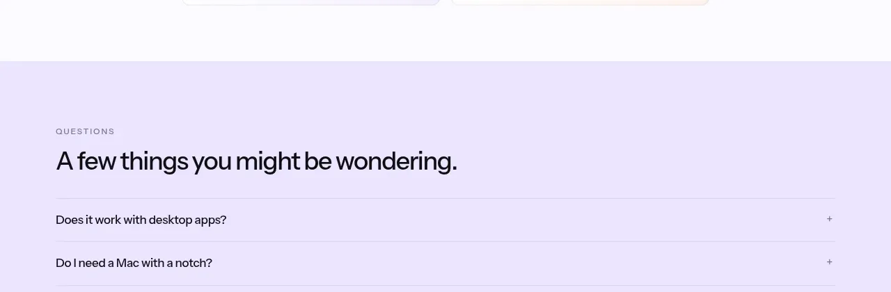 Social proof and comparison links
CrewTower Mod for Claude Code · Testimonials
Social proof and comparison links
CrewTower Mod for Claude Code · Testimonials
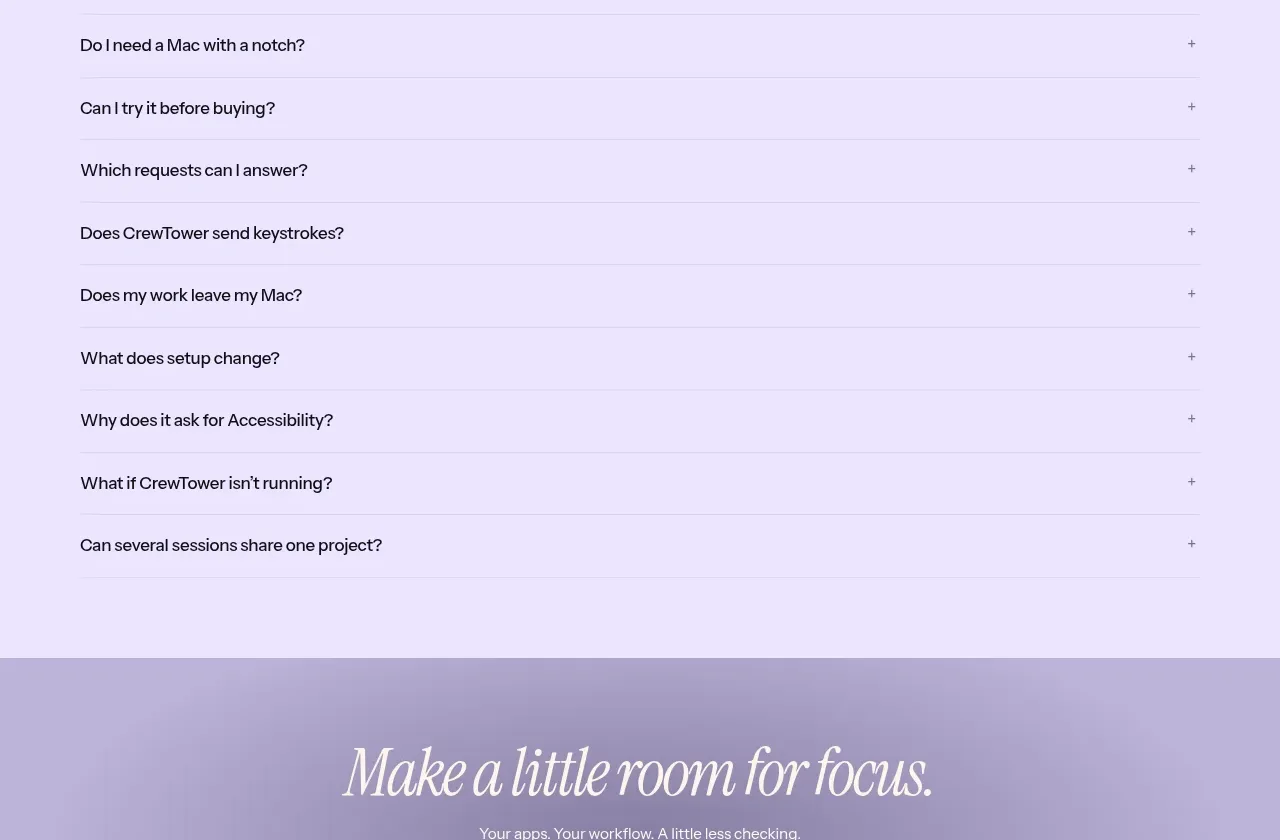 Frequently asked questions
CrewTower Mod for Claude Code · FAQ
Frequently asked questions
CrewTower Mod for Claude Code · FAQ
 Final conversion banner
CrewTower Mod for Claude Code · Call to action
Final conversion banner
CrewTower Mod for Claude Code · Call to action
 Site footer
CrewTower Mod for Claude Code · Footer
Site footer
CrewTower Mod for Claude Code · Footer