 kage
kage
maybloc.com

Design analysis
A compact centered CTA sits inside a wide textured panel, with a bold two-line serif invitation and two contrasting actions.
Prompt preview
## Reference images

Study these alongside the description below: hierarchy, rhythm, spacing, colour. Build for the product you are asked about, using this design language.

- Component: https://kage-design-assets.t3.tigrisfiles.io/components/maybloc/1877ee03-3cf3-49f7-b006-226ca2ea42de-1792217043-9.webp
- Full page it was cut from: https://kage-design-assets.t3.tigrisfiles.io/screenshots/maybloc/1877ee03-3cf3-49f7-b006-226ca2ea42de-1792216974687-full.webp
- Component on Kage: https://kage.design/component/maybloc-cta-2

## Before you start
Ask what the user's product is, who it serves, and what brand voice and visual identity it should use. Apply the principles below to that product rather than reproducing the reference.

Build a centered final CTA inside a wide, softly rounded textured or abstract background panel. Use a two-line serif heading, generous top and bottom padding, and two adjacent buttons: a dark filled primary pill and a light outlined secondary pill. Keep the texture subtle enough for legibility, approximate it with a pale gray/white marble treatment or an original gradient, and use #111111 text, #fafafa panel highlights, and #dddddd borders with a 16–20px radius. Center the content and maintain strong focus states. On small screens stack the buttons.

Never: use the reference's logo, product name, copy, illustrations, imagery, or exact background artwork.
More components

 Final conversion banner
CrewTower Mod for Claude Code · Call to action
Final conversion banner
CrewTower Mod for Claude Code · Call to action
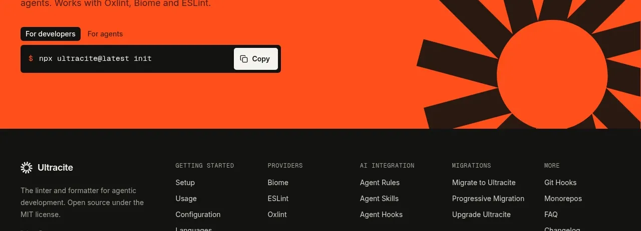
 Bright installation call to action
Ultracite v8 · Call to action
Bright installation call to action
Ultracite v8 · Call to action
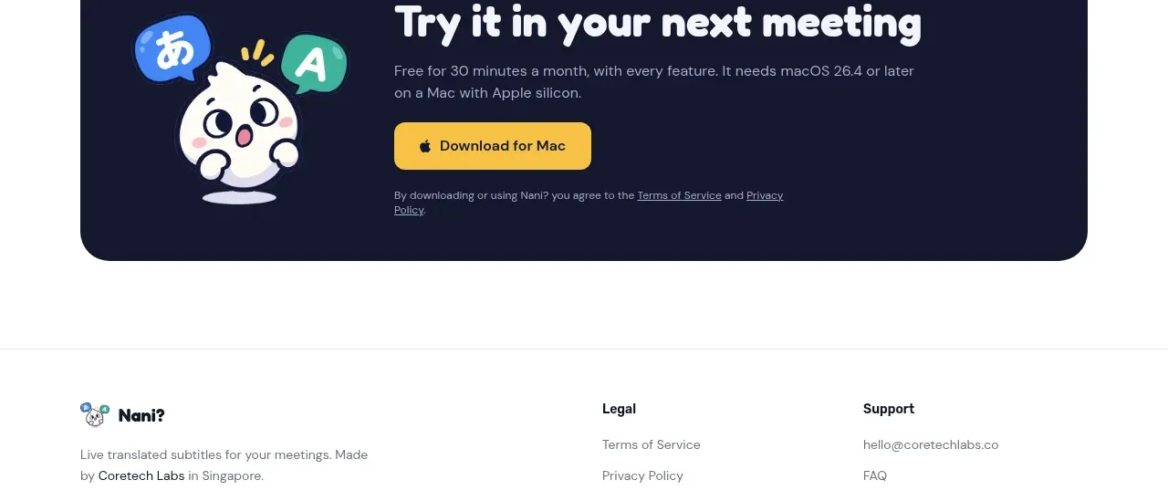
 Download call to action
NANI??? · Call to action
Download call to action
NANI??? · Call to action
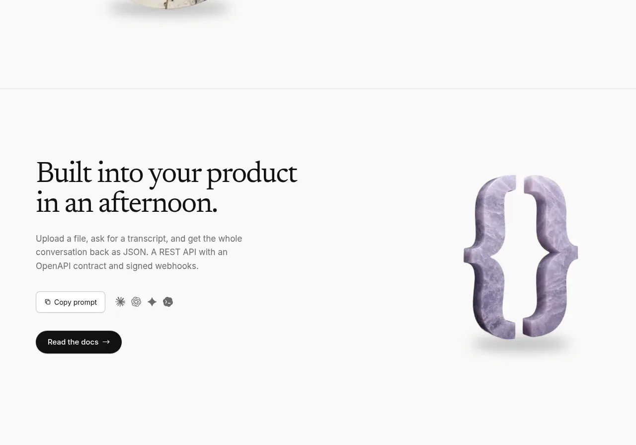
 Developer integration CTA
Maybloc · Call to action
Developer integration CTA
Maybloc · Call to action
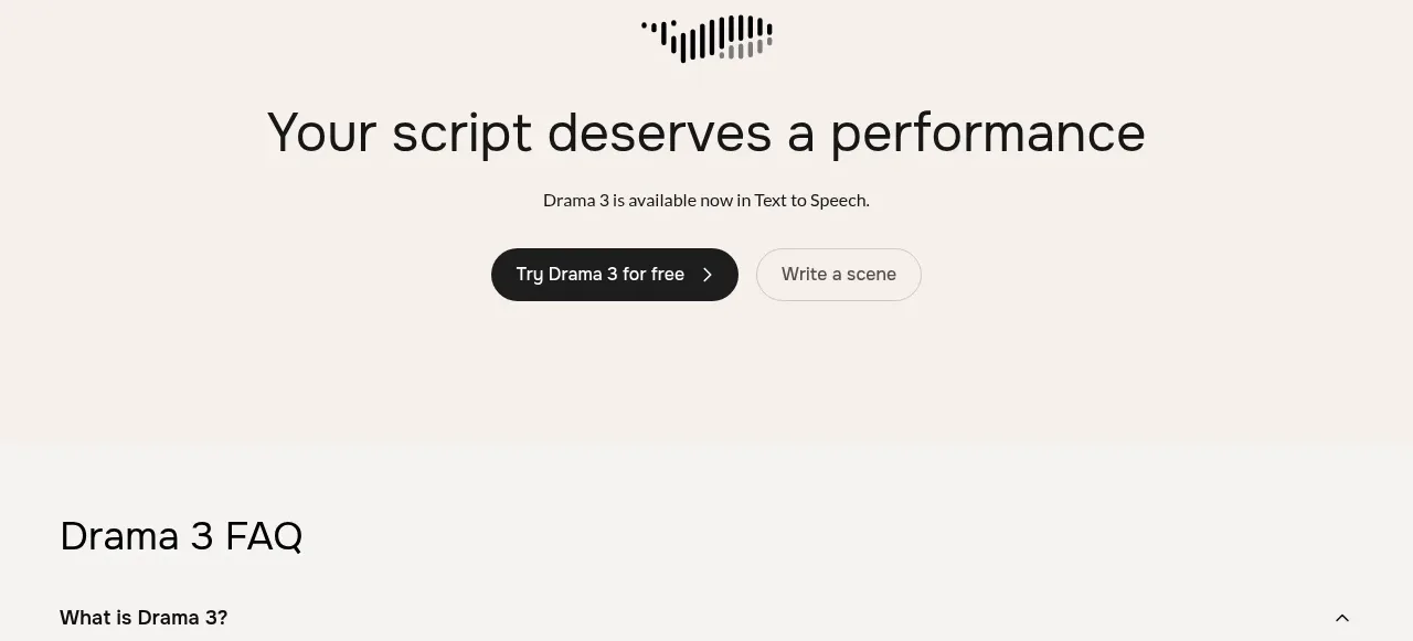
 Centered conversion call to action
Fish Audio Drama 3 · Call to action
Centered conversion call to action
Fish Audio Drama 3 · Call to action
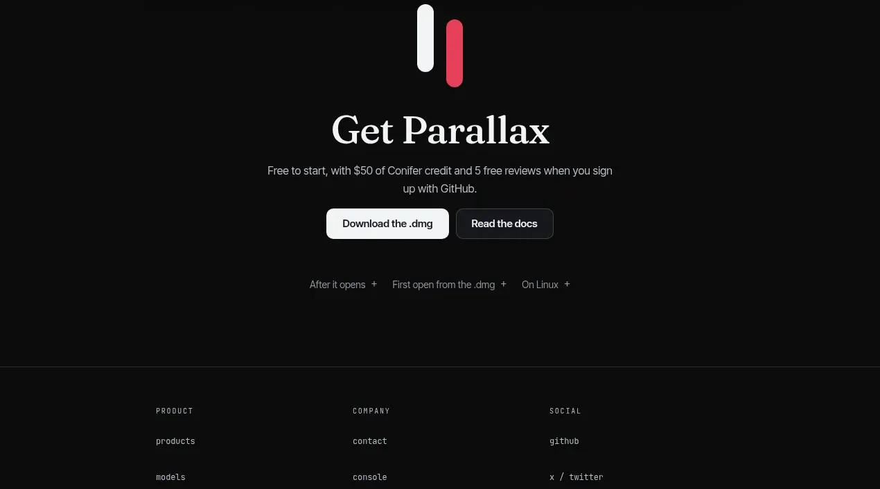
 Download-focused closing call to action
Parallax · Call to action
Download-focused closing call to action
Parallax · Call to action