 kage
kage
crewtower.app
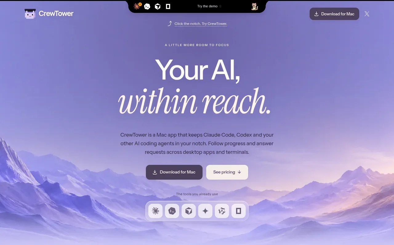
Design analysis
The hero uses an oversized two-line headline, concise explanatory copy, paired calls to action, and a soft illustrated mountain-like backdrop to make the promise feel calm and cinematic.
Prompt preview
## Reference images

Study these alongside the description below: hierarchy, rhythm, spacing, colour. Build for the product you are asked about, using this design language.

- Component: https://kage-design-assets.t3.tigrisfiles.io/components/crewtower-mod-for-claude-code/6a95b5f4-2bf6-41f9-aa93-70409ededf43-1792303419-1.webp
- Full page it was cut from: https://kage-design-assets.t3.tigrisfiles.io/screenshots/crewtower-mod-for-claude-code/6a95b5f4-2bf6-41f9-aa93-70409ededf43-1792303277739-full.webp
- Component on Kage: https://kage.design/component/crewtower-mod-for-claude-code-hero

## Before you start
Ask what the user's product does, who should act after seeing the hero, and what visual mood defines their brand. Then apply these principles to their content.

Create a centered hero beneath the navigation with a short eyebrow, an oversized two-line headline, a brief paragraph, two horizontally paired CTAs, and a small row of supported tools or integrations. Make the first line a crisp sans-serif and let the second line use a contrasting editorial/italic style only if that suits the brand. Use a soft lavender-to-blue gradient background with approximate colors #8c82c9, #b9afe1, and #e9e5fb; keep text near #171522. Use a max-width of 620px, 20–28px paragraph spacing, 12–16px button gaps, 12px button radii, and ample vertical breathing room. The backdrop can be abstract and atmospheric, but it must remain subordinate to the message. Make buttons keyboard accessible and ensure the hero remains legible on mobile.

Never use logos, product names, copy, illustrations, or imagery from the reference.
More components
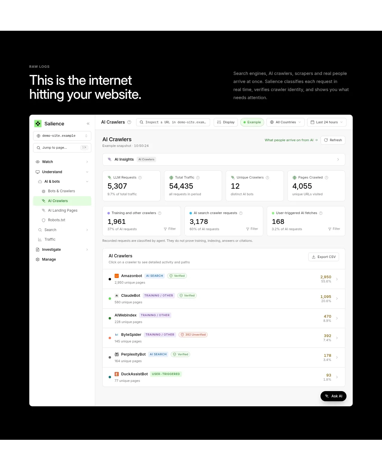
 Raw activity dashboard showcase
Salience · Hero
Raw activity dashboard showcase
Salience · Hero
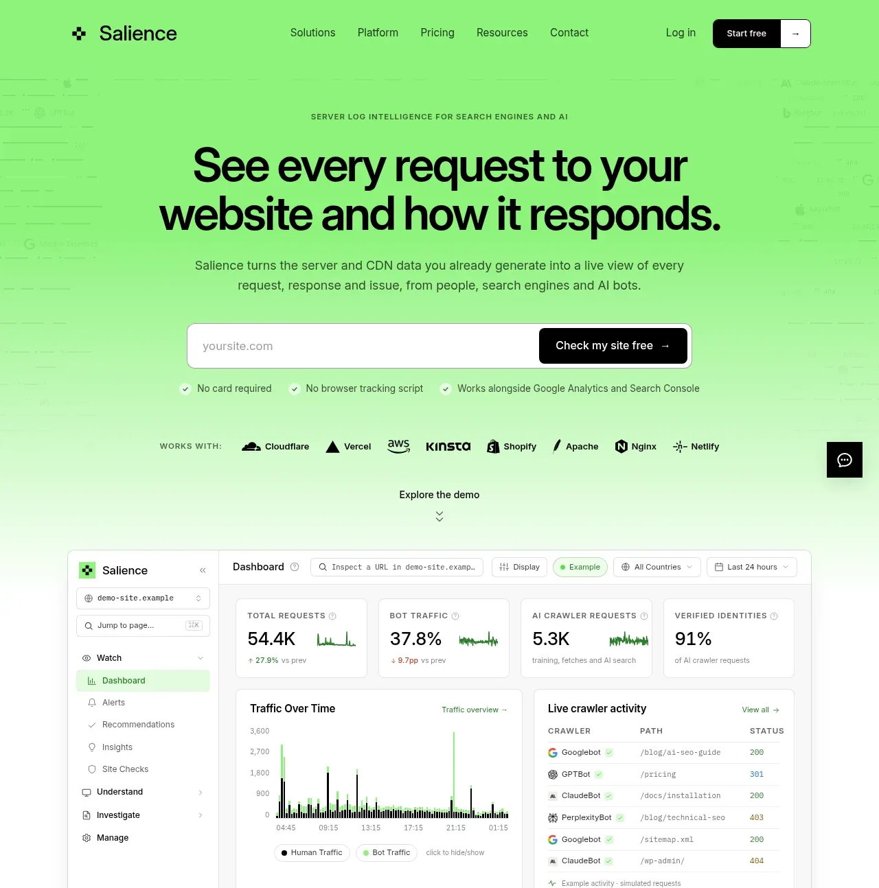 Product promise and site checker hero
Salience · Hero
Product promise and site checker hero
Salience · Hero
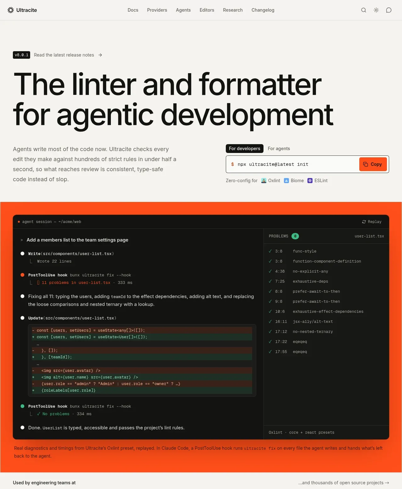
 Agentic development hero with live terminal preview
Ultracite v8 · Hero
Agentic development hero with live terminal preview
Ultracite v8 · Hero
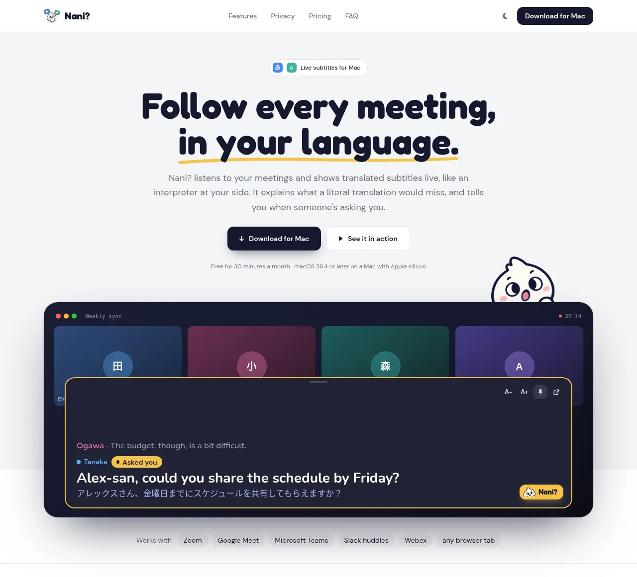
 Translation meeting hero
NANI??? · Hero
Translation meeting hero
NANI??? · Hero
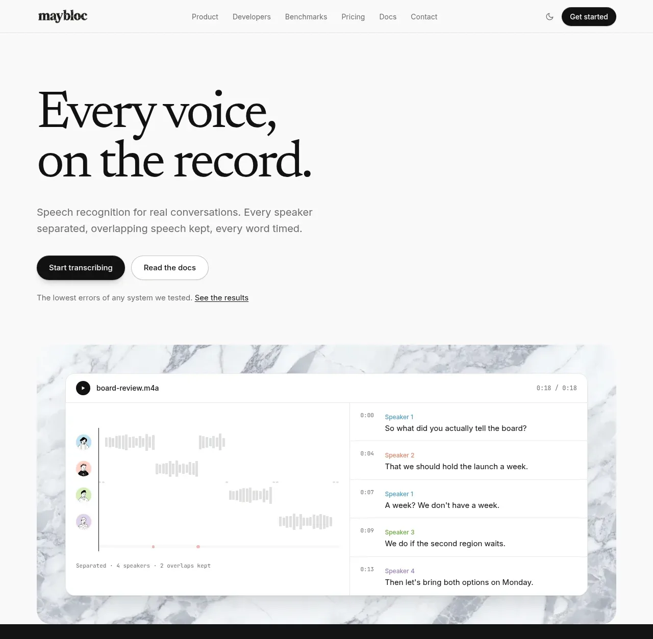
 Editorial speech transcription hero
Maybloc · Hero
Editorial speech transcription hero
Maybloc · Hero
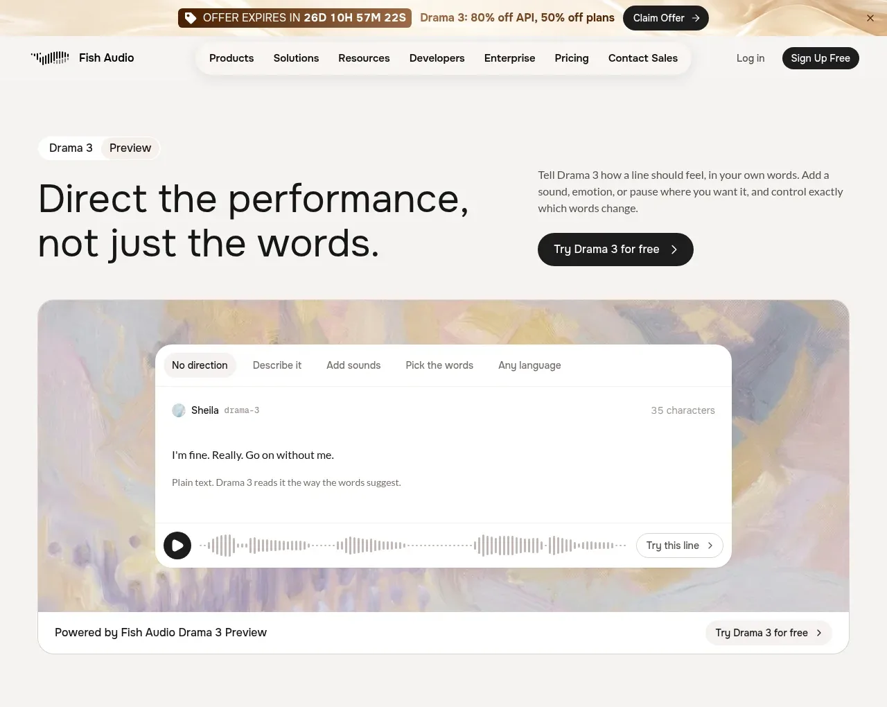
 Performance direction hero and interactive preview
Fish Audio Drama 3 · Hero
Performance direction hero and interactive preview
Fish Audio Drama 3 · Hero