 kage
kage
salience.com
Design analysis
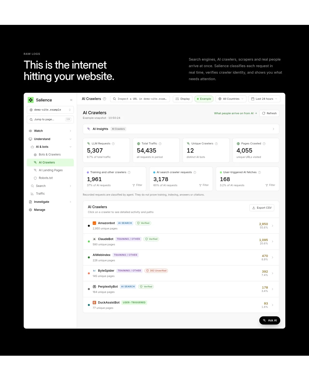
A dark product showcase frames a large crawler/activity dashboard, explaining the source data before presenting a credible, detailed interface visual.
Prompt preview
## Reference images

Study these alongside the description below: hierarchy, rhythm, spacing, colour. Build for the product you are asked about, using this design language.

- Component: https://kage-design-assets.t3.tigrisfiles.io/components/salience/db9244f7-ec48-4516-9a93-11a957a9eab9-1792303421-7.webp
- Full page it was cut from: https://kage-design-assets.t3.tigrisfiles.io/screenshots/salience/db9244f7-ec48-4516-9a93-11a957a9eab9-1792303314589-full.webp
- Component on Kage: https://kage.design/component/salience-hero-2

## Before you start
Ask what raw activity or operational data the user's product exposes and what the viewer should understand from the demo. Build a new product showcase using those insights.

Create a dark showcase band (#050605) with an eyebrow and a large white heading on the left, plus a concise contextual paragraph on the right. Below, place a wide responsive dashboard mockup built in HTML/CSS rather than an image: light rounded shell, left navigation rail, toolbar filters, metric cards, a data table with coloured status chips, and a small bottom action. Use a realistic but invented dataset and generic labels. The mockup should occupy most of the content width, have a 12px radius, 1px pale border, and a subtle shadow; keep internal typography compact at 11–14px. Use lime accents (#8bea72) sparingly against white surfaces. Provide horizontal scrolling or a stacked mobile version. The composition should communicate depth and product credibility without becoming a literal screenshot.

Never use logos, product names, copy, illustrations, or imagery from the reference.
More components
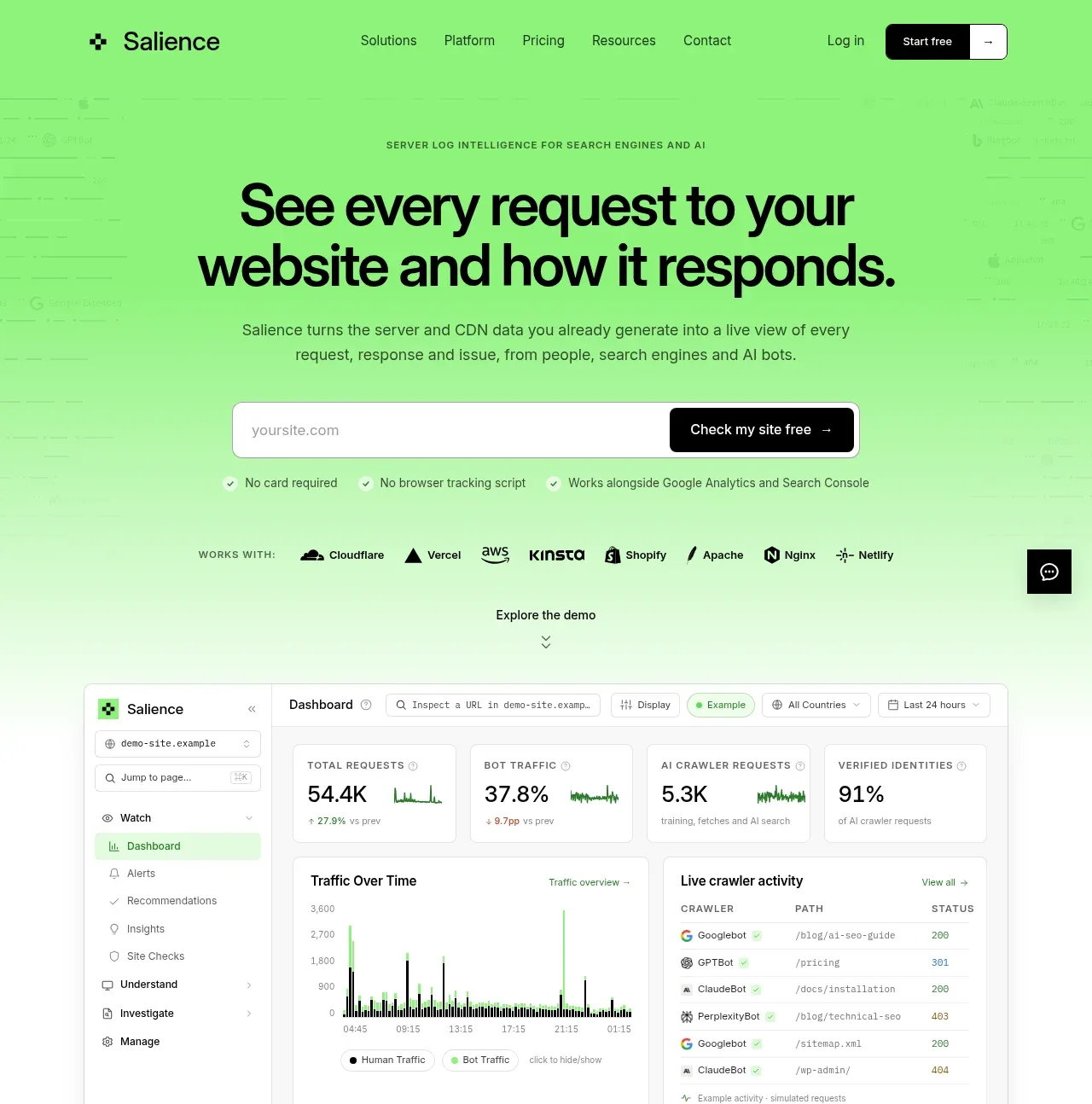
 Product promise and site checker hero
Salience · Hero
Product promise and site checker hero
Salience · Hero
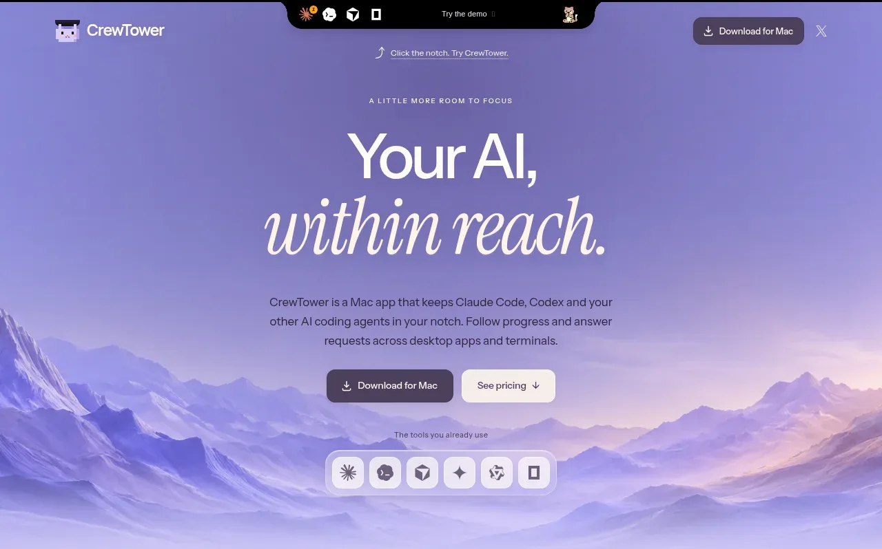
 Focus-oriented hero
CrewTower Mod for Claude Code · Hero
Focus-oriented hero
CrewTower Mod for Claude Code · Hero
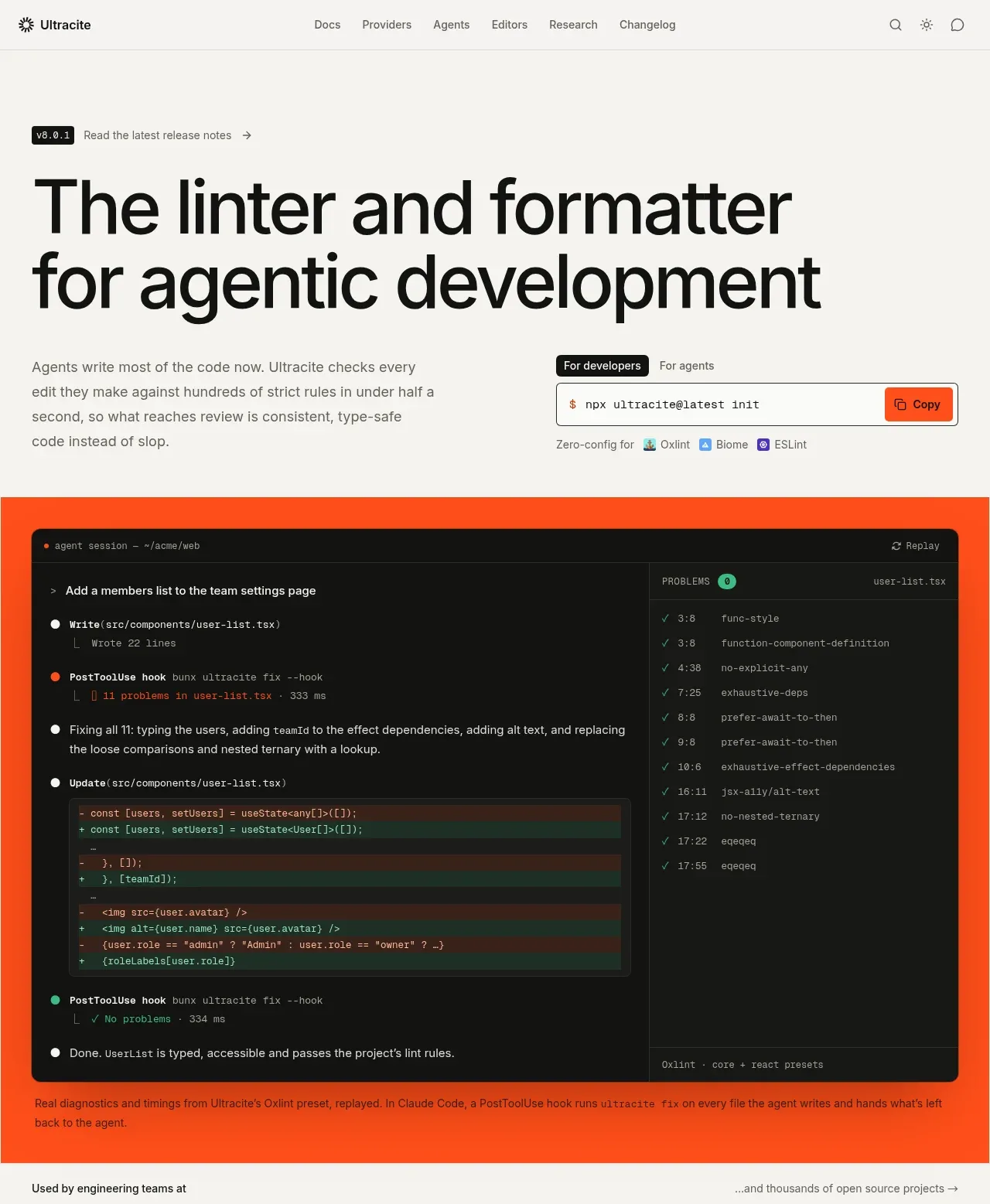
 Agentic development hero with live terminal preview
Ultracite v8 · Hero
Agentic development hero with live terminal preview
Ultracite v8 · Hero
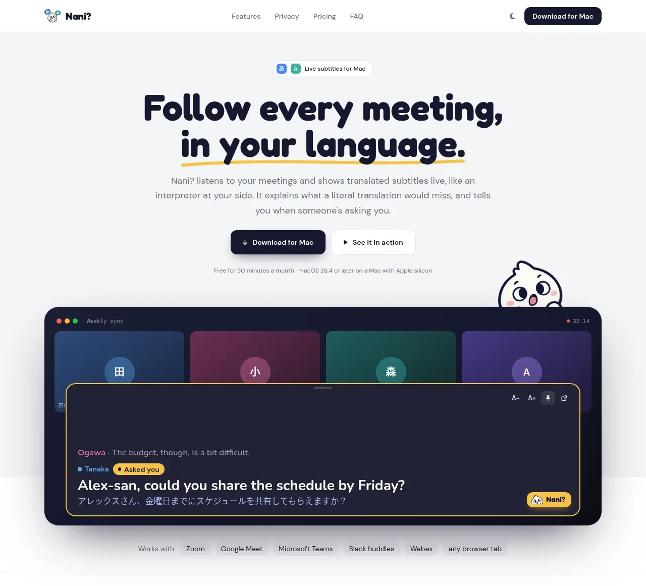
 Translation meeting hero
NANI??? · Hero
Translation meeting hero
NANI??? · Hero
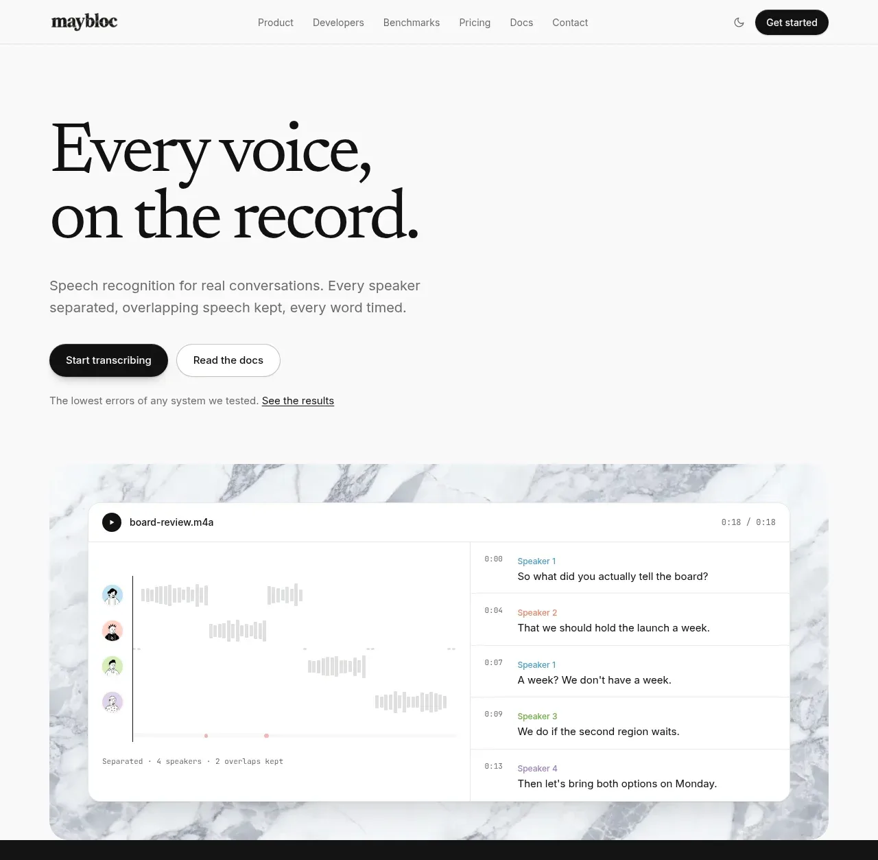
 Editorial speech transcription hero
Maybloc · Hero
Editorial speech transcription hero
Maybloc · Hero
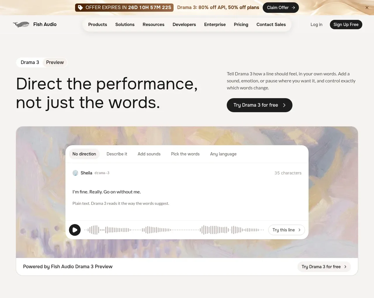
 Performance direction hero and interactive preview
Fish Audio Drama 3 · Hero
Performance direction hero and interactive preview
Fish Audio Drama 3 · Hero