 kage
kage
maybloc.com
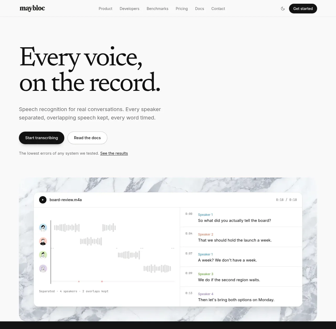
Design analysis
Large serif headline and two actions introduce the product, followed by a marble-backed transcription interface that makes the promise tangible.
Prompt preview
## Reference images

Study these alongside the description below: hierarchy, rhythm, spacing, colour. Build for the product you are asked about, using this design language.

- Component: https://kage-design-assets.t3.tigrisfiles.io/components/maybloc/1877ee03-3cf3-49f7-b006-226ca2ea42de-1792217040-1.webp
- Full page it was cut from: https://kage-design-assets.t3.tigrisfiles.io/screenshots/maybloc/1877ee03-3cf3-49f7-b006-226ca2ea42de-1792216974687-full.webp
- Component on Kage: https://kage.design/component/maybloc-hero

## Before you start
Ask what the user's product is, who it serves, and what brand voice and visual identity it should use. Apply the principles below to that product rather than reproducing the reference.

Create a spacious hero immediately below the navigation. Use a large high-contrast serif display heading with a deliberate two-line break, a short muted sans-serif paragraph beneath it, and two horizontally aligned CTAs: a dark filled pill for the primary action and a white outlined pill for the secondary action. Add a small proof line below the buttons. Under the copy, place a wide product visual or interactive demo inside a soft off-white/marble-like framed area; the demo should show a believable transcript or workflow with speaker rows, timestamps, and a waveform, but use the user's own domain. Keep the page background near-white #fafafa, text #111111, body copy #777777, borders #e5e5e5, and use generous vertical whitespace. The visual can have a 14–18px radius and subtle shadow. On mobile stack the copy and visual while preserving the clear primary CTA.

Never: use the reference's logo, product name, copy, illustrations, imagery, or exact transcript content.
More components
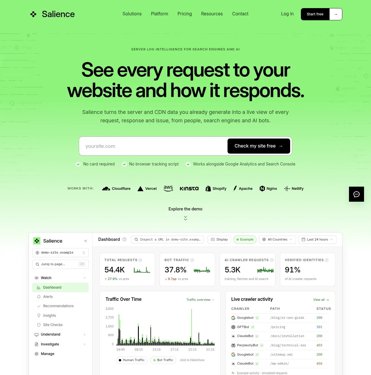
 Product promise and site checker hero
Salience · Hero
Product promise and site checker hero
Salience · Hero
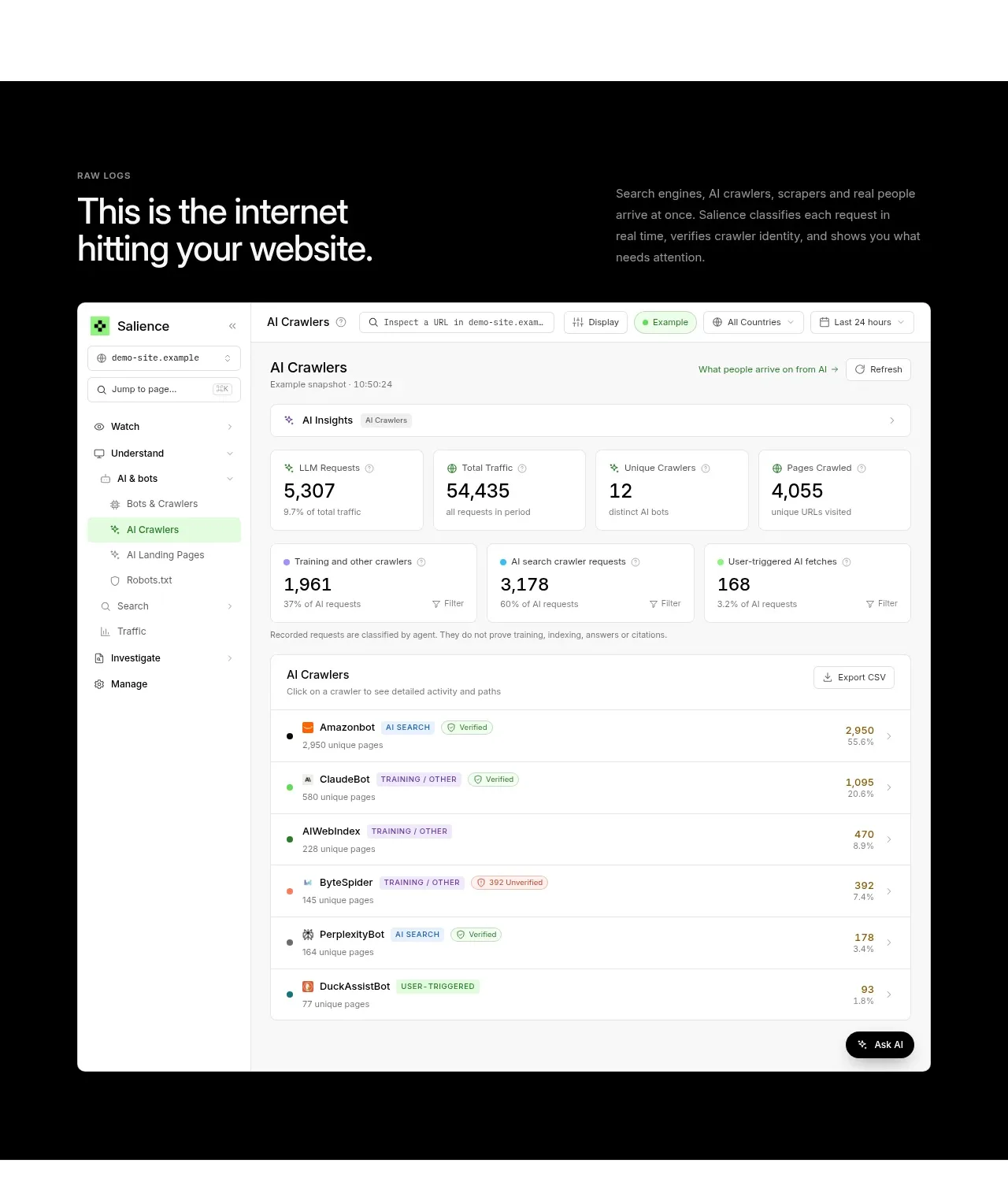 Raw activity dashboard showcase
Salience · Hero
Raw activity dashboard showcase
Salience · Hero
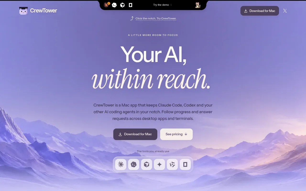
 Focus-oriented hero
CrewTower Mod for Claude Code · Hero
Focus-oriented hero
CrewTower Mod for Claude Code · Hero
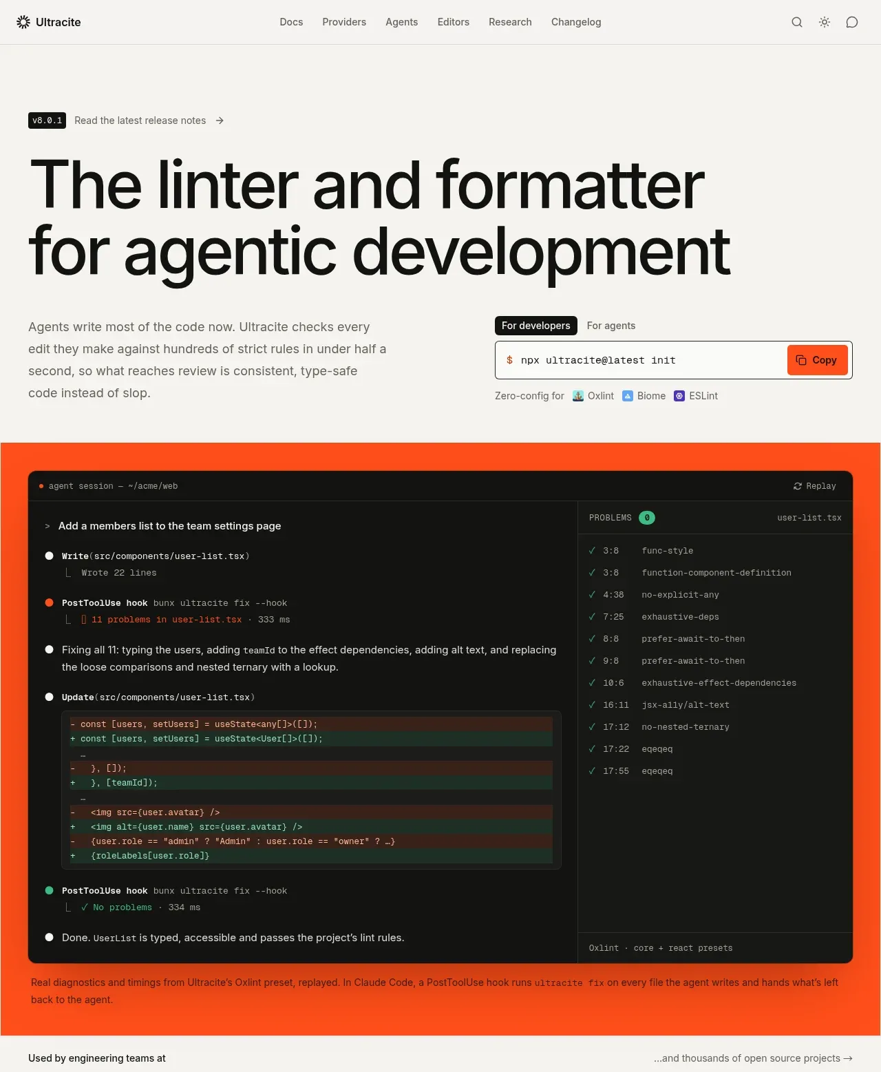
 Agentic development hero with live terminal preview
Ultracite v8 · Hero
Agentic development hero with live terminal preview
Ultracite v8 · Hero
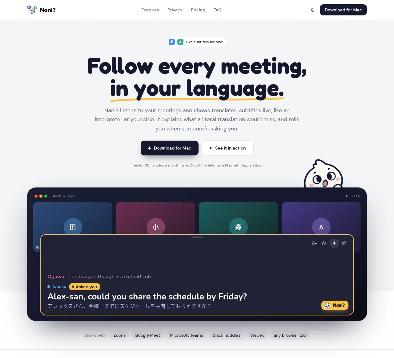
 Translation meeting hero
NANI??? · Hero
Translation meeting hero
NANI??? · Hero
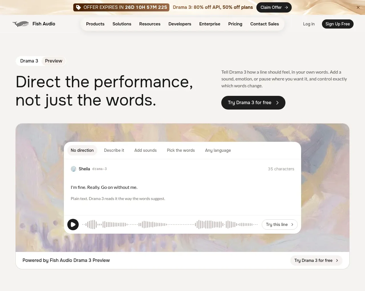
 Performance direction hero and interactive preview
Fish Audio Drama 3 · Hero
Performance direction hero and interactive preview
Fish Audio Drama 3 · Hero