 kage
kage
ultracite.ai
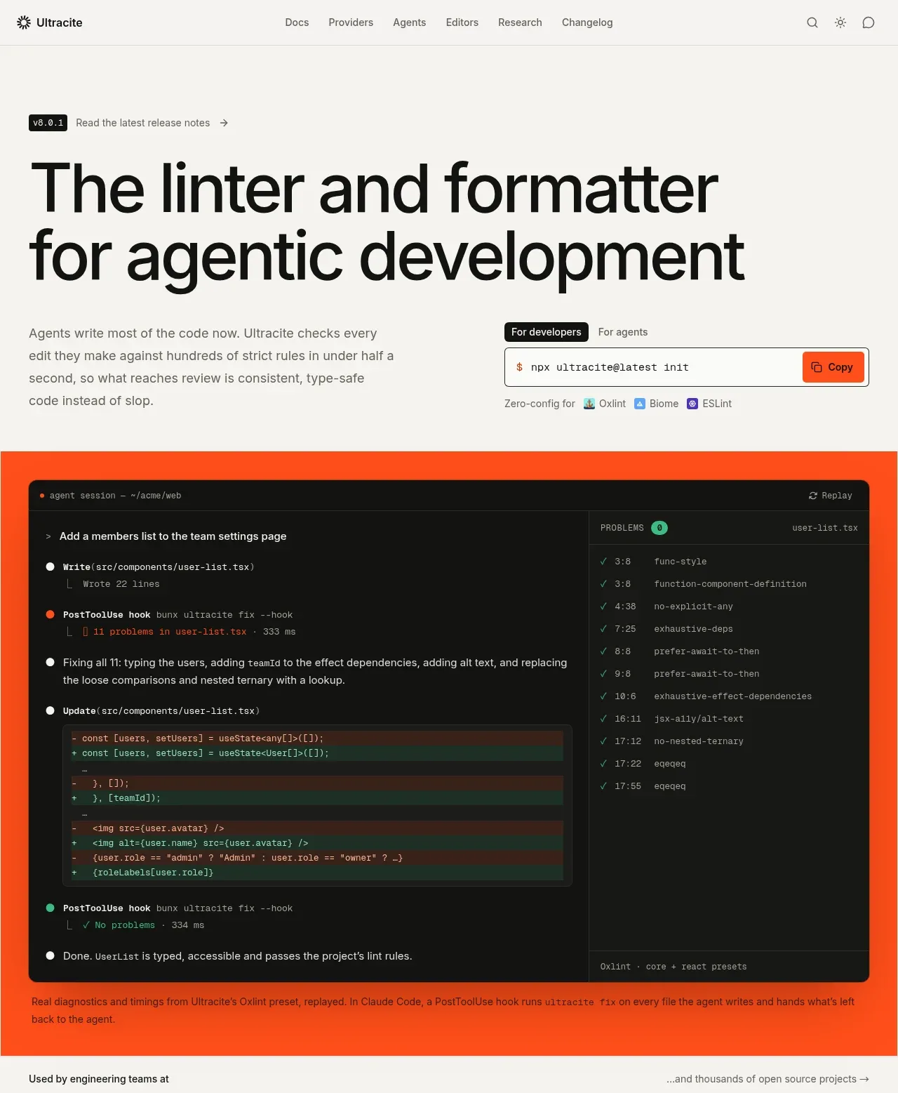
Design analysis
The hero combines an oversized two-line claim, concise explanatory copy, an install command with audience tabs, and a large high-contrast product/session preview. The vivid orange stage gives the technical demo a memorable focal point.
Prompt preview
## Reference images

Study these alongside the description below: hierarchy, rhythm, spacing, colour. Build for the product you are asked about, using this design language.

- Component: https://kage-design-assets.t3.tigrisfiles.io/components/ultracite-v8/2cfe6d77-9aac-44fd-bb06-05dad12091d2-1792303305-1.webp
- Full page it was cut from: https://kage-design-assets.t3.tigrisfiles.io/screenshots/ultracite-v8/2cfe6d77-9aac-44fd-bb06-05dad12091d2-1792303236925-full.webp
- Component on Kage: https://kage.design/component/ultracite-v8-hero

## Before you start
Ask what the user's product does, who the primary audience is, and what brand colors and tone should guide the page. Then create an original hero using these principles for that product.

Create a full-width developer-tool hero directly below the navigation. Start with a large two-line headline on the left or across the page, followed by a short paragraph that explains the practical benefit in plain language. Pair the lower part of the intro with a compact install command module: include audience tabs, a monospace command, and a copy button. Below or beside it, show a large framed terminal or workflow preview that demonstrates the product in action rather than using generic marketing artwork.

Use a warm off-white base (#f7f7f4), almost-black typography (#111110), and a saturated orange demonstration stage around #ff4b1f. Headline typography should be oversized, tight, and responsive—roughly 64–72px desktop with 0.92 line-height, reducing fluidly on mobile. Body copy can be 15–16px with muted gray #686863. Use a black terminal surface #121211, 1px dark borders, 8–12px radius, and a small orange status accent. Keep the hero content aligned to consistent page gutters, with generous vertical whitespace before the headline and between the intro and preview. The copy action should provide hover, pressed, focus, and copied states.

The preview should feel like a credible developer session: a dark panel, structured log lines, code changes, and a right-side diagnostics or issues column. Keep it readable at a glance and let the orange stage frame it with generous padding. On mobile, stack the command and preview and allow horizontal scrolling inside the terminal only.

### Never
- Never use the reference's logos, product names, copy, illustrations, or imagery.
- Never make the terminal a decorative fake with unreadable random text.
- Never add multiple competing primary CTAs.
More components
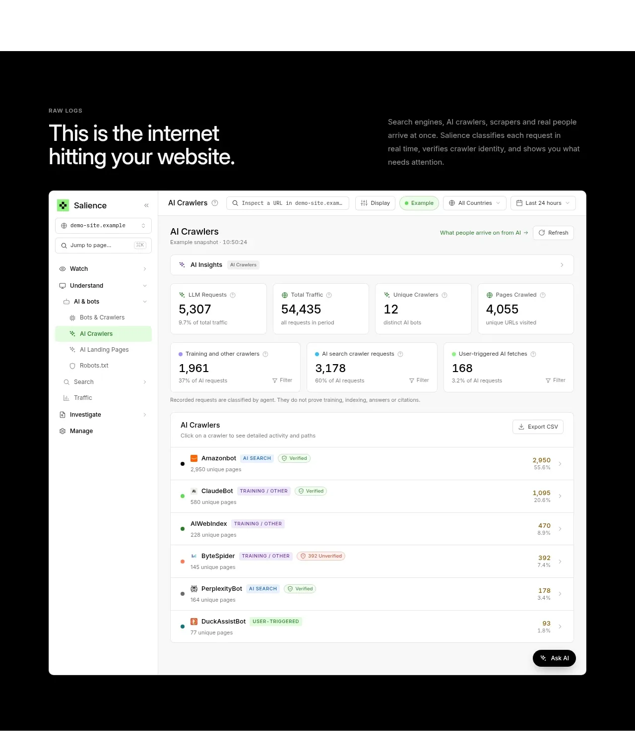
 Raw activity dashboard showcase
Salience · Hero
Raw activity dashboard showcase
Salience · Hero
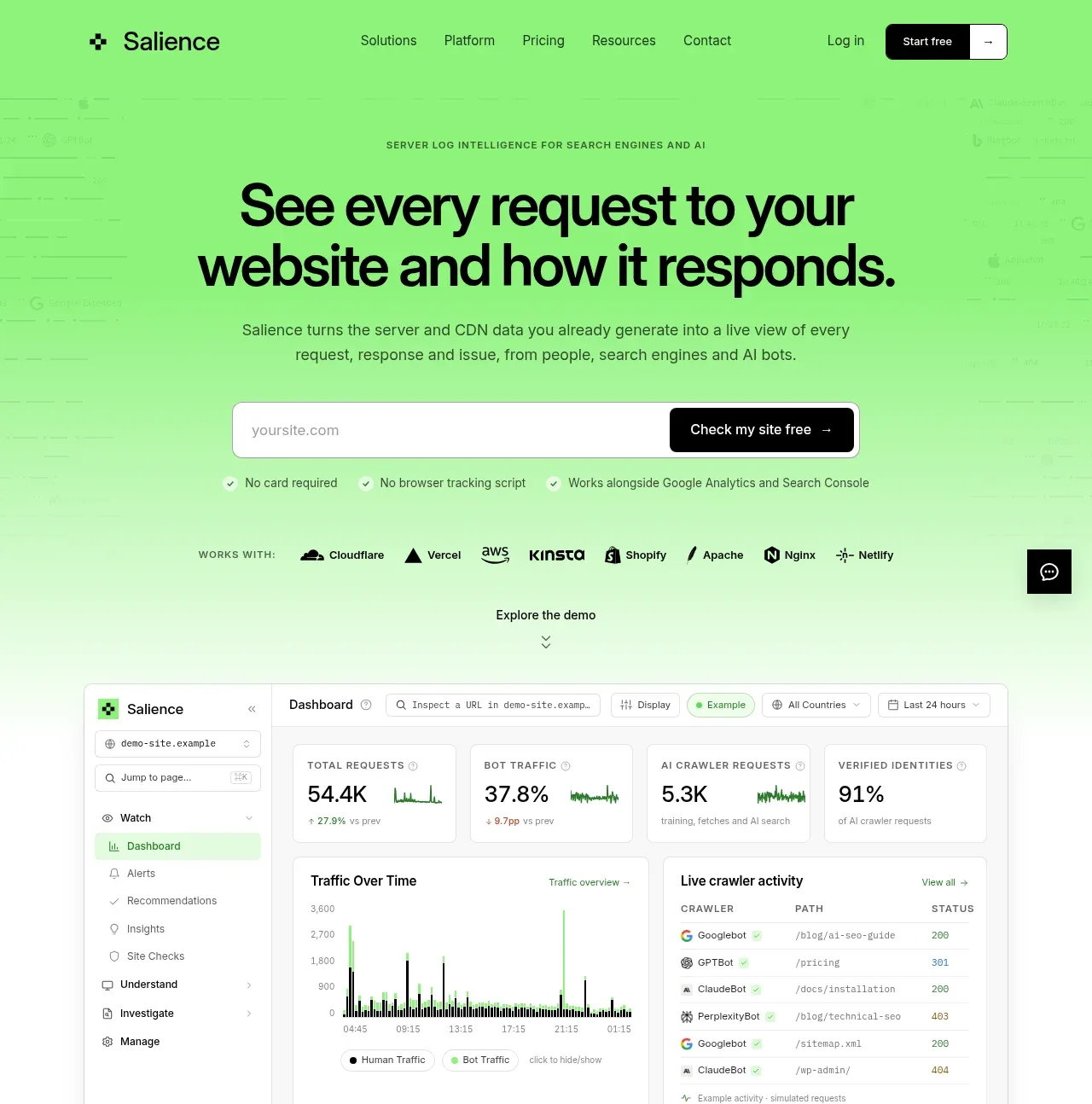 Product promise and site checker hero
Salience · Hero
Product promise and site checker hero
Salience · Hero
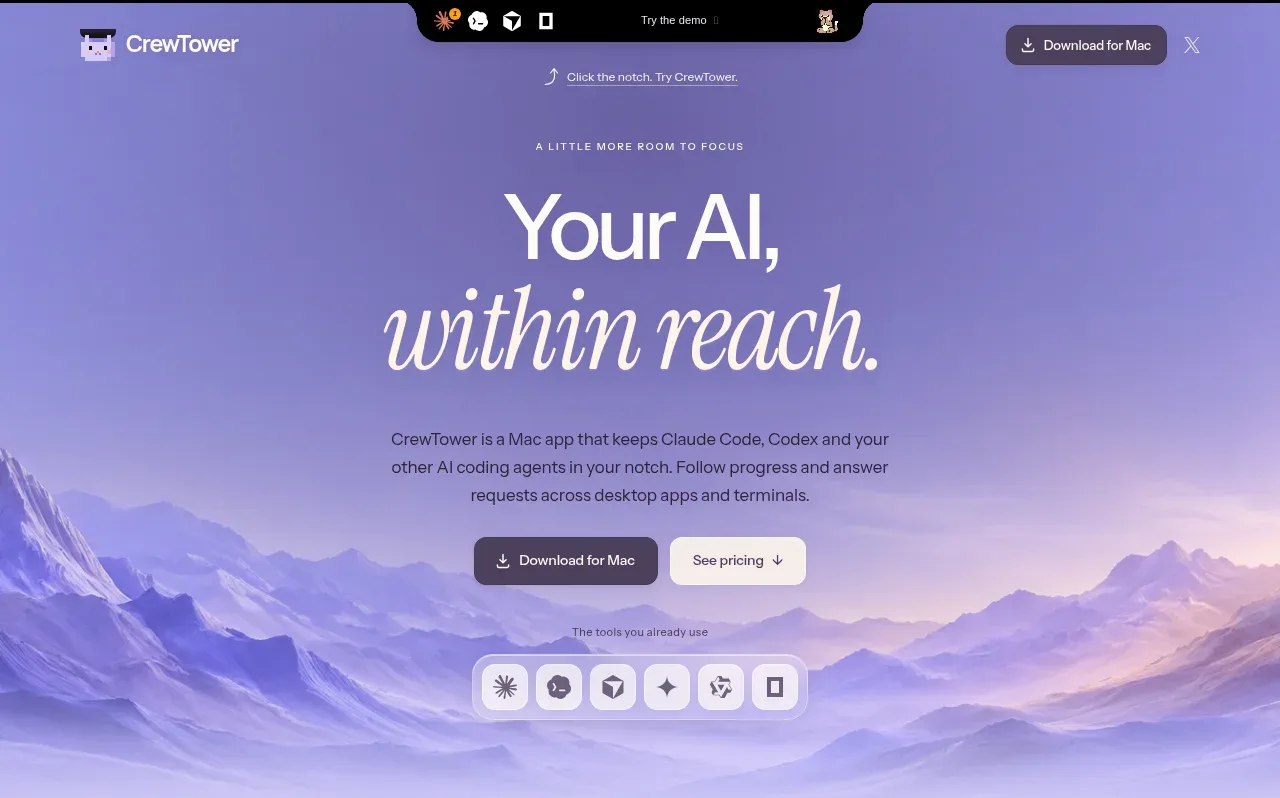
 Focus-oriented hero
CrewTower Mod for Claude Code · Hero
Focus-oriented hero
CrewTower Mod for Claude Code · Hero
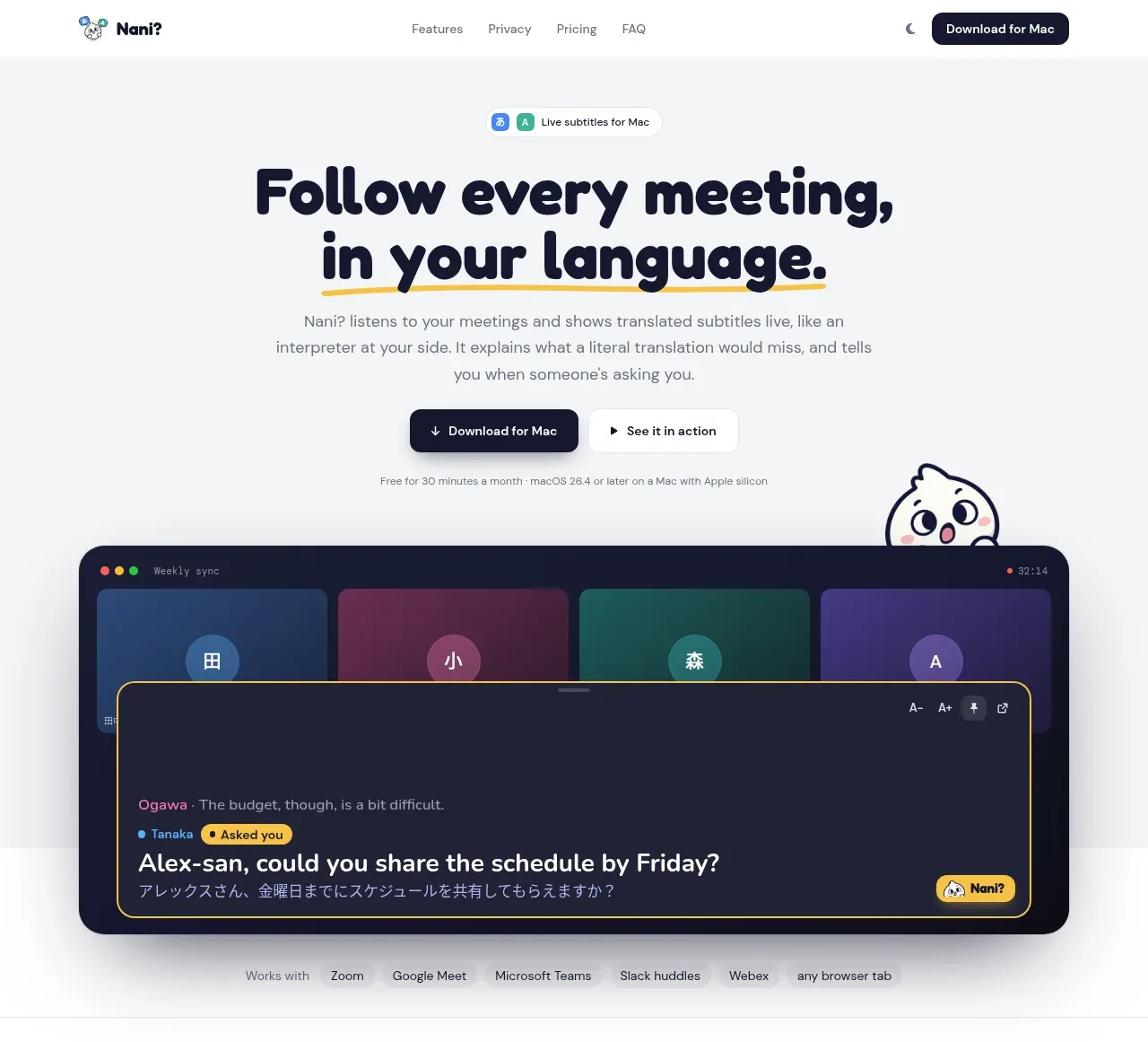
 Translation meeting hero
NANI??? · Hero
Translation meeting hero
NANI??? · Hero
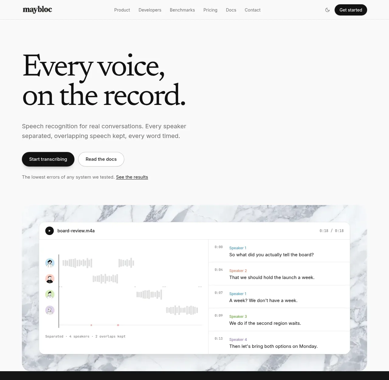
 Editorial speech transcription hero
Maybloc · Hero
Editorial speech transcription hero
Maybloc · Hero
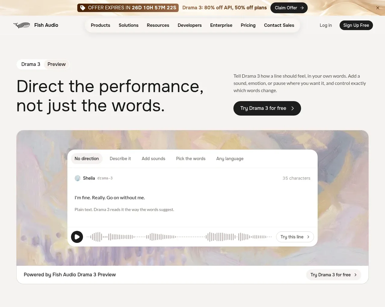
 Performance direction hero and interactive preview
Fish Audio Drama 3 · Hero
Performance direction hero and interactive preview
Fish Audio Drama 3 · Hero