kage
kage
fish.audio

Design analysis
A warm, editorial product page for an AI voice-acting model. Cream/beige backgrounds with painterly, impressionistic artwork panels carry the emotional theme, while real product UI (chat-like script cards, waveform players, tag chips) is rendered inside soft white cards. Purple is used sparingly and consistently to highlight inline direction tags like [sigh] and [whisper], making the core feature visually self-explanatory. The page alternates between dense interactive demos and airy typographic sections, with a bento-style five-card feature grid, a multiplayer scene demo, an API code block, FAQ accordion, and an unusually deep footer.
Prompt preview
## Reference images

Study these alongside the description below: hierarchy, rhythm, spacing, colour. Build for the product you are asked about, using this design language.

- Full page: https://kage-design-assets.t3.tigrisfiles.io/screenshots/fish-audio-drama-3/b8b3d5d8-1af1-45c3-b814-ec39ae20de20-1792216963457-full.webp
- Above the fold: https://kage-design-assets.t3.tigrisfiles.io/screenshots/fish-audio-drama-3/b8b3d5d8-1af1-45c3-b814-ec39ae20de20-1792216959206.webp
- Design on Kage: https://kage.design/designs/fish-audio-drama-3-landing-page

## Before you start
Ask the user what they are building, who it is for, and what brand assets (name, colours, type) they already have. Wait for the answers. Everything below is applied to *their* product, not the reference.

## Page structure
1. **Announcement bar**: slim warm-orange banner with a countdown pill, one-line offer text, and a dark pill CTA plus dismiss ×.
2. **Nav**: wordmark with waveform glyph left, centre pill-shaped nav cluster (Products, Solutions, Resources, Developers, Enterprise, Pricing, Contact Sales), Log In and a dark rounded Sign Up button right.
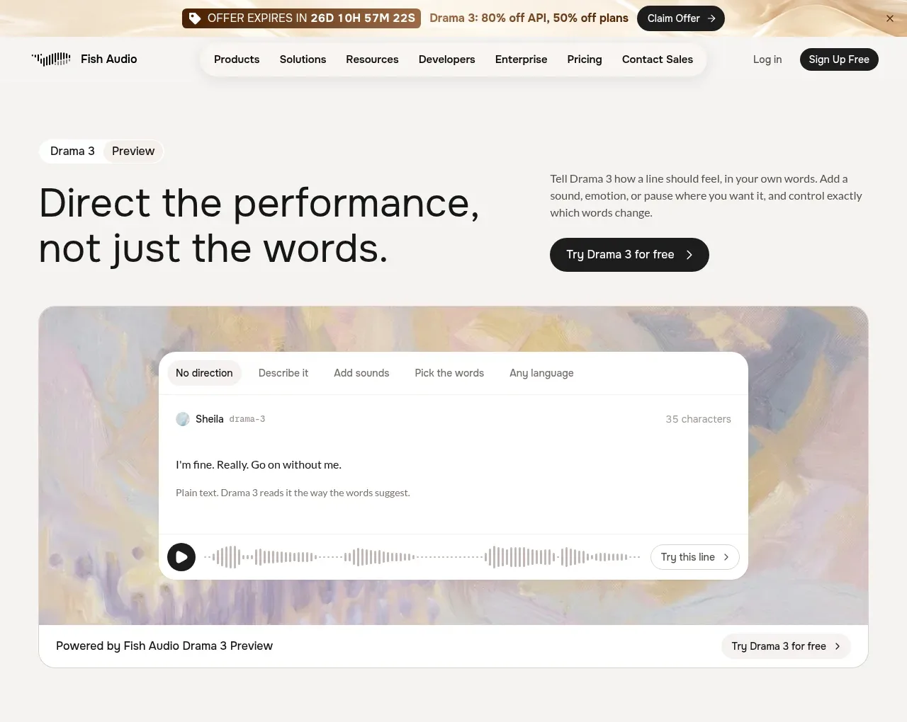
3. **Hero**: two-column split — huge two-line headline ("Direct the performance, not just the words.") left, small explanatory paragraph and a dark pill CTA right. Small "Drama 3 / Preview" chips above the headline.
4. **Hero demo card**: full-width rounded panel with a painterly gradient/painted background; a floating white app-like card sits on top with tabs (No direction, Describe it, Add sounds, Pick the words, Any language), a speaker row, script text, and an inline waveform player with a play button and "Try this line" link. A caption bar below says "Powered by …" with another CTA.
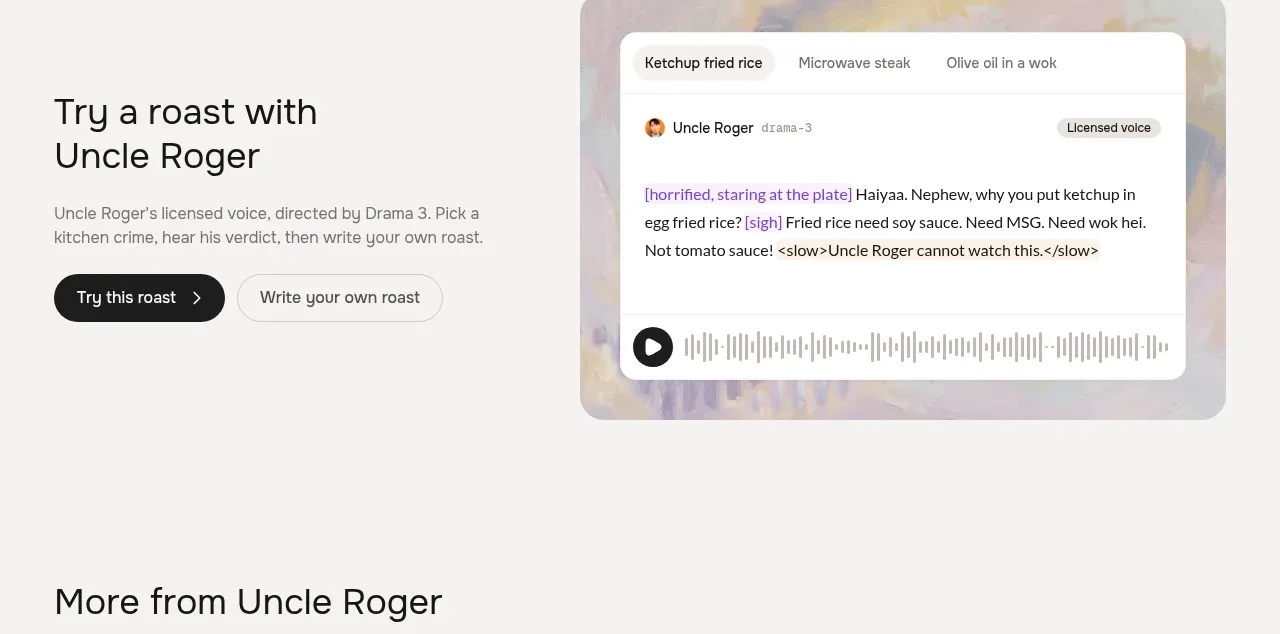
5. **Celebrity demo section**: split layout — left text block ("Try a roast with …"), title, paragraph, dark primary pill + light secondary pill; right, a demo card on a painterly background with prompt-chip tabs at top, a licensed-voice badge, a script with highlighted inline direction tags, and a waveform player.
6. **Card gallery**: section heading + one-line subtitle, then a three-column grid of painterly tiles, each with an expression title, quoted line, waveform, an emotion description bottom-left, and a play button.
7. **Feature bento**: heading left, short right-aligned paragraph. Row 1: three equal cards, each a demo surface (tagged text, tagged sentence, interactive tag-picker chips) above a bold title and explanation. Row 2: two asymmetric cards (wide language-demo card, narrower Auto Tag card).
8. **Scene demo**: split — left heading ("Write the scene. Auto Tag directs it."), paragraph, script/after-toggle pills, waveform, caption, CTA; right, a screenplay-style multi-speaker card with colour-dotted speaker rows and inline tags, on a painterly panel.
9. **API section**: split — left heading "Direct from the API", paragraph, "Read the docs" link; right a light code block with a POST header and cURL example.
10. **Closing CTA**: centred waveform glyph, huge one-line headline, small subline, dark primary pill + light secondary pill on a slightly warmer beige band.
11. **FAQ**: heading "…FAQ", accordion list; first item expanded, rest collapsed with chevrons.
12. **Footer**: five link columns (Products, Solutions, Research, Resources, Company) on beige, then wordmark, legal line, language selector, social icons.

## Design language
- Palette: warm cream/beige background (#F2EEE7–#F5F1EA), white cards, near-black ink (#171512), soft orange accent for the announcement bar, and one restrained purple accent (#6C5CE7-ish) reserved exclusively for inline direction tags — that single-purpose colour is the page's smartest trick; keep it.
- Emotional texture comes from painterly, impressionistic gradient artwork panels behind demo cards — muted peach/olive/mauve — giving a "performance/studio" mood without photography. Recreate with layered soft radial/linear gradients or CSS-painted noise, never stock images.
- Type: large humanist/soft serif-feel display headings with tight tracking, two-to-three line heroes; small (13–14px) quiet body text at generous line-height. Big contrast between display scale and body scale builds hierarchy.
- Surfaces: everything sits in large-radius (16–24px) white cards with hairline borders and no heavy shadows. Demo cards look like real product UI — tabs, chips, avatars, inline code-style tags — so the product demos itself.
- Rhythm: alternate split text/demo sections with dense bento feature grids and airy centred typographic breaks; background shifts subtly (cream → warmer beige) to mark major bands.
- Chips and pills everywhere: nav is a pill cluster, toggles are pill pairs, tags are small rounded chips; buttons are full pill-shaped — dark = primary, outlined/light = secondary, always with a small arrow glyph.
- Waveform motifs recur as brand device: in the logo, as play buttons over decorative waveforms, and as the closing-CTA glyph.
- Motion expectation: subtle — hover lifts on cards, accordion expand/collapse, play-button pulses; keep transitions quiet and fast.

## Never
- No Uncle Roger, Sheila, Adrián/Della characters, their dialogue, or any copy from the reference.
- No Fish Audio wordmark, waveform-logo shape as-is, or "Drama 3" naming.
- Don't clone the roast/kitchen-crime demo concept or the exact tag strings ([sigh], [whisper] examples are fine as generic syntax only if rewritten).
- Never present the result as Fish Audio or imply their endorsement.
Components from this page
All components
 Promotion banner and primary navigation
Fish Audio Drama 3 · Navigation
Promotion banner and primary navigation
Fish Audio Drama 3 · Navigation
 Performance direction hero and interactive preview
Fish Audio Drama 3 · Hero
Performance direction hero and interactive preview
Fish Audio Drama 3 · Hero
 Voice character showcase
Fish Audio Drama 3 · Feature grid
Voice character showcase
Fish Audio Drama 3 · Feature grid
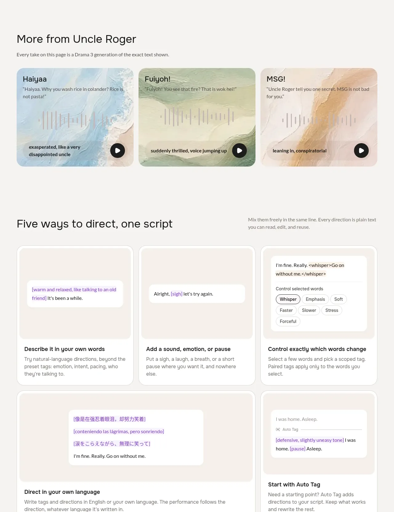 Ways to shape a performance
Fish Audio Drama 3 · Feature grid
Ways to shape a performance
Fish Audio Drama 3 · Feature grid
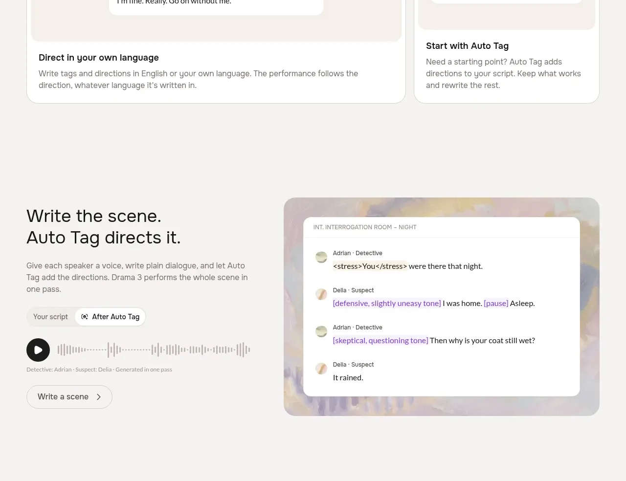 Scene writing and automatic direction
Fish Audio Drama 3 · Feature grid
Scene writing and automatic direction
Fish Audio Drama 3 · Feature grid
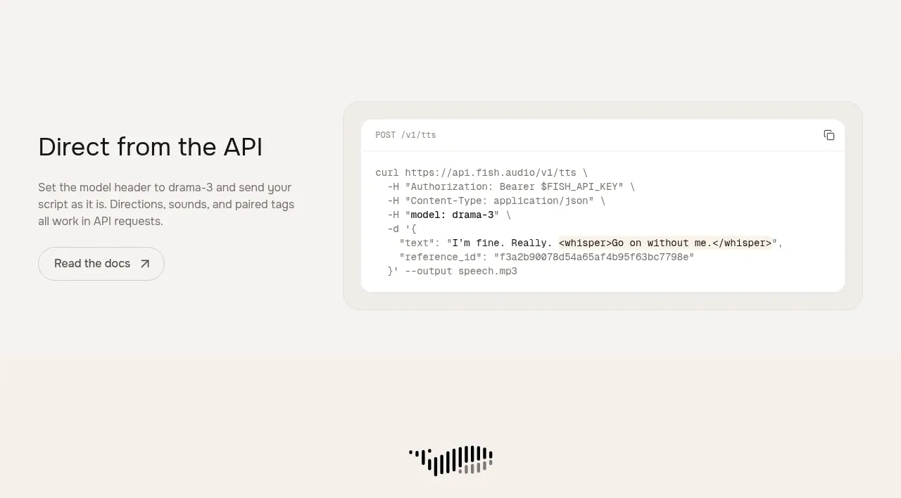 API integration example
Fish Audio Drama 3 · Code block
API integration example
Fish Audio Drama 3 · Code block
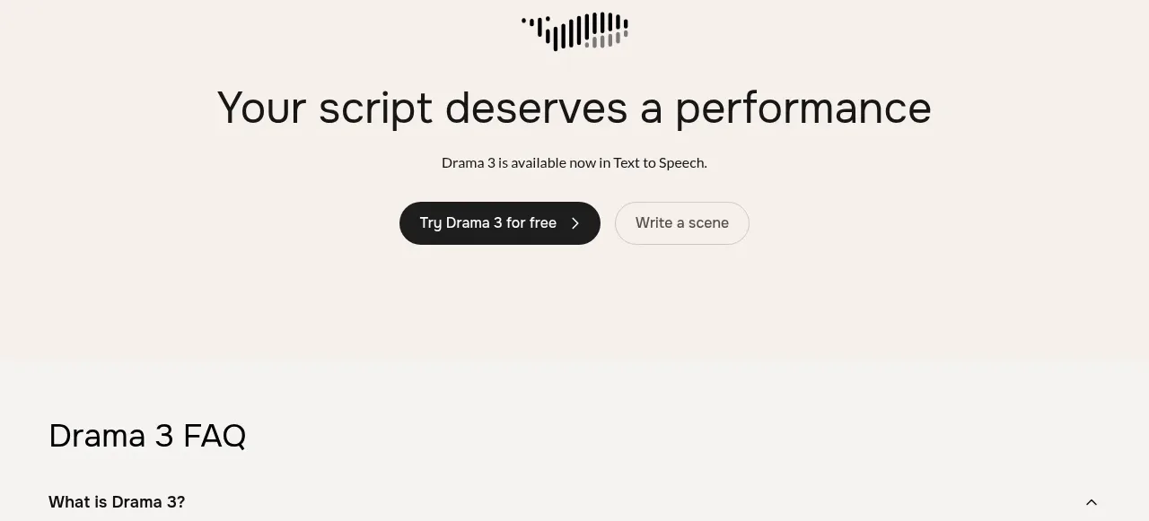 Centered conversion call to action
Fish Audio Drama 3 · Call to action
Centered conversion call to action
Fish Audio Drama 3 · Call to action
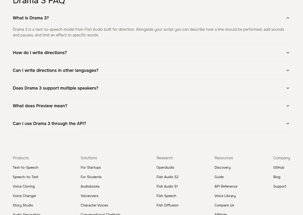 Frequently asked questions
Fish Audio Drama 3 · FAQ
Frequently asked questions
Fish Audio Drama 3 · FAQ
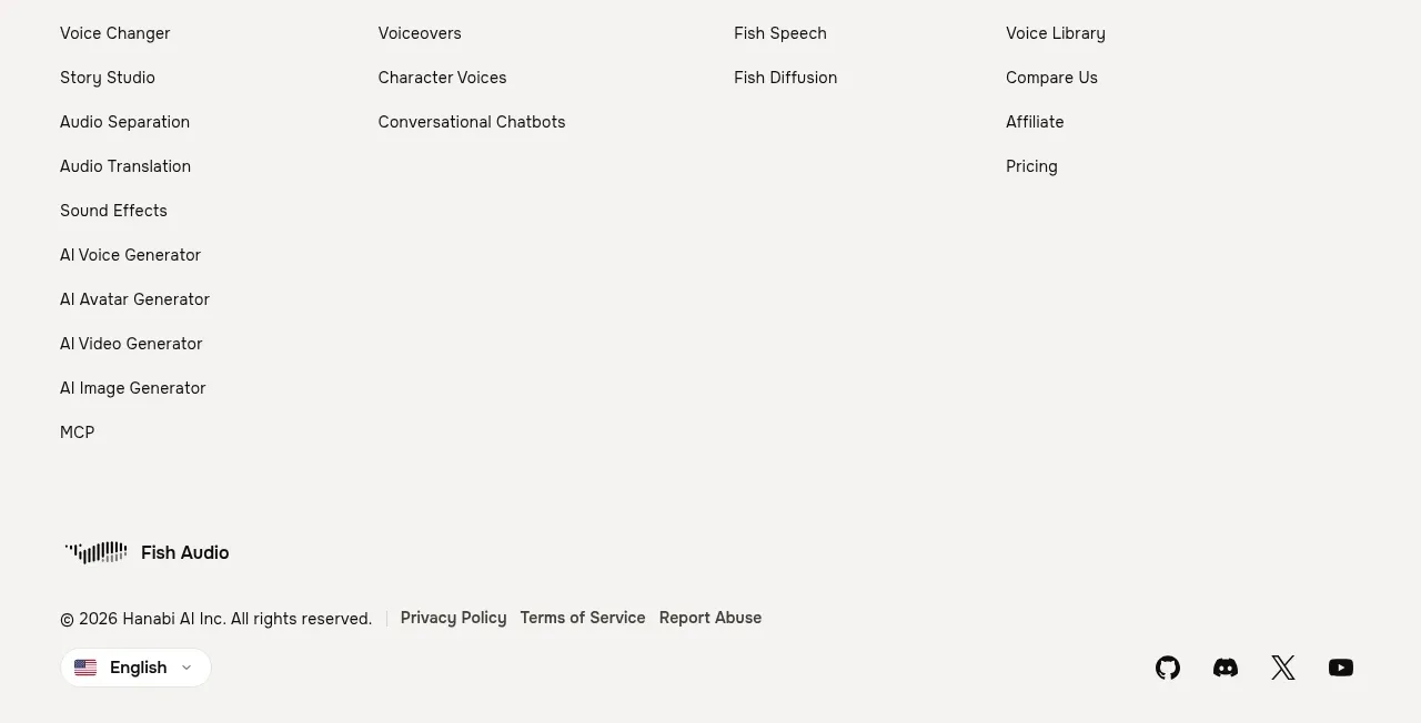 Multi-column site footer
Fish Audio Drama 3 · Footer
Multi-column site footer
Fish Audio Drama 3 · Footer