kage
kage
godaylight.com

Design analysis
An editorially paced landing page for a home solar/battery subscription. It alternates full-bleed photographic and gradient "sun" moments with airy, bordered card sections on warm cream, using a large serif display face against small mono-style labels. The middle tells a three-step story (subscribe, install, power on) as alternating left/right split cards with generous empty space, then the page darkens through stormy "problem" imagery before resolving into a purple+photo CTA split and a saturated orange gradient footer.
Prompt preview
## Reference images

Study these alongside the description below: hierarchy, rhythm, spacing, colour. Build for the product you are asked about, using this design language.

- Full page: https://kage-design-assets.t3.tigrisfiles.io/screenshots/godaylight-com/ca5e907b-4256-46ba-9367-b5c95fdb4894-1791311174290-full.webp
- Above the fold: https://kage-design-assets.t3.tigrisfiles.io/screenshots/godaylight-com/ca5e907b-4256-46ba-9367-b5c95fdb4894-1791311169202.webp
- Design on Kage: https://kage.design/designs/godaylight-landing-page

## Before you start
Ask the user what they are building, who it is for, and what brand assets they already have (name, colours, type). Wait for the answers before writing code. Apply the design language below to their product, not to the reference site.

## Page structure
1. **Floating pill nav** centred at top: logo left, small links, one solid accent "Sign up" button; rounded white pill over the hero.
2. **Hero**: full-bleed dusk photo of a house; small mono kicker top-left ("POWER YOU CONTROL"), giant two-line serif headline ("Power your home for less"), short supporting paragraph, and an inline address input + dark pill CTA. Small stat cards (kWh generated, thermostat, backup score) float as UI chips around a bright gradient panel on the right.
3. **Photo collage grid**: airy bordered grid on cream, mixed photo tiles (solar roof at dusk, battery cabinet, phone-in-hand app shot) offset at different cell sizes with lots of empty cream cells — rhythm by imbalance, not symmetry.
4. **Gradient interlude**: full-bleed warm orange "sun in hand" gradient section, centred serif headline ("A new way to power your home"), short paragraph, white pill CTA.
5. **Step 1 card**: bordered cream card, kicker "STEP 1", left-aligned headline + copy + dark CTA, glowing orange logo tile right.
6. **Step 2 card**: mirrored split — copy left, isometric line-art house illustration with orange solar tiles right.
7. **Step 3 card**: copy left, product-UI mock (energy savings card with big "0.0 kWh" and weekday row) right. Each step card is separated by large empty vertical space.
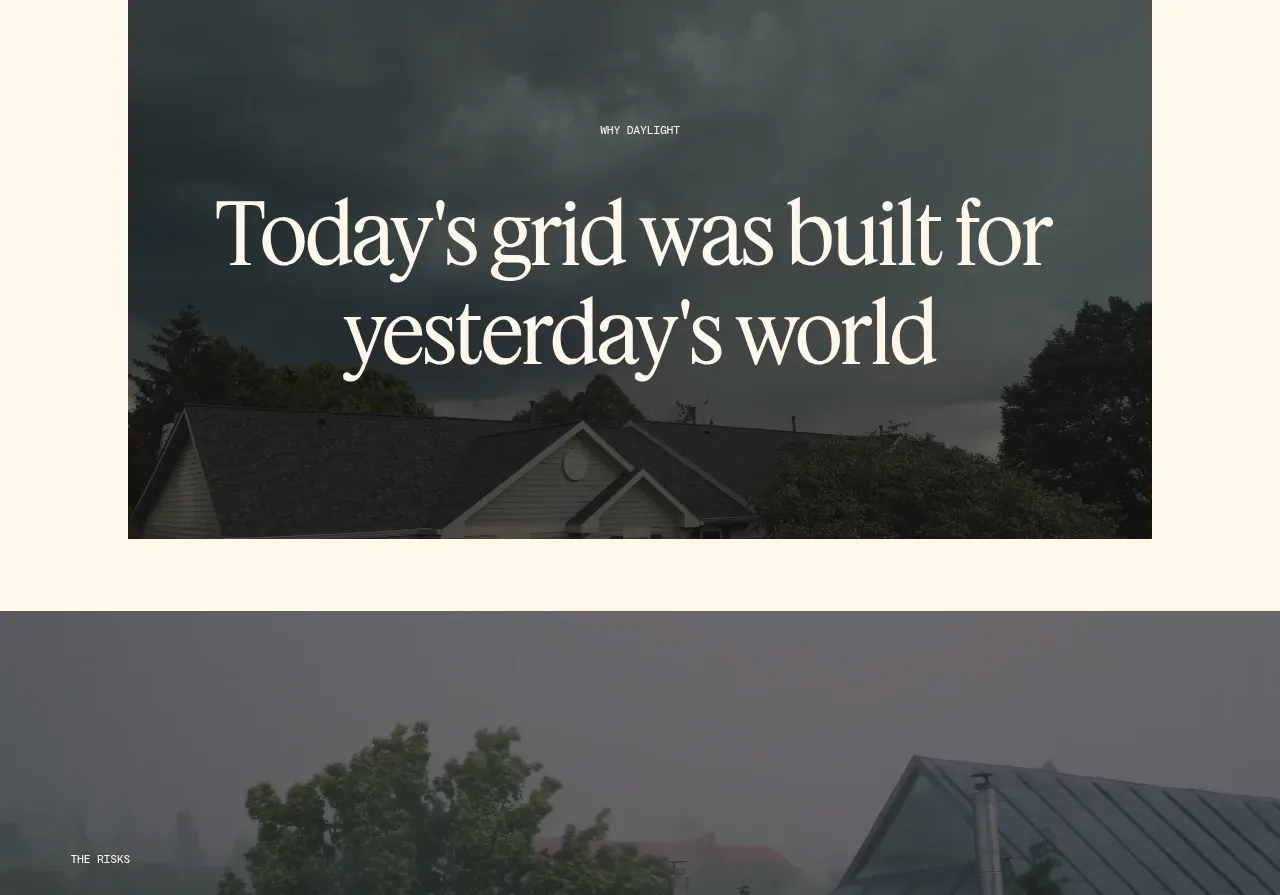
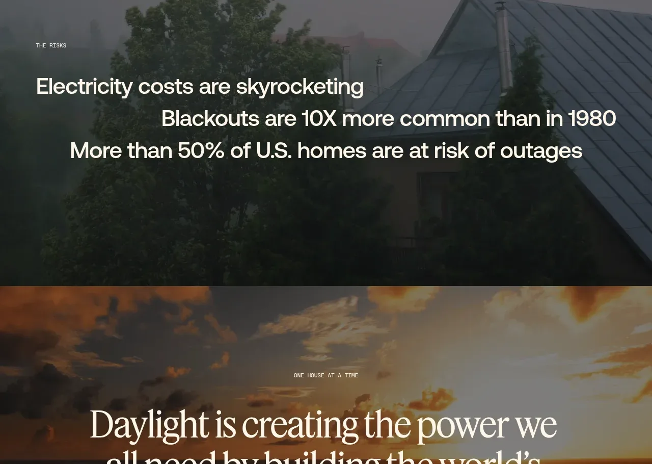
8. **Problem section**: dark stormy rooftop photo card, centred serif headline "Today's grid was built for yesterday's world"; then a darker full-bleed section with staggered stat lines (rising costs, outages 10x, 50% at risk) over moody tree/sky imagery.
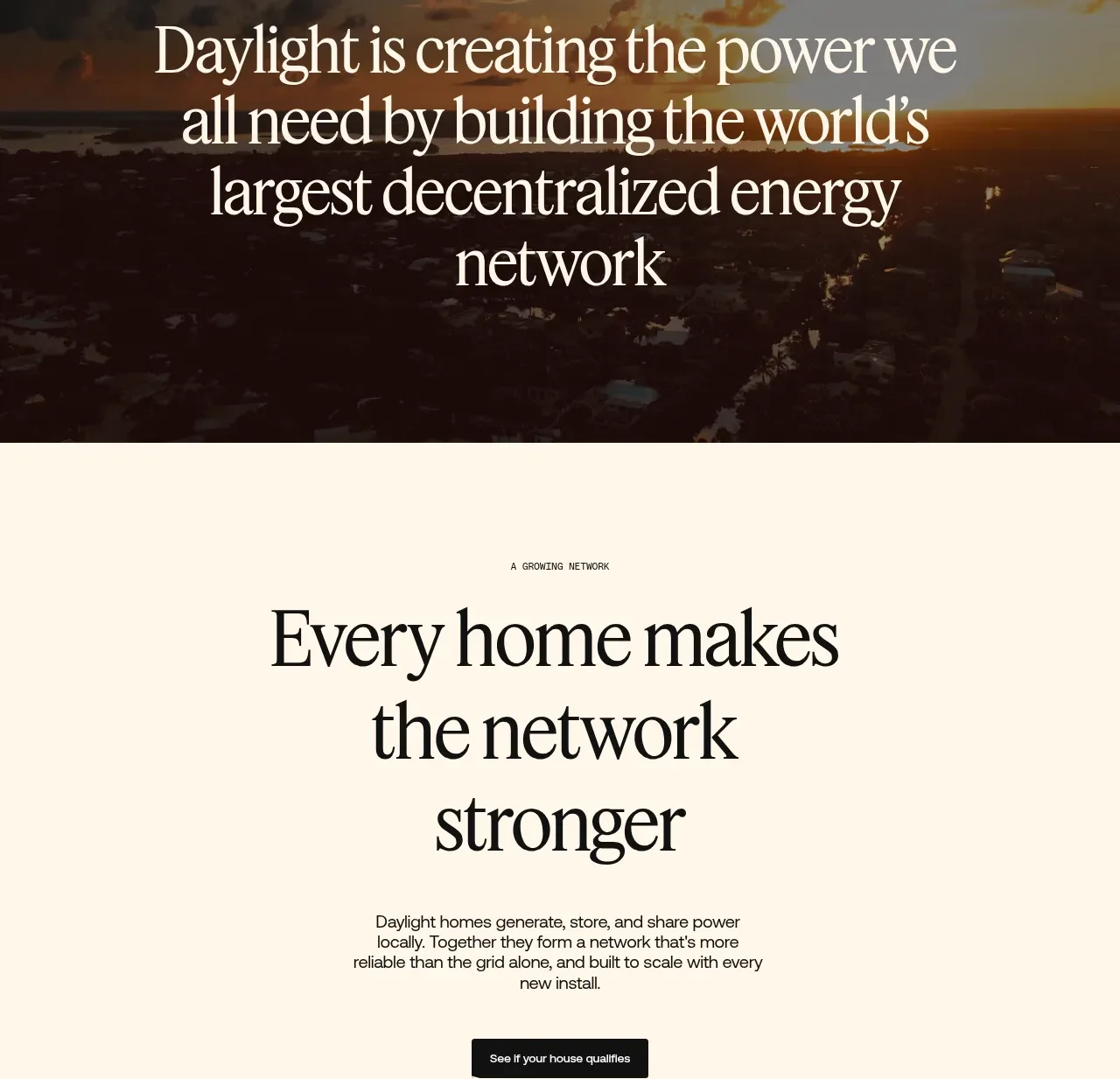
9. **Mission statement**: full-bleed sunset gradient, centred large serif statement about building a decentralized energy network.
10. **Network section**: cream, centred kicker "A GROWING NETWORK", large serif headline "Every home makes the network stronger", paragraph, dark pill CTA, and a dotted/nodal map graphic below.
11. **Final CTA split**: left lavender/periwinkle panel with purple serif "Step into Daylight" and CTA; right warm interior family photo.
12. **Footer**: saturated orange gradient; centred bracketed links ([ BLOG ] [ CAREERS ] etc.), wordmark left, big "More Power" right, socials/legal at bottom.

## Design language
- Build hierarchy with a huge serif display face (~clamp 3–6rem, tight leading) for headlines only; all body copy is small, sans or mono-flavoured, ~14–15px, generous line-height.
- Use tiny uppercase letter-spaced mono kickers ("STEP 1", "WHY DAYLIGHT") above every section — they carry structure without rules or dividers.
- Palette: warm cream background #F2EDE4, near-black ink #1A1611, accent orange #F0540A→#FFB547 gradients for sun/energy moments, periwinkle #B9A6F5 for the closing CTA, deep stormy blues/greys for problem imagery.
- Alternate temperature down the page: warm light sections → saturated orange gradient → moody dark sections → bright CTA; this creates an emotional arc (hope → problem → resolution).
- Cards: 1px warm grey borders, ~8–12px radius, flat — no shadows; density inside cards is low, with 48–64px+ padding.
- Rhythm: separate step cards with very large (200px+) empty cream gaps; compress stat lines into tight staggered rows in dark sections for contrast.
- Buttons: pill-shaped; solid black or accent orange; secondary as white pill. Inputs inline with the CTA in the hero.
- Imagery: full-bleed photographic moments between structured sections; photos are warm, dusk-toned, cinematic. UI stats appear as small floating chips, not dashboards.
- Motion: subtle; let scroll pacing and imagery do the work. No heavy animation needed.

## Never
Never use the Daylight name, wordmark, logo, "More Power" tagline, or any copy, illustrations, or photography from the reference. Do not present the result as Daylight's site.
Components from this page
All components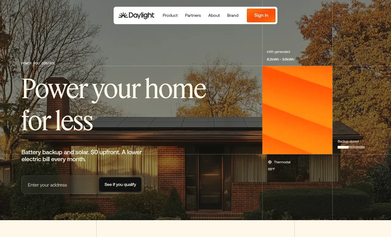
 Photographic power-home hero
godaylight.com · Hero
Photographic power-home hero
godaylight.com · Hero
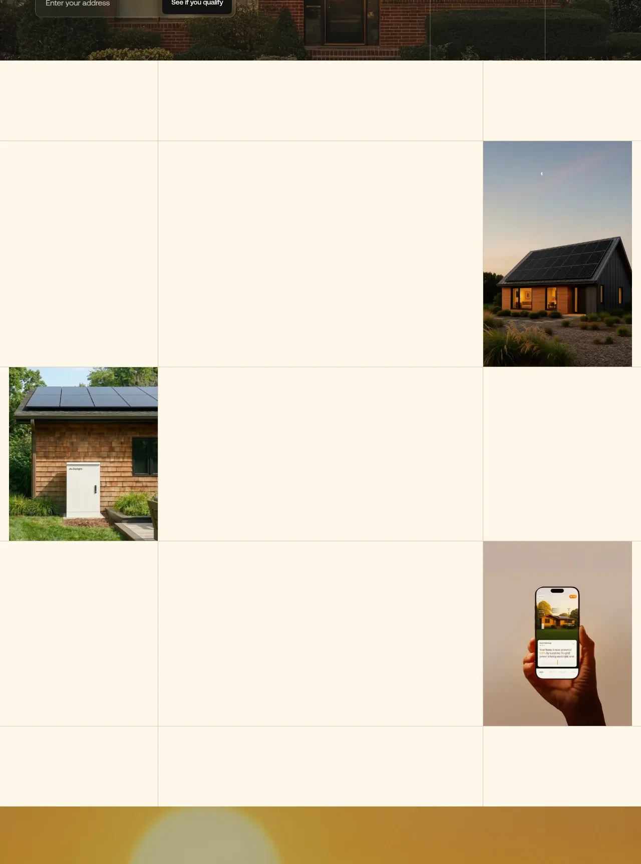 Editorial image mosaic
godaylight.com · Gallery
Editorial image mosaic
godaylight.com · Gallery
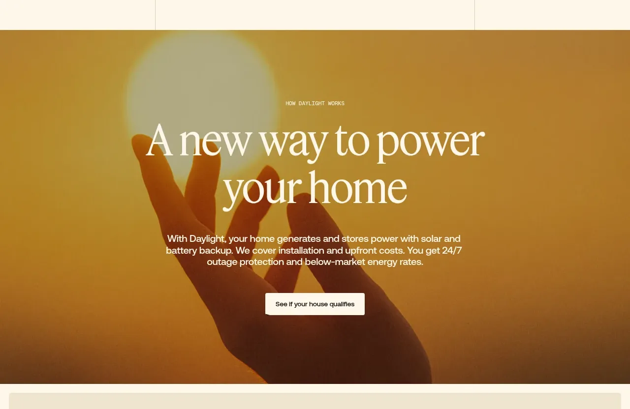 Warm mission statement panel
godaylight.com · Hero
Warm mission statement panel
godaylight.com · Hero
 Three-step process cards
godaylight.com · Feature grid
Three-step process cards
godaylight.com · Feature grid
 Grid problem statement
godaylight.com · Hero
Grid problem statement
godaylight.com · Hero
 Risks statistic banner
godaylight.com · Banner
Risks statistic banner
godaylight.com · Banner
 Decentralized energy statement
godaylight.com · Hero
Decentralized energy statement
godaylight.com · Hero
 Network growth CTA
godaylight.com · Call to action
Network growth CTA
godaylight.com · Call to action
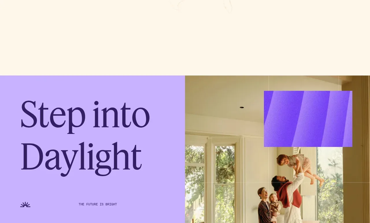 Split closing CTA
godaylight.com · Call to action
Split closing CTA
godaylight.com · Call to action
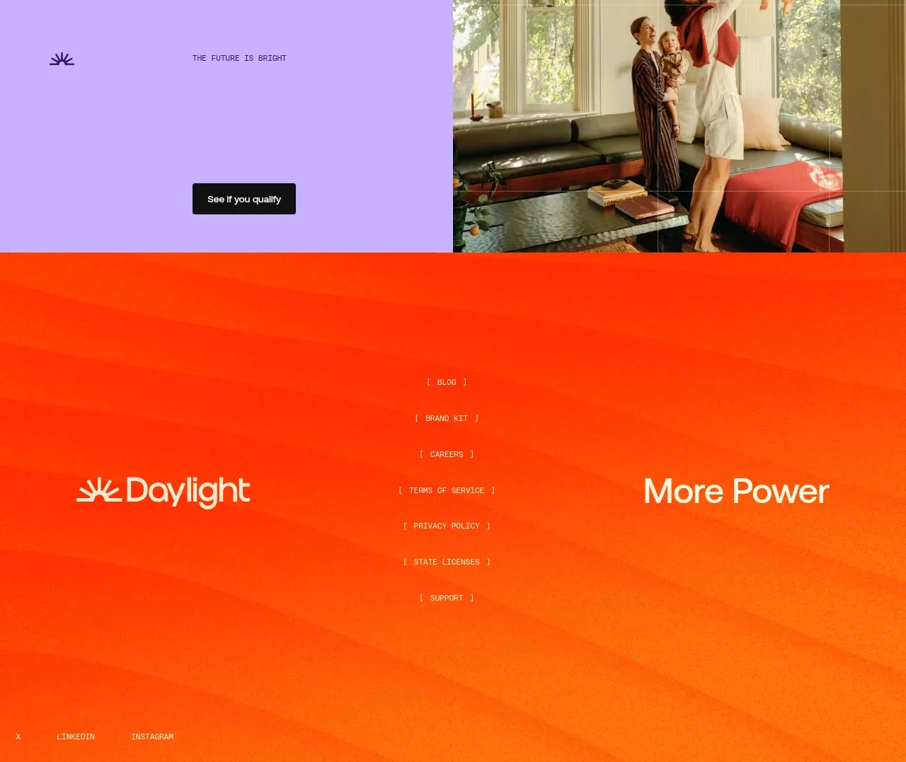 Orange gradient footer
godaylight.com · Footer
Orange gradient footer
godaylight.com · Footer