kage
kage
harbor.my
Design analysis
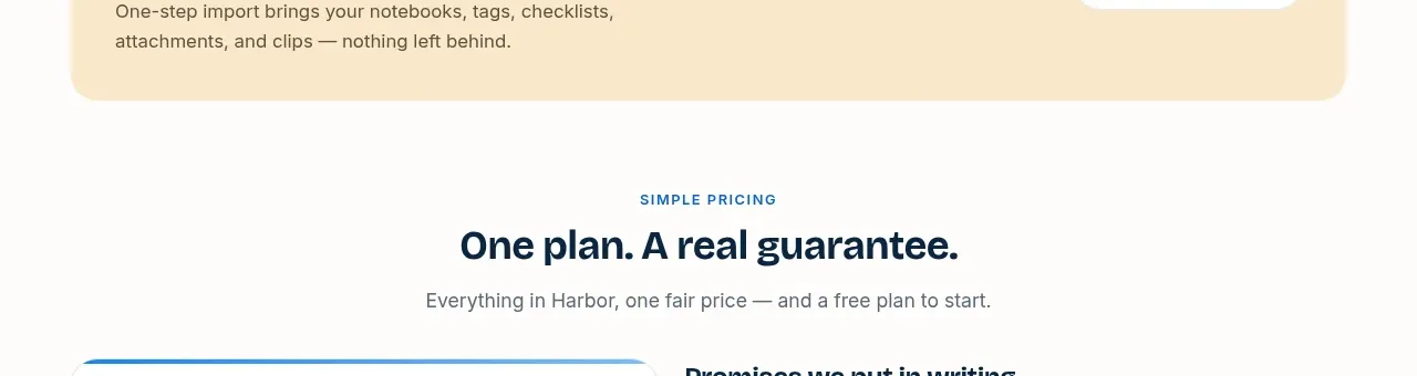
A pale warm banner addresses switching friction directly, with a concise migration promise and a right-aligned explanatory action.
Prompt preview
## Reference images

Study these alongside the description below: hierarchy, rhythm, spacing, colour. Build for the product you are asked about, using this design language.

- Component: https://kage-design-assets.t3.tigrisfiles.io/components/harbor/210c2f1c-cc35-4a7c-ab88-9680504ac3f6-1789970606-8.webp
- Full page it was cut from: https://kage-design-assets.t3.tigrisfiles.io/screenshots/harbor/210c2f1c-cc35-4a7c-ab88-9680504ac3f6-1789970506977-full.webp
- Component on Kage: https://kage.design/component/harbor-banner

## Before you start
Ask what the user's product, audience, and brand are, then apply the principles below to that product rather than reproducing the reference.

Build a horizontal migration banner inside the page max-width. Use a pale cream background around `#FFF0CD`, 22px radius, a small uppercase label, a bold one-line promise, a short supporting sentence, and a contrasting pill link or button aligned to the right. Keep the layout two-column on desktop and stack it on mobile. Use navy typography, muted brown-gray body text, 24–32px internal padding, and a subtle border or inset highlight. The banner should feel reassuring and lightweight rather than like a full hero.

Never use logos, product names, copy, illustrations, or imagery from the reference.