kage
kage
harbor.my

Design analysis
A restrained productivity landing page uses a white canvas, dark navy typography, compact uppercase eyebrow labels, and blue pill-shaped actions to create a clear hierarchy. After the centered hero and product screenshot, the page shifts into alternating feature rows with lifestyle imagery, then uses pale blue, lavender, mint, and yellow panels to vary rhythm; later sections become denser with an integration diagram, feature grid, pricing comparison, download strip, and a dark multi-column footer.
Prompt preview
## Reference images

Study these alongside the description below: hierarchy, rhythm, spacing, colour. Build for the product you are asked about, using this design language.

- Full page: https://kage-design-assets.t3.tigrisfiles.io/screenshots/harbor/210c2f1c-cc35-4a7c-ab88-9680504ac3f6-1789970506977-full.webp
- Above the fold: https://kage-design-assets.t3.tigrisfiles.io/screenshots/harbor/210c2f1c-cc35-4a7c-ab88-9680504ac3f6-1789970503001.webp
- Design on Kage: https://kage.design/designs/harbor-landing-page

## Before you start
Ask the user what they are building, who it is for, and what brand assets they already have (name, colours, type). Wait for their answers before proceeding. Apply the reference's design language to their product, not to Harbor.

## Page structure
Build the page from top to bottom in this order:
1. **Sticky navigation** — Use a slim white header with a small brand mark at left, compact navigation links across the middle, and a text login link plus blue rounded primary action at right.
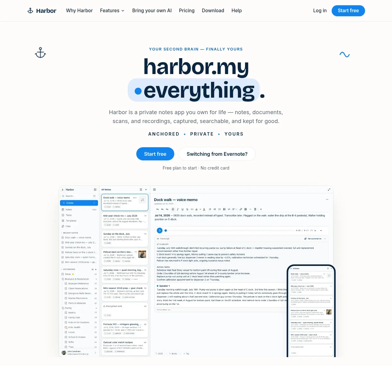
2. **Centered hero** — Add a generous white hero with a small uppercase eyebrow, a large two-line headline with one highlighted word inside a soft blue rounded shape, a short explanatory paragraph, a spaced three-word value line, paired CTAs, and a small reassurance line.
3. **Product preview** — Place a large desktop application screenshot below the hero, with a phone preview overlapping its lower-right edge. Keep the image framed lightly and let it carry much of the product explanation.
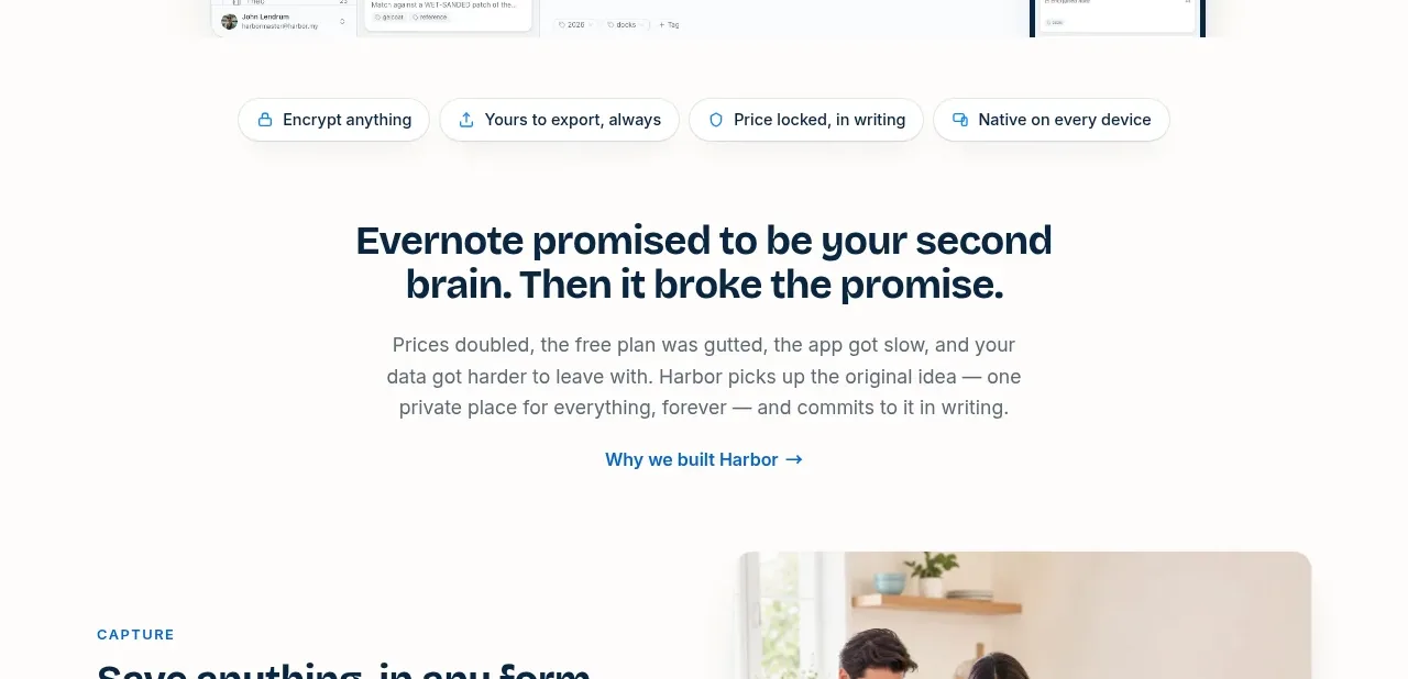
4. **Trust chips** — Add a horizontal row of small bordered pills beneath the preview for security, exportability, pricing, and device coverage.
5. **Origin/problem statement** — Center a compact section explaining the product's motivation, using a bold two-line heading, readable paragraph, and text link.
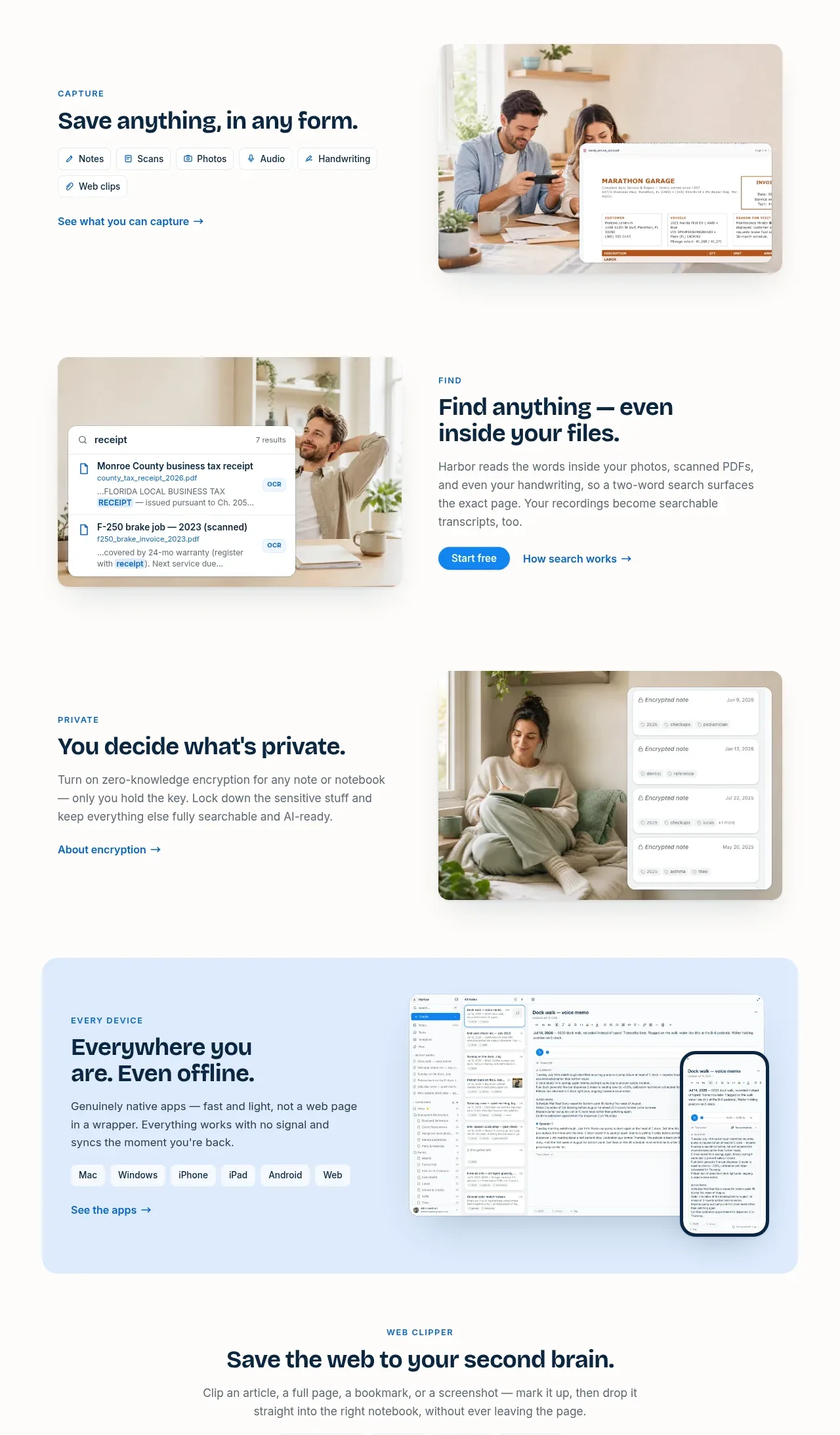
6. **Capture feature row** — Use a two-column row with an eyebrow, heading, small capture-type chips, and link on the left; place a rounded lifestyle/product composite image on the right.
7. **Search feature row** — Reverse the image and copy positions. Show a search/OCR result composite on the left and explain finding content inside files on the right, with a blue CTA and secondary link.
8. **Privacy feature row** — Return to copy-left/image-right, focusing on user-controlled privacy and encryption beside a calm lifestyle image with encrypted-note overlays.
9. **Every-device panel** — Add a wide rounded pale-blue panel with copy, platform chips, and link on the left, and a desktop-plus-phone product composition on the right.
10. **Web clipper section** — Center an eyebrow, headline, paragraph, and two rows of small format/browser chips, followed by a large rounded lavender-tinted browser clipping demonstration.
11. **Bring-your-own-AI section** — Center the heading and explanation, then show a bordered integration diagram: AI tools on the left flow through API/CLI/MCP pills into a dark product destination card on the right. Follow it with a privacy reassurance and link.
12. **Everything-else feature grid** — Center the section heading, then present eight compact cards in a four-column grid over two rows. Each card has a soft pastel icon circle, bold title, and concise supporting text.
13. **Ownership CTA** — Use a full-width dark navy rounded panel with a centered eyebrow, white headline, light paragraph, translucent promise pill, white CTA, and muted reassurance text.
14. **Evernote migration strip** — Add a full-width pale-yellow rounded banner with migration eyebrow, heading, short explanation, and a white pill CTA aligned to the right.
15. **Pricing section** — Center the pricing eyebrow, headline, and subtitle. Below, use a two-column layout: a white pricing card with annual/monthly toggle, large price, checklist, and blue CTA on the left; four stacked pastel promise cards on the right. Add a small handwritten-style reassurance line below.
16. **Download CTA** — Add a wide rounded mint panel with a small free-plan pill, centered heading and description, then a row of downloadable platform pills with icons and secondary labels. Use a very faint oversized brand-neutral line illustration or watermark only if it belongs to the user's own identity.
17. **Footer** — Finish with a deep navy footer. Use a brand/about and newsletter column at left, then product, features, resources, and company link columns. Add a divider, platform download pills, another divider, and a bottom copyright/social/legal row.

## Design language
- Build hierarchy with a restrained scale: compact 11–12px uppercase eyebrow labels with generous letter spacing, 30–40px bold section headings, 16–18px body copy, and small muted utility text.
- Keep the base canvas warm white or near-white, approximately `#fdfcf9`, with dark navy text around `#092942` rather than pure black.
- Use a vivid but controlled blue for primary actions and links, approximately `#1688df`; reserve it for CTAs, key highlights, and small interface accents.
- Change rhythm down the page: begin airy and centered, move into spacious alternating image/text rows, then tighten into panels, diagrams, an eight-card grid, pricing details, and a dense footer.
- Use rounded rectangles consistently: small controls around 999px radius, content cards around 14–20px, and large feature panels around 18–24px. Borders should be thin and low-contrast, around `#e5e8e7`.
- Keep shadows extremely soft and broad, just enough to separate white cards from the background; avoid dramatic elevation or glass effects.
- Pair a friendly geometric or humanist sans-serif for headings and body text. Use heavy weight for headlines, medium weight for labels, and relaxed line-height for explanatory paragraphs.
- Use pastel surfaces sparingly to signal section changes: pale blue around `#dcecff`, lavender around `#eee9ff`, mint around `#d9f3e8`, and warm yellow around `#fff0cf`. Do not turn the page into a rainbow; most sections remain white.
- Treat product screenshots and lifestyle composites as rounded editorial objects, often combining a desktop/mobile UI view with a real-world photo. Keep images large, clean, and more prominent than decorative graphics.
- Make CTAs pill-shaped with a clear filled primary button and a quieter outlined or text alternative. Repeat the main action at meaningful conversion points without adding multiple competing colours.
- Use short, direct links with arrow suffixes, compact platform chips, and icon-in-pastel-circle treatments to make dense feature content scannable.
- Keep motion subtle: allow gentle hover colour changes, button lift, chip emphasis, and restrained image reveal on scroll; avoid bouncing, parallax-heavy, or distracting animation.

## Never
- Do not reuse Harbor's logo, anchor mark, wordmark, product name, tagline, copy, screenshots, illustrations, photography, or icon set.
- Do not present the result as Harbor or imply affiliation with it.
- Create new product-specific content, visuals, brand assets, and interface screenshots for the user's product while preserving the structural and visual principles above.
Components from this page
All components
 Global navigation bar
Harbor · Navigation
Global navigation bar
Harbor · Navigation
 Product hero with app preview
Harbor · Hero
Product hero with app preview
Harbor · Hero
 Problem statement and trust link
Harbor · Call to action
Problem statement and trust link
Harbor · Call to action
 Alternating product capability story
Harbor · Feature grid
Alternating product capability story
Harbor · Feature grid
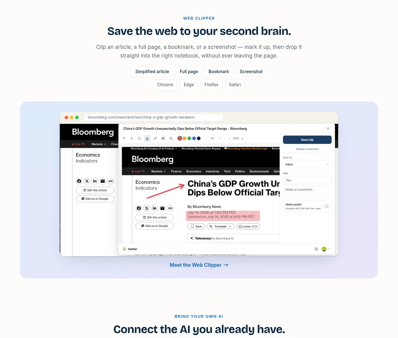 Web capture demonstration
Harbor · Gallery
Web capture demonstration
Harbor · Gallery
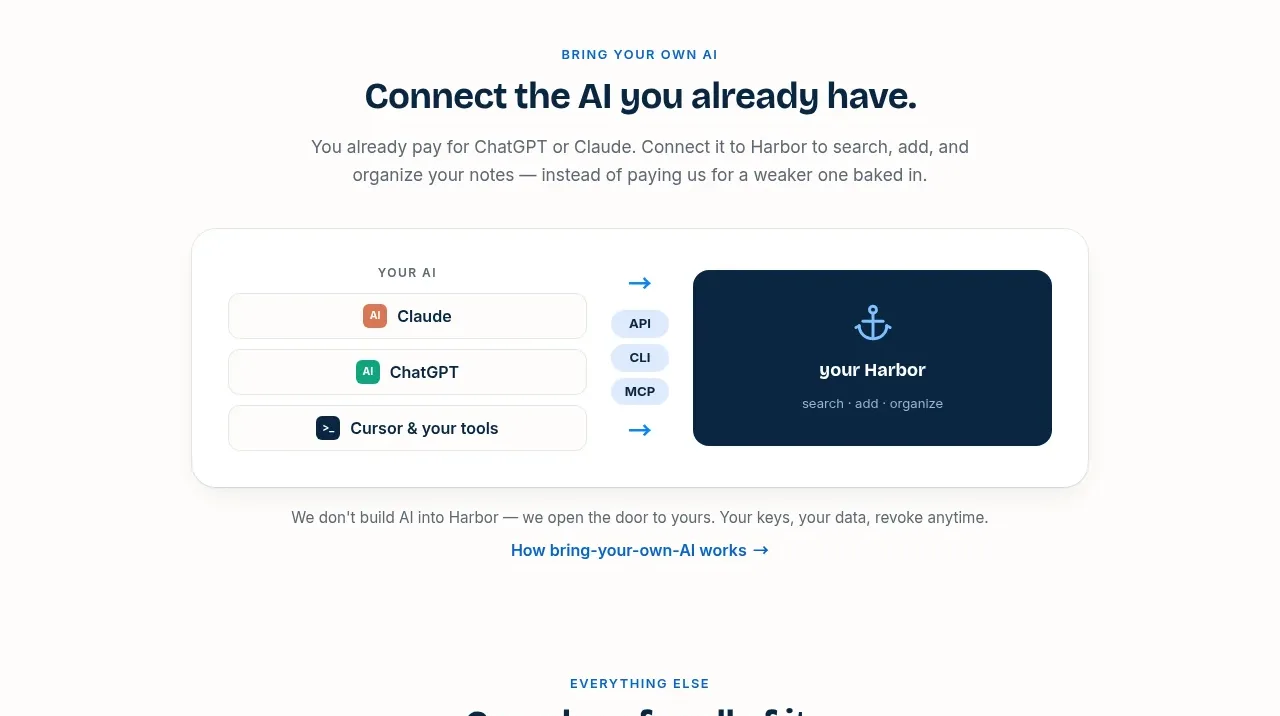 Bring-your-own-AI integration
Harbor · Card
Bring-your-own-AI integration
Harbor · Card
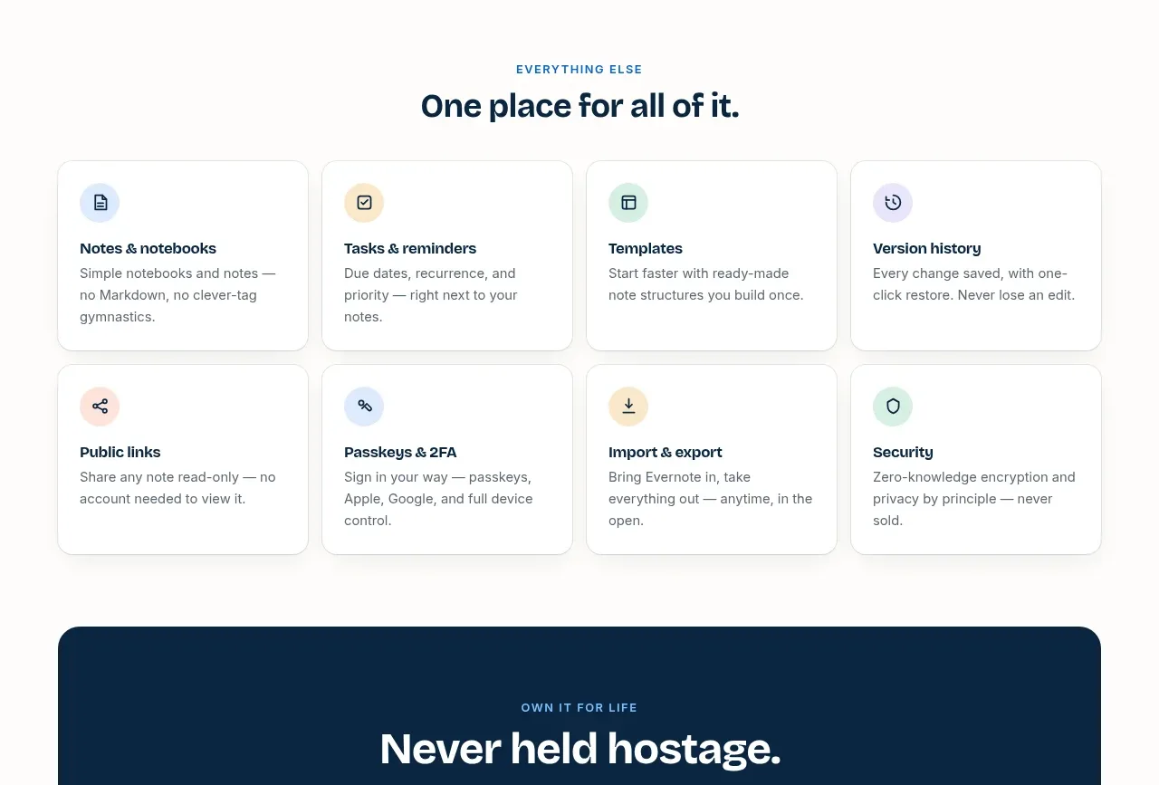 Everything-else capability grid
Harbor · Feature grid
Everything-else capability grid
Harbor · Feature grid
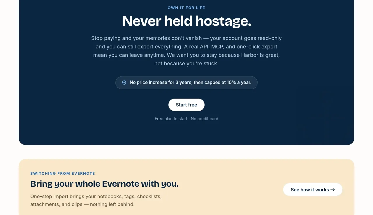 Retention and ownership call to action
Harbor · Call to action
Retention and ownership call to action
Harbor · Call to action
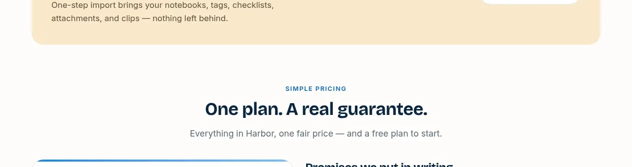 Migration reassurance banner
Harbor · Banner
Migration reassurance banner
Harbor · Banner
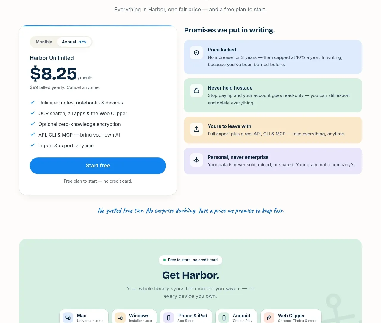 Simple pricing and written promises
Harbor · Pricing table
Simple pricing and written promises
Harbor · Pricing table
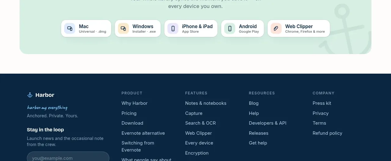 Download and platform availability
Harbor · Call to action
Download and platform availability
Harbor · Call to action
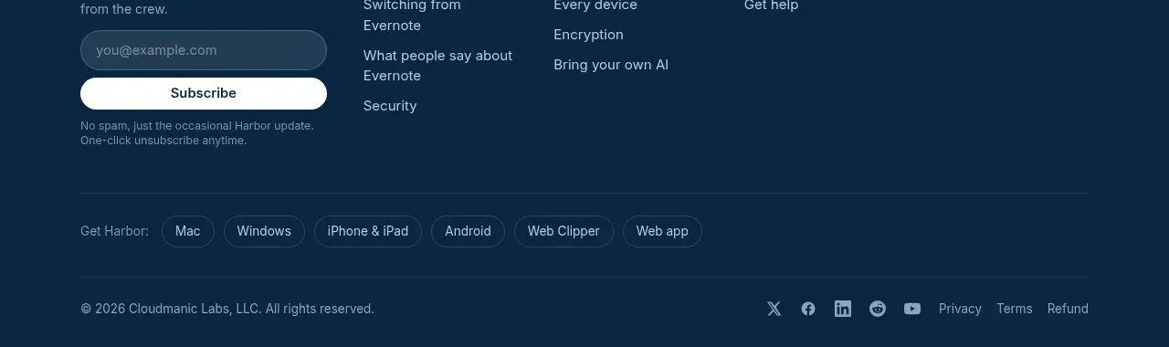 Multi-column site footer
Harbor · Footer
Multi-column site footer
Harbor · Footer