kage
kage
inngest.com

Design analysis
A cinematic, editorial card section that combines a customer testimonial control bar with a large visual before/after comparison panel. It works through strong contrast, generous negative space, restrained borders, and a clear two-level interaction pattern: navigation for stories and a draggable comparison control.
Prompt preview
## Reference images

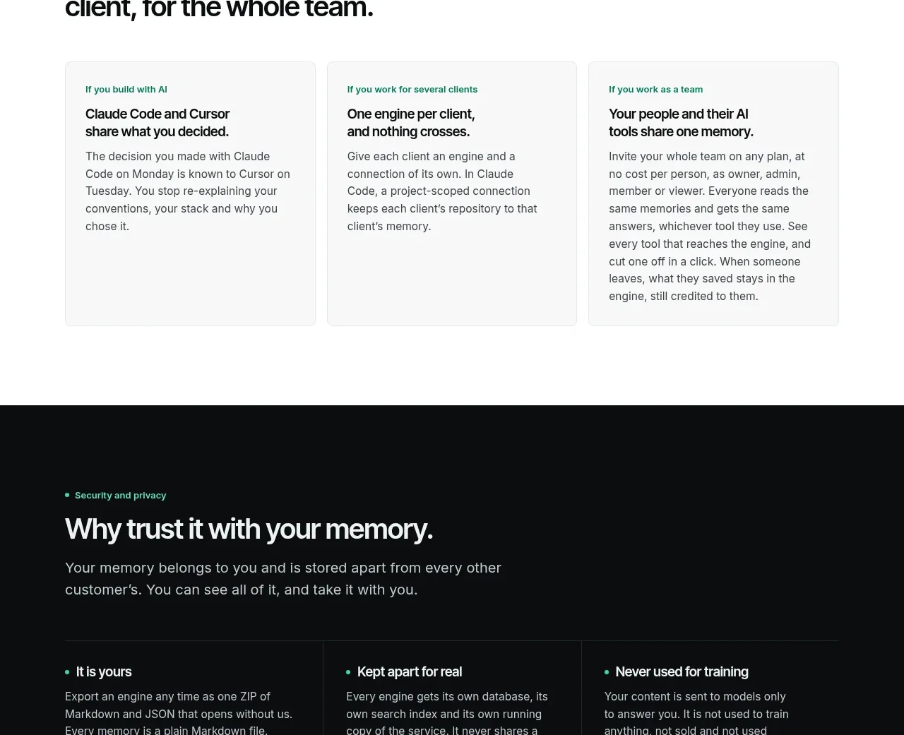
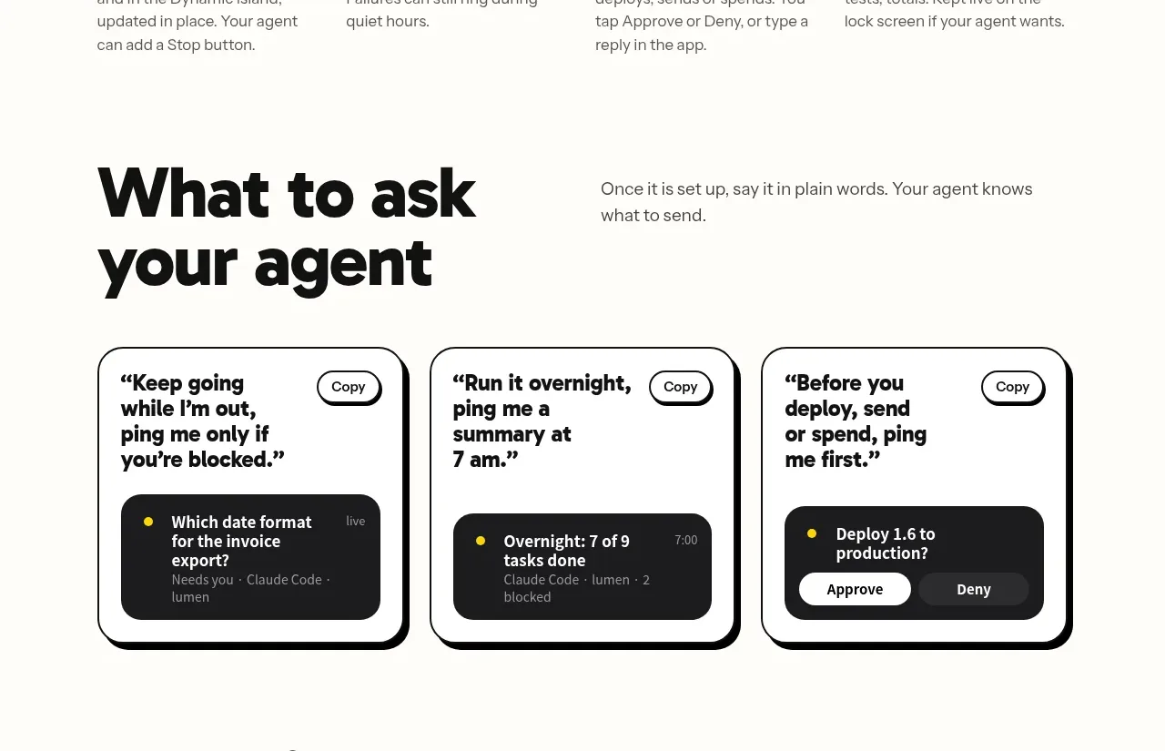
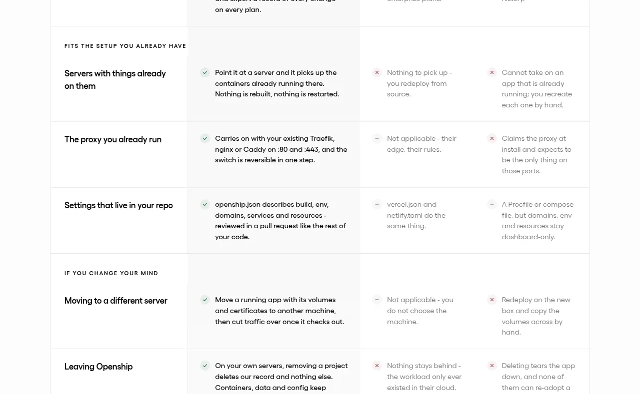
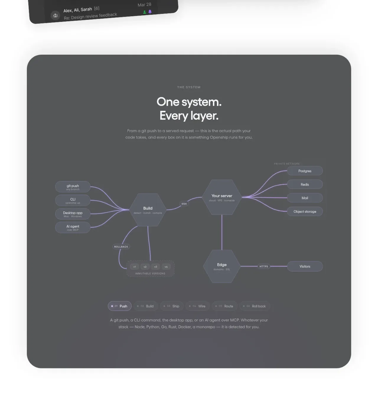
Study these alongside the description below: hierarchy, rhythm, spacing, colour. Build for the product you are asked about, using this design language.

- Component: https://kage-design-assets.t3.tigrisfiles.io/components/inngest-com/085d18d8-47d3-43b1-92ae-d8bd045a677d-1789074884-8.webp
- Full page it was cut from: https://kage-design-assets.t3.tigrisfiles.io/screenshots/inngest-com/085d18d8-47d3-43b1-92ae-d8bd045a677d-1789074849550-full.webp
- Component on Kage: https://kage.design/component/inngest-card

## Before you start
Ask what the user's product is, who it is for, and what its brand personality and visual identity are. Then apply the principles below to create an original version for that product—not a copy of the reference.

## Design language

Build a dark, high-contrast customer-proof section that pairs a testimonial carousel header with a large product transformation or comparison visual.

### Layout and alignment
- Use a full-width section with a near-black textured or subtly varied background; if texture is unsuitable, use a very faint radial gradient or noise overlay.
- Organize the section into two related zones:
  1. A compact upper control row containing the active customer identity, secondary metadata, action buttons, and carousel navigation.
  2. A spacious lower content area containing a large comparison panel and, where appropriate, a strong editorial headline aligned to its left.
- Keep the main content inside a centered max-width container of approximately 1180–1280px with 32–40px horizontal padding on desktop.
- Align the testimonial text and comparison panel to a consistent vertical grid. Let the comparison panel occupy most of the available width while preserving visible negative space around it.
- On smaller screens, stack the testimonial information, actions, navigation, headline, and comparison panel. Keep the panel wide enough to remain legible and allow horizontal overflow only when it improves the interaction.

### Typography hierarchy
- Use a clean grotesk or modern sans-serif with a crisp, slightly technical feel.
- Customer name: medium weight, approximately 18–20px, white or near-white.
- Customer role or company context: approximately 16–18px, near-white with slightly reduced emphasis.
- Buttons and navigation labels: uppercase, compact, bold or medium weight, approximately 11–13px, with modest letter spacing.
- Editorial headline: very large uppercase display type, approximately 56–72px on desktop and 38–48px on mobile; use tight line-height around 0.95–1.05 and keep the line breaks intentional.
- Supporting labels inside the comparison panel should be small, uppercase, and clearly subordinate to the headline.

### Colour
- Base background: approximately #111111 or #151515.
- Add barely perceptible tonal variation using charcoal values around #1A1A1A–#242424 rather than obvious decorative imagery.
- Primary text: #F5F5F2 or #FFFFFF.
- Secondary text and inactive controls: #A7A7A3–#C0C0BC.
- Borders and dividers: rgba(255,255,255,0.55) for prominent outlines and rgba(255,255,255,0.25) for quiet separators.
- Use one vivid product accent for the active comparison state, such as electric blue around #244BFF or a brand-appropriate equivalent. Keep the accent concentrated in the active panel or handle rather than scattering it throughout the section.
- Buttons may use a light neutral fill such as #F2F2EE with dark text, paired with a transparent dark button and light outline.

### Borders, radius, and surfaces
- Keep the aesthetic architectural and restrained: mostly square corners or a small radius of 4–8px.
- Use thin, visible outlines around the comparison frame and navigation buttons.
- The filled primary action should have a small radius and generous horizontal padding; the secondary action should use a transparent background with a matching outline.
- Avoid card shadows. Use contrast, borders, and spacing to define hierarchy.
- Treat the comparison panel as a framed viewport with a dark technical diagram, screenshot, or abstract product representation inside it. Create an obvious vertical split between “before” and “after” states without using reference-specific content.

### Interaction
- Implement the upper area as an accessible carousel with previous and next circular buttons, keyboard support, visible focus states, and an understated progress track.
- The progress track should be a thin horizontal rule with a brighter active segment and muted inactive segments.
- Make the main comparison panel interactive with a draggable vertical divider or range input. The divider should have a high-contrast handle, remain easy to target on touch devices, and update the before/after reveal smoothly.
- Include useful labels for both states, but do not rely on colour alone to communicate the difference.
- Buttons should have subtle hover transitions: slightly brighter fills, stronger borders, or a small change in opacity. Keep motion fast and purposeful, approximately 150–250ms.
- Respect prefers-reduced-motion and ensure all controls remain usable without pointer dragging.

### Responsive behavior
- Preserve the strong dark visual field and the comparison interaction at every breakpoint.
- Reduce headline size and spacing before reducing control usability.
- Allow action buttons to wrap or become full-width on narrow screens.
- Place carousel navigation below the testimonial if the top row becomes crowded.
- Make the comparison viewport responsive with a stable aspect ratio, readable internal labels, and a sufficiently large divider handle.

## Never
- Never use the reference website's logos, product names, customer names, testimonial copy, or brand-specific wording.
- Never copy the exact headline, layout proportions, diagram, screenshots, imagery, or illustrations from the reference.
- Never add unrelated stock photography or decorative illustrations; use only original product-relevant content supplied by the user's product.
- Never make the carousel or before/after control purely decorative: provide real keyboard, touch, focus, and reduced-motion behavior.
- Never rely on the bright accent colour as the only indication of state or meaning.