kage
contextengine.com
Design analysis
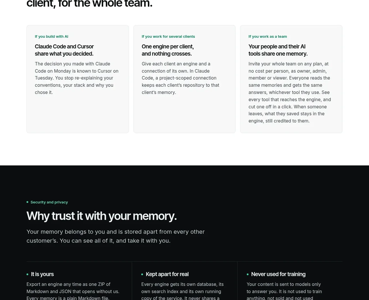
Three equal editorial cards explain how the product adapts to different customer situations without relying on imagery.
Prompt preview
## Reference images

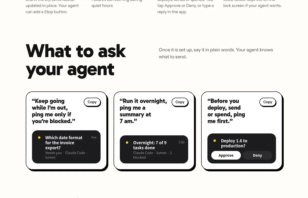
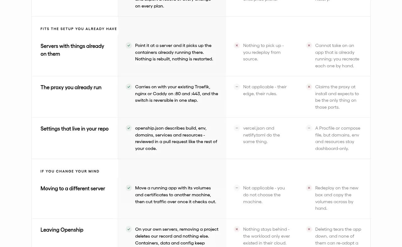
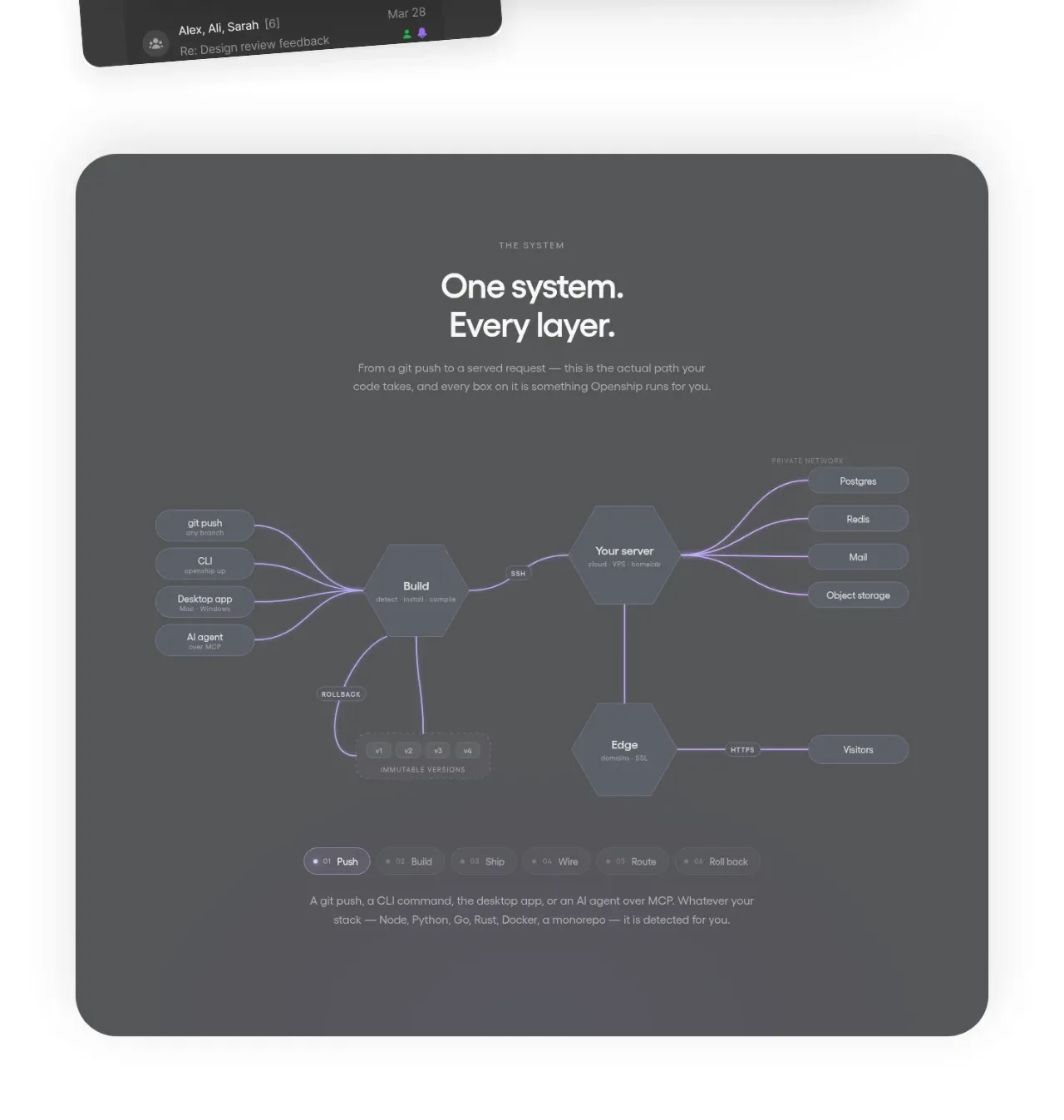
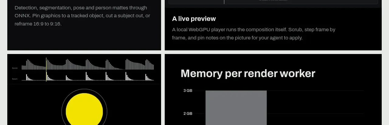
Study these alongside the description below: hierarchy, rhythm, spacing, colour. Build for the product you are asked about, using this design language.

- Component: https://kage-design-assets.t3.tigrisfiles.io/components/context-engine/37fe6fcb-aa91-474a-8a89-1c1cadc0a655-1792821973-7.webp
- Full page it was cut from: https://kage-design-assets.t3.tigrisfiles.io/screenshots/context-engine/37fe6fcb-aa91-474a-8a89-1c1cadc0a655-1792821825382-full.webp
- Component on Kage: https://kage.design/component/context-engine-card

## Before you start
Ask who the user's main customer segments are and what distinct job each segment needs to accomplish. Turn those into three differentiated but related cards.

Build a section with a small green eyebrow and a large statement headline, followed by three equal-height cards in one row. Each card should have a small green category label, a clear 18–20px title, and a paragraph that explains the value for that audience. Keep the cards editorial and text-led, with a pale gray background, white or very-light surfaces, 1px borders, 10px radius, and generous padding. Use a simple 3-column grid with consistent baselines and stack vertically on mobile. Avoid adding icons unless they clarify the audience distinction.

Never: use logos, product names, copy, illustrations, or imagery from the reference.