kage
kage
layernote.io

Design analysis
A long-form SaaS landing page uses a white canvas, oversized black sans-serif headlines, and a bright cyan accent to create a clear visual system. The page moves from a product-led hero into problem/solution comparisons, a dark narrative break, feature workflow blocks, audience cards, integrations, capabilities, pricing, testimonial, FAQ, and a cyan CTA/footer; density increases through screenshot grids and pricing tables while generous whitespace keeps the sections legible.
Prompt preview
## Reference images

Study these alongside the description below: hierarchy, rhythm, spacing, colour. Build for the product you are asked about, using this design language.

- Full page: https://kage-design-assets.t3.tigrisfiles.io/screenshots/layernote/c87f4990-99cd-473d-ba2e-c718b2a2f8cb-1790402512875-full.webp
- Above the fold: https://kage-design-assets.t3.tigrisfiles.io/screenshots/layernote/c87f4990-99cd-473d-ba2e-c718b2a2f8cb-1790402508611.webp
- Design on Kage: https://kage.design/designs/layernote-landing-page

## Before you start
Ask the user what they are building, who it is for, and which brand assets they already have, including the product name, colours, typefaces, logo, imagery, and existing UI components. Wait for their answers before designing. Apply the system below to their product, not to the reference product.

## Page structure
1. **Minimal top navigation** — Use a compact left-aligned wordmark area, restrained text links for the major sections, and right-aligned sign-in and pill CTA controls.
2. **Hero** — Place an oversized multi-line headline on the left, with one phrase highlighted in a bright cyan marker treatment; add a small floating annotation/callout, concise supporting copy, primary and secondary CTAs, a trial reassurance, and a large product UI image spanning the lower portion.
3. **Problem introduction** — Center a small cyan eyebrow above a large statement that reframes the problem, with substantial white space around it.
4. **Problem-versus-solution comparison** — Present two side-by-side cards: a muted “old way” visual with red-cross bullets and a clearer product visual with green check bullets. Finish with a centered CTA beneath the cards.
5. **Dark narrative break** — Use a full-width photographic panel with a dark navy overlay and left-aligned eyebrow, headline, short paragraph, and small cyan button; let the image occupy the right side and create a tonal reset.
6. **Solution introduction** — Return to white with a centered eyebrow, two-line headline, and explanatory paragraph.
7. **Three capability cards** — Arrange three cards in a row for the primary surfaces or inputs; give each a small title, description, and large light product screenshot, with “coming soon” badges where appropriate.
8. **Secondary workflow cards** — Add two wider cards below for deeper workflows, each combining a short description with a product comparison or automation screenshot.
9. **How-it-works intro** — Use a left-aligned section title and a right-aligned explanatory sentence, followed by a compact step indicator or tab row and a CTA at the edge.
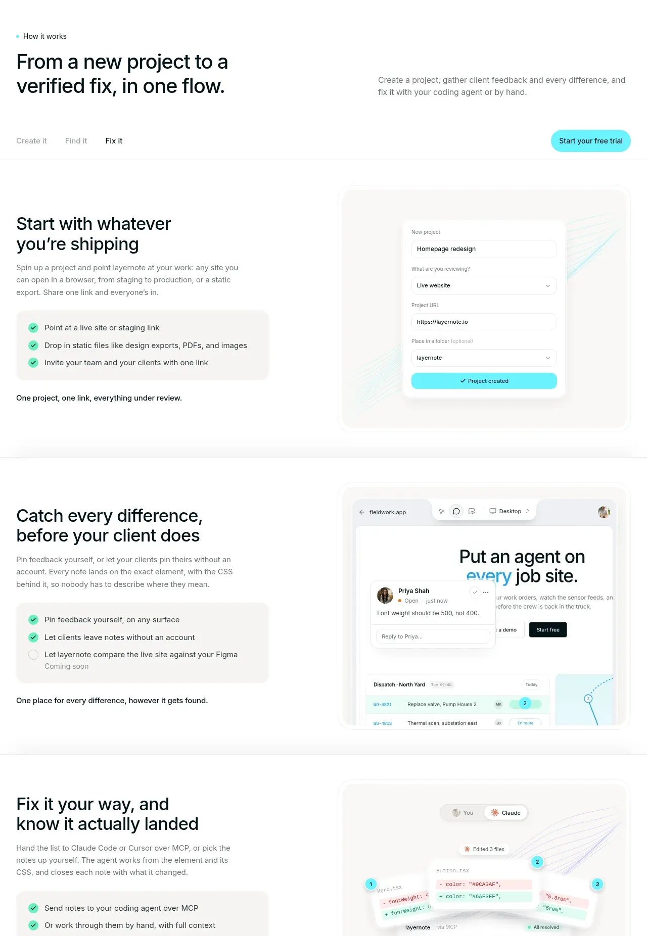
10. **Workflow step one** — Split text and interface imagery into two columns. Explain the first action with a bold heading, short copy, a pale checklist panel, and a large product mockup on the opposite side.
11. **Workflow step two** — Repeat the split layout with alternating image/text placement, explaining how feedback is collected and connected to the product surface.
12. **Workflow step three** — Repeat again for the final resolution or coding handoff, using a screenshot with annotation trails and a checklist panel.
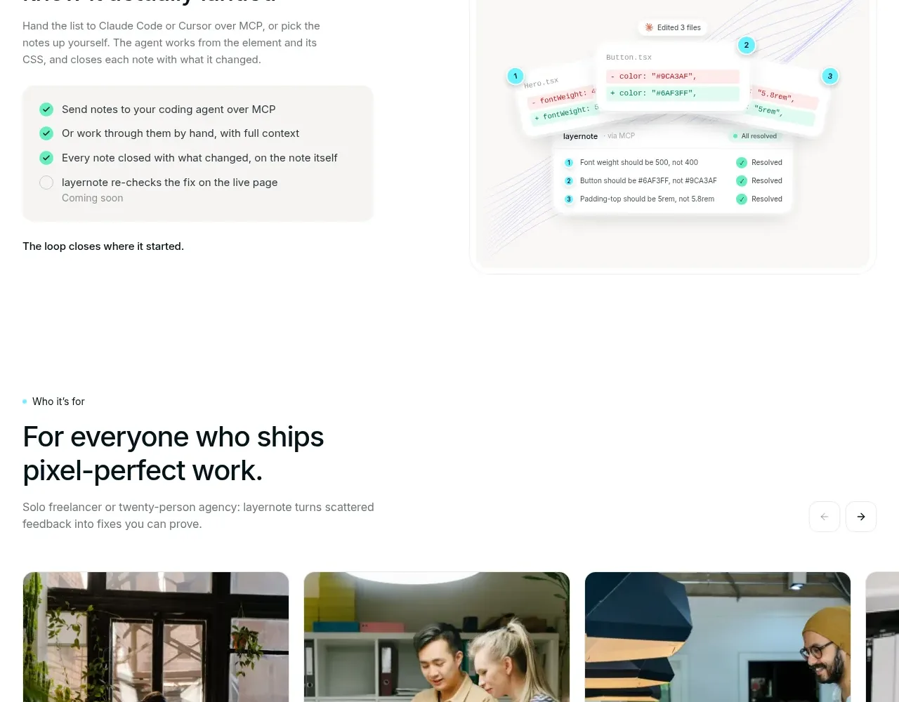
13. **Audience section** — Introduce the section with an eyebrow and headline, then show a horizontally scrolling row of rounded photo cards. Pair each image with an audience label and a short use-case description.
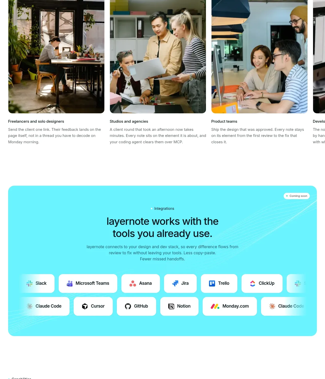
14. **Integrations panel** — Put the integrations message inside a large rounded cyan panel with faint line-work in the background. Center the heading and supporting text, then show two rows of white rounded integration pills with small neutral logos or labels.
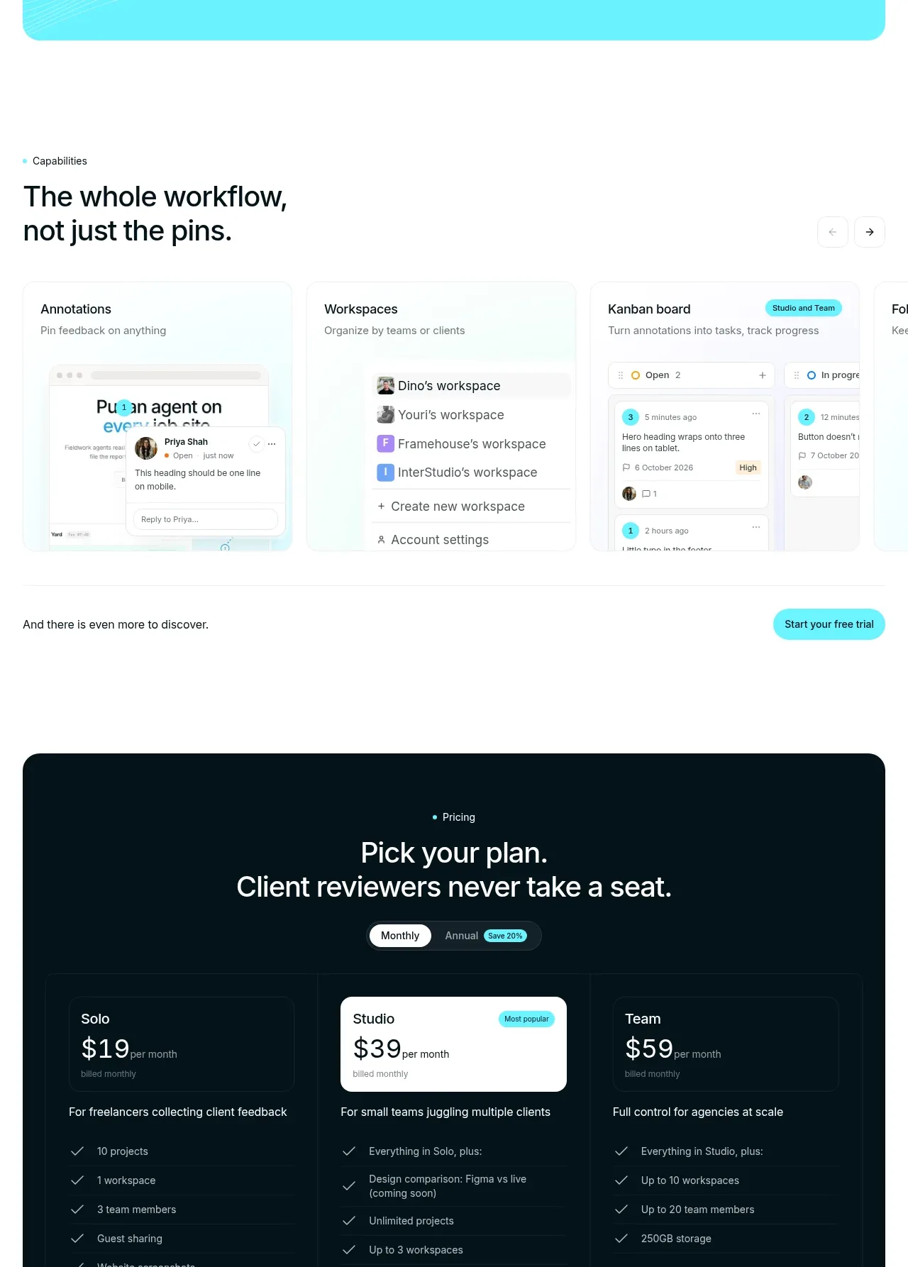
15. **Capabilities carousel** — Use a left-aligned heading and a horizontal row of pale product cards for annotations, workspaces, boards, and additional capabilities. Include subtle carousel controls and a small CTA below.
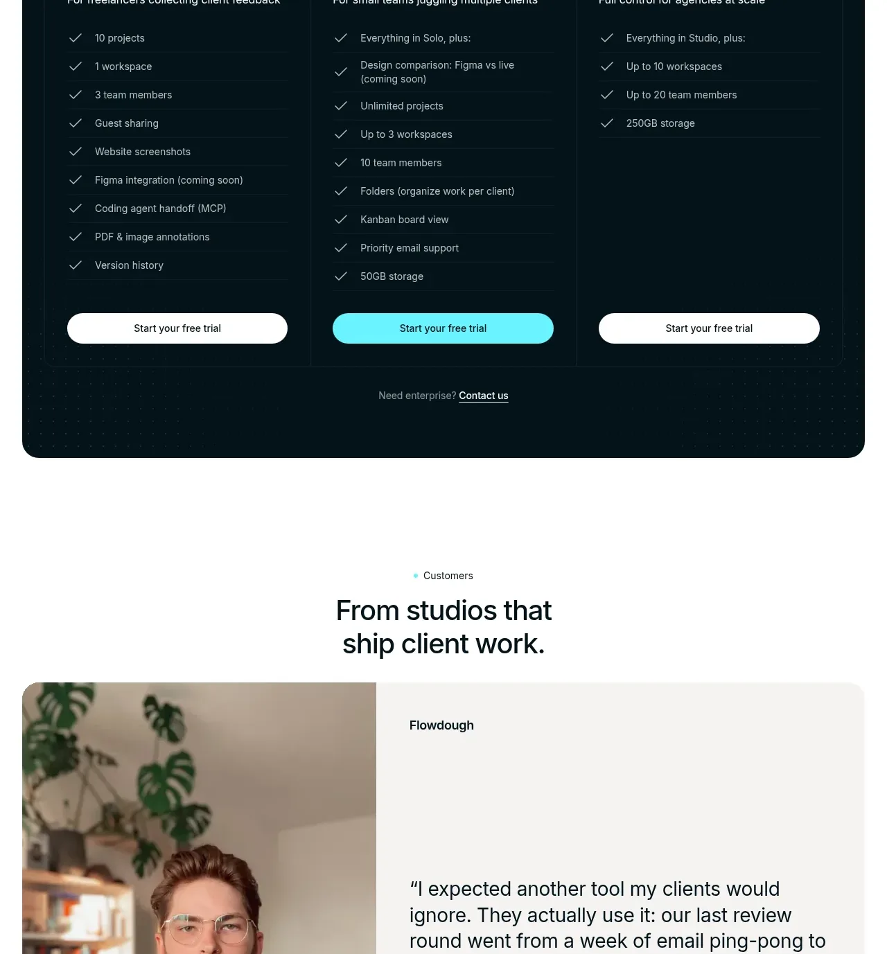
16. **Pricing** — Place a dark navy rounded container on the white page. Center the eyebrow and headline, add a monthly/annual toggle, then show three pricing columns with the middle plan visually selected in a white card, feature checklists, and full-width pill buttons.
17. **Customer testimonial** — Center an eyebrow and heading above a large rounded split card with a portrait on the left and a quote, company, and attribution on the right; add understated carousel dots/arrows below.
18. **FAQ** — Use a two-column layout: a left heading with a contact link and a right stack of horizontal accordion rows, each with a question and plus icon.
19. **Final CTA** — Use a full-width bright cyan section with centered headline, short supporting text, and a dark pill CTA; retain faint decorative line-work for continuity with the integration panel.
20. **Footer** — Finish with a dark navy footer containing the product description and badges on the left, grouped navigation and comparison/resource/legal links across the top, a subtle divider, copyright text, and an oversized low-contrast decorative wordform near the bottom.

## Design language
- Build hierarchy with very large black sans-serif headlines, short eyebrow labels, compact gray body copy, and strong left alignment for explanatory sections; use centered alignment only for section introductions, pricing, testimonials, and CTAs.
- Keep the primary canvas white or near-white, with generous vertical spacing between major sections. Increase density inside screenshot grids, comparison cards, capability cards, and pricing columns so the page alternates between breathing room and evidence.
- Use a vivid cyan accent close to `#55E5EE` for highlighted text, pill buttons, status dots, selected states, and large CTA panels. Pair it with near-black/navy `#03151B`, black `#0A0D0F`, soft gray `#727A7D`, and pale surfaces around `#F5F7F6`.
- Pair a clean geometric sans-serif for all text with a tight, oversized display scale: hero headline around 56–72px desktop, section headlines around 36–48px, card headings around 16–22px, and body copy around 13–16px with relaxed line height.
- Treat screenshots as the main visual language: use crisp UI mockups, faint cyan connector lines, annotation dots, avatars, and checkmarks rather than decorative illustrations. Keep image cards softly rounded, generally around 12–18px, with minimal borders and very light shadows.
- Use dark navy only for intentional contrast sections such as the narrative break, pricing, and footer. Use cyan panels as high-energy conversion moments, not as a general page background.
- Keep controls compact and pill-shaped, with black or navy primary buttons, cyan secondary/action buttons, thin gray dividers, and small status badges. Use green checks and occasional red crosses only to communicate resolved versus unresolved states.
- Maintain a restrained editorial rhythm: alternate centered statements, dense evidence grids, full-bleed image moments, split feature rows, and horizontal card rails. Use subtle horizontal overflow/carousel behavior for audience and capability cards.
- Motion should be quiet and functional: allow screenshot cards, carousels, accordions, and integration rows to reveal or slide smoothly; use short fades and small vertical movement, never distracting animation. Make all carousels keyboard accessible and ensure the dense comparison and pricing layouts collapse cleanly on mobile.

## Never
- Do not copy the reference product’s logos, wordmarks, product name, tagline, exact copy, screenshots, illustrations, photography, badges, or icon sets.
- Do not present the result as Layernote or imply affiliation with it.
- Replace every example with the user’s own product language, brand assets, content, imagery, and interface screens while preserving only the reusable layout logic and visual principles.
Components from this page
All components
 Minimal product navigation
layernote · Navigation
Minimal product navigation
layernote · Navigation
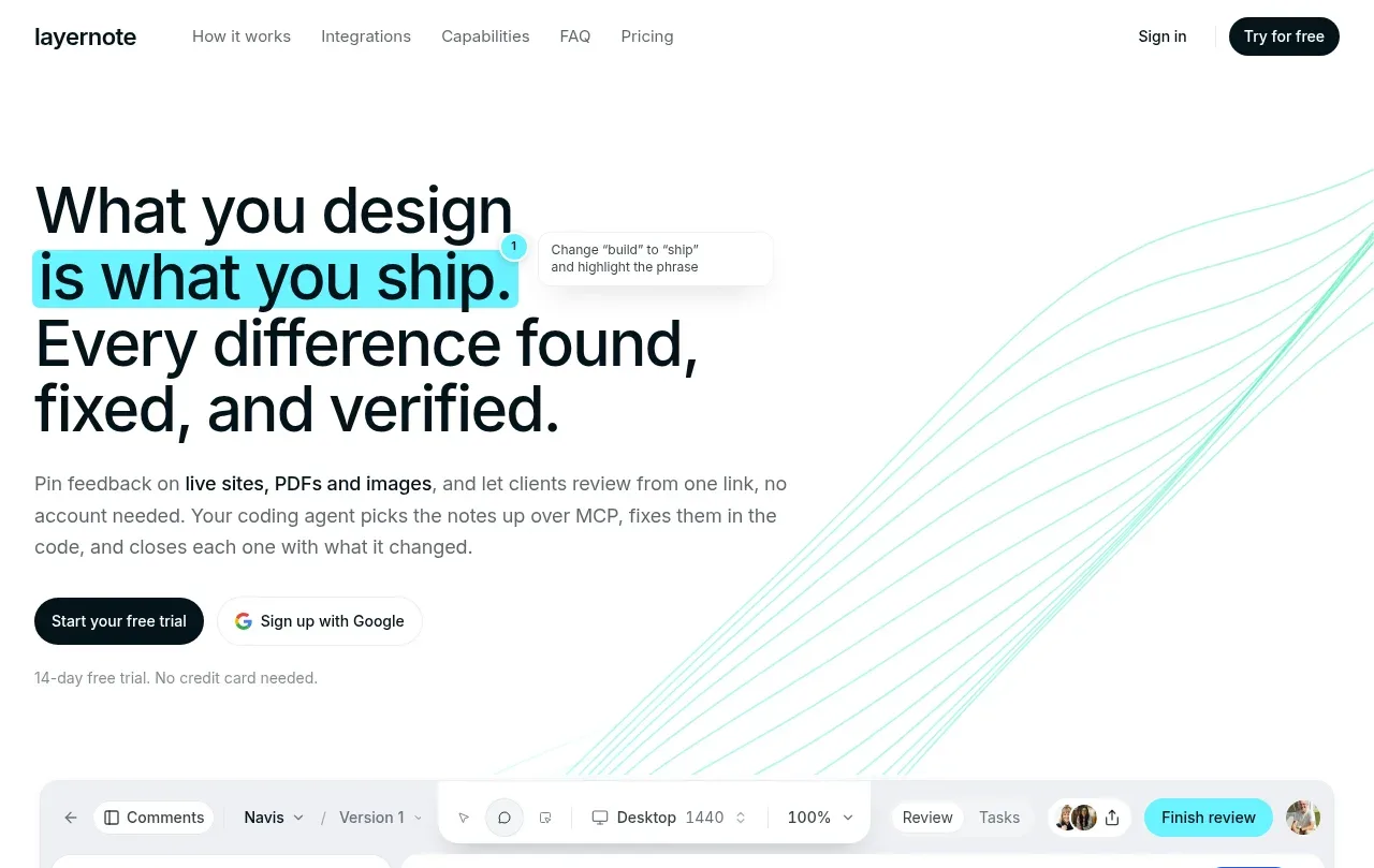 Direct product promise hero
layernote · Hero
Direct product promise hero
layernote · Hero
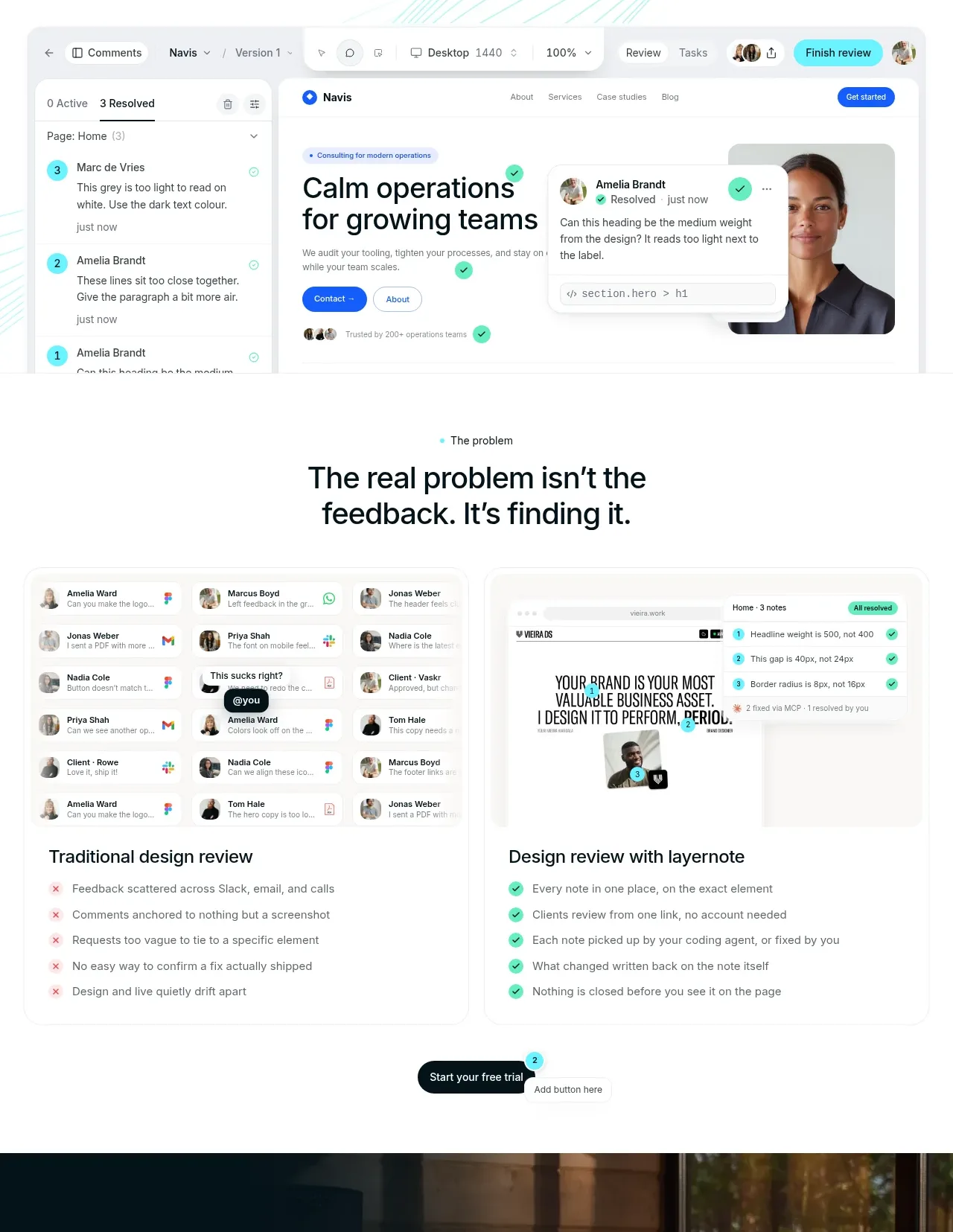 Problem and solution comparison
layernote · Feature grid
Problem and solution comparison
layernote · Feature grid
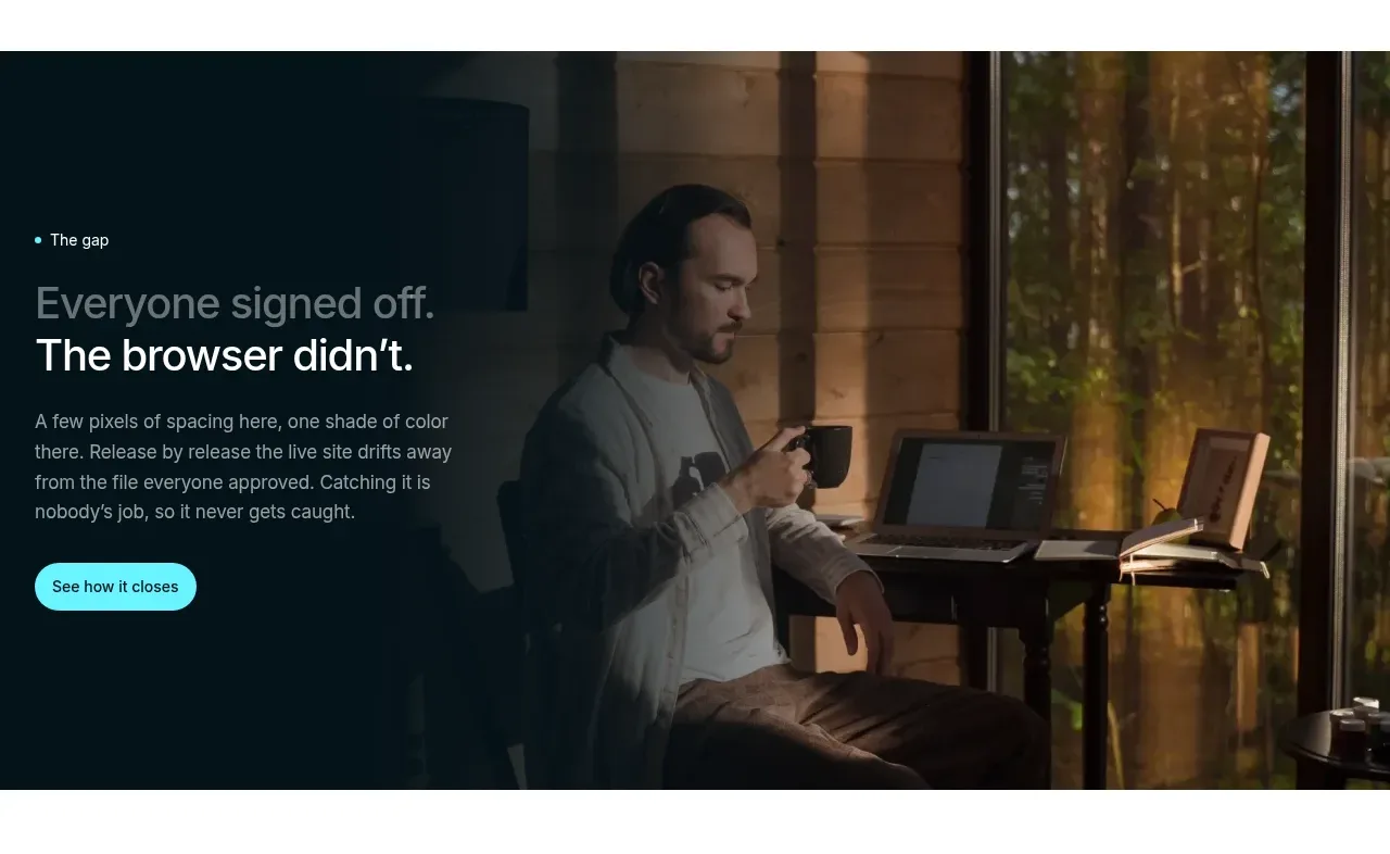 Story-led gap banner
layernote · Banner
Story-led gap banner
layernote · Banner
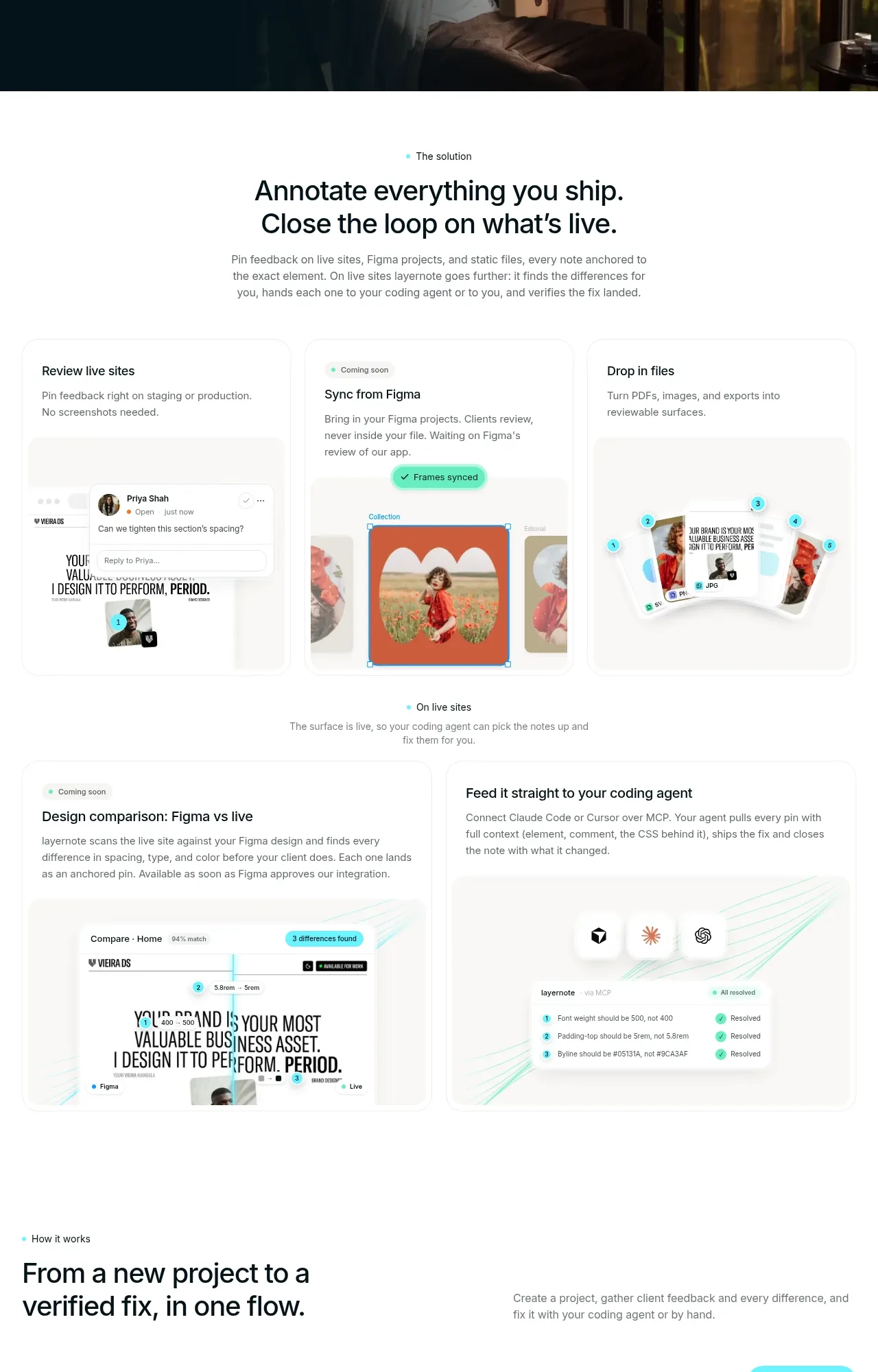 Workflow feature tour
layernote · Feature grid
Workflow feature tour
layernote · Feature grid
 Audience use-case gallery
layernote · Gallery
Audience use-case gallery
layernote · Gallery
 Integrations ecosystem panel
layernote · Logo cloud
Integrations ecosystem panel
layernote · Logo cloud
 Extended workflow modules
layernote · Feature grid
Extended workflow modules
layernote · Feature grid
 Three-tier pricing table
layernote · Pricing table
Three-tier pricing table
layernote · Pricing table
 Customer testimonial feature
layernote · Testimonials
Customer testimonial feature
layernote · Testimonials
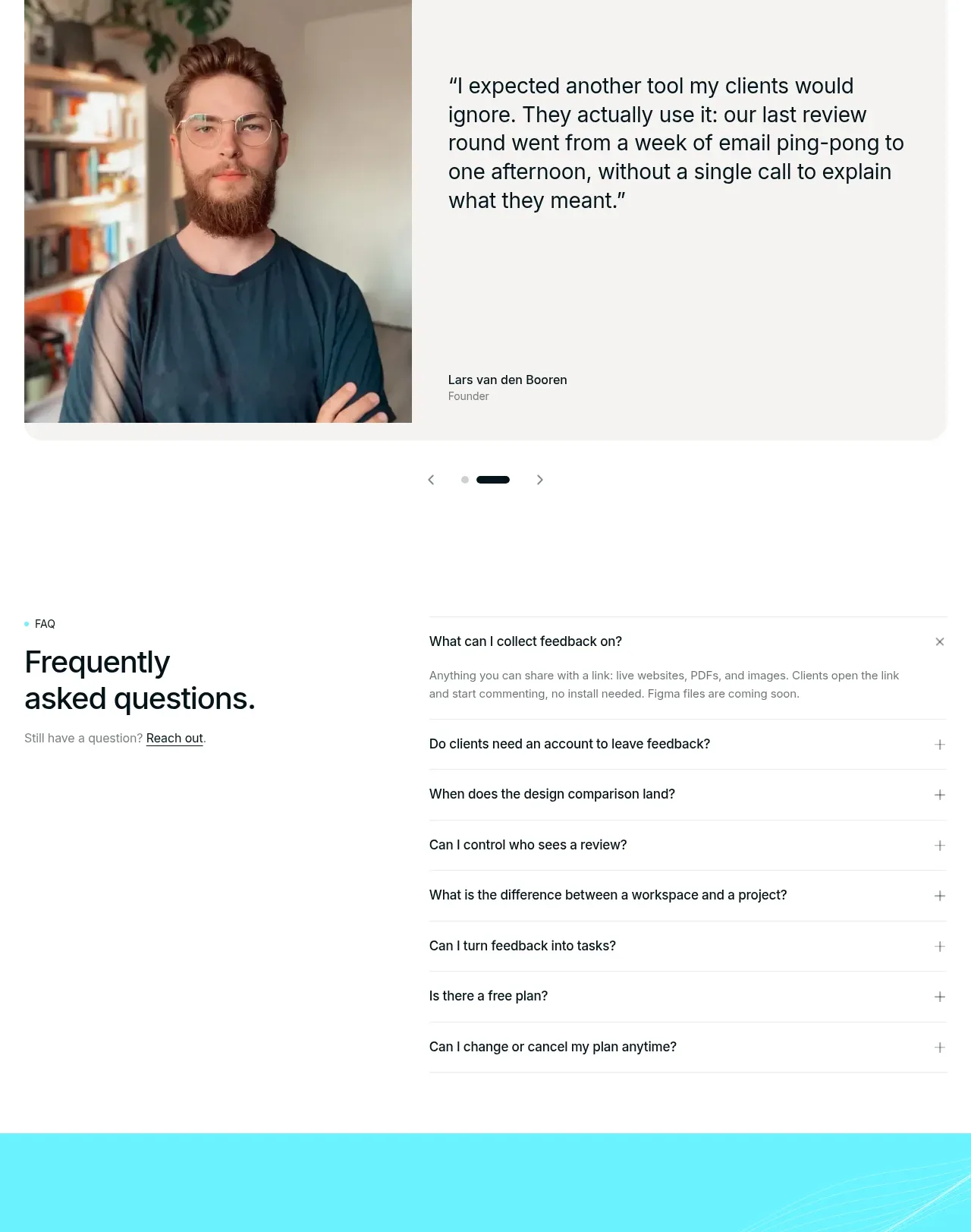 Frequently asked questions
layernote · FAQ
Frequently asked questions
layernote · FAQ
 Bright closing conversion CTA
layernote · Call to action
Bright closing conversion CTA
layernote · Call to action