kage
kage
linear.app

Design analysis
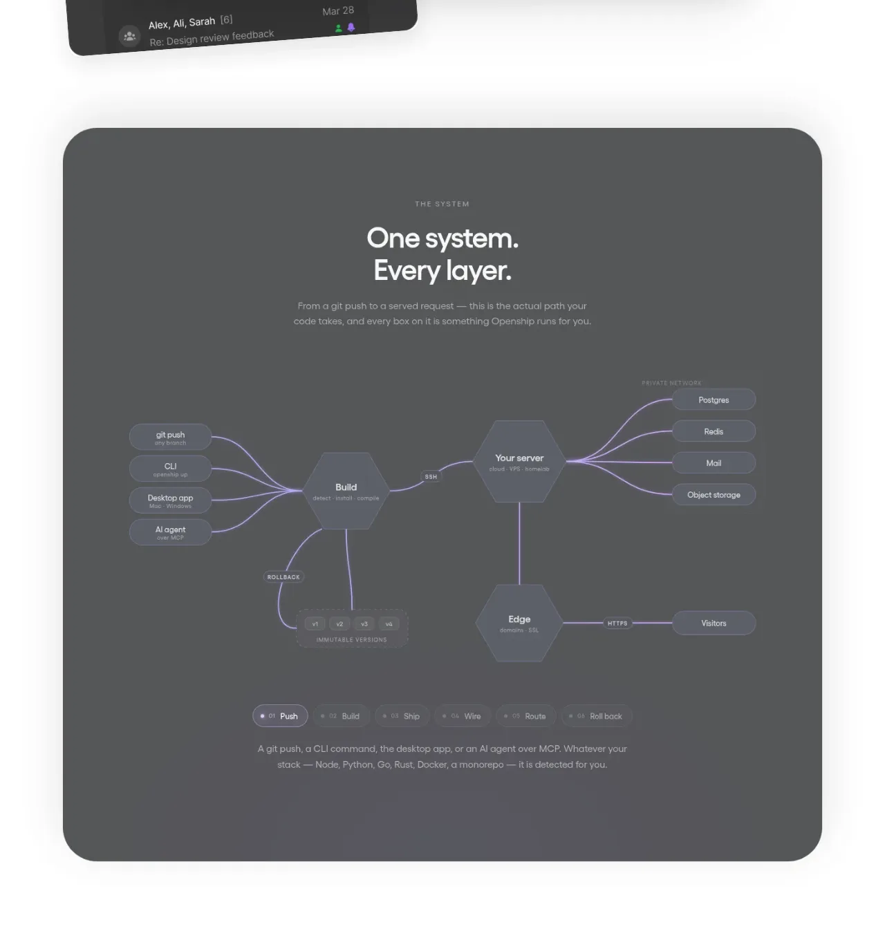
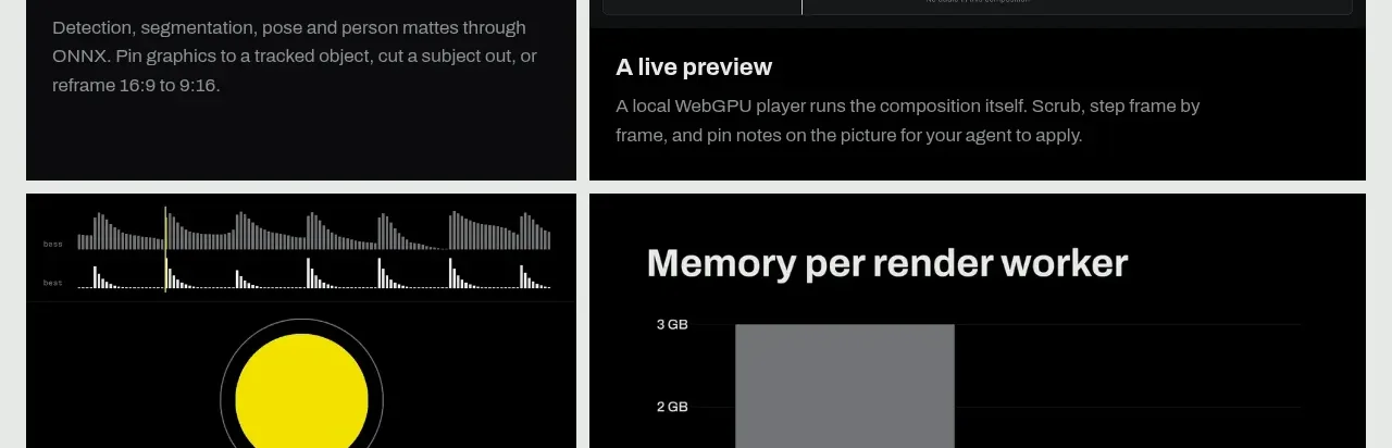
A cinematic product-preview card that combines a muted issue list with a dominant code editor and a ghosted comparison pane. Strong depth, restrained contrast, and selective syntax highlights make the interface feel technical without becoming visually noisy.
Prompt preview
## Reference images

Study these alongside the description below: hierarchy, rhythm, spacing, colour. Build for the product you are asked about, using this design language.

- Component: https://kage-design-assets.t3.tigrisfiles.io/components/linear-app/3b71fb78-773e-45c4-803c-426bf7f1ae53-1789060209-8.webp
- Full page it was cut from: https://kage-design-assets.t3.tigrisfiles.io/screenshots/linear-app/3b71fb78-773e-45c4-803c-426bf7f1ae53-1789060182-full.webp
- Component on Kage: https://kage.design/component/linear-card

## Before you start
Ask what the user's product is, who it is for, and what brand direction, visual identity, and content should be used. Then apply the principles below to create an original version for that product rather than reproducing the reference.

## Design goal
Build a dark, cinematic product-preview card for a software product. The composition should communicate technical depth and active work through layered interface surfaces: a dim background work list, a large foreground code editor, and a partially visible secondary comparison pane. Treat this as a reusable visual system for the user's product, not as a literal screenshot recreation.

## Layout and alignment
- Use a wide landscape card, approximately 1280×560 at desktop proportions, with responsive scaling and a minimum height that preserves the layered composition.
- Place the background work-list panel flush toward the left and slightly lower than the main panel. It should occupy roughly 42% of the width and feel partially obscured.
- Place the primary editor panel over it, beginning around one-third of the card width and extending beyond the right edge or close to it. Let the editor dominate the visual hierarchy.
- Add a narrow, low-contrast comparison/editor pane behind or beside the primary editor on the right. It should be visibly offset, not a duplicate that competes for attention.
- Use consistent left gutters for filenames, line numbers, issue identifiers, and row content. Align code text and line numbers on a strict monospace grid.
- Clip overflow at the card boundary so the layered panels feel like a cropped product interface rather than a collection of separate cards.
- On smaller screens, preserve the primary editor and simplify or hide the background list and comparison pane rather than compressing every layer.

## Typography hierarchy
- Use a compact sans-serif UI font for panel labels, issue titles, metadata, and navigation.
- Use a readable monospace font for code, filenames, line numbers, and diff content.
- Keep the filename/header text small and muted, around 13–15px; use 12–14px for code and 10–12px for line numbers.
- Make code text medium-weight with comfortable line height, approximately 1.7–1.9, so the editor feels legible even when displayed as a decorative card.
- Use muted gray for secondary copy and brighter gray-white only for active code and important row labels.

## Colour and contrast
- Use a near-black page/card base around #080A0B or #0A0C0D.
- Use layered panel surfaces around #101315, #0D1011, and #151819 with subtle tonal differences rather than obvious fills.
- Use primary text around #D7D9D7, secondary text around #777D7B, and line numbers around #555C59.
- Use a restrained green accent around #35C66A for completed or active states, and a warm yellow accent around #D6B52F for in-progress states.
- For code syntax, use low-saturation accents such as muted coral #C97979, lavender #A99ACB, amber #C5A66A, and cool blue-green #82AFA5.
- Red diff lines may use a very subtle translucent red wash, approximately rgba(170, 55, 55, 0.18), with a thin darker-red edge. Keep all highlights subdued.
- Create depth with a gentle black-to-transparent vignette and soft shadows, not bright gradients or glossy effects.

## Borders, radius, and surfaces
- Use a 1px border around the main card and panels, approximately rgba(255,255,255,0.10) on the outer edge and rgba(255,255,255,0.05) internally.
- Give the outer card a radius around 16–20px; use 12–16px for the editor and list panels.
- Keep corners and dividers crisp but subtle. Avoid heavy outlines, glassmorphism blur, or large visible drop shadows.
- Use a soft shadow behind the foreground editor, with a large blur and low opacity, to establish clear depth over the background list.
- Add a faint top or side sheen only if it reinforces the dark layered material; never let it overpower the content.

## Visible interaction and detail
- Include a compact editor header with a file icon, a path or contextual label, and a small product/workspace control aligned to the right.
- Show realistic but original code-like rows with line numbers, indentation, syntax colours, and a few highlighted changed lines. The exact code and labels must be generated for the user's product.
- Use horizontal diff markers or subtle coloured gutters to indicate changed lines without turning the card into a loud status dashboard.
- In the background list, group rows under a few status headers and use tiny status indicators, but keep it heavily dimmed and subordinate.
- Preserve enough contrast for the primary code pane to read as an interface, while allowing the background and comparison pane to fade into the atmosphere.
- If animated, use only restrained motion: a slow editor glow, subtle cursor blink, or gentle panel reveal. Avoid rapid typing, scrolling, or attention-grabbing transitions.
- Make the entire card accessible: maintain readable contrast in the primary panel, provide reduced-motion behavior, and ensure decorative code is not required to understand the product.

## Never
- Never use logos, product names, or branded controls from the reference.
- Never reuse the reference's exact copy, issue titles, file paths, code, labels, or syntax content.
- Never copy the exact panel geometry, screenshot, or composition; reinterpret the layered-editor principle for the user's product.
- Never use illustrations, photographs, or imagery from the reference.
- Never make the interface depend on tiny illegible text, excessive blur, or decorative noise.
- Never let the secondary panes, syntax colours, or background issue list overpower the primary product story.