kage
kage
make0.ai
Design analysis
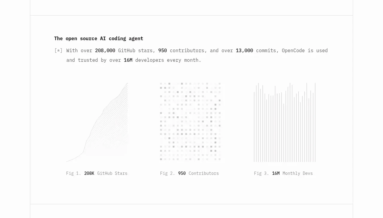
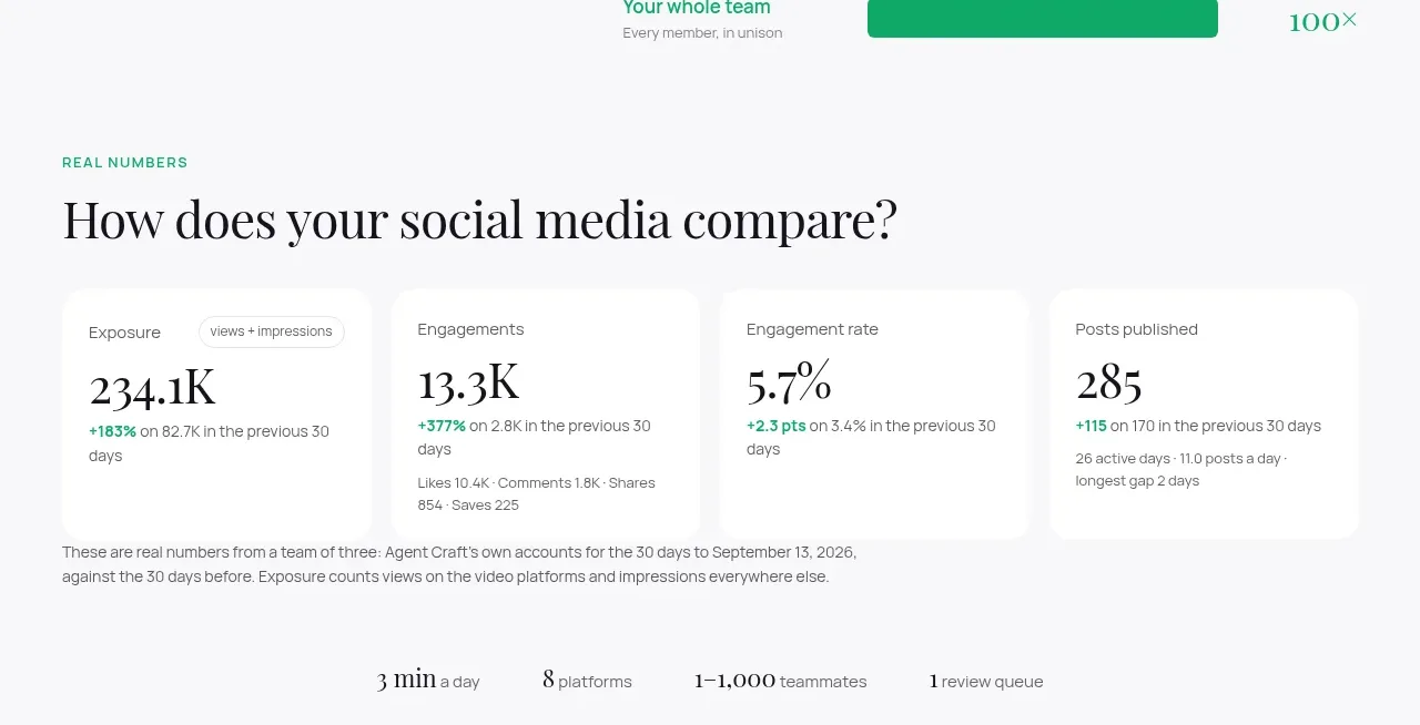
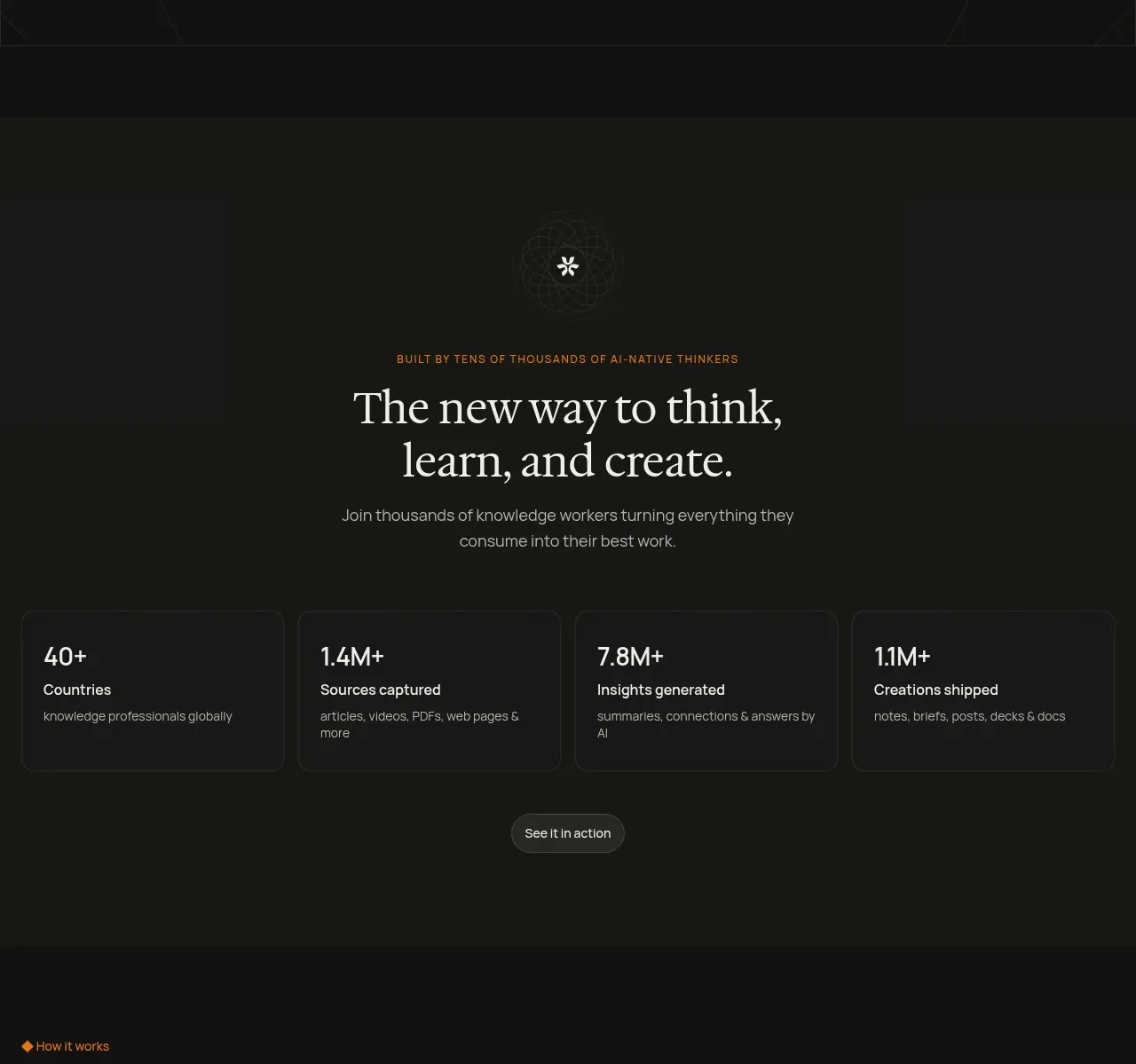
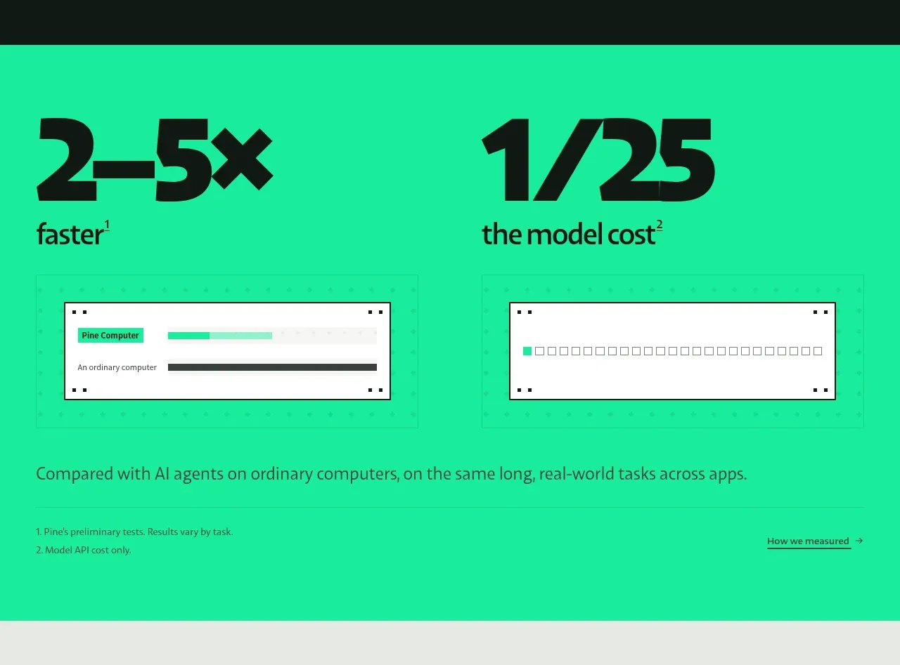
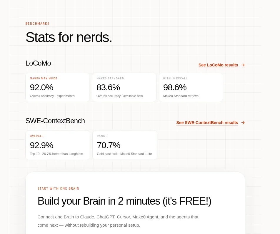
A credibility section organizes benchmark names, result links, and compact metric cards into two clear rows.
Prompt preview
## Reference images

Study these alongside the description below: hierarchy, rhythm, spacing, colour. Build for the product you are asked about, using this design language.

- Component: https://kage-design-assets.t3.tigrisfiles.io/components/make0-brain/19c81372-003a-4a5c-a9ad-89626e51177c-1792044275-5.webp
- Full page it was cut from: https://kage-design-assets.t3.tigrisfiles.io/screenshots/make0-brain/19c81372-003a-4a5c-a9ad-89626e51177c-1792044170316-full.webp
- Component on Kage: https://kage.design/component/make0-brain-stats

## Before you start
Ask what the user's product and brand are, then apply these principles to that product rather than reproducing the reference.

Create a benchmark/results section with a small uppercase eyebrow and a large concise heading. Organize the content into two labeled benchmark rows. Each row should have a dataset title at left, an understated result link at right, and a horizontal set of compact metric cards below. Cards use white backgrounds, 1px warm-gray borders, 10–12px radii, small uppercase labels, large numeric values, and tiny explanatory captions. Use black for values, muted gray for metadata, and a restrained orange-red for links and accents. Keep the section dense but readable with 28–40px gaps between rows and responsive horizontal scrolling or a stacked layout on narrow screens.

Never: use logos, product names, copy, illustrations, or imagery from the reference.