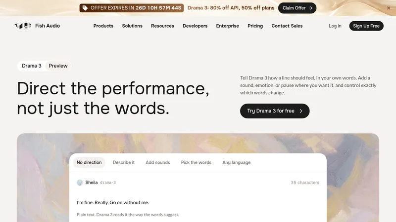
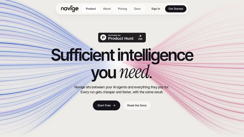
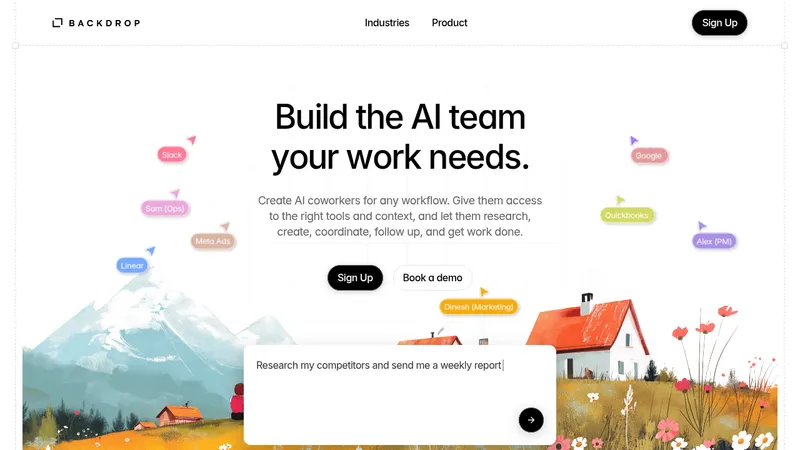
kage
kage
maybloc.com

Design analysis
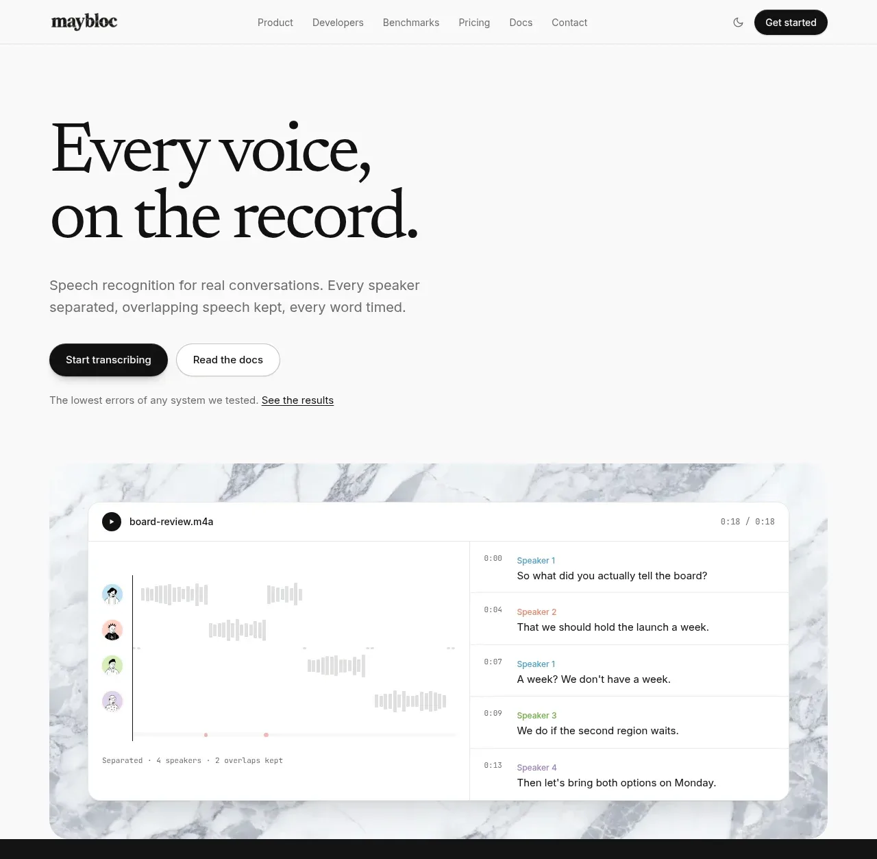
A restrained, editorial landing page pairs oversized black serif headlines with small gray sans-serif explanatory copy on a warm white canvas. The hero establishes the product with a large transcription interface over pale marble, then the page alternates between dense proof sections, spacious feature explanations, and framed UI diagrams; a brief black benchmark band sharply changes the rhythm. Pastel, stone-like 3D objects add character beside otherwise precise cards and tables, while thin rules, soft shadows, and low-radius panels keep the visual system quiet and technical.
Prompt preview
## Reference images

Study these alongside the description below: hierarchy, rhythm, spacing, colour. Build for the product you are asked about, using this design language.

- Full page: https://kage-design-assets.t3.tigrisfiles.io/screenshots/maybloc/1877ee03-3cf3-49f7-b006-226ca2ea42de-1792216974687-full.webp
- Above the fold: https://kage-design-assets.t3.tigrisfiles.io/screenshots/maybloc/1877ee03-3cf3-49f7-b006-226ca2ea42de-1792216969824.webp
- Design on Kage: https://kage.design/designs/maybloc-landing-page

## Before you start
Ask the user what they are building, who it is for, and what brand assets they already have, including the product name, colours, type choices, logo, and any existing imagery. Wait for their answers before designing. Apply the reference's design language to their product, not to Maybloc or any other reference brand.

## Page structure
1. **Slim navigation bar:** Use a white or warm-white header with a small brand mark at left, compact text links across the middle, a subtle theme/control icon, and one dark rounded primary button at right. Separate it from the page with a faint horizontal rule.
2. **Hero introduction:** Create a generous white hero with a very large two-line editorial serif headline, a short gray sans-serif description, paired primary and secondary buttons, and a small supporting proof link beneath. Keep the text left aligned with substantial empty space around it.
3. **Product demonstration:** Place a wide rounded media or interface panel below the hero copy, using a pale marble-like abstract background and a crisp transcription UI card layered on top. Show playback, speaker lanes, timestamps, waveform-like marks, and transcript rows as a product explanation rather than decorative chrome.
4. **Benchmark proof band:** Switch to a near-black full-width section. Make the main percentage statistic extremely large, pair it with a serif explanation and a bordered call-to-action, then add a single rounded dark-gray comparison panel containing three columns of benchmark results.
5. **Conversation capabilities overview:** Return to the light canvas with a large serif heading about understanding the whole conversation. Follow it with three alternating feature rows: speaker separation with a transcript/lane diagram and pastel sculptural object; crosstalk retention with an overlap timeline card and speech-bubble objects; and word-level timing with highlighted transcript words and a clock-like object. Alternate text and visual placement to create a measured zig-zag rhythm.
6. **Speaker sorting section:** Add a ruled light section with a two-column intro: a large serif heading on the left and compact explanatory copy on the right. Under it, show a wide white rounded diagram grouping repeated pastel speaker avatars into four labelled columns.
7. **Transcript add-ons section:** Introduce another two-column heading/copy row explaining optional transcript enhancements. Below it, use a large rounded white feature panel with a compact multi-column add-on grid at the top and a larger redaction demonstration beneath, including before/after text, blacked-out fields, and a small tactile card object.
8. **Privacy and ownership section:** Use a spacious light section with a large multiline serif statement on the left and a translucent blue-green lock object on the right. Finish with a horizontal divider and three evenly spaced columns covering deletion, workspace privacy, and retention/playback rules.
9. **Model/product specification section:** Present a split layout with a large marble ring or abstract object on the left and a product/model title, short description, and four compact specifications on the right. Use a divider above the stats and keep the copy restrained.
10. **Developer integration section:** Add a generous two-column developer callout with a serif headline about integrating quickly, short API-oriented copy, a small copy-prompt control row, a dark documentation button, and a purple abstract code-bracket object on the opposite side.
11. **Final conversion panel:** Place a wide rounded marble-texture banner with a centered serif invitation, one dark primary button, and one light outlined secondary button.
12. **Footer:** End with a ruled footer containing a large typographic brand treatment and short tagline at left, four compact navigation columns for product, developers, company, and legal, then a thin bottom rule with copyright, agent/tool links, and contact details.

## Design language
- Build hierarchy through contrast between oversized, high-contrast editorial serif headlines and restrained gray sans-serif body text. Use a display serif around 56–76px for major desktop headings, 30–42px for feature headings, and a neutral sans around 13–16px for supporting copy and navigation.
- Keep the page predominantly warm white, approximately `#fafafa` or `#f8f8f7`, with near-black text around `#111111` and muted copy around `#737373`. Use a near-black `#141414` benchmark section as the main tonal interruption.
- Let rhythm change down the page: begin with a spacious hero and large demonstration, compress into a data-dense dark proof band, then return to generous alternating feature rows. Use framed diagrams and tables to create denser moments before opening back up for privacy, model, integration, and the final CTA.
- Use marble, stone, paper, or other softly veined abstract textures only as restrained backgrounds or sculptural product accents. Keep them pale and desaturated; introduce pastel blue, coral, green, lavender, and sea-glass tones in small illustrations rather than as broad page fills.
- Treat diagrams as product evidence: use white cards, thin gray rules, tiny labels, speaker colours, timelines, highlighted words, and simplified transcript rows. Make the UI explanatory and legible, not a generic dashboard.
- Use rounded containers with modest radii around 14–20px, 1px borders around `#e5e5e5`, and very soft shadows such as `0 10px 30px rgba(0,0,0,.08)`. Avoid heavy gradients, glossy glass, and excessive elevation.
- Keep primary buttons black with white text and pill-like rounding; use white or transparent secondary buttons with a thin border. Buttons should be compact and quiet, with a slight colour or elevation response on hover rather than dramatic animation.
- Use thin horizontal rules to divide major sections and align content to a consistent wide grid with generous side margins. Alternate content alignment deliberately, but keep headings and body copy on a disciplined baseline.
- Give abstract 3D objects soft ambient shadows and tactile, imperfect surfaces. They should explain a concept or provide a visual pause, while the actual product UI remains crisp and geometric.
- Keep motion subtle: use gentle hover states, button transitions, and slow entrance/fade movement for diagrams or sculptural objects. Do not animate the page aggressively or make decorative objects compete with the copy.
- Make the layout responsive by collapsing split rows and multi-column diagrams into a readable vertical sequence on smaller screens, preserving the serif scale, section order, contrast shifts, and generous whitespace.

## Never
- Do not copy Maybloc's logo, wordmark, product name, tagline, exact copy, illustrations, photography, 3D objects, or icon set.
- Do not reproduce the reference's transcription content, benchmark claims, model name, navigation labels, or brand-specific numbers.
- Do not present the result as Maybloc or imply affiliation with the reference.
- Do not replace the editorial whitespace, proof-led section rhythm, and explanatory product diagrams with a generic SaaS dashboard, noisy gradients, or a dense template.
Components from this page
All components
 Minimal product navigation
Maybloc · Navigation
Minimal product navigation
Maybloc · Navigation
 Editorial speech transcription hero
Maybloc · Hero
Editorial speech transcription hero
Maybloc · Hero
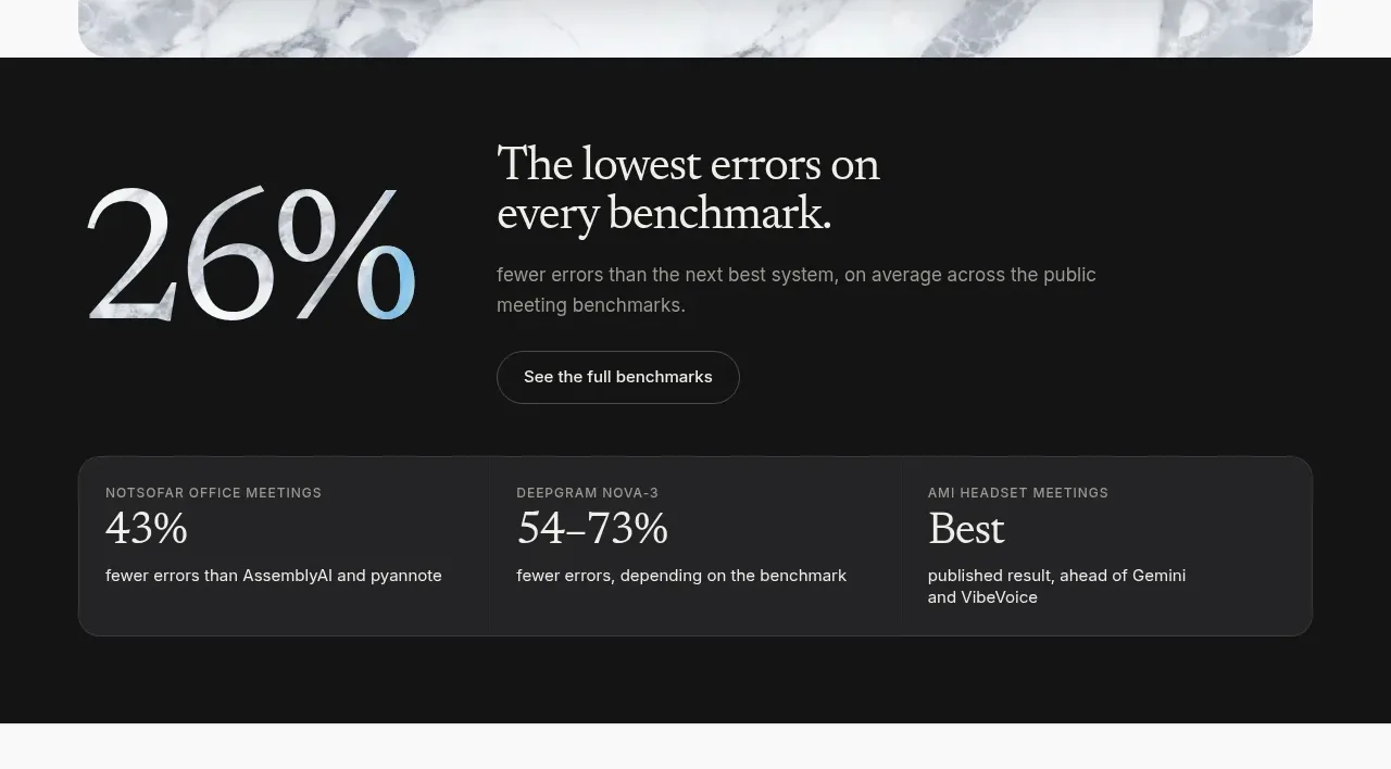 Benchmark proof band
Maybloc · Stats
Benchmark proof band
Maybloc · Stats
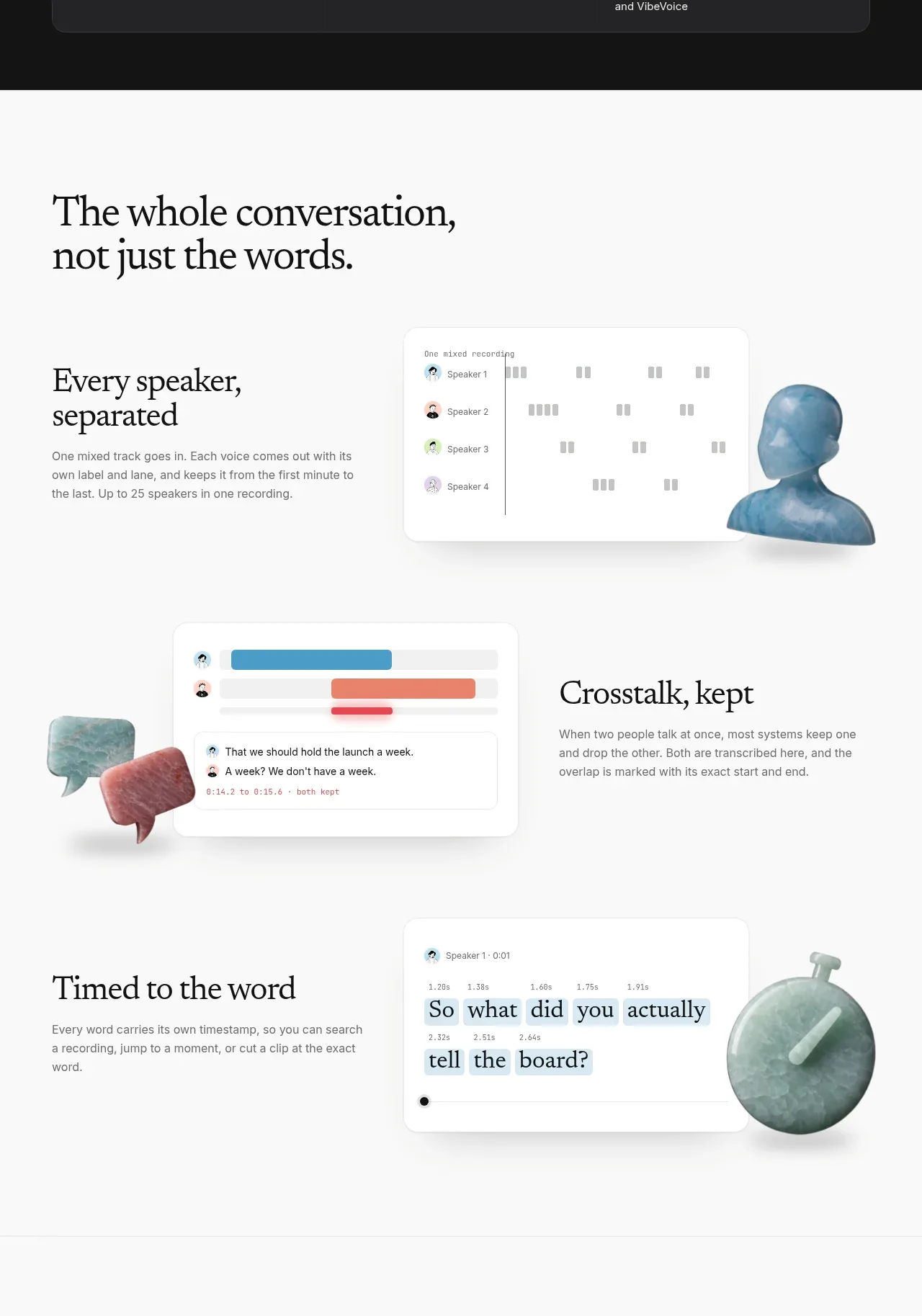 Conversation intelligence features
Maybloc · Feature grid
Conversation intelligence features
Maybloc · Feature grid
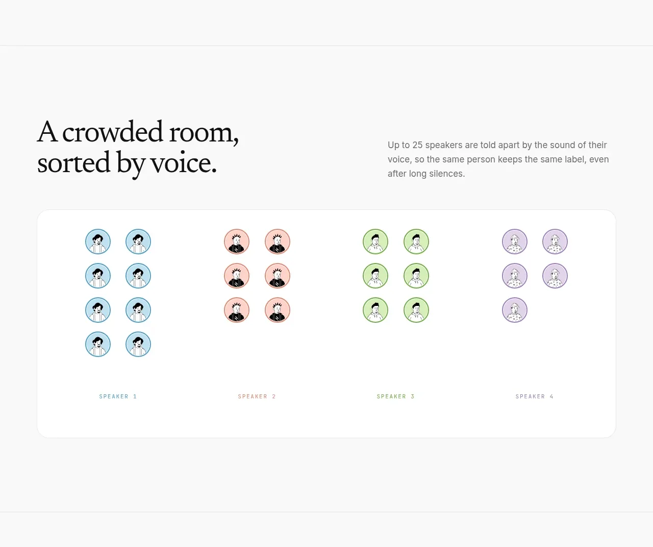 Speaker separation visualization
Maybloc · Card
Speaker separation visualization
Maybloc · Card
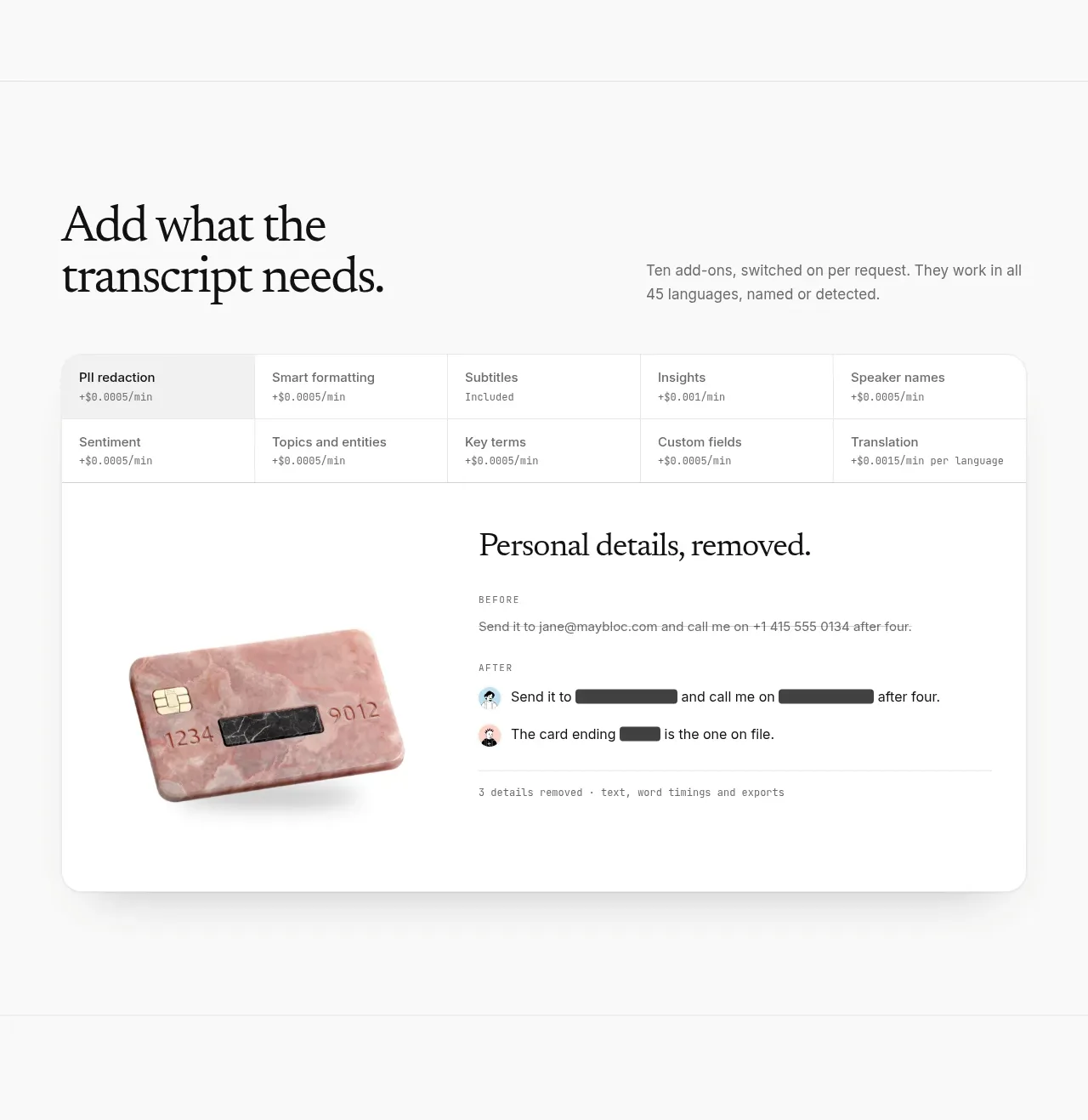 Transcript add-ons and redaction
Maybloc · Feature grid
Transcript add-ons and redaction
Maybloc · Feature grid
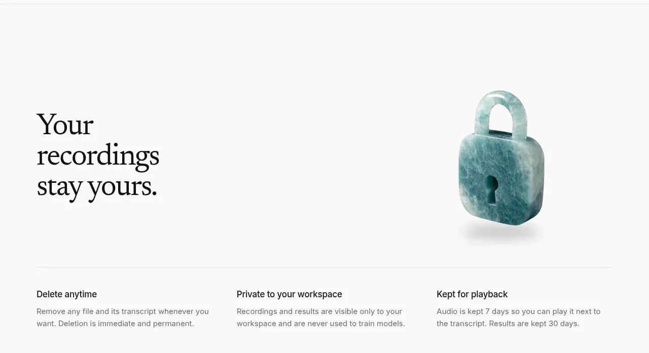 Ownership and retention principles
Maybloc · Feature grid
Ownership and retention principles
Maybloc · Feature grid
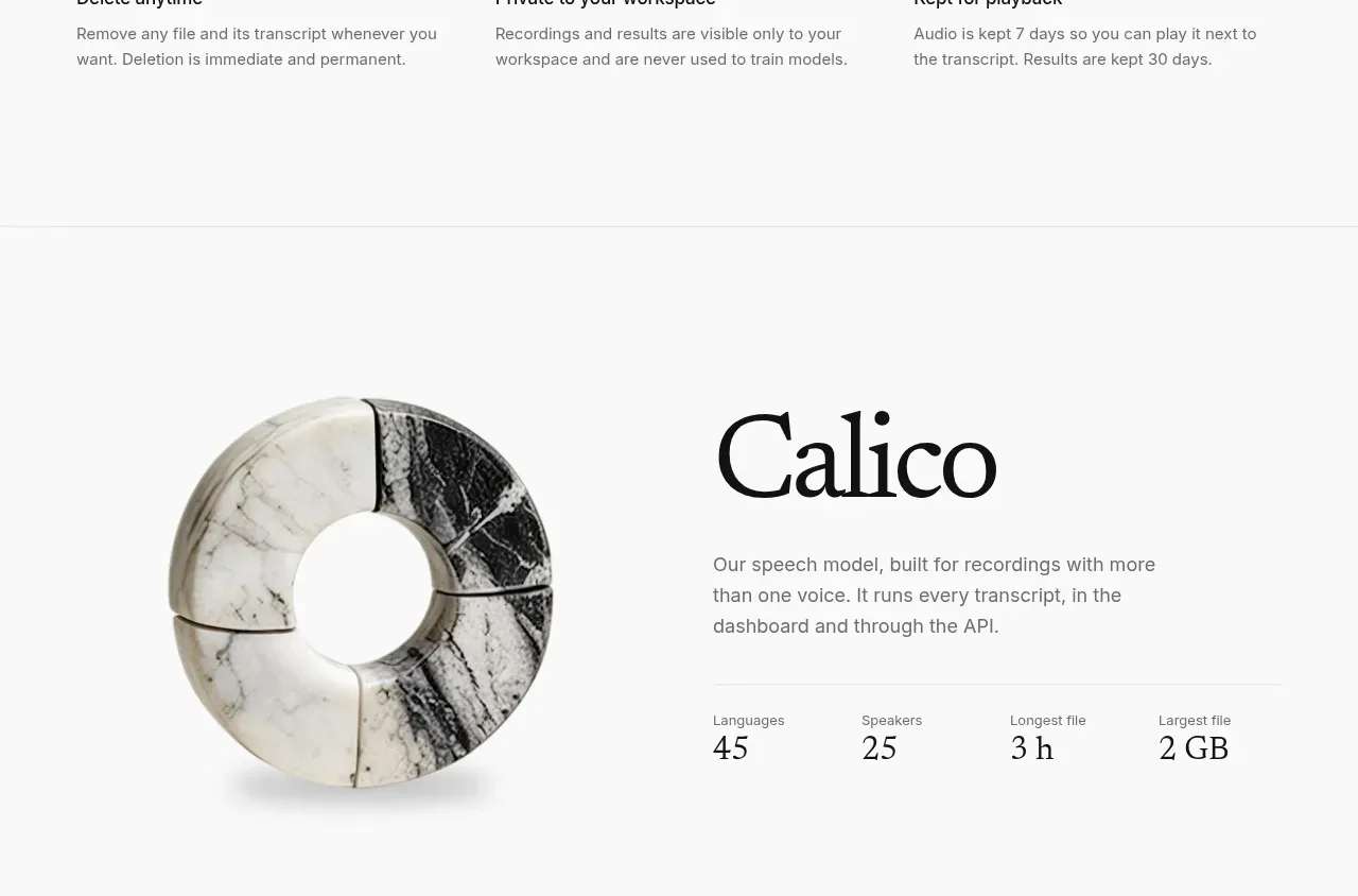 Model capability profile
Maybloc · Stats
Model capability profile
Maybloc · Stats
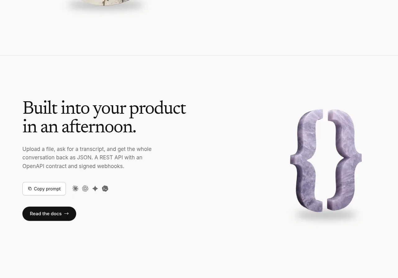 Developer integration CTA
Maybloc · Call to action
Developer integration CTA
Maybloc · Call to action
 Marble-backed final CTA
Maybloc · Call to action
Marble-backed final CTA
Maybloc · Call to action
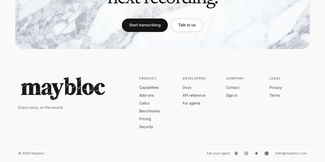 Multi-column site footer
Maybloc · Footer
Multi-column site footer
Maybloc · Footer