kage
kage

Design analysis
A Mac meeting-translation app sold with a deliberately friendly, rounded visual language: chunky rounded display type, a hand-drawn yellow underline on the hero keyword, a blob mascot, and dark navy app mockups that pop against an off-white ground. The page runs airy centred hero → giant app mockup → dense bilingual bento grid of feature cards with dark inset UI panels → three-step onboarding row → a full-bleed navy privacy band that breaks the rhythm → three-tier pricing where only the "Most popular" card is dark → a narrow FAQ accordion → a rounded dark CTA card. Yellow does almost all accent work (alerts, badges, the Pro CTA), while blue eyebrows, green success chips and per-speaker colours organise the dense product UI; every feature is demonstrated with real-looking English/Japanese dialogue, giving the whole page a bilingual texture.
Prompt preview
## Reference images

Study these alongside the description below: hierarchy, rhythm, spacing, colour. Build for the product you are asked about, using this design language.

- Full page: https://kage-design-assets.t3.tigrisfiles.io/screenshots/nani/f548445b-7dd2-48a7-847f-0684381711f2-1792217012251-full.webp
- Above the fold: https://kage-design-assets.t3.tigrisfiles.io/screenshots/nani/f548445b-7dd2-48a7-847f-0684381711f2-1792217007353.webp
- Design on Kage: https://kage.design/designs/nani-landing-page

# Build a playful, bilingual-friendly landing page for a desktop utility

## Before you start
Ask the user what they are building, who it is for (platform, audience, use case), and what brand assets they already have (name, logo, colours, typefaces). Wait for the answers before writing any code. Everything below is a design language to apply to *their* product — never reproduce the reference product, its name, mascot or copy.

## Page structure
1. **Top nav** — slim bar on light ground: wordmark + small logo mark left; 4 text links right of centre; a theme-toggle icon button; a solid near-black pill CTA on the far right.
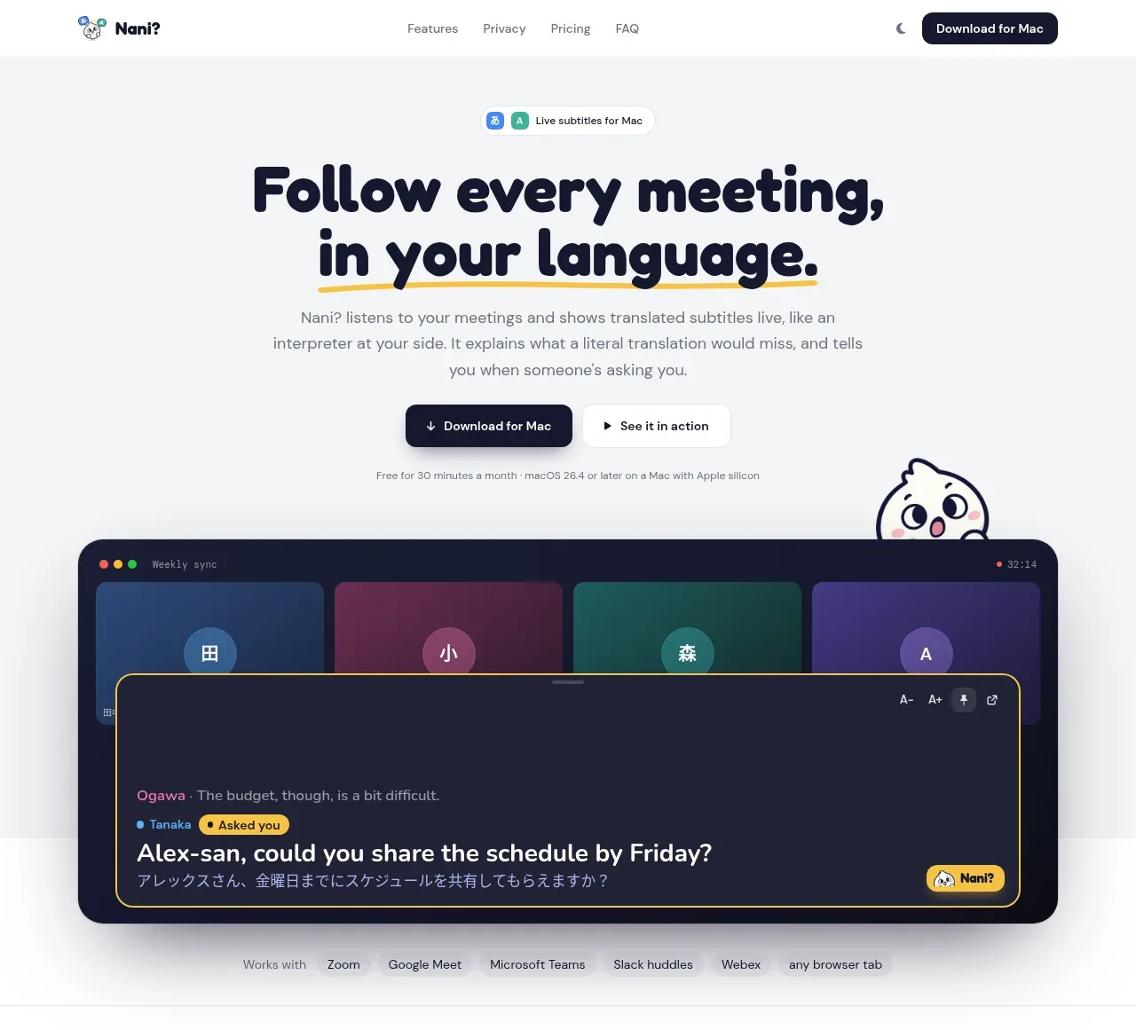
2. **Hero (centred, airy)** — tiny pill badge with two micro-icons; two-line rounded display headline where the key phrase gets a hand-drawn yellow underline stroke; two-sentence subcopy; two CTAs side by side (solid dark pill with ↓ arrow + quiet outlined pill); one line of fine print (free tier + OS requirement); small mascot peeking from the right edge.
3. **Hero product mockup** — one large dark rounded "overlay window" screenshot: macOS traffic lights, session title, timer; stacked coloured meeting-tile cards behind; foreground panel with a yellow border showing a speaker line, a highlighted "asked you" alert badge, the translated question and the original-language line beneath, plus a small logo chip. Below it, a quiet "Works with" strip: grey label + row of pill chips naming integrations.
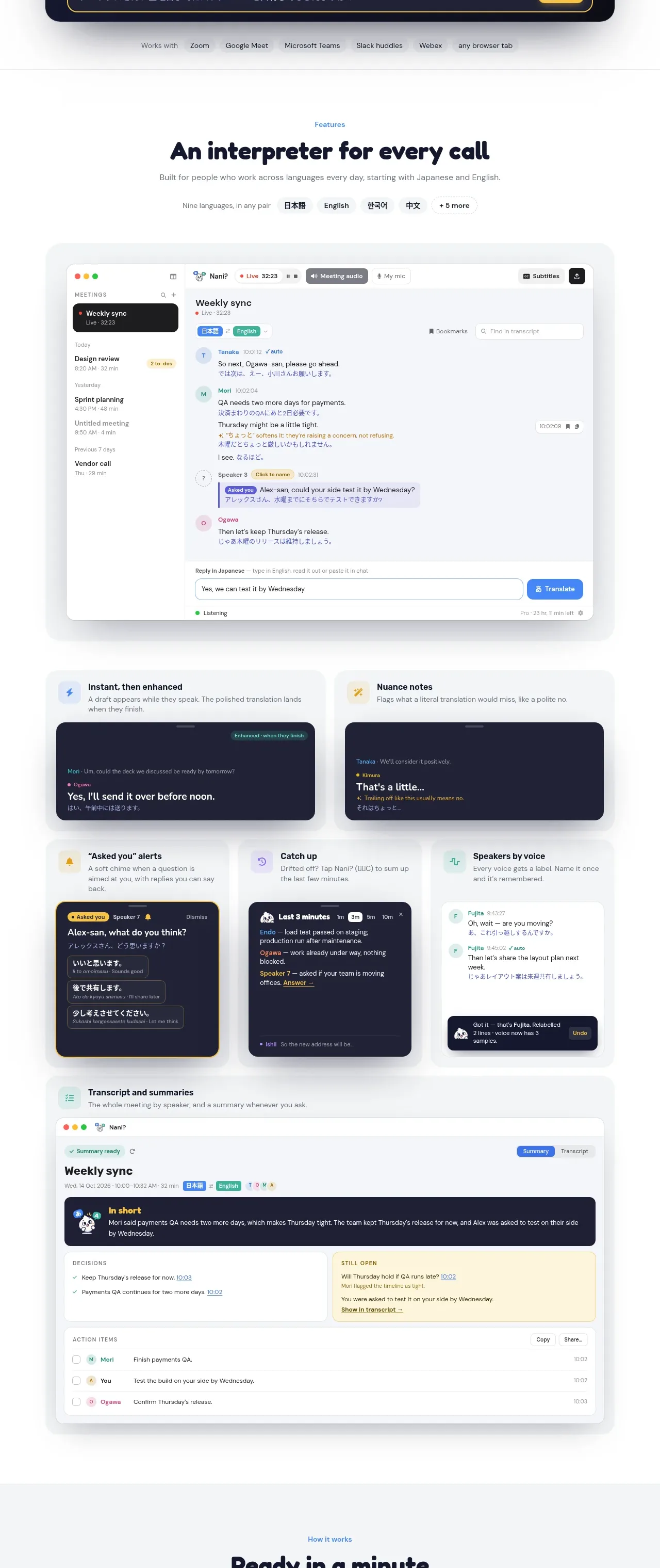
4. **Features section header** — small blue eyebrow in caps, big rounded headline, one-line sub, then a row of language pills (4 real ones + a "+N more" pill).
5. **Main app screenshot** — one wide light card containing the full product window: left sidebar with a meetings list (live meeting flagged with a red dot, past meetings with times/durations), main transcript pane with per-speaker colour chips, bilingual message pairs (translation bold, original language dimmer beneath), an amber "nuance" annotation line, one highlighted question bubble, and a bottom composer ("type in English, reply in Japanese" pattern) with an accent Translate button and a listening status dot.
6. **Bento grid (2 rows)** — Row A: two wide light cards, each with icon + title + one-line explanation and a dark inset mockup panel (before/after translation; nuance explanation). Row B: three cards — an alert card with a yellow-bordered mockup listing 2–3 short reply options the user can tap; a dark "catch-up summary" card with time-window chips (1m/3m/5m); a light "recognise voices" card with labelled speaker rows and a small confirmation toast. Vary card heights deliberately.
7. **Wide summary card** — one full-width light card titled "transcript and summaries": dark "In short" summary banner, two-column list (Decisions with timestamps; a yellow "Still open" callout with an action reminder), then an Action-items checklist with per-item avatar, due time, and Copy/Share pill buttons.
8. **How it works** — blue eyebrow + headline, then three equal step cards with coloured number dots (1 blue, 2 teal, 3 yellow), short title + one-line body; step 3 shows keyboard keys as inset key-cap chips.
9. **Privacy band (full-bleed dark navy)** — left column: eyebrow, large white headline, paragraph, a "what we keep" row of three chips, underlined policy link; right column: a dark card with an on-device badge, a 2×2 grid of capability tiles (icon + title + one-liner, some with illustrative micro-visuals), and two wide cards beneath labelled with data-flow categories (AUDIO / SENTENCES style captions).
10. **Pricing** — blue eyebrow + headline + one-line sub; a Monthly/Yearly toggle (with "save up to N%" note) next to a currency switch (two 3-letter codes); three cards: left light "Free" card with big $0 and check list; middle dark navy "Most popular" card (yellow tag, struck-through price + green early-access badge, yellow CTA); right light top-tier card. Check lists use small green checks. Footnote lines on early-access pricing, then a row of four small info cards (top-up, billing rule, cancellation, checkout/tax clarity) each with icon + title + two-line body.
11. **FAQ** — narrow centred column: eyebrow + headline "Questions"-style, ~8 accordion rows (white pills, question left, + icon right), then a quiet contact line with a mailto link.
12. **Final CTA** — inset rounded dark navy card: two mascot speech bubbles with a character from each supported language, big white rounded headline, one-line sub with platform requirements, solid yellow pill CTA, tiny legal microcopy with underlined links.
13. **Footer (light)** — logo + one-sentence blurb ("made by [studio] in [city]") left; two link columns (Legal, Support); bottom hairline with copyright and third-party trademark notice.

## Design language
- **Ground and ink**: page background is a near-white warm grey `#F5F6F8` with white cards/sections; ink is a near-black navy `#1A1D29`; dark surfaces (mockups, privacy band, popular plan, closing CTA) are deep navy `#151A2E` with panel insets at `#1E2440`.
- **Accent discipline**: one warm yellow `#FFC93C` carries all "attention + action" moments (hero underline, alert badges, primary CTA on dark surfaces, callouts). Blue `#4A7DFF` is only for wayfinding (eyebrows, links, step 1). Green `#2FBF71` marks positive/success; red `#F4587A` marks live state. Give speakers/people their own stable colours inside product mockups.
- **Type**: a very rounded, heavy display face for headlines, prices and numbers (think Baloo 2 / Quicksand weight 700–800), paired with a neutral sans for body and UI (Inter, 15–16px/1.6). Timestamps, durations and version strings in a small mono (12px). Include a CJK fallback so second-language sample text renders cleanly. Scale: hero ~64px, section headlines ~40px, card titles 18–20px, eyebrows 12–13px caps with wide tracking.
- **Hierarchy rule**: every section = eyebrow → headline → one-sentence sub, then the evidence (mockup, card, steps). Headers are centred; evidence blocks are full-width and left-aligned inside.
- **Cards**: flat light-grey `#EFF1F4` surfaces with 20–24px radius, no borders and no shadows — depth comes only from the dark inset mockup panels (radius 14–16px) sitting inside them. Dark cards get 1px subtle inner borders instead of shadows.
- **Rhythm down the page**: hero is airy (120px+ padding); the bento/features zone is dense and information-rich; the full-bleed dark privacy band is the single hard rhythm break; pricing returns to light; the FAQ narrows to ~640px; the page closes on the dark CTA card, then a quiet footer. Alternate these beats — never two dark sections back to back.
- **Bilingual texture**: inside every product mockup, show a translated line and the original-language line together; this is the page's storytelling device — apply it to the user's own domain.
- **Motion/interaction**: hover lifts cards ~2px with a slightly stronger surface; the live dot pulses; accordions expand smoothly with the + rotating to ×; toggles slide; keyboard chips look pressable. Nothing bounces or parallax — restraint keeps the playfulness in the type and mascot, not in motion.

## Never
Do not use the reference product's name, wordmark or logo, its blob mascot or its speech-bubble characters, its integration list, its Japanese/English sample dialogue, its pricing numbers, or any of its copy. Do not present the result as that product. Never classify or imitate any blocked/empty capture as a design.
Components from this page
All components
 Top navigation
NANI??? · Navigation
Top navigation
NANI??? · Navigation
 Translation meeting hero
NANI??? · Hero
Translation meeting hero
NANI??? · Hero
 Feature showcase
NANI??? · Feature grid
Feature showcase
NANI??? · Feature grid
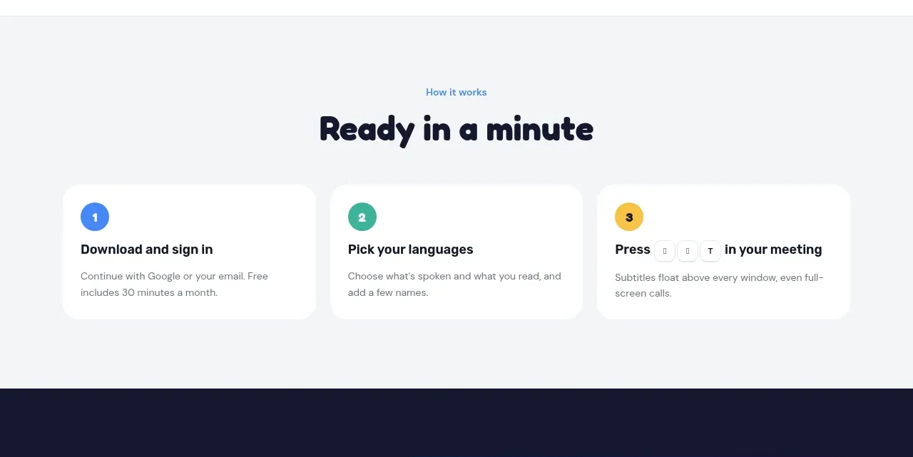 Three-step setup
NANI??? · Feature grid
Three-step setup
NANI??? · Feature grid
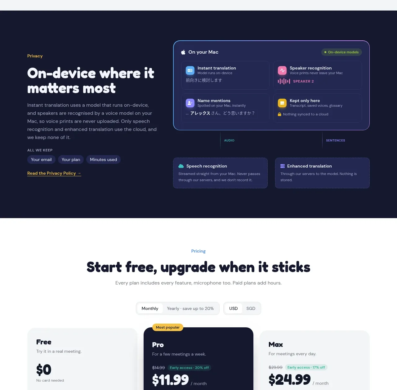 Privacy architecture
NANI??? · Feature grid
Privacy architecture
NANI??? · Feature grid
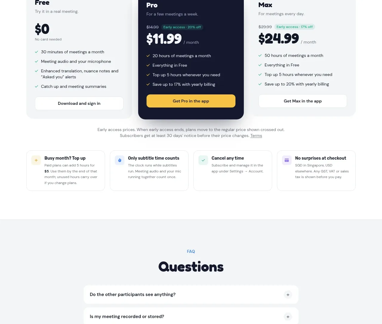 Three-plan pricing
NANI??? · Pricing table
Three-plan pricing
NANI??? · Pricing table
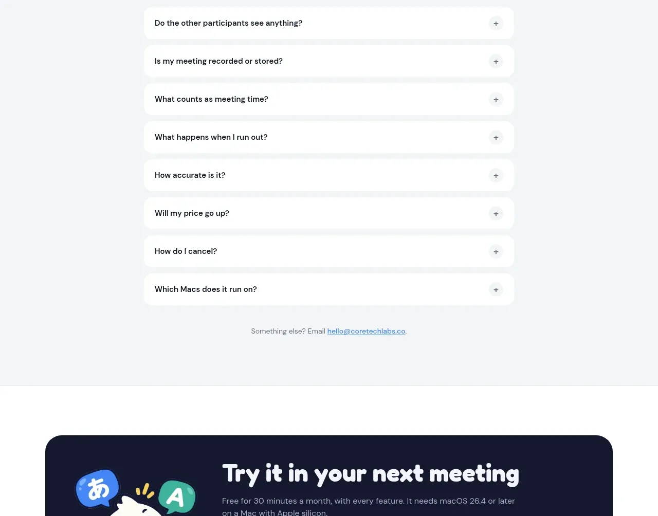 Frequently asked questions
NANI??? · FAQ
Frequently asked questions
NANI??? · FAQ
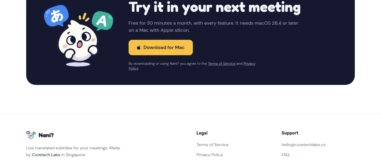 Download call to action
NANI??? · Call to action
Download call to action
NANI??? · Call to action
 Site footer
NANI??? · Footer
Site footer
NANI??? · Footer