kage
kage
opencode.ai
Design analysis
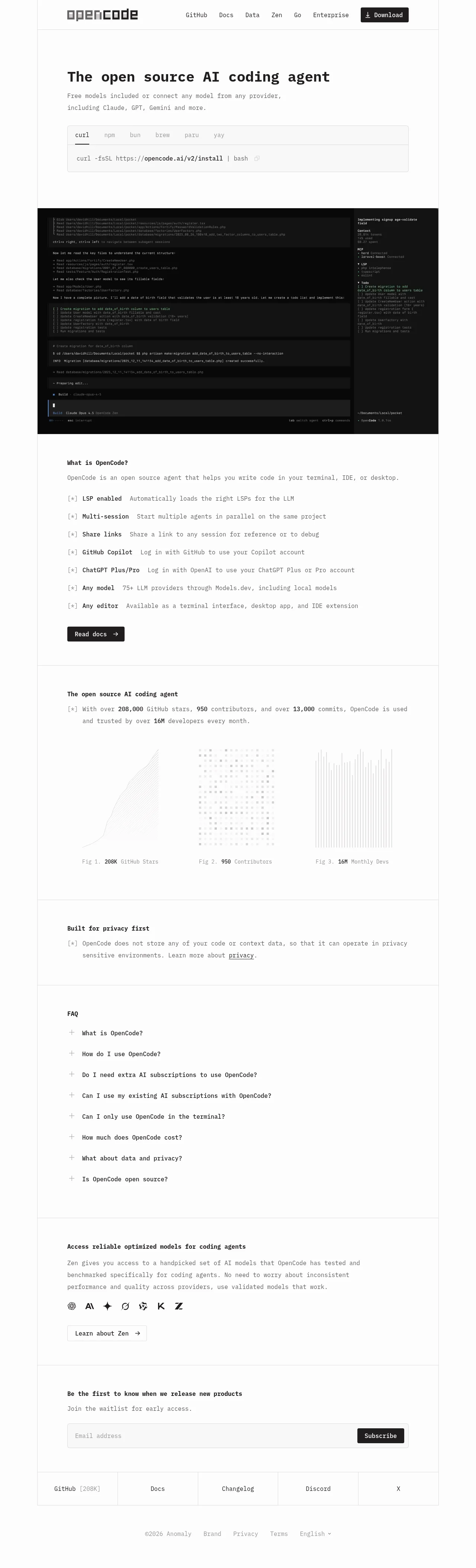
A terminal-native landing page set entirely in monospace type on a white canvas, divided by 1px hairline rules instead of cards or gradients. The hero states one claim, then hands proof to a full-width black TUI capture rather than illustration, followed by a tabbed install command for every package manager. Down the page the rhythm alternates sparse manifesto lines (`[*]`-marked privacy statement, traction stats) with dense reference-style blocks (feature list, FAQ accordion), and traction numbers are treated as academic figures — captioned generative line, dot and bar plots. A bordered footer grid of equal cells closes the page like a terminal table.
Prompt preview
## Reference images

Study these alongside the description below: hierarchy, rhythm, spacing, colour. Build for the product you are asked about, using this design language.

- Full page: https://kage-design-assets.t3.tigrisfiles.io/screenshots/opencode-2-0/565a21f1-5840-46fe-9e23-a71210513fd4-1791957827568-full.webp
- Above the fold: https://kage-design-assets.t3.tigrisfiles.io/screenshots/opencode-2-0/565a21f1-5840-46fe-9e23-a71210513fd4-1791957823565.webp
- Design on Kage: https://kage.design/designs/opencode-2-0-landing-page

# Terminal-native monospace landing page

## Before you start
Ask the user:
- What are you building, and what is the single sentence that describes it?
- Who is it for (engineers, agencies, enterprises, hobbyists)?
- What brand assets exist: product name, logo/wordmark, brand colours, an existing typeface?
Wait for the answers before writing any code. Everything below is applied to their product and brand — this reference describes the design language only, not the content.

## Page structure
Build a single-column landing page with these sections, top to bottom:
1. **Top nav**: wordmark on the left (text is fine), 4–6 plain text links, and one solid black button (e.g. Download / Get started) on the right. Thin bottom border.
2. **Hero**: a left-aligned, very large monospace headline (one sentence), a short two-line muted sub-paragraph, then an install widget: a bordered box with a row of tabs (curl, npm, brew, or the package managers relevant to the product) over a copyable one-line command with a copy icon. This is the primary CTA, not a marketing button.
3. **Terminal proof (full-bleed)**: a full-content-width dark block showing the product actually working — a real terminal UI capture or a faithful simulated transcript: chat/agent log on the left, a status sidebar on the right (context, services, task list), monospace at small size. Keep it authentic, dense and slightly noisy, like a real session.
4. **What it is / feature rundown**: small bold heading ("What is X?"), one sentence of prose, then a list of 6–8 features, each a single row: an ASCII-style `[*]` marker, a bold inline label, then a regular-weight one-line description. Close with a solid black button ("Read docs →").
5. **Traction figures**: a `[*]` sentence with the key numbers set in bold (stars, contributors, users — or the user's equivalent metrics), then three monochrome generative graphics side by side in a 3-column grid: a line-slope plot, a scattered dot plot, and a vertical bar plot, each captioned below like an academic paper: "Fig 1. **208K** GitHub Stars". Render these with lightweight SVG/canvas in grays only.
6. **Privacy/trust statement**: deliberately sparse — one small bold heading and a single `[*]` sentence with one underlined link. Let the whitespace do the work.
7. **FAQ accordion**: small bold "FAQ" heading, then 7–9 questions as full-width rows with a thin divider, a `+` icon on the left, and smooth expand/collapse on click.
8. **Secondary product cross-sell**: small bold heading, one short paragraph, a row of 6–8 small monochrome provider/partner glyphs, and a ghost button ("Learn about X →").
9. **Waitlist/newsletter**: small bold heading, one-line sub-copy, then a full-width input field with a black Subscribe button flush at the right end of the same field.
10. **Footer grid**: a row of 5 equal cells separated by hairline borders, each a link (GitHub with the star count in brackets, Docs, Changelog, community, social). Below it a small legal row: ©year company, Brand, Privacy, Terms, and a language selector.

## Design language
- **One typeface**: a single monospace family (e.g. a JetBrains Mono-style stack) for everything — headings, body, buttons, captions. Hierarchy comes from size and weight, never from mixing typefaces. H1 ≈ 56–72px bold; section headings ≈ 15–16px bold; body ≈ 14–15px at 1.6 line height; captions ≈ 12–13px muted.
- **Palette (strict)**: white `#FFFFFF` page, near-black `#111111` text, muted gray `#737373` for secondary copy, hairline borders `#E5E5E5`, and pure black `#0A0A0A` reserved for the terminal block and primary buttons (white text). No accent colour anywhere — contrast comes from black-on-white inversion, not hue.
- **Structure through rules, not cards**: separate every section with a full-width 1px hairline border. No rounded cards, no shadows, no gradients. Content column ≈ 720–780px for prose; the terminal block breaks out wider. Vertical padding between sections ≈ 96–128px.
- **ASCII punctuation as design**: use `[*]` glyphs instead of bullet dots, `+` icons on accordions, `→` arrows in buttons, and bracketed counts like `GitHub [208K]`. These markers replace icons almost everywhere.
- **Academic figure treatment**: caption every visual as "Fig N." with the number bolded and repeated in the caption — it turns marketing metrics into evidence.
- **Rhythm**: alternate density deliberately — sparse manifesto sections (one or two lines, lots of air) against dense reference blocks (FAQ, feature list, footer). The black terminal block is the page's single high-contrast anchor and must sit high, right after the hero.
- **Controls**: buttons are rectangles with 2–4px radius, black fill, white monospace text, arrow glyph; secondary buttons are ghost with a 1px border. Inputs are flat fields with a hairline border, no floating labels.
- **Motion**: nearly none — tab switching in the install widget, copy-to-clipboard confirmation, accordion expansion, subtle hover underlines on links. Anything more breaks the deadpan tone.
- **Proof over polish**: prefer real product surfaces (terminal output, file paths, commands, counts) over illustration, icons or photography.

## Never
- Do not reuse the OpenCode wordmark, logo, product names (OpenCode, Zen, Anomaly), copy, install URL, or any provider logos from the reference.
- Do not present the result as OpenCode or imply affiliation; apply the design language to the user's own product, name and metrics.
- Do not add decorative colour, gradients, glassmorphism, illustrations, photography or emoji — the system is monochrome and typographic.
Components from this page
All components
 Minimal developer navigation
OpenCode 2.0 · Navigation
Minimal developer navigation
OpenCode 2.0 · Navigation
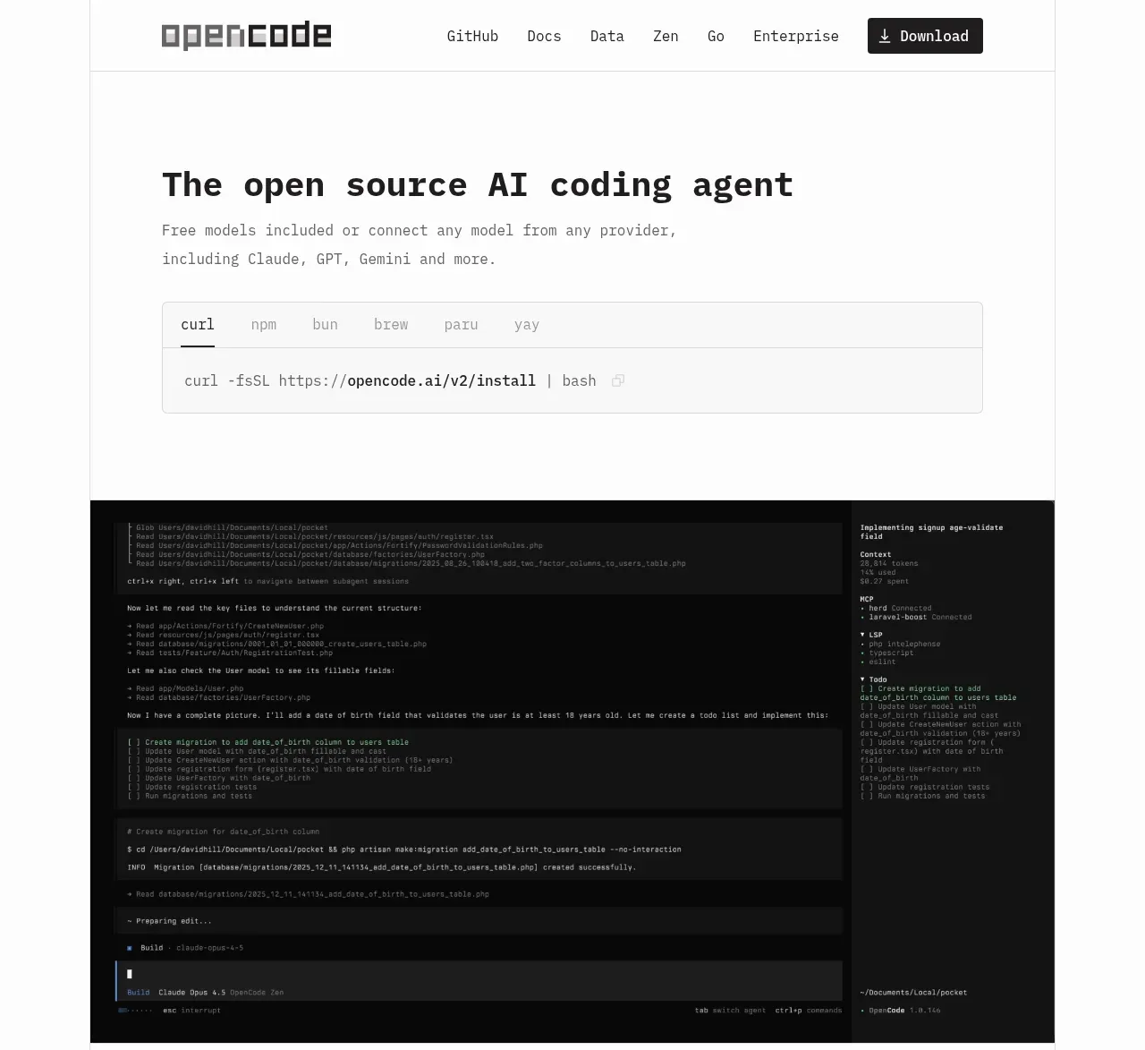 Terminal-first product hero
OpenCode 2.0 · Hero
Terminal-first product hero
OpenCode 2.0 · Hero
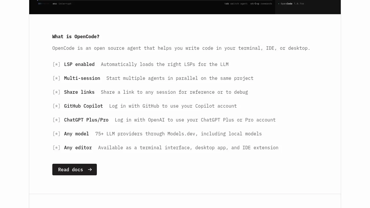 Core capabilities overview
OpenCode 2.0 · Feature grid
Core capabilities overview
OpenCode 2.0 · Feature grid
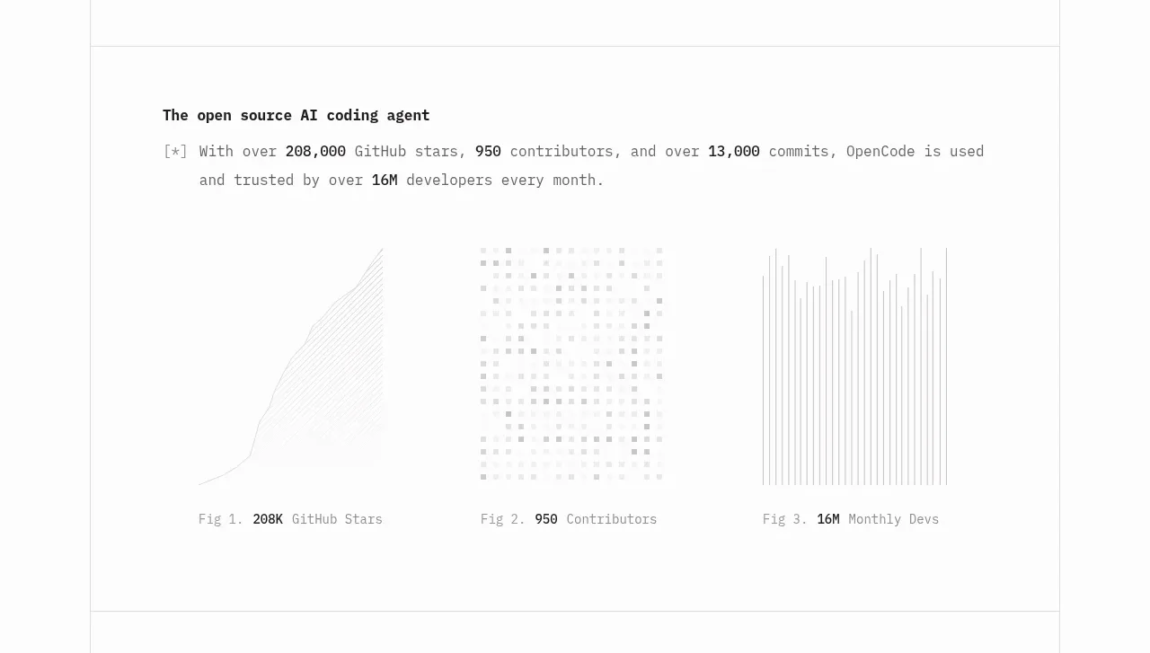 Adoption proof visualizations
OpenCode 2.0 · Stats
Adoption proof visualizations
OpenCode 2.0 · Stats
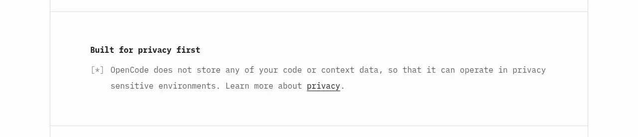 Privacy commitment
OpenCode 2.0 · Card
Privacy commitment
OpenCode 2.0 · Card
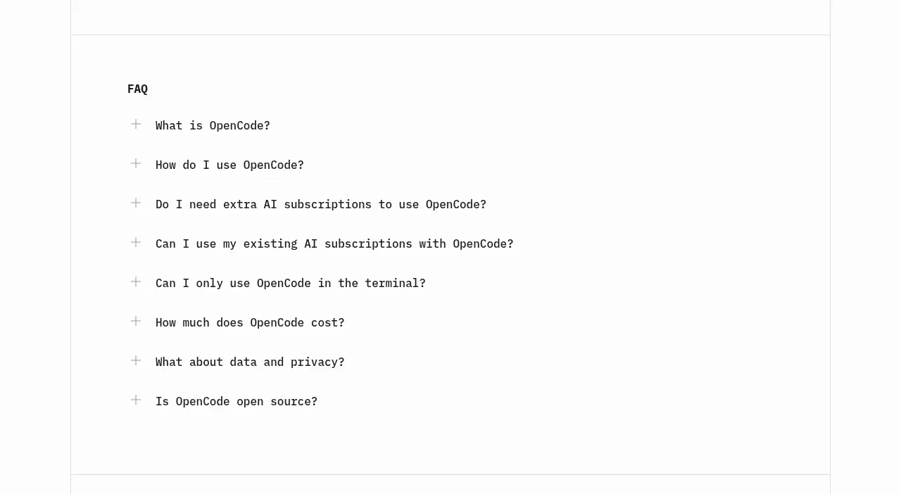 Frequently asked questions
OpenCode 2.0 · FAQ
Frequently asked questions
OpenCode 2.0 · FAQ
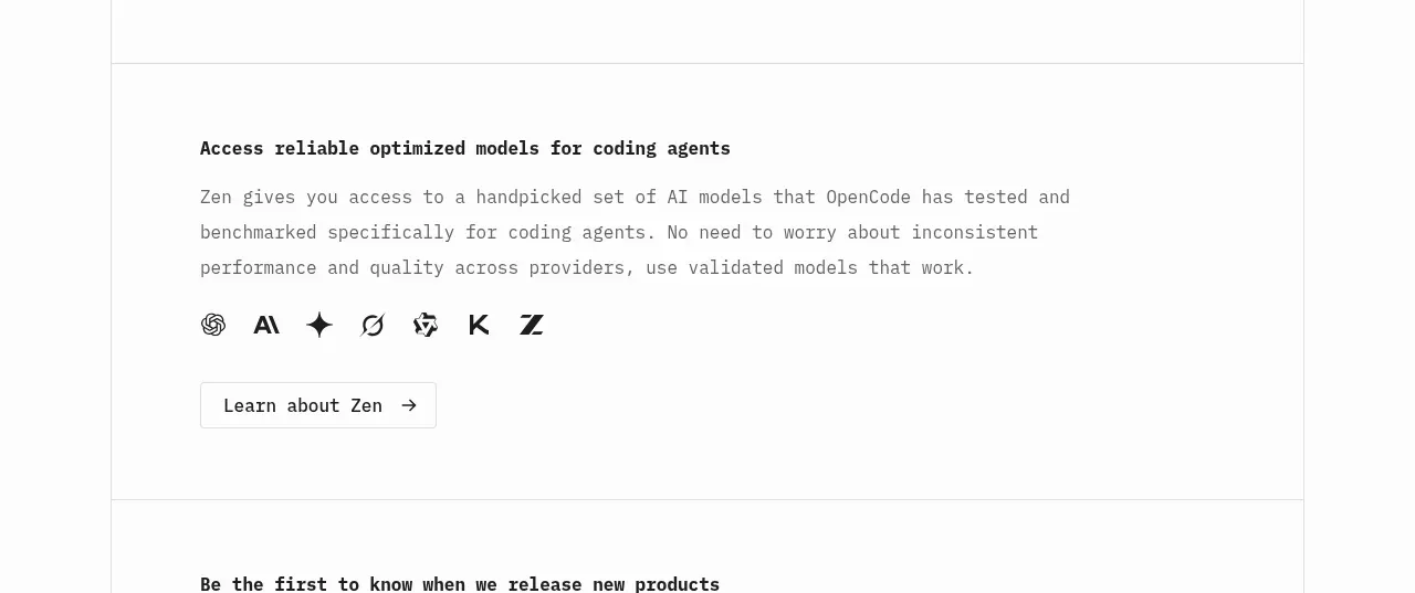 Model access feature block
OpenCode 2.0 · Feature grid
Model access feature block
OpenCode 2.0 · Feature grid
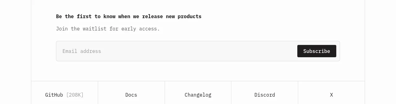 Early-access signup
OpenCode 2.0 · Form
Early-access signup
OpenCode 2.0 · Form
 Utility link footer
OpenCode 2.0 · Footer
Utility link footer
OpenCode 2.0 · Footer