kage
kage
openflowkit.com

Design analysis
A long-form product landing page uses an off-white canvas, oversized black typography, and a restrained orange accent to frame a sequence of diagram-led product stories. The page moves from a spacious hero and flow illustration into alternating two-column explanations, dense feature cards, framed product mockups, a dark cinematic showcase, FAQ rows, and a high-contrast orange CTA/footer, with rounded borders and very soft shadows keeping the interface tactile but quiet.
Prompt preview
## Reference images

Study these alongside the description below: hierarchy, rhythm, spacing, colour. Build for the product you are asked about, using this design language.

- Full page: https://kage-design-assets.t3.tigrisfiles.io/screenshots/openflowkit-2/3de20331-4179-415d-a7ba-29915155b155-1791957697393-full.webp
- Above the fold: https://kage-design-assets.t3.tigrisfiles.io/screenshots/openflowkit-2/3de20331-4179-415d-a7ba-29915155b155-1791957693190.webp
- Design on Kage: https://kage.design/designs/openflowkit-2-landing-page

## Before you start
Ask the user what they are building, who it is for, and what brand assets they already have (name, colours, type, logo, imagery, and product UI). Wait for their answers before designing. Apply every instruction below to their product, not to the reference product.

## Page structure
1. **Top navigation:** Use a compact, centered header on an off-white background with a small brand mark at left, a short set of links in the middle, and utility controls plus a bordered primary action at right.
2. **Announcement pill:** Place a small rounded update pill above the hero headline, with a tiny accent indicator and a short link treatment.
3. **Hero:** Build a large two-line centered headline with the key phrase highlighted in the brand accent. Add a restrained supporting sentence, paired primary and secondary buttons, and a tiny reassurance row beneath.
4. **Hero product flow:** Show a wide, airy diagram composition below the hero: connected cards, directional curved lines, small agent labels, and a lightweight toolbar/input affordance. Keep the illustration as the visual proof of the product rather than using photography.
5. **Trust strip:** Add a slim row below the flow with a small social-proof badge on the left and three concise product principles on the right, separated from the next section by a hairline rule.
6. **Intro statement:** Center a small eyebrow, a medium-large headline with one accented phrase, and a short subtitle introducing the product’s core workflow.
7. **Embedded demo panel:** Use a large rounded bordered media frame with generous empty space, a centered statement, a compact row of pill-like interaction modes, and a small play control.
8. **Three-use-case section:** Introduce a left-aligned headline and right-aligned explanatory copy, then arrange one large tinted feature card beside two smaller stacked cards. Each card should include an eyebrow, bold title, short description, arrow affordance, and a small diagram fragment.
9. **Repository mapping section:** Use the same split heading/copy rhythm, then place a full-width framed application mockup showing a browser/repository bar, dotted canvas, connected service nodes, and a bottom status strip.
10. **Technology coverage section:** Present a two-column heading and explanatory text, followed by a horizontal field of small technology chips with varied recognizable colour accents.
11. **Architecture exploration section:** Repeat the split heading/copy pattern and show a large framed architecture canvas with tabs, grid background, labeled nodes, connectors, and a small contextual footer.
12. **Creative canvas section:** Place a smaller diagram mockup on the left and an explanatory text block on the right. Use expressive shapes, freehand connectors, notes, charts, and a short list of supported visual primitives.
13. **Output links row:** Add a compact horizontal row of export or capability links with tiny labels and one-line descriptions.
14. **Agent integration section:** Use a bordered two-column section with heading/copy on the left, supported-agent badges or text links below, and a terminal or command-window mockup on the right.
15. **Code-to-diagram section:** Add another split heading/copy introduction followed by a wide two-pane framed demo: source syntax on the left, rendered diagram preview on the right, and small action controls along the bottom.
16. **Feature grid:** Introduce a final utility-focused heading and arrange an asymmetric bento grid of cards. Include a large tinted card, several compact cards, code snippets, provider chips, layout examples, sharing controls, diagram-type pills, and export-format pills.
17. **Dark cinematic showcase:** Switch to a near-black full-width band. Use an accented headline and a wide dark diagram/player mockup with glowing connectors, playback controls, and subtle orange highlights; make this section feel denser and more cinematic than the rest.
18. **Open-source CTA:** Return to the light background with a left-side orbital/product graphic and a right-side headline, supporting copy, and GitHub-style action. Keep the message direct and the composition spacious.
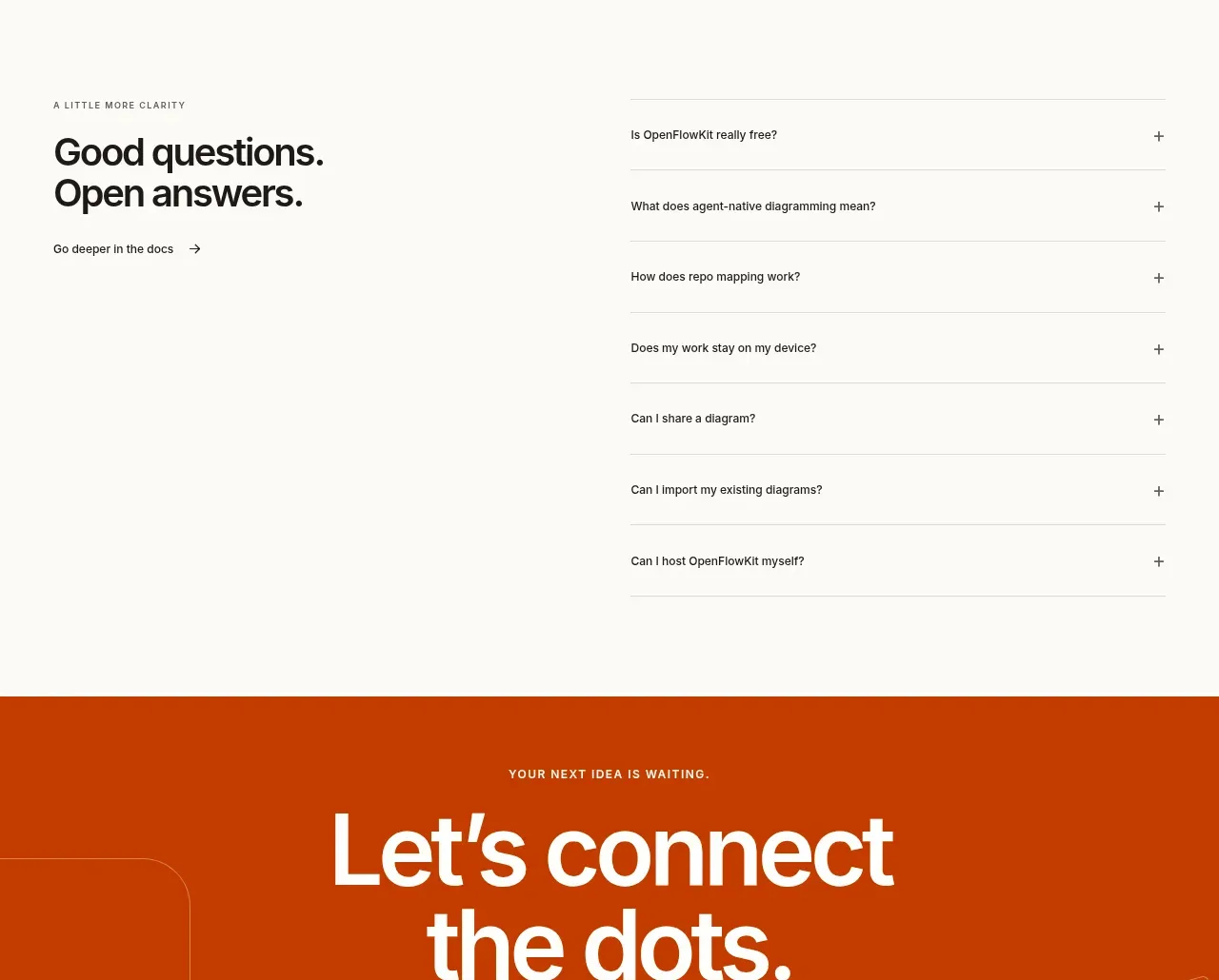
19. **FAQ section:** Use a two-column layout with a heading and docs link on the left and a vertically stacked accordion list on the right. Separate questions with fine horizontal rules and simple plus controls.
20. **Final CTA band:** Use a full-width saturated orange panel with centered white oversized type, a dark button, small eyebrow and reassurance text, plus faint abstract connector lines in the background.
21. **Footer:** Finish with a light multi-column footer: brand and short descriptor at left, social links below, then grouped navigation columns. Add a thin bottom rule and tiny legal/status metadata.

## Design language
- Build hierarchy through scale and spacing: use very large, tightly set sans-serif headlines, small uppercase eyebrows with generous tracking, short gray body copy, and compact utility labels.
- Keep the page editorial and product-led: alternate spacious text-led bands with dense framed interface demonstrations so the rhythm changes as the user scrolls.
- Use an off-white base around `#fbfaf7` or `#f8f7f3`, near-black text around `#171614`, and a warm orange accent around `#d94a0b` to highlight only key words, active borders, connectors, and primary actions.
- Reserve stronger colour for interaction and emphasis. Let most diagrams use white, pale gray, muted beige, soft peach, and occasional green, blue, or purple node accents rather than colourful backgrounds.
- Pair a modern grotesk sans-serif for all interface text with weight and size doing most of the work; use tight line-height for display headlines and relaxed line-height for explanatory copy.
- Use thin neutral borders, subtle inner strokes, small-to-medium corner radii, and very soft shadows on cards and mockups. Avoid heavy elevation, glossy gradients, and excessive decoration.
- Give product screenshots a consistent canvas language: faint dotted grids, labeled nodes, thin curved connectors, small pills, browser/tool headers, and compact status bars.
- Use asymmetric editorial grids: large left-anchored statements with narrower right copy, then full-width media frames or bento cards. Keep section gutters wide and vertical spacing generous.
- Let cards vary in tint and size while maintaining a shared border, radius, padding, and arrow affordance. Use peach/orange-tinted cards sparingly as visual anchors.
- Treat the dark showcase as a deliberate tonal break: use `#151311` or `#191714`, dim gray text, orange edge light, and restrained glow around active diagram paths.
- Motion should be subtle and purposeful: animate diagram connectors, node reveals, chip hover states, accordion expansion, and media playback controls without introducing constant parallax or distracting looping effects.
- Make responsive behavior preserve the narrative: collapse split sections into stacked blocks, turn bento grids into one-column cards, keep diagrams horizontally scrollable or scaled inside framed containers, and retain generous mobile spacing.

## Never
- Never copy logos, wordmarks, product names, slogans, exact copy, illustrations, photography, icon sets, diagram content, provider marks, or branded UI from the reference.
- Never present the result as OpenFlowKit or imply affiliation with it.
- Replace all reference-specific assets and language with the user’s own product, audience, brand system, and content while preserving only the reusable layout and design principles.
Components from this page
All components
 Global navigation
OpenFlowKit 2 · Navigation
Global navigation
OpenFlowKit 2 · Navigation
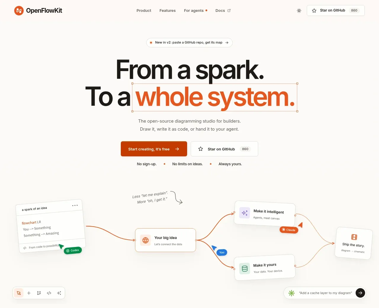 Product positioning hero
OpenFlowKit 2 · Hero
Product positioning hero
OpenFlowKit 2 · Hero
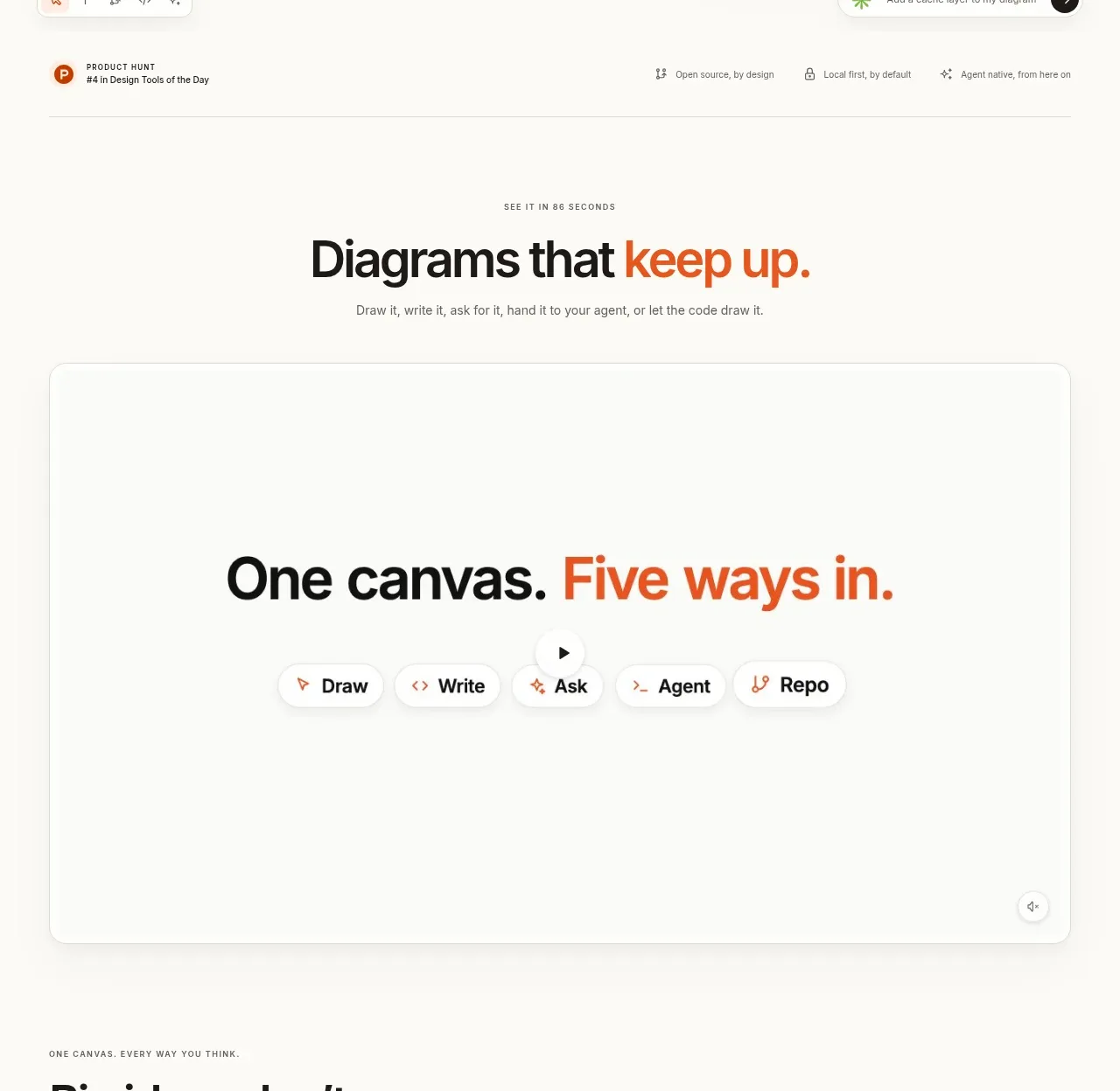 Canvas modes showcase
OpenFlowKit 2 · Feature grid
Canvas modes showcase
OpenFlowKit 2 · Feature grid
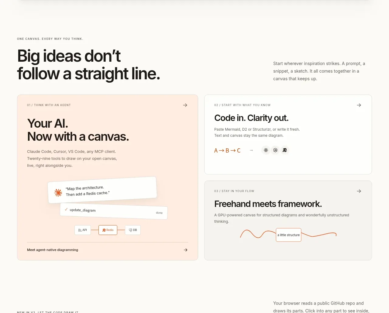 Workflow benefits grid
OpenFlowKit 2 · Feature grid
Workflow benefits grid
OpenFlowKit 2 · Feature grid
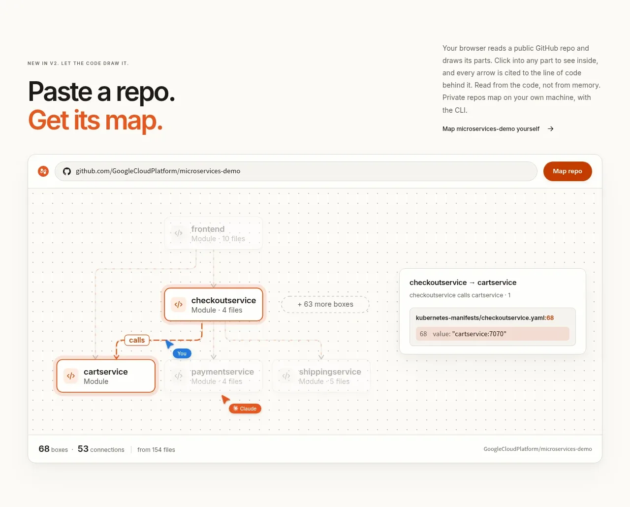 Repository mapping demo
OpenFlowKit 2 · Gallery
Repository mapping demo
OpenFlowKit 2 · Gallery
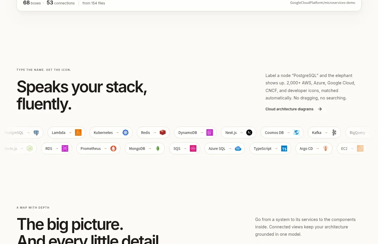 Technology compatibility
OpenFlowKit 2 · Logo cloud
Technology compatibility
OpenFlowKit 2 · Logo cloud
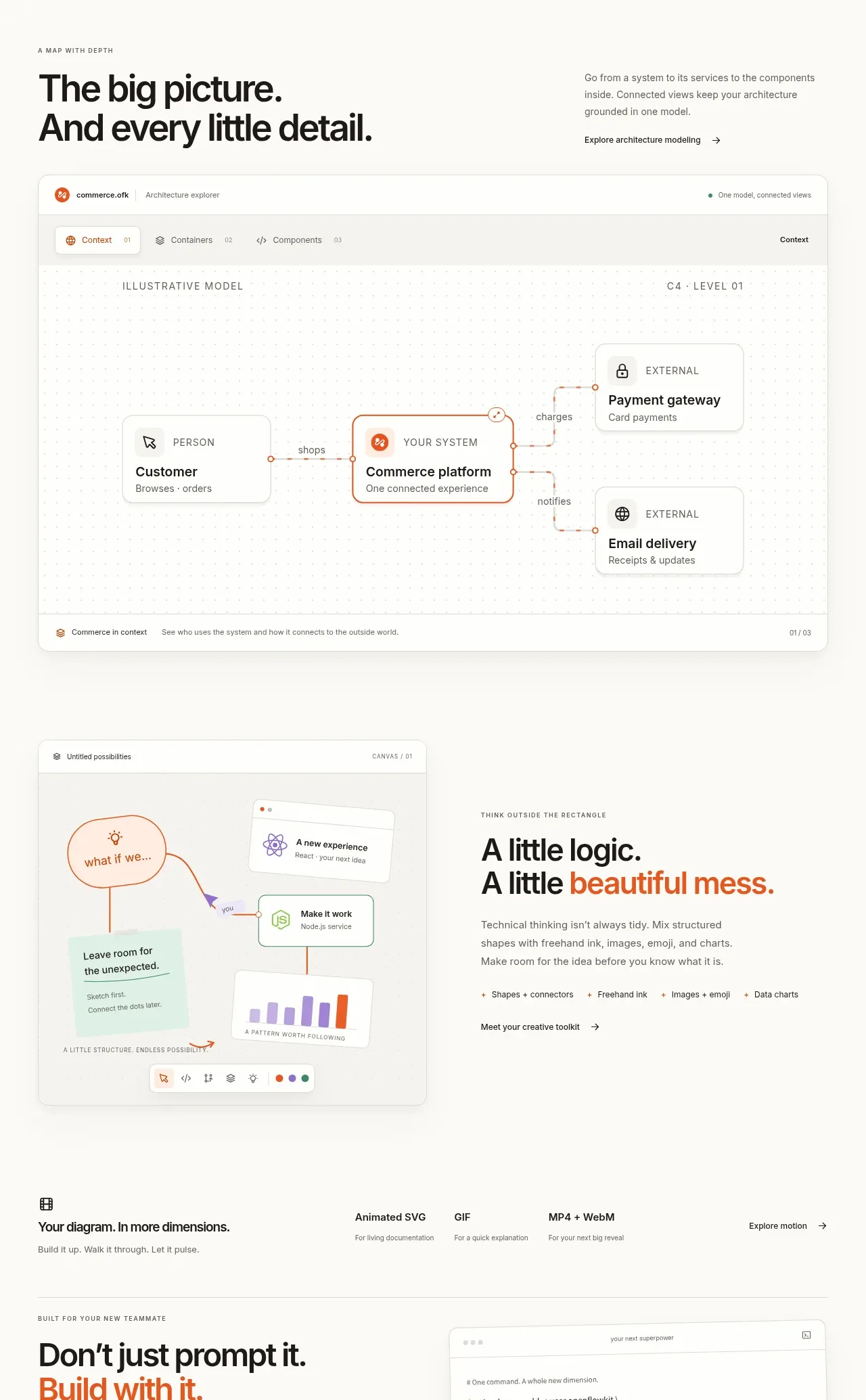 System overview canvas
OpenFlowKit 2 · Gallery
System overview canvas
OpenFlowKit 2 · Gallery
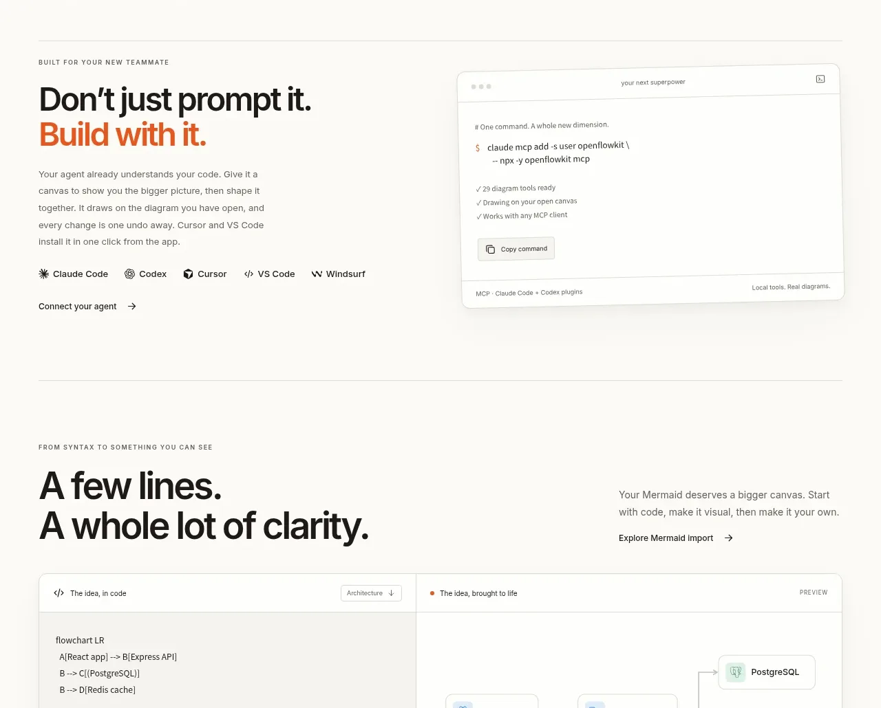 Agent and developer workflows
OpenFlowKit 2 · Feature grid
Agent and developer workflows
OpenFlowKit 2 · Feature grid
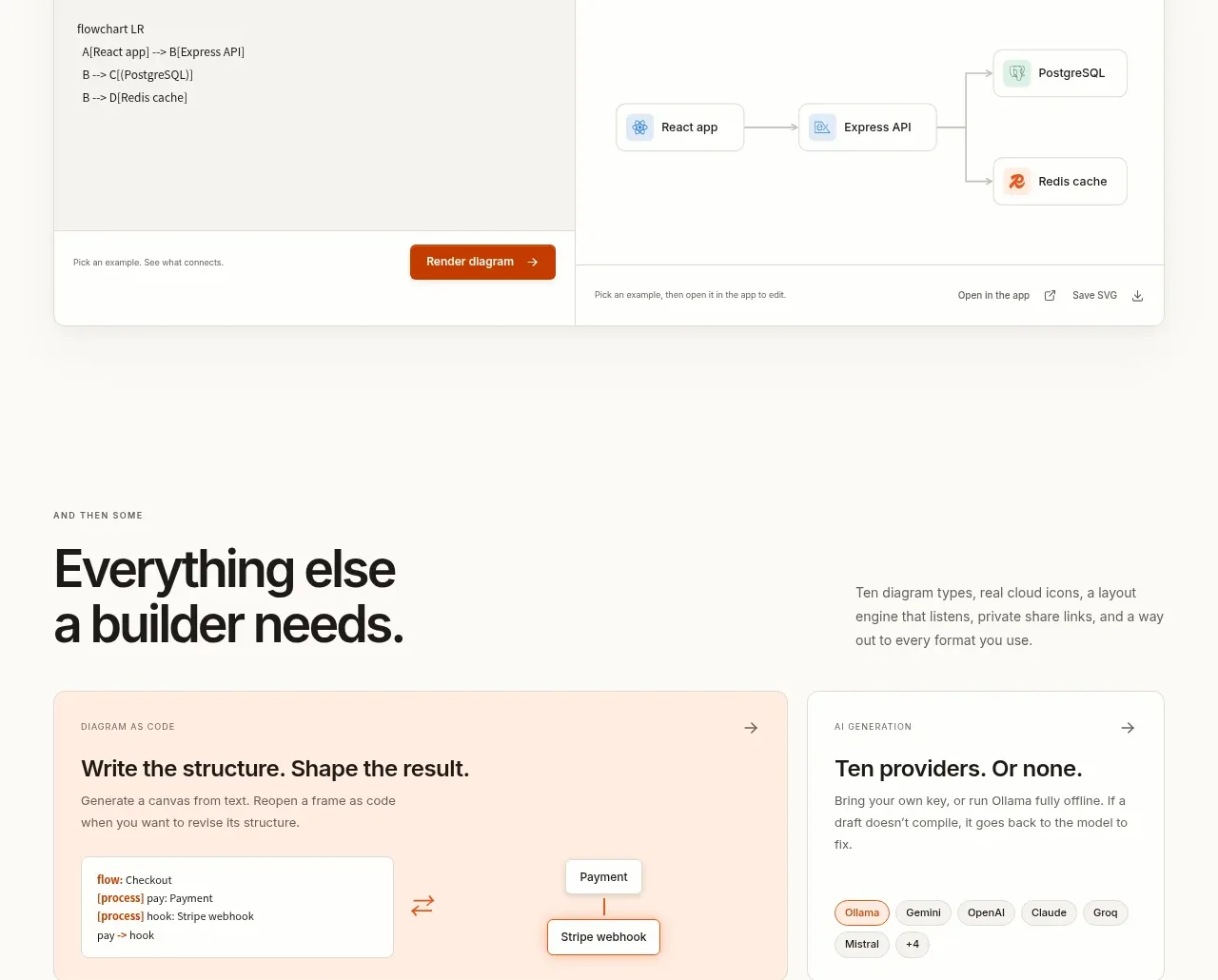 Code-to-visual editor
OpenFlowKit 2 · Code block
Code-to-visual editor
OpenFlowKit 2 · Code block
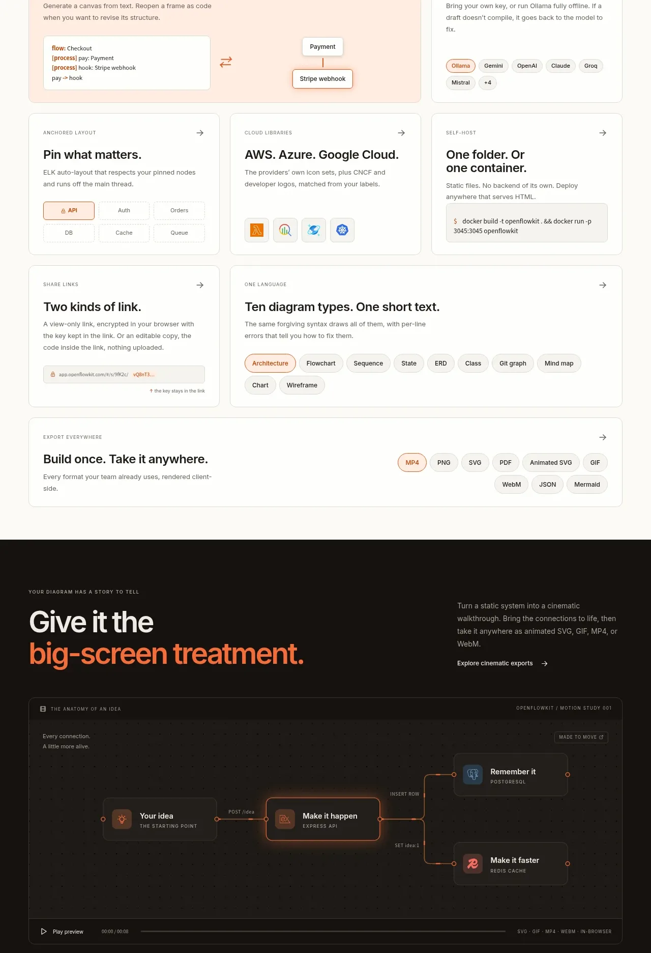 Builder capabilities grid
OpenFlowKit 2 · Feature grid
Builder capabilities grid
OpenFlowKit 2 · Feature grid
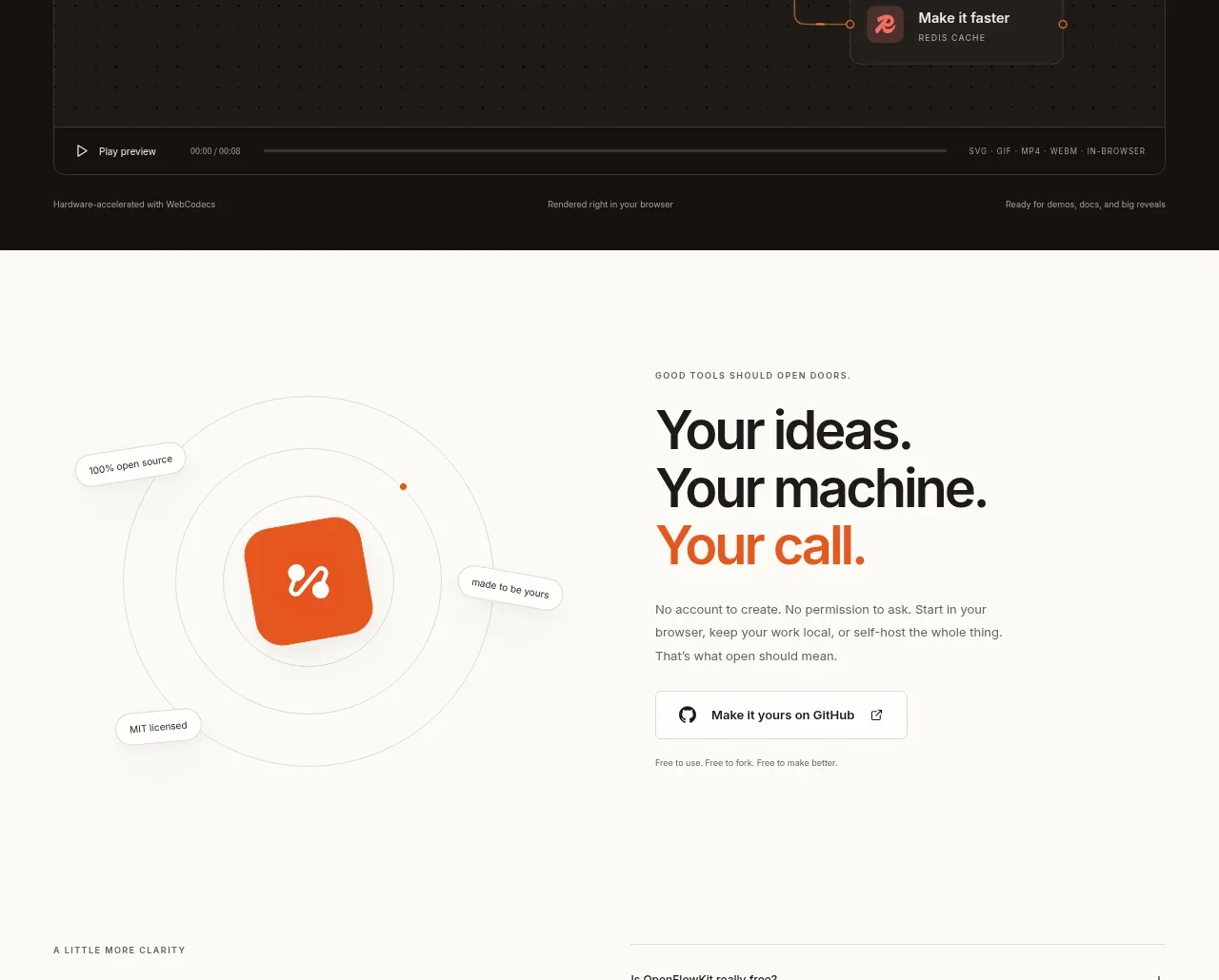 Cinematic product preview
OpenFlowKit 2 · Call to action
Cinematic product preview
OpenFlowKit 2 · Call to action
 Open-source closing CTA
OpenFlowKit 2 · Call to action
Open-source closing CTA
OpenFlowKit 2 · Call to action