kage
kage
pitch.com

Design analysis
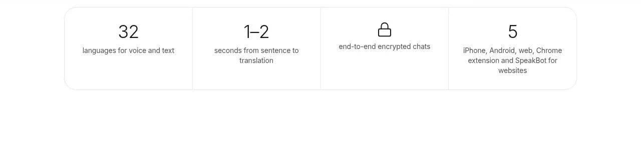
A spacious, three-column proof-point section that uses restrained copy, generous whitespace, and a barely-there lavender gradient to transition into the next product-story block. Its value comes from hierarchy and rhythm rather than oversized numerals or decorative imagery.
Prompt preview
## Reference images

Study these alongside the description below: hierarchy, rhythm, spacing, colour. Build for the product you are asked about, using this design language.

- Component: https://kage-design-assets.t3.tigrisfiles.io/components/pitch-com/6703b162-6073-44e6-a626-e3df0dc35c4b-1789060647-3.webp
- Full page it was cut from: https://kage-design-assets.t3.tigrisfiles.io/screenshots/pitch-com/6703b162-6073-44e6-a626-e3df0dc35c4b-1789060611-full.webp
- Component on Kage: https://kage.design/component/pitch-stats

# Build a soft gradient stats band for a product website

## Before you start
Ask me what my product is, who it is for, and what its brand voice, colors, and typography are. Then apply the principles below to create a version that fits my product—do not reproduce the reference literally.

## Goal
Create a calm, editorial stats/proof-point section that communicates three concise reasons customers trust or choose the product. The component should feel like a transition between sections: quiet at the top, increasingly tinted toward the bottom, and spacious enough to make the next section feel anticipated.

## Design language

### Layout and alignment
- Use a full-width section with a very pale neutral-to-lavender background gradient. Keep the content inside the product’s standard max-width container, approximately 1180–1240px on desktop.
- Place three proof points in an evenly distributed horizontal row on desktop. Each item should occupy a similar column width, with consistent left alignment within its column.
- Keep the proof-point row near the top of the section, with generous empty space below it. The empty space is intentional: it creates a visual pause before the next content block.
- Add the next section below or allow it to begin at the bottom edge of the component, using the stats band as a soft lead-in rather than a self-contained card.
- On smaller screens, stack the items vertically with a deliberate gap and reduce the section’s vertical height while preserving generous breathing room.

### Typography hierarchy
- Use a modern sans-serif appropriate to the product brand, with a warm, human feel rather than a technical UI-only typeface.
- Render each proof point as one or two short lines of medium-sized body text, around 16–18px on desktop and 15–17px on mobile.
- Use a comfortable line height around 1.45–1.6 and moderate letter spacing. Keep the copy readable and avoid turning the statements into oversized headline numerals.
- If a metric is needed, emphasize it subtly with weight or color inside the sentence; do not make the metric the only visual focus.
- Maintain strong contrast without using pure black: use a deep ink tone such as #171329 or an equivalent from the brand palette.

### Color and background
- Start with an almost-white background near the top, such as #FCFBFF or #FFFFFF.
- Fade toward a very light lavender near the lower portion, such as #F0E9FF or #EEE7FF. Keep the gradient low contrast and atmospheric rather than saturated.
- Use dark plum/ink text, approximately #252139, with optional muted purple accents around #5632B8 for links or highlighted metrics.
- Let the background do most of the visual work; do not add patterns, illustrations, photos, or large decorative shapes.

### Spacing, borders, and radius
- Give the section approximately 24–32px horizontal padding on mobile and 28–40px on desktop.
- Use around 48–72px of top padding for the stats row, then 220–360px of lower breathing room depending on the surrounding page composition.
- Use a 48–72px column gap on wide screens where space allows, but keep each statement comfortably readable.
- Avoid visible borders around the overall section. If the following content is a separate panel, it may use a large rounded top radius around 28–40px to create a soft transition.
- Keep any internal cards borderless and flat; this component should not feel like a dashboard grid.

### Interaction and responsive behavior
- The stats are informational, so they do not need controls or hover states.
- If a proof point links to supporting evidence, use a subtle underline or brand-color text treatment and a restrained hover color change.
- On mobile, preserve the reading order from left to right as a top-to-bottom stack. Ensure line lengths remain short enough for quick scanning.
- Respect reduced-motion preferences; do not rely on animated gradients or scroll effects. If an entrance animation is used, keep it to a gentle opacity/translate transition and make it optional.

## Content guidance
- Write three concise, credible proof points relevant to the user’s product—for example adoption, expertise, time saved, outcomes, or customer trust.
- Keep each item to one or two lines where possible. Avoid unsupported claims and use qualifiers when the product requires them.
- Make the three statements parallel in tone and grammatical structure.

## Never
- Never copy the reference’s logos, product names, wording, headlines, or claims.
- Never reuse its exact brand identity, typography, color values, layout proportions, or visual assets as a literal copy.
- Never include illustrations, photographs, icons, or decorative imagery from the reference.
- Never use the reference product’s name in the rendered component.
- Never turn this into a dense analytics dashboard or a row of oversized statistic cards.