kage
kage
plaid.com

Design analysis
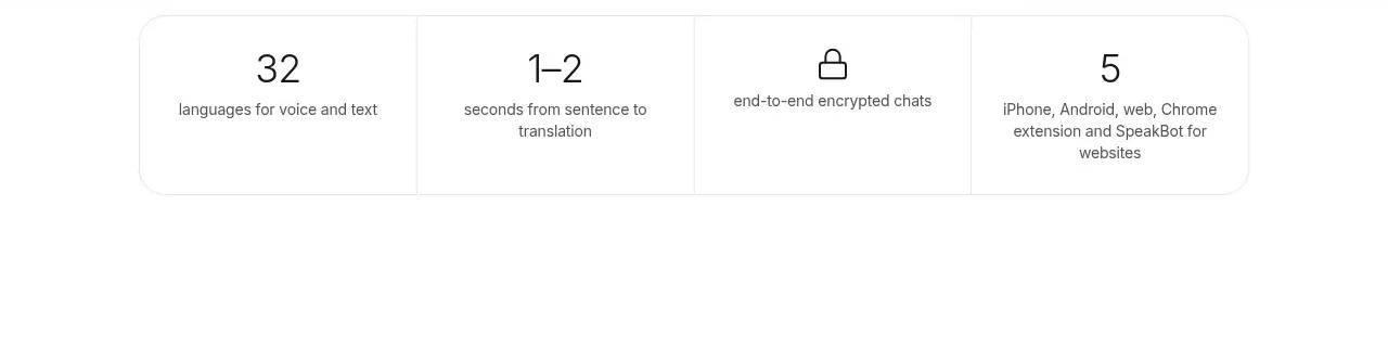
A spacious split section pairs an abstract stack of floating product and notification cards with a strong editorial headline and a four-item proof-point grid. The contrast between oversized serif numerals and compact sans-serif labels makes the metrics feel premium, memorable, and easy to scan.
Prompt preview
## Reference images

Study these alongside the description below: hierarchy, rhythm, spacing, colour. Build for the product you are asked about, using this design language.

- Component: https://kage-design-assets.t3.tigrisfiles.io/components/plaid-com/7f22fbce-e808-4b19-99a1-7dcb31fbfb56-1789060800-4.webp
- Full page it was cut from: https://kage-design-assets.t3.tigrisfiles.io/screenshots/plaid-com/7f22fbce-e808-4b19-99a1-7dcb31fbfb56-1789060772-full.webp
- Component on Kage: https://kage.design/component/plaid-stats

## Before you start
Ask the user what their product is, who it serves, and what brand personality, typefaces, colours, and proof points they want to use. Then apply the principles below to create an original stats section for that product—not a literal recreation of any reference.

## Build this section
Create a large, airy credibility section for a modern technology or financial-services website. Use a pale, almost-white blue/lilac background and a two-column composition:

- **Left visual column:** reserve roughly 42–45% of the section width for a vertical, loosely staggered stack of small rounded media tiles and notification cards. The tiles should feel like abstract product moments: colourful gradients, cropped UI-like surfaces, or neutral placeholders generated for the user’s product. Alternate their horizontal positions slightly and leave generous vertical gaps so the stack feels editorial rather than like a rigid list. Use soft shadows, rounded corners, and restrained layering. Keep this visual column decorative and secondary to the proof points.
- **Right content column:** reserve roughly 48–52% of the width. Align all text to one consistent left edge. Start with a large, dark navy headline of about 64–76px on desktop, with tight line-height around 0.98–1.05 and a maximum width of about 560px. Follow it with a concise supporting paragraph in a readable sans-serif at about 21–25px, line-height 1.45–1.55, with a maximum width around 500px.
- **Metrics grid:** below the paragraph, place four stats in a 2×2 grid. Use generous row and column gaps, approximately 56–80px vertically and 56–96px horizontally. Each stat has an oversized, elegant serif numeral or short value at about 56–68px, in a vivid lavender-purple, followed by a compact dark navy label in a bold or semibold sans-serif at about 22–26px with tight line-height. Allow labels to wrap naturally into two or three short lines. Keep each metric visually independent; do not enclose them in cards or add divider lines.

## Design language

- **Layout:** use a centered max-width container of roughly 1180–1280px, with 8–10vw horizontal padding and 120–170px vertical padding. The visual column may extend slightly upward or downward to create an off-balance editorial rhythm, while the right column should remain structurally aligned. On mobile, stack the visual above the content, reduce the media stack to three or four items, and turn the metrics into a single column or a balanced 2×2 grid depending on available width.
- **Alignment:** maintain a strict left edge for the right-side headline, paragraph, and metrics. Keep the floating visual stack within its own column so it never competes with the text. Use responsive CSS grid or flex layout rather than absolute positioning for the main structure; absolute positioning is acceptable only for small decorative offsets inside the visual column.
- **Typography:** use a contemporary sans-serif for headline, body, and labels, with a dark navy tone and confident but not overly heavy weight. Pair the stat values with a high-contrast editorial serif or a similarly expressive display face. Make the values visually dominant, but keep them compact enough that labels remain immediately associated with them. Use `clamp()` sizing for responsive type.
- **Colour:** background approximately `#F5F7FC` or a very pale blue-lilac. Primary text approximately `#062E4A` or `#06304D`. Stat values approximately `#9658C6` to `#A66ACD`. Floating visual surfaces may use saturated cyan, electric blue, mint, coral, lilac, and soft yellow accents, but keep the overall palette coordinated with the user’s brand. Use white or translucent white for notification cards.
- **Cards and surfaces:** notification cards should be white or near-white, about 18–22px radius, with a subtle border such as `rgba(6, 46, 74, 0.08)` and a soft shadow like `0 12px 28px rgba(6, 46, 74, 0.12)`. Media tiles can use 14–18px radius and should crop their abstract content with `overflow: hidden`. Do not make the metric items card-like.
- **Spacing:** favour generous negative space. The headline-to-paragraph gap can be 24–32px, paragraph-to-metrics gap 72–110px, and metric value-to-label gap 12–18px. Avoid filling every area of the section; the calm whitespace is part of the design.
- **Interaction:** this is primarily a static proof section. If the floating tiles are interactive, add only a restrained hover treatment such as a 2–4px lift, slight scale, or shadow increase, with a 200–300ms ease transition. Respect reduced-motion preferences. Do not animate the numbers in a distracting way; an optional subtle count-up may run once when the grid enters the viewport.
- **Accessibility:** use real text for all statistics and labels, semantic headings, sufficient colour contrast, responsive wrapping, and meaningful accessible labels for any decorative or interactive visual. Mark purely decorative tiles as hidden from assistive technology.

## Never
- Never use the reference site’s logo, product name, company name, or brand-specific copy.
- Never reuse the reference statistics, notification text, recognizable icons, or exact content.
- Never copy the reference imagery, illustrations, people, screenshots, or media compositions; generate abstract, product-relevant alternatives or use neutral placeholders.
- Never reproduce the exact layout measurements or pixel-for-pixel arrangement; preserve the design principles while adapting the section to the user’s product and brand.
- Never sacrifice responsive behaviour, semantic HTML, keyboard accessibility, or reduced-motion support for visual similarity.