 kage
kage
qagent.in

Design analysis
A compact dark banner closes the explanatory flow with a direct promise and two contrasting actions.
Prompt preview
## Reference images

Study these alongside the description below: hierarchy, rhythm, spacing, colour. Build for the product you are asked about, using this design language.

- Component: https://kage-design-assets.t3.tigrisfiles.io/components/qagent/ac07fafb-2e50-4f4b-8444-88a4bcf31a5f-1789711535-8.webp
- Full page it was cut from: https://kage-design-assets.t3.tigrisfiles.io/screenshots/qagent/ac07fafb-2e50-4f4b-8444-88a4bcf31a5f-1789711433120-full.webp
- Component on Kage: https://kage.design/component/qagent-cta

## Before you start
Ask what the user's product is, who it serves, and what brand personality and visual system it should use. Then apply the principles below to that product rather than reproducing this reference.

Create a wide, compact CTA banner inside the page container. Use a near-black panel (#1d1d19) with 10–12px rounded corners, a short high-contrast headline, one supporting sentence, and two right-aligned buttons: a warm accent primary and a dark/neutral secondary. Align content horizontally on desktop and stack it on mobile. Keep the banner height economical, use 16–24px padding, white or warm-white text, muted secondary text, and a clear hover state on both buttons.

Never: use logos, product names, copy, illustrations, or imagery from the reference.
More components
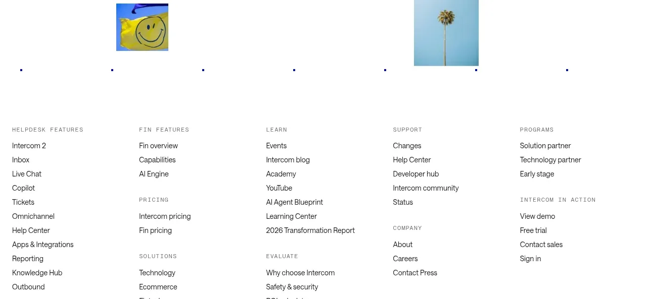
 Final customer experience call to action
intercom.com · Call to action
Final customer experience call to action
intercom.com · Call to action
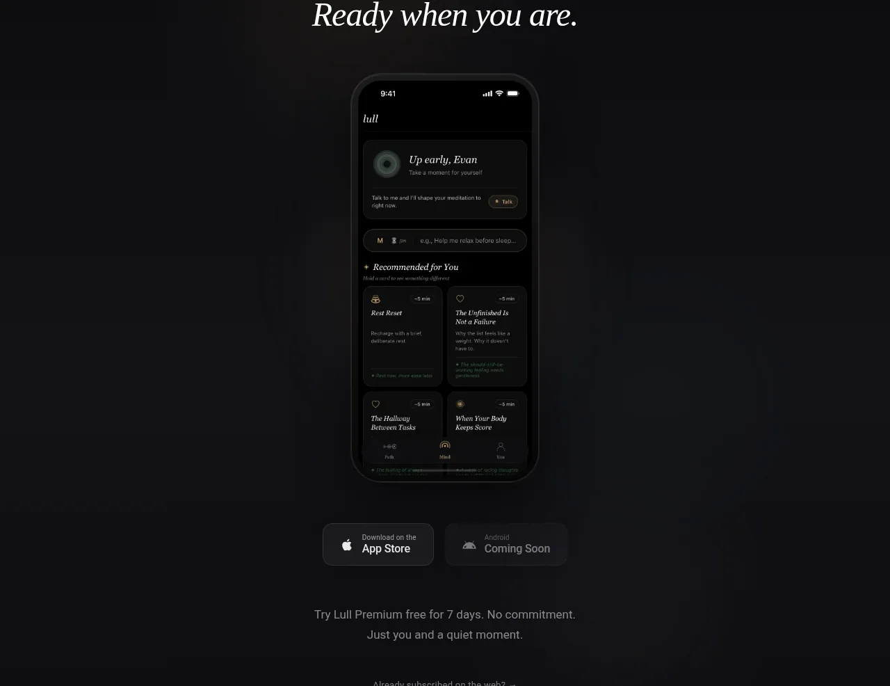
 App download conversion
Lull · Call to action
App download conversion
Lull · Call to action

 Centered final call to action
ApplySeed · Call to action
Centered final call to action
ApplySeed · Call to action
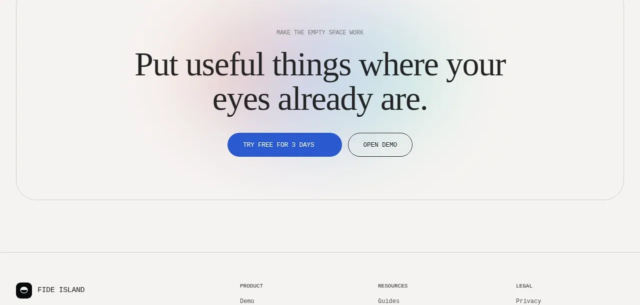
F
Final conversion call to action
Fide Island · Call to action
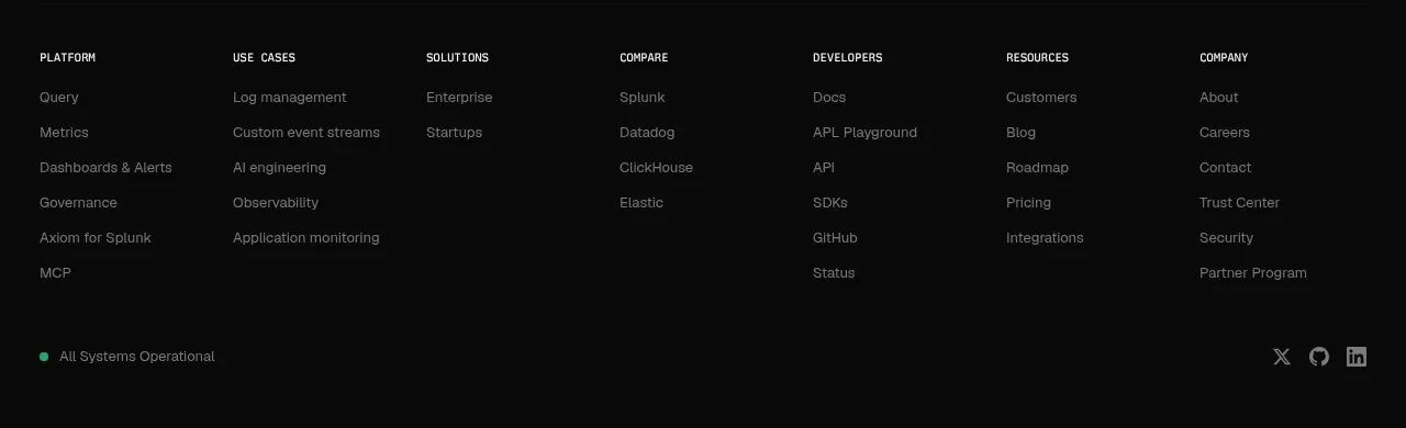
A
Final signup call to action
Axiom · Call to action
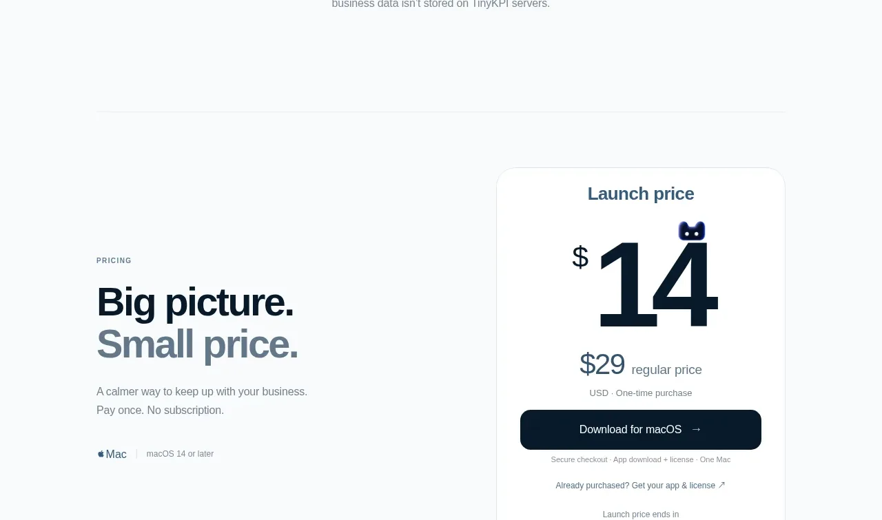
 Privacy promise
TinyKPI · Call to action
Privacy promise
TinyKPI · Call to action