 kage
bytemailapp.com
Design analysis
A large soft-gradient CTA repeats the core promise, shows the purchase choice, and places a single checkout action in the center. Its visual separation makes the final conversion moment unmistakable.
Prompt preview
## Reference images

Study these alongside the description below: hierarchy, rhythm, spacing, colour. Build for the product you are asked about, using this design language.

- Component: https://kage-design-assets.t3.tigrisfiles.io/components/bytemail/045a2cef-1fc1-40ba-865c-126b992dab68-1793253738-11.webp
- Full page it was cut from: https://kage-design-assets.t3.tigrisfiles.io/screenshots/bytemail/045a2cef-1fc1-40ba-865c-126b992dab68-1793253665308-full.webp
- Component on Kage: https://kage.design/component/bytemail-cta

## Before you start
Ask what final action the user's product wants visitors to take, what offer or reassurance should accompany it, and what brand colors are appropriate. Apply the principles below to that product.

Build a wide final CTA with a subtle two-tone pastel gradient, a centered icon or product cue, a concise headline, one sentence of reassurance, and a focused pricing or signup module. Use generous vertical padding, a 20px radius, soft inset contrast, and one primary button with strong contrast. Keep the module narrow enough to feel intentional, show billing terms clearly, and include a small trust note beneath the action. Use approximate colors #e7f5f3, #e7ebff, #f6f0e7, dark #07151b, and action blue #2456d8.

Never use logos, product names, copy, illustrations, or imagery from the reference.
More components
 Split final conversion panel
throxy · Call to action
 Fast-start conversion CTA
Basedash View-only members · Call to action
 Guarantee and proof CTA
Open For sales · Call to action
 Closing conversion CTA
Open For sales · Call to action
 Playground call to action
Zro: Uncensored Security Models · Call to action
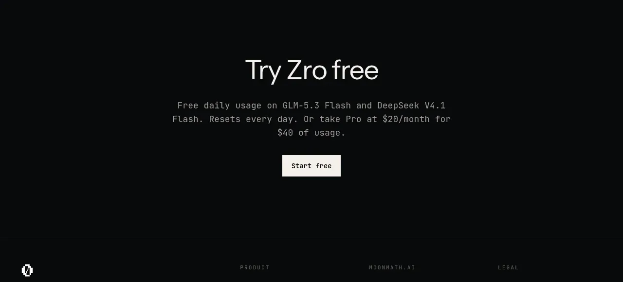 Final free-trial CTA
Zro: Uncensored Security Models · Call to action