 kage
basedash.com
Design analysis
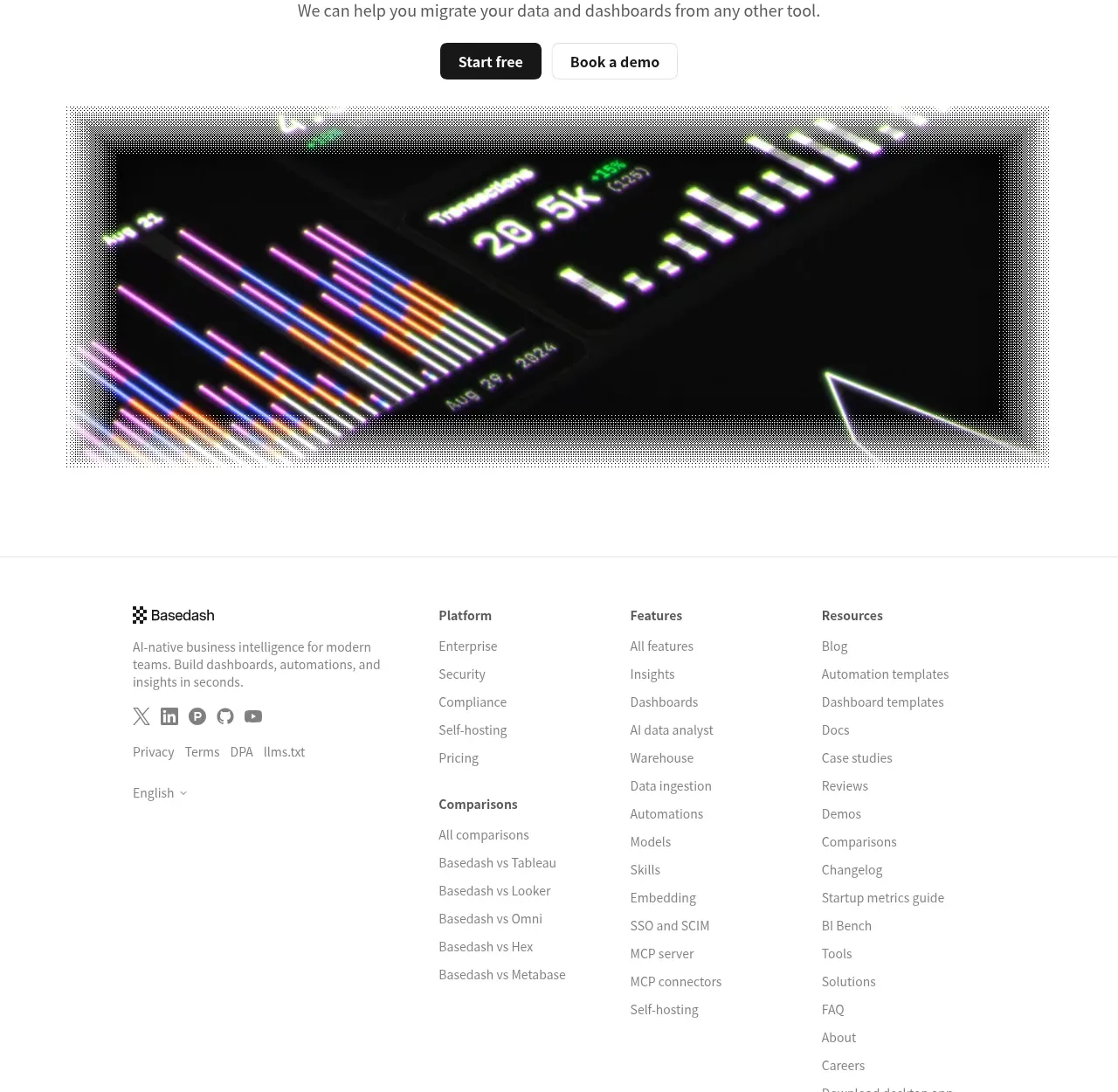
A centered final invitation with paired actions leads into a wide dark product visual, creating a strong pre-footer conversion moment.
Prompt preview
## Reference images

Study these alongside the description below: hierarchy, rhythm, spacing, colour. Build for the product you are asked about, using this design language.

- Component: https://kage-design-assets.t3.tigrisfiles.io/components/basedash-view-only-members/6dbd0b50-cdba-4977-b7dc-6a7ba68a352e-1793253920-9.webp
- Full page it was cut from: https://kage-design-assets.t3.tigrisfiles.io/screenshots/basedash-view-only-members/6dbd0b50-cdba-4977-b7dc-6a7ba68a352e-1793253800610-full.webp
- Component on Kage: https://kage.design/component/basedash-view-only-members-cta

## Before you start
Ask what the user's product is, what low-friction conversion action should be primary, and what brand tone belongs at the end of the page. Build for those answers.

Create a final CTA section with a centered headline around 36–42px, a short muted supporting sentence, and paired primary/secondary buttons. Place a wide cinematic product visual beneath the actions with a controlled max-width around 780px, dark surface, subtle frame, and restrained glow or gradient treatment. Keep the CTA copy area white and spacious, then give the media enough height to feel like a conclusion. Use black #171717 primary button, white secondary button with #e5e5e5 border, 6–8px radius, and 14px semibold text. Ensure keyboard focus states and mobile stacking; the visual should remain an interface or data scene specific to the user's product.

Never: use logos, product names, copy, illustrations, or imagery from the reference.
More components
 Split final conversion panel
throxy · Call to action

 Guarantee and proof CTA
Open For sales · Call to action
 Closing conversion CTA
Open For sales · Call to action
 Final purchase call to action
bytemail · Call to action

 Playground call to action
Zro: Uncensored Security Models · Call to action
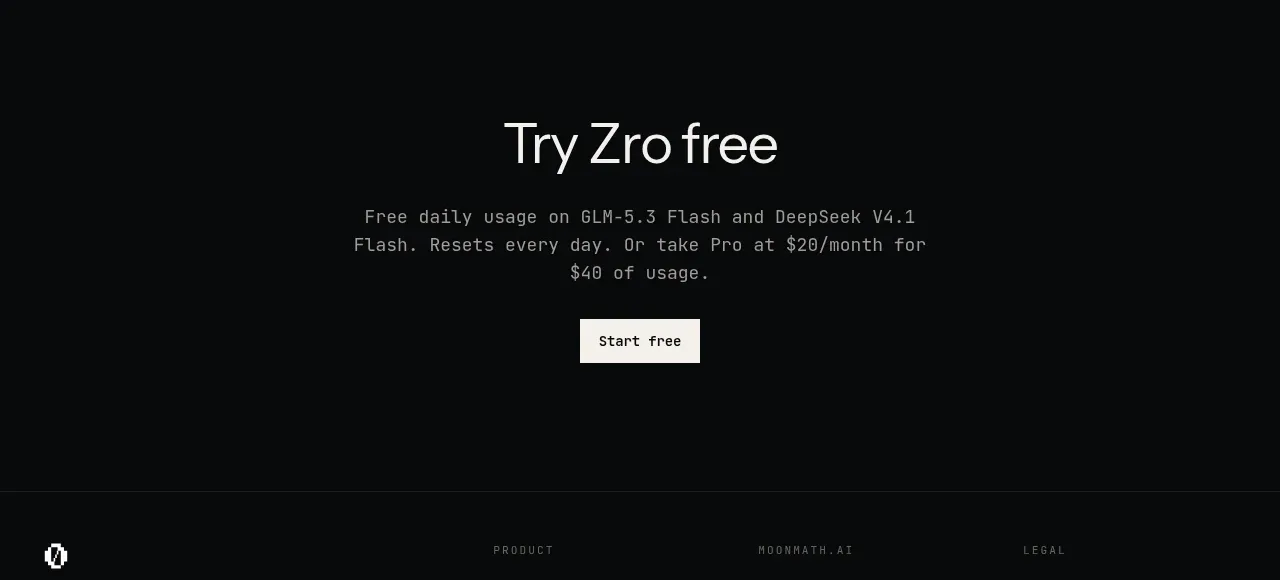 Final free-trial CTA
Zro: Uncensored Security Models · Call to action