 kage
throxy.com
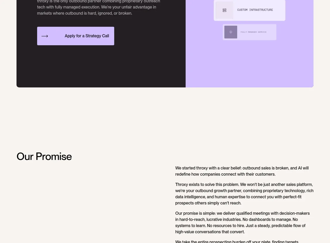
Design analysis
A large two-tone panel combines a dark persuasive message and CTA with a lavender abstract capability stack, creating a strong conversion moment.
Prompt preview
## Reference images

Study these alongside the description below: hierarchy, rhythm, spacing, colour. Build for the product you are asked about, using this design language.

- Component: https://kage-design-assets.t3.tigrisfiles.io/components/throxy/4d577be3-3944-4c06-b2f6-094c0e693ab7-1793253971-9.webp
- Full page it was cut from: https://kage-design-assets.t3.tigrisfiles.io/screenshots/throxy/4d577be3-3944-4c06-b2f6-094c0e693ab7-1793253814515-full.webp
- Component on Kage: https://kage.design/component/throxy-cta

### Before you start
Ask what the user's product, audience, and brand are, then apply these principles to that product.

Build a wide two-column conversion panel with a dark left half and a soft lavender right half. The left side should include a large benefit-led heading, a concise paragraph, and a light lavender button with an arrow; the right side should show three or four abstract stacked capability cards with subtle depth and fading opacity. Use a 20px panel radius, equal-height halves, 64–88px padding, black #211D20, lavender #CDB7FF, ivory #F7F5F0, and white cards. Keep the CTA visually dominant, ensure contrast in both halves, and make the panel stack on mobile.

Never: use logos, product names, copy, illustrations, or imagery from the reference.
More components
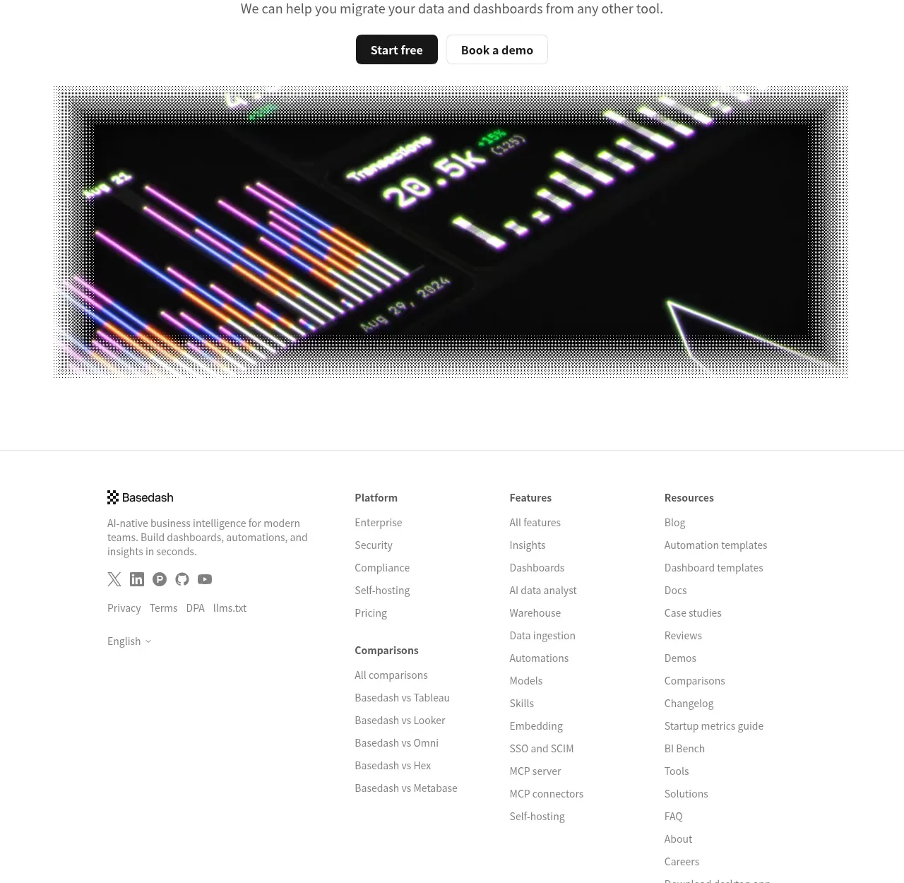
 Fast-start conversion CTA
Basedash View-only members · Call to action
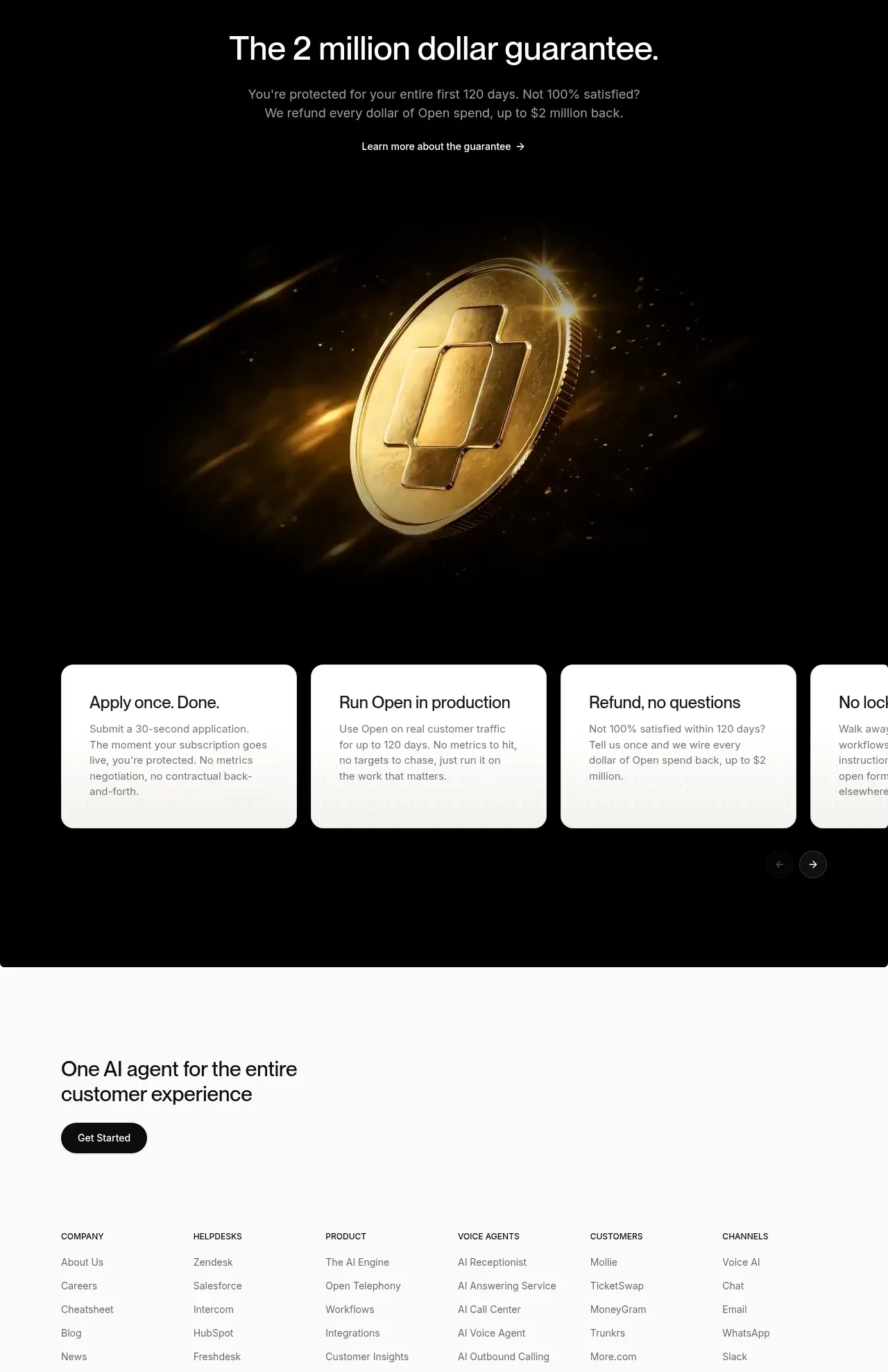
 Guarantee and proof CTA
Open For sales · Call to action
 Closing conversion CTA
Open For sales · Call to action
 Final purchase call to action
bytemail · Call to action
 Playground call to action
Zro: Uncensored Security Models · Call to action
 Final free-trial CTA
Zro: Uncensored Security Models · Call to action