 kage
open.cx
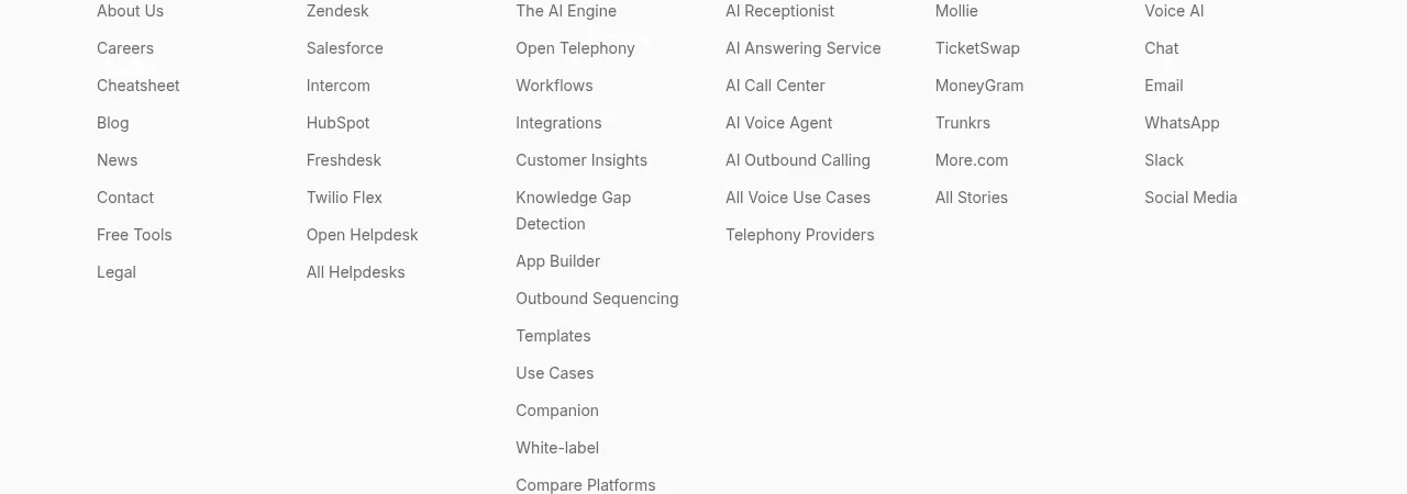
Design analysis
A quiet final conversion band distills the product promise into a short heading and one high-contrast action before the footer.
Prompt preview
## Reference images

Study these alongside the description below: hierarchy, rhythm, spacing, colour. Build for the product you are asked about, using this design language.

- Component: https://kage-design-assets.t3.tigrisfiles.io/components/open-for-sales/9a311215-a6aa-4eac-b69d-0b0434feabcf-1793253814-7.webp
- Full page it was cut from: https://kage-design-assets.t3.tigrisfiles.io/screenshots/open-for-sales/9a311215-a6aa-4eac-b69d-0b0434feabcf-1793253735957-full.webp
- Component on Kage: https://kage.design/component/open-for-sales-cta-2

## Before you start
Ask for the user's primary conversion goal, preferred CTA label, and the shortest credible product promise. Apply the structure below with that product's content.

Build a compact closing CTA on an off-white background (#fafafa), aligned to the same content container as the page. Use a concise two-line heading at 24–30px with tight line-height, a single filled dark or brand-colour pill button beneath it, and substantial vertical whitespace. Keep the composition intentionally simple so it feels like a confident handoff into the footer. Use a 1px divider only if needed, and make the button clearly keyboard-focusable and touch-friendly.

Never: use the reference heading, CTA label, product name, logo, imagery, or exact copy.
More components
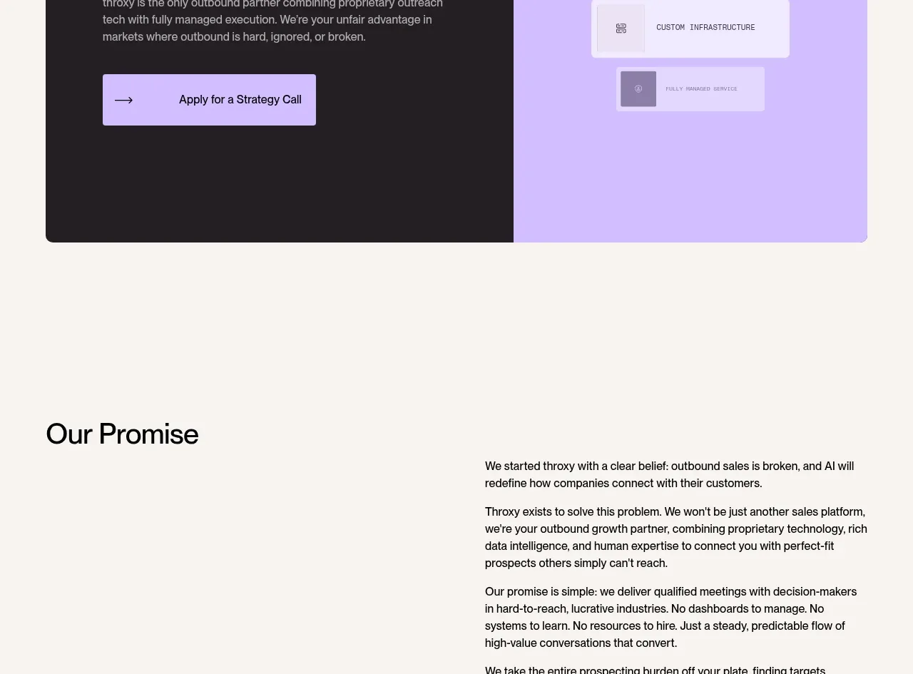
 Split final conversion panel
throxy · Call to action
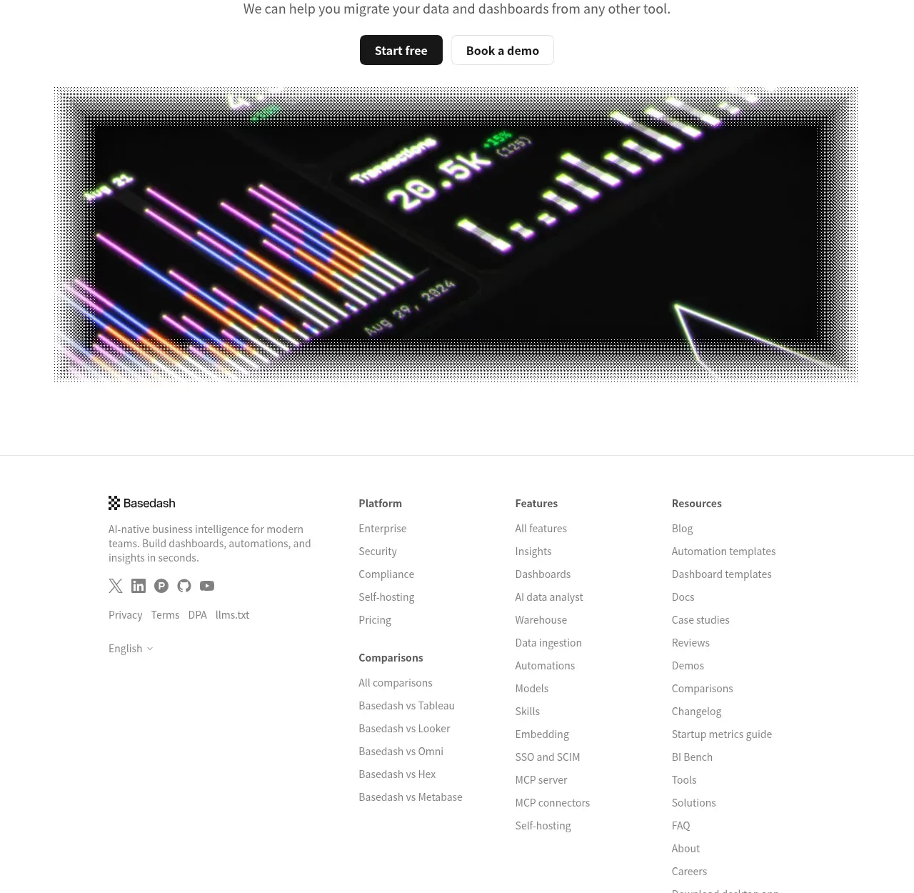
 Fast-start conversion CTA
Basedash View-only members · Call to action
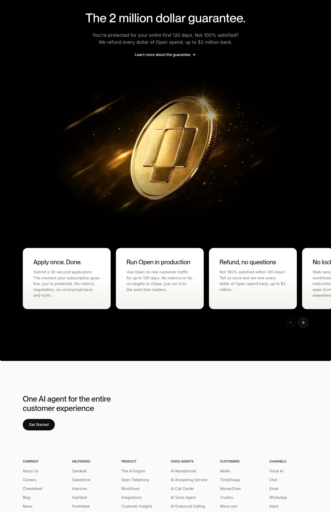
 Guarantee and proof CTA
Open For sales · Call to action

 Final purchase call to action
bytemail · Call to action

 Final free-trial CTA
Zro: Uncensored Security Models · Call to action
 Playground call to action
Zro: Uncensored Security Models · Call to action