 kage
kage
salience.com

Design analysis
A long-form B2B analytics landing page uses a fluorescent lime hero to establish identity, then alternates spacious white sections with high-contrast black feature bands. The page moves from a centered conversion hero and dashboard proof, through audience cards, workflow explanations, alerts and raw-log views, into an illustrated data pipeline, trust messaging, pricing, FAQ, and a dark conversion footer; thin rules, compact uppercase labels, restrained radii, and embedded product UI keep the presentation technical rather than decorative.
Prompt preview
## Reference images

Study these alongside the description below: hierarchy, rhythm, spacing, colour. Build for the product you are asked about, using this design language.

- Full page: https://kage-design-assets.t3.tigrisfiles.io/screenshots/salience/db9244f7-ec48-4516-9a93-11a957a9eab9-1792303314589-full.webp
- Above the fold: https://kage-design-assets.t3.tigrisfiles.io/screenshots/salience/db9244f7-ec48-4516-9a93-11a957a9eab9-1792303310739.webp
- Design on Kage: https://kage.design/designs/salience-landing-page

## Before you start
Ask the user what they are building, who it is for, and what brand assets they already have, including the product name, colours, typefaces, logo, and any existing UI screenshots. Wait for their answers before designing. Apply the system below to their product, not to the reference product.

## Page structure
1. **Global header** — Use a compact desktop navigation with a small brand mark at left, evenly spaced product links in the middle, and login plus a dark primary action at right. Keep it transparent or integrated into the opening colour field.
2. **Hero / conversion panel** — Start with a full-width fluorescent green hero. Center a small uppercase eyebrow, a very large two-line headline, a short explanatory paragraph, a URL or input field paired with a dark CTA, reassurance points beneath, and a row of supported-platform marks. Add a small “explore” cue before the product preview.
3. **Primary dashboard preview** — Place a large framed analytics dashboard screenshot directly below the hero content, centered with a subtle shadow and light border. It should show a sidebar, toolbar, metric cards, chart, and activity table so the product is understood visually before more copy appears.
4. **Customer proof row** — On white, add a small uppercase attribution line and a restrained horizontal row of monochrome customer names or marks.
5. **Four benefit columns** — Follow with a thin top rule and four equal columns, each with a tiny pale-green icon, bold short heading, and compact explanatory text. Keep this section airy and aligned to the same page grid.
6. **Audience cards** — Introduce an “audiences” eyebrow and a large heading, then show four bright-green cards in one row. Each card contains an audience title, a short quote or scenario, and a small linked use case; add a minimal secondary-use row underneath.
7. **How-it-works introduction** — On white, use an eyebrow, a large two-line heading, and a short subheading. Beneath it, present a three-step horizontal process with numbered labels, small icons, headings, descriptions, and supporting platform marks; finish with text links to setup and supported platforms.
8. **Dark analytics-misses feature band** — Switch abruptly to black. Use a two-column layout: a large white heading and paragraph on the left, and five stacked feature rows on the right. Separate rows with fine dark-gray rules and use small neon-green square icons for each item.
9. **Alerts section** — Return to white with a split layout: explanatory copy and CTA-oriented heading on the left, a framed alerts interface preview on the right. Below, add a “fits how you already work” area divided into agent integrations and team-facing tools, each with three compact icon-and-copy items.
10. **Dark raw-logs showcase** — Use another black band with a small eyebrow, a large white heading, a short paragraph, and a wide dashboard screenshot showing crawler/request data. Keep the screenshot bright and highly legible against the dark surrounding field.
11. **Data engine diagram** — Return to white. Introduce the section with a large heading and a short right-aligned explanation, then build a left-to-right flow diagram: source lists on the left, a black central intelligence card, and four stacked neon-green outcome cards on the right. Use thin curved connector lines and small category labels.
12. **Trust and data protection band** — Add a compact black strip with a heading and four evenly spaced reassurance columns. Each column uses a green outline icon, bold title, and small text; finish with a privacy/data-protection link.
13. **Pricing section** — On white, introduce pricing with an eyebrow, large heading, supporting copy, and a small billing currency selector. Present three bordered plan cards in a row, with the middle growth plan filled bright green and the outer plans white. Include price, limits, feature lines, and full-width dark or outlined trial buttons; follow with smaller free, solo, and enterprise rows.
14. **FAQ section** — Use a spacious white area with a large heading and a vertical accordion list. Each question occupies a row separated by thin gray rules and ends with a small green plus sign. Finish with a black rounded question box containing suggested prompts and a white input bar with a green ask button.
15. **Final CTA** — Switch to black and place a large white multi-line conversion statement at left, a short supporting sentence below, and two contrasting buttons. Keep substantial empty space around the content.
16. **Footer** — Add a divided dark footer with the brand lockup and description on the left, social buttons beneath, and several link columns for solutions, product, resources, and company. End with a fine-rule legal row and a very large, low-contrast oversized wordmark treatment cropped along the bottom edge.

## Design language
- Build hierarchy through oversized black or white sans-serif headings, compact uppercase eyebrow labels, and short paragraphs; use a strong display scale for section titles and a noticeably smaller, dense scale for labels, metadata, and UI text.
- Use a wide centered content grid with generous horizontal margins. Let major sections breathe, then create denser rhythm inside cards, dashboard screenshots, pricing rows, FAQ rows, and the process diagram.
- Alternate backgrounds deliberately: fluorescent lime for acquisition and emphasis, white for explanation and comparison, and near-black for high-contrast feature storytelling and closing conversion moments.
- Use approximately `#8AF276` to `#91F27A` for the signature green, `#000000` for primary dark areas and buttons, `#FFFFFF` for light surfaces, and `#E8E8E8` / `#222222` for fine rules and dark-surface separators. Keep green concentrated in hero fields, selected cards, icons, tags, and active controls rather than tinting every element.
- Pair a clean geometric sans-serif with a heavy, tightly set headline weight. Keep body copy neutral and compact, with comfortable line height; use uppercase tracking for eyebrows and navigation metadata.
- Treat borders as thin and functional, mostly `1px` gray or near-black rules. Use restrained corner radii around 4–8px on cards, inputs, screenshots, and buttons; avoid ornamental pills except for compact status chips inside product UI.
- Use almost no shadow on ordinary content. Reserve a soft, subtle shadow and light border for dashboard and alert screenshots so they read as tangible product evidence.
- Make product mockups dense and credible: side navigation, toolbars, stat cards, tables, charts, status badges, and small controls should use a light gray interface with green highlights and dark text.
- Let section rhythm change down the page: start with a high-energy, centered hero, move into proof and benefit grids, expand into alternating editorial feature bands, then become more comparison-heavy in pricing and FAQ before ending with sparse dark CTA/footer space.
- Use interaction cues that are simple and explicit: dark rectangular CTAs with compact arrow affordances, green active states, plus signs for accordion rows, and clearly separated links. Any motion should be restrained—fade or slight rise on scroll, subtle dashboard hover emphasis, and no distracting decorative animation.

## Never
- Do not use the reference product’s logos, wordmarks, product name, copy, customer names, screenshots, illustrations, photography, or icon set.
- Do not reproduce Salience branding or present the result as Salience.
- Replace every example with the user’s own product, audience, data, brand assets, and interface content while preserving only the transferable layout and design principles.
Components from this page
All components
 Minimal product navigation
Salience · Navigation
Minimal product navigation
Salience · Navigation
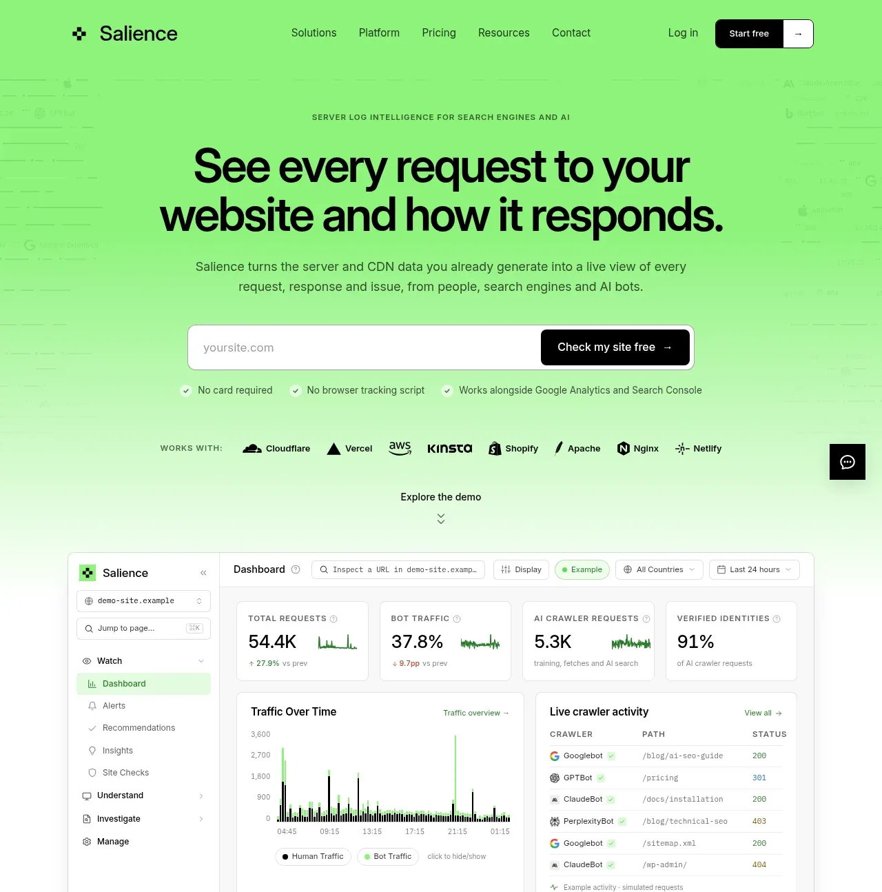 Product promise and site checker hero
Salience · Hero
Product promise and site checker hero
Salience · Hero
 Trust proof and core outcomes
Salience · Feature grid
Trust proof and core outcomes
Salience · Feature grid
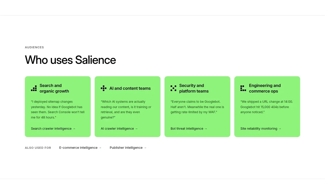 Audience use-case cards
Salience · Card
Audience use-case cards
Salience · Card
 Three-step implementation flow
Salience · Feature grid
Three-step implementation flow
Salience · Feature grid
 What analytics misses
Salience · Feature grid
What analytics misses
Salience · Feature grid
 Actionable alert workflow
Salience · Feature grid
Actionable alert workflow
Salience · Feature grid
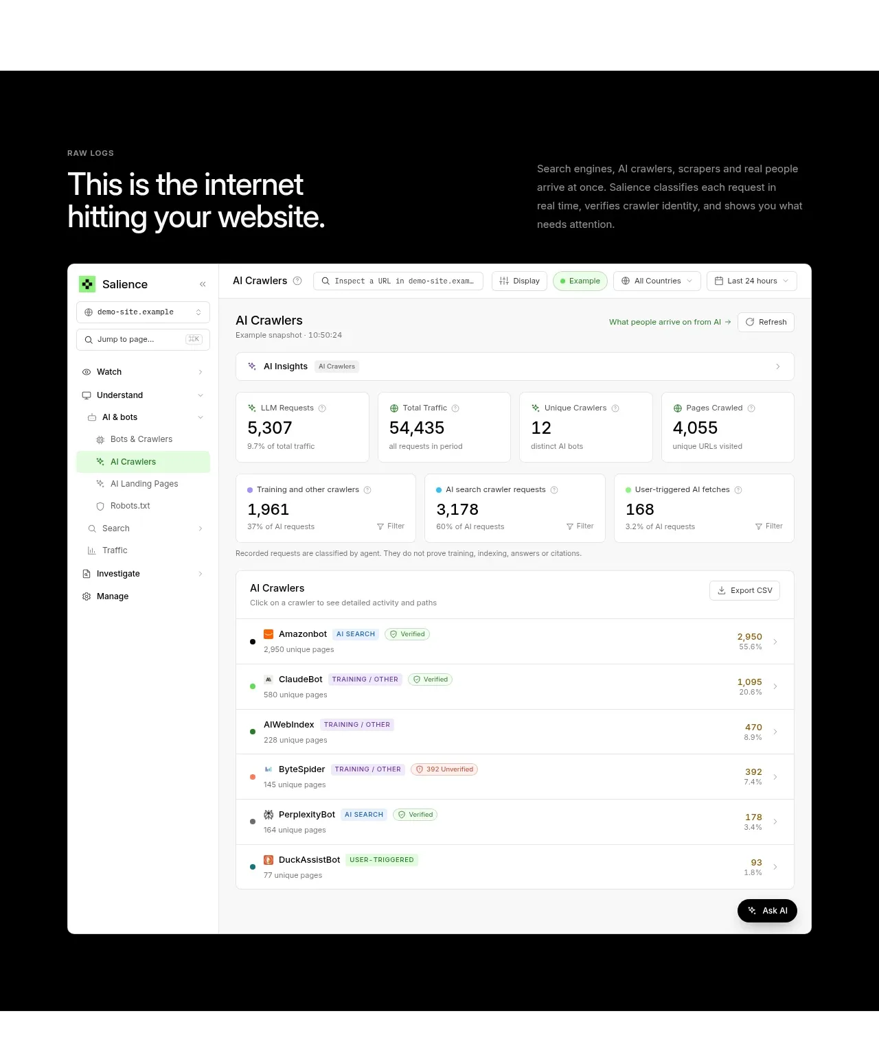 Raw activity dashboard showcase
Salience · Hero
Raw activity dashboard showcase
Salience · Hero
 Data-to-action engine
Salience · Feature grid
Data-to-action engine
Salience · Feature grid
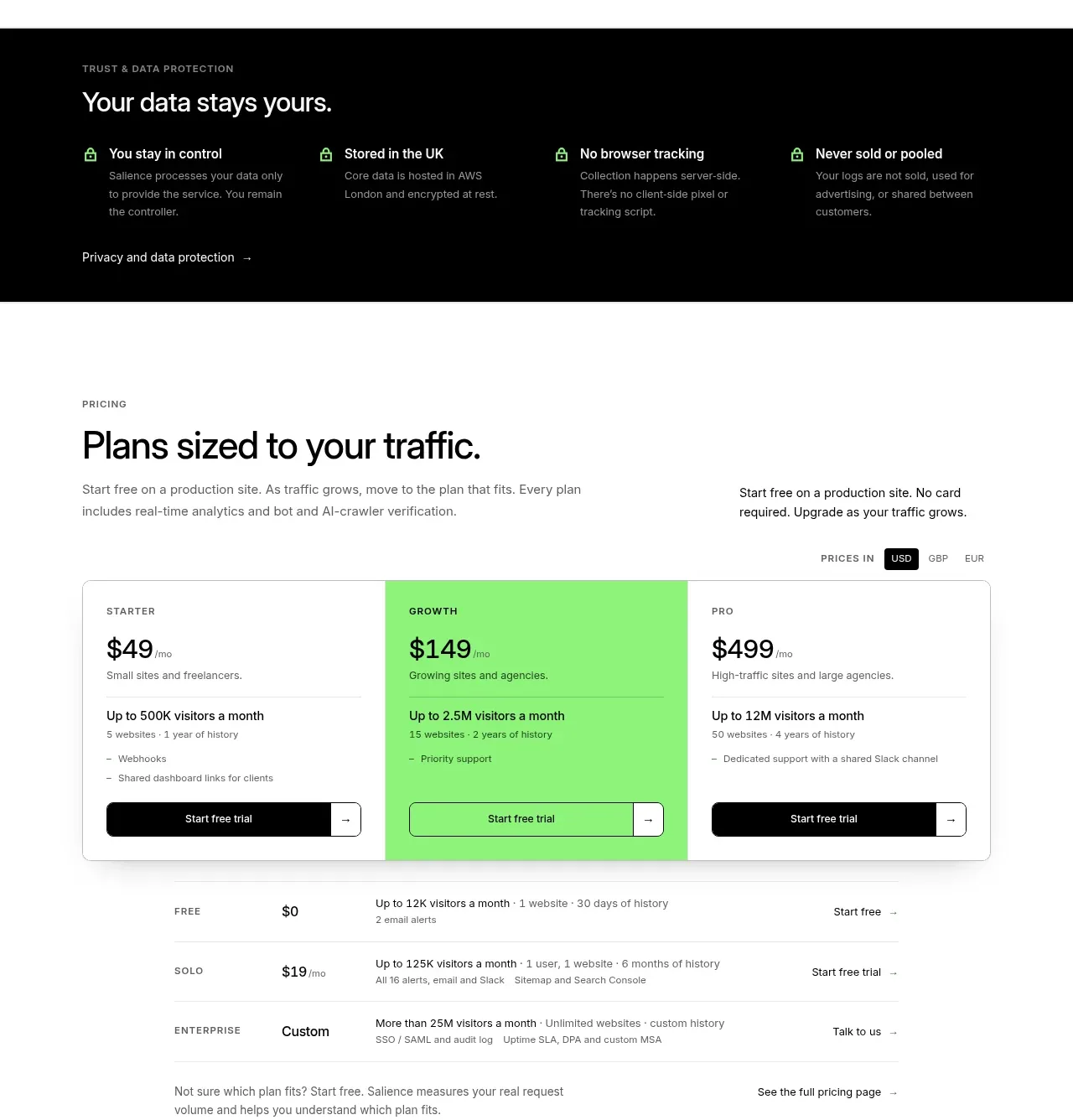 Traffic-based pricing plans
Salience · Pricing table
Traffic-based pricing plans
Salience · Pricing table
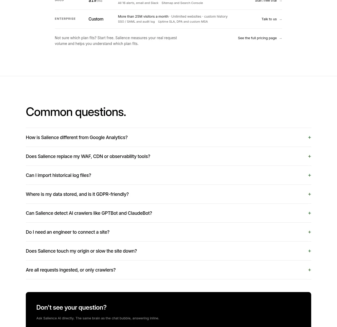 Common questions accordion
Salience · FAQ
Common questions accordion
Salience · FAQ
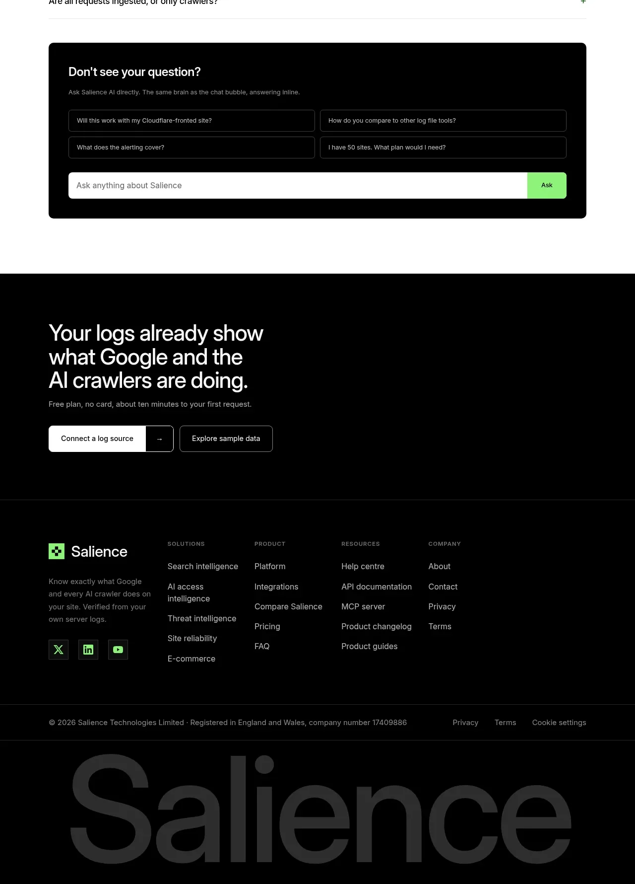 Conversion footer and site links
Salience · Footer
Conversion footer and site links
Salience · Footer
Related designs
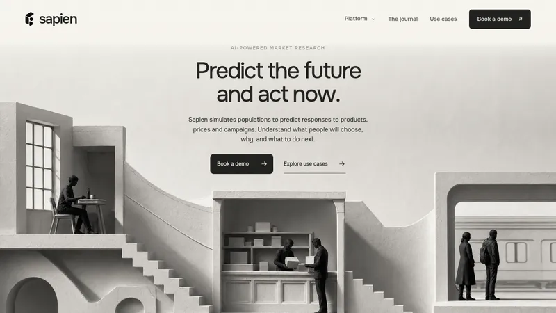

 Sapien
Landing page · Analytics & data
Sapien
Landing page · Analytics & data
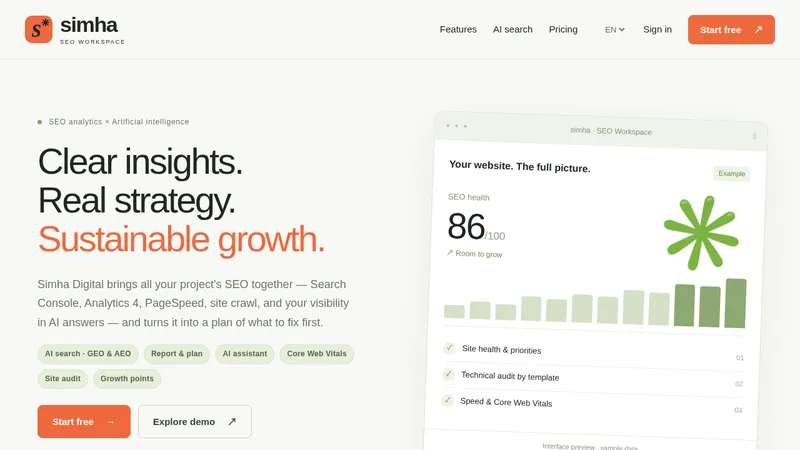

 Simha Digital
Landing page · Analytics & data
Simha Digital
Landing page · Analytics & data
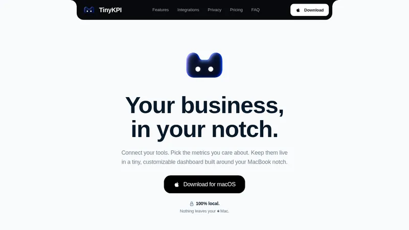

 TinyKPI
Landing page · Analytics & data
TinyKPI
Landing page · Analytics & data


 Basedash in Español Français & Português
Landing page · Analytics & data
Basedash in Español Français & Português
Landing page · Analytics & data


 AI Observability by OpenObserve
Landing page · Analytics & data
AI Observability by OpenObserve
Landing page · Analytics & data


 AdScope
Landing page · Analytics & data
AdScope
Landing page · Analytics & data