kage
kage
Design analysis
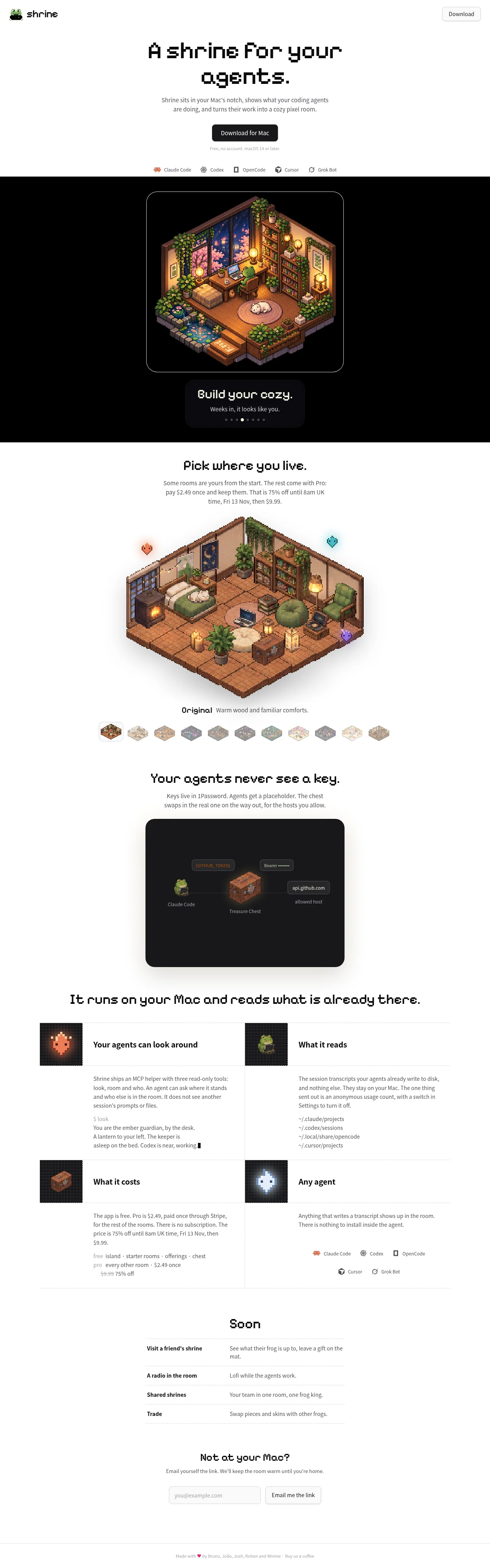
A monochrome landing page that pushes all its colour into cozy isometric pixel-art, so the chrome stays black/white/gray and the warmth lives only in the illustrations. The hero uses a chunky pixel display font with sentence-case headings ending in periods, then the page hands off to a full-bleed black band for the framed product screenshot before returning to an airy single column (~640px) of centred sections: a room-style picker with thumbnail swatches, a dark rounded key-flow diagram with monospace pills, a dotted-line 2×2 feature grid with dark pixel-icon tiles, a roadmap as a two-column dotted list, and an email capture. Rhythm comes from alternating white and black bands and from dotted 1px separators instead of solid rules, with a tiny emoji footer closing the page.
Prompt preview
## Reference images

Study these alongside the description below: hierarchy, rhythm, spacing, colour. Build for the product you are asked about, using this design language.

- Full page: https://kage-design-assets.t3.tigrisfiles.io/screenshots/shrine/ff477ea2-1694-4783-bdc4-4322fec31da4-1792130580085-full.webp
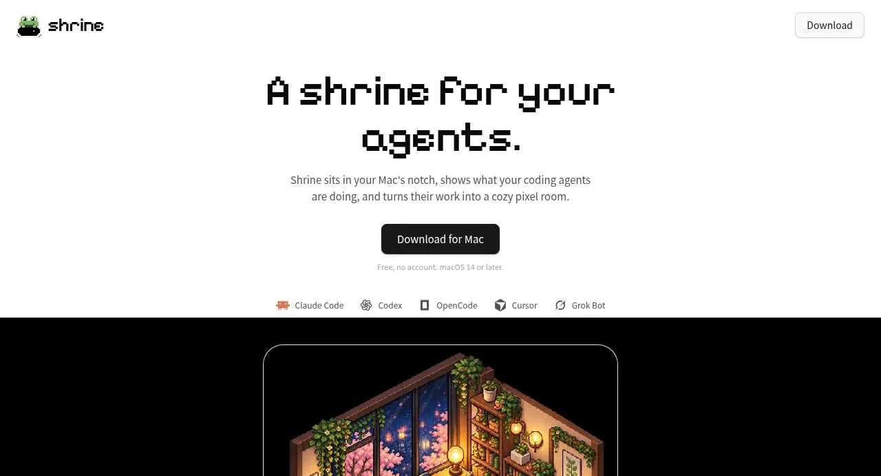
- Above the fold: https://kage-design-assets.t3.tigrisfiles.io/screenshots/shrine/ff477ea2-1694-4783-bdc4-4322fec31da4-1792130577413.webp
- Design on Kage: https://kage.design/designs/shrine-landing-page

## Before you start
Ask the user what they are building, who it is for, and what brand assets they already have (product name, colours, typefaces, any mascot or illustration style). Wait for the answers. Everything below is a design language to apply to *their* product — never reproduce the reference product itself.

## Page structure
1. **Header** — slim bar on white: small mascot/logo mark plus lowercase wordmark left, a single pill CTA button right. No nav links.
2. **Hero** — centred single column (~640px max): two-line pixel-font headline ending in a period, one short gray sub-paragraph, one black pill CTA, one line of 12px microcopy beneath it, then a horizontal strip of five small partner/tool marks in muted monochrome.
3. **Full-bleed dark showcase band** — pure black background edge to edge; a framed product screenshot (rounded corners, thin light border) centred, followed by a small dark caption card with a pixel-font line, a supporting sentence, and carousel dots.
4. **Style picker section** — back on white: pixel-font heading, gray paragraph with pricing detail, a large isometric feature illustration with floating decorative sprites, a one-line caption (bold label + gray descriptor), then a strip of ~12 small thumbnail swatches for switching styles, the active one outlined.
5. **Diagram section** — pixel heading plus short gray paragraph, then a large dark rounded card containing a simple left-to-right flow: monospace token pills, icons, dotted connector, and tiny gray labels under each node.
6. **Feature grid** — full-width pixel heading, then a 2×2 grid separated by dotted 1px lines (one vertical, two horizontal). Each cell: small dark square icon tile, bold sans heading, gray body text, and one cell-specific extra (a monospace path list, a price list with a strikethrough old price, or a row of tool marks).
7. **Roadmap list** — centred pixel heading, then a narrow list of four rows: bold label on the left, gray one-line description on the right, dotted rule between rows.
8. **Email capture** — pixel heading, one gray sentence, an underlined-feel light input plus a bordered light pill button side by side.
9. **Footer** — one 12px centered gray line with a heart emoji, contributor names, and a small link.

## Design language
- **Two-tone rhythm**: alternate white and pure-black full-bleed bands down the page (white hero → black showcase → white → white → white → white → white). The black band is the only full-bleed interruption; it acts as the stage for the product's most emotional visual.
- **Chrome is monochrome, art carries colour**: buttons, text, borders and cards stay black/white/gray (#FFFFFF background, #0A0A0A ink and dark bands, #6F6F6F body text, #E5E5E5 hairlines). All saturation — warm browns and ember orange (~#C97840, ~#E8590C), green (~#8FBF4D), pink (~#E8A9BC), teal (~#46C8C8) — lives inside illustrations and icon tiles only. Never colour the UI chrome with them.
- **Type pairing**: a chunky pixel/bitmap display font (e.g. Pixelify Sans or Silkscreen as a stand-in) used *only* for headings, sentence case, always ending with a period; body text is a plain sans (Inter/system) at 14–15px in gray; monospace for tokens, file paths and prices. Scale is extreme: pixel headings ~56–64px in the hero, ~28–32px in sections, while body never exceeds 15px — the contrast does the work.
- **Hierarchy without weight**: single-column centred sections, one heading + one paragraph each; no sidebars. Density increases mid-page (2×2 grid) and relaxes again for roadmap and email capture, so the page breathes in waves.
- **Borders over shadows**: flat design — 1px dotted rules as separators (grid, roadmap), 1px solid hairlines on screenshot frames and inputs, no drop shadows. Cards get radius 16–20px; buttons and pills get full radius.
- **Dark cards as dioramas**: on dark cards use a slightly lighter near-black panel (#0E0E10), monospace pills with thin dark borders, dotted connector lines, and 11–12px gray labels beneath each node to make a diagram read like a scene.
- **Motion is minimal**: carousel dots under the showcase, thumbnail selection swapping the active outline, subtle hover darkening on buttons. Nothing slides or parallax.
- **Buttons**: primary = black pill, white text, ~14px; secondary = light gray fill or 1px border pill. Exactly one primary CTA visible per viewport.

## Never
- No frog mascot, pixel room artwork, isometric room illustrations, or any sprite/illustration style copied from the reference — draw the user's own mascot or art if they supply one.
- No copy, taglines, section titles, pricing text, contributor names, or the "Build your cozy" / "Your agents never see a key" phrasing from the reference.
- No tool names or logos from the reference (Claude Code, Codex, OpenCode, Cursor, Grok Bot) or 1Password references; substitute the user's actual integrations.
- Never present the result as the reference product or reuse its wordmark in any form.
Components from this page
All components
 Pixel-style top navigation
Shrine · Navigation
Pixel-style top navigation
Shrine · Navigation
 Download-focused product hero
Shrine · Hero
Download-focused product hero
Shrine · Hero
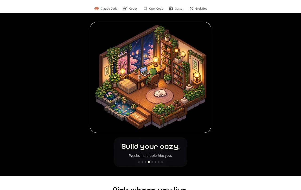 Dark product preview gallery
Shrine · Gallery
Dark product preview gallery
Shrine · Gallery
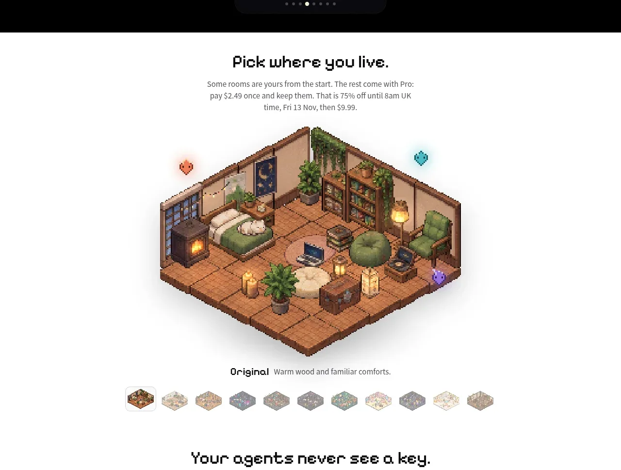 Selectable environment showcase
Shrine · Gallery
Selectable environment showcase
Shrine · Gallery
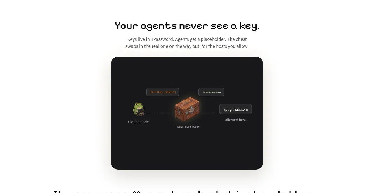 Privacy and workflow explanation
Shrine · Feature grid
Privacy and workflow explanation
Shrine · Feature grid
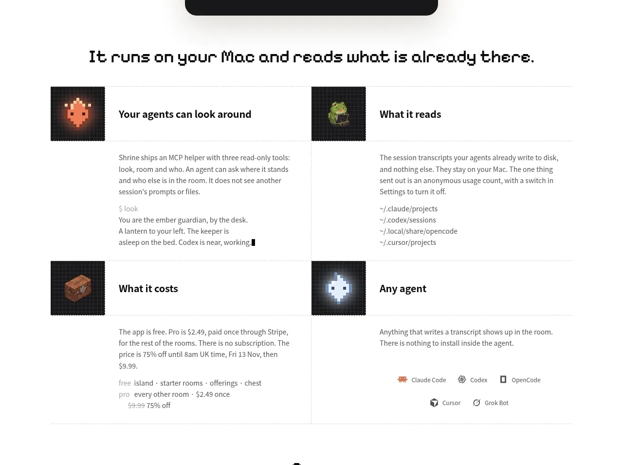 Four-part product capabilities grid
Shrine · Feature grid
Four-part product capabilities grid
Shrine · Feature grid
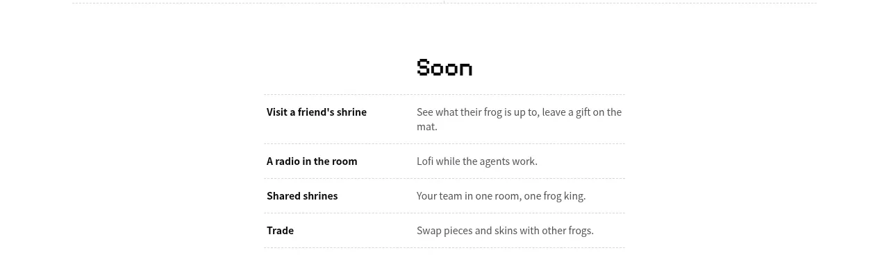 Near-term roadmap table
Shrine · Table
Near-term roadmap table
Shrine · Table
 Email link fallback form
Shrine · Form
Email link fallback form
Shrine · Form
 Minimal creator footer
Shrine · Footer
Minimal creator footer
Shrine · Footer