 kage
kage
stowdrop.app

Design analysis
A spacious, dark FAQ section uses a large rounded panel, restrained dividers, and a centered oversized heading to make support content feel calm and premium. The low-contrast structure keeps attention on the questions while a warm accent provides a small, clear interaction cue.
Prompt preview
## Reference images

Study these alongside the description below: hierarchy, rhythm, spacing, colour. Build for the product you are asked about, using this design language.

- Component: https://kage-design-assets.t3.tigrisfiles.io/components/stowdrop-app/2ca5946d-e8e0-4e0c-8652-e4352b3d8fe1-1789067825-10.webp
- Full page it was cut from: https://kage-design-assets.t3.tigrisfiles.io/screenshots/stowdrop-app/2ca5946d-e8e0-4e0c-8652-e4352b3d8fe1-1789060554-full.webp
- Component on Kage: https://kage.design/component/stowdrop-pricing-table

## Before you start
Ask me what my product does, who it is for, and what brand direction, tone, and design system I want to use. Then apply the principles below to create an FAQ or pricing-adjacent support section for my product—not a copy of the reference.

## Design language

Build a dark, editorial FAQ section that can sit beneath a pricing table or product feature page. It should feel polished, quiet, and highly legible rather than like a dense settings screen.

### Layout and alignment
- Use a near-black page background, approximately `#080909`, with a generous vertical gap separating this section from the preceding content.
- Introduce the section with a small uppercase eyebrow label aligned to the main content container. Keep it compact, letter-spaced, and use a warm accent colour.
- Place the FAQ content inside a broad rounded panel, typically 92–94% of the viewport width with a sensible max-width around 1180–1280px.
- Use a deep charcoal panel surface, approximately `#121416`, with the heading centered near the top and the questions arranged below in a narrower readable column.
- Keep the panel visually anchored with generous internal padding: roughly 72–96px on desktop and 32–40px on mobile.
- Align all structural elements to a consistent page grid. Do not let the centered heading cause the question rows to become overly wide.
- On small screens, stack the layout, reduce the heading size, preserve comfortable side padding, and allow question text to wrap naturally.

### Typography hierarchy
- Use a modern sans-serif with a clean, slightly editorial feel.
- Set the eyebrow in uppercase at approximately 11–12px, with 0.16–0.22em tracking and medium weight.
- Set the section heading large and compact—approximately 48–64px on desktop, with tight line-height around 0.95–1.05. Use a strong white or near-white such as `#F3F4F5`.
- Keep question labels around 16–18px with medium weight and relaxed line-height.
- Use muted supporting text around `#96999B` or `#A5A7A8`; maintain enough contrast for accessibility.
- Create a clear type contrast between the oversized heading and restrained question rows.

### Colour, borders, and shape
- Page background: `#080909`.
- Panel background: `#121416`.
- Primary text: `#F1F2F3`.
- Secondary text: `#9A9C9F`.
- Dividers: a subtle translucent light line, approximately `rgba(255,255,255,0.10)`.
- Accent: a warm orange such as `#FF7429`, used sparingly for the eyebrow and the active/open control.
- Give the main panel a large radius of approximately 28–34px. Use smaller radii, around 8–10px, for compact controls if needed.
- Avoid heavy shadows; if separation is necessary, use a very soft dark shadow or a slight tonal difference instead.

### Interaction
- Make each FAQ row keyboard accessible and clearly interactive.
- Use horizontal dividers between rows rather than boxed cards.
- Provide a quiet hover state by slightly lifting the text contrast or changing the row background by a very small amount.
- Support an open state with an animated height/opacity transition for the answer and a clear icon or accent indicator that changes state.
- Keep motion restrained: approximately 160–240ms with an ease-out curve.
- Ensure focus-visible states are obvious against the dark surface, using an accent outline or high-contrast ring.
- If this section is paired with pricing, keep the FAQ interaction independent from plan selection and do not obscure pricing information.

### Responsive and accessibility requirements
- Use semantic headings, buttons, and disclosure patterns such as `aria-expanded` and `aria-controls`.
- Maintain at least 44px of interactive height for question controls.
- Check colour contrast for all text and controls.
- Preserve the spacious, premium feeling at tablet and mobile widths without forcing horizontal scrolling.

## Never
- Never use logos, product names, or brand copy from the reference.
- Never copy the reference questions, pricing language, exact wording, or layout proportions literally.
- Never include the reference product’s illustrations, imagery, icons, or decorative assets.
- Never reproduce the reference as a pixel-for-pixel clone; adapt the underlying hierarchy and interaction principles to my product and brand.
- Never make the dark UI depend on colour alone to communicate an open, selected, or focused state.
More components
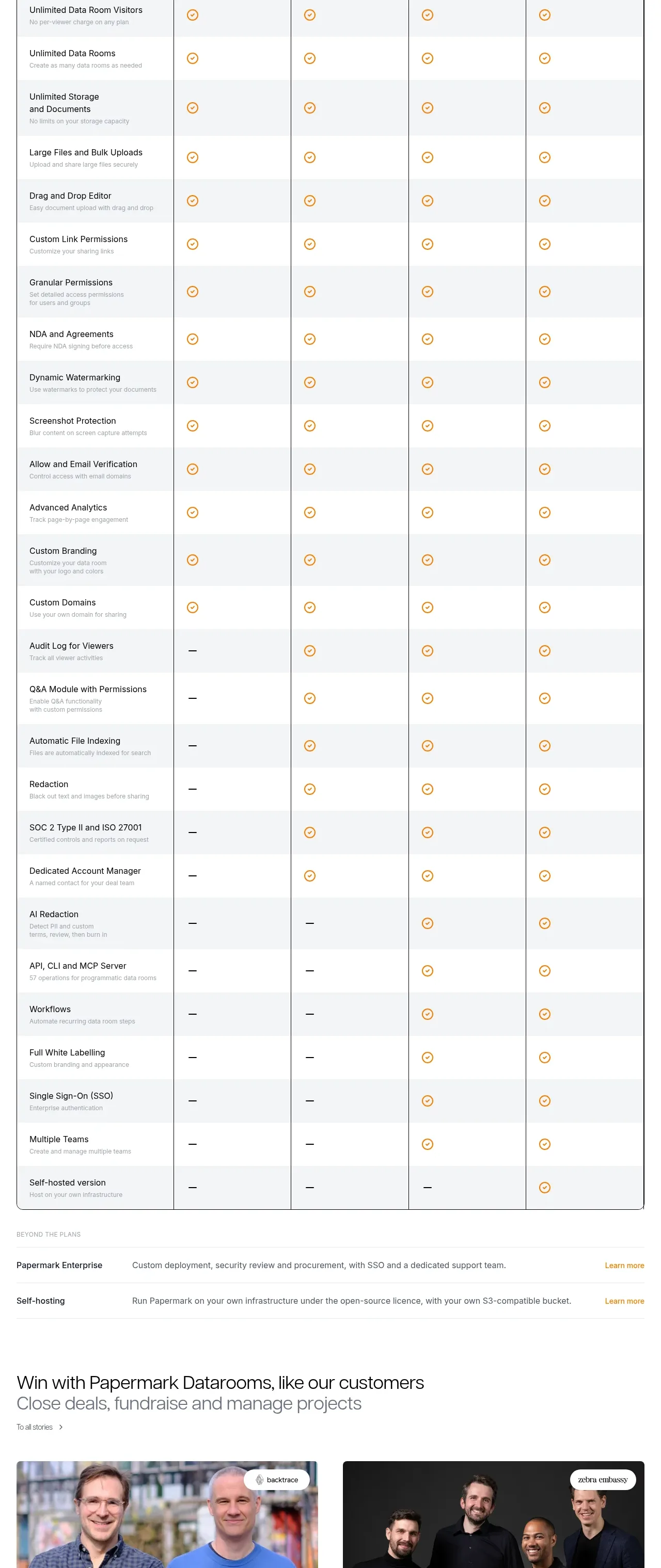
 Plan comparison table
Papermark Data Rooms · Pricing table
Plan comparison table
Papermark Data Rooms · Pricing table
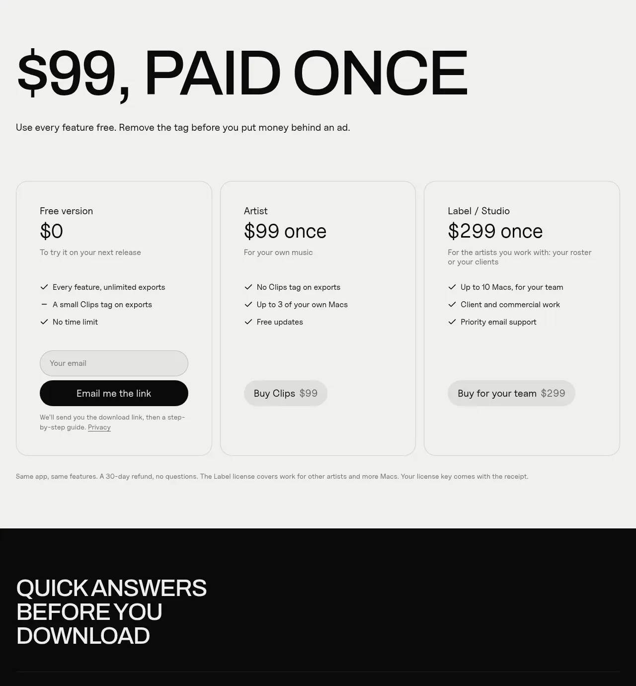
 One-time purchase pricing
Clips by Plastic · Pricing table
One-time purchase pricing
Clips by Plastic · Pricing table
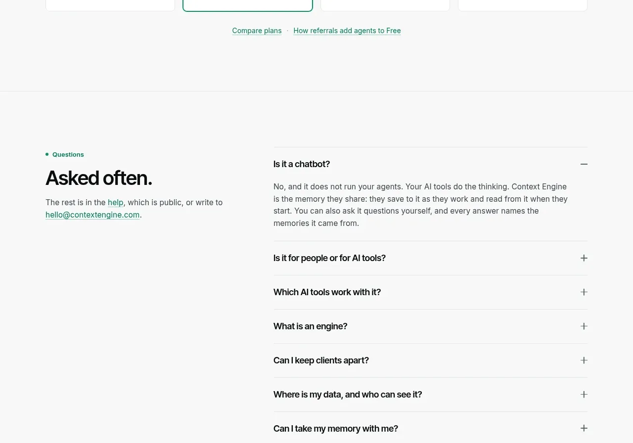
 Per-unit pricing table
Context Engine · Pricing table
Per-unit pricing table
Context Engine · Pricing table
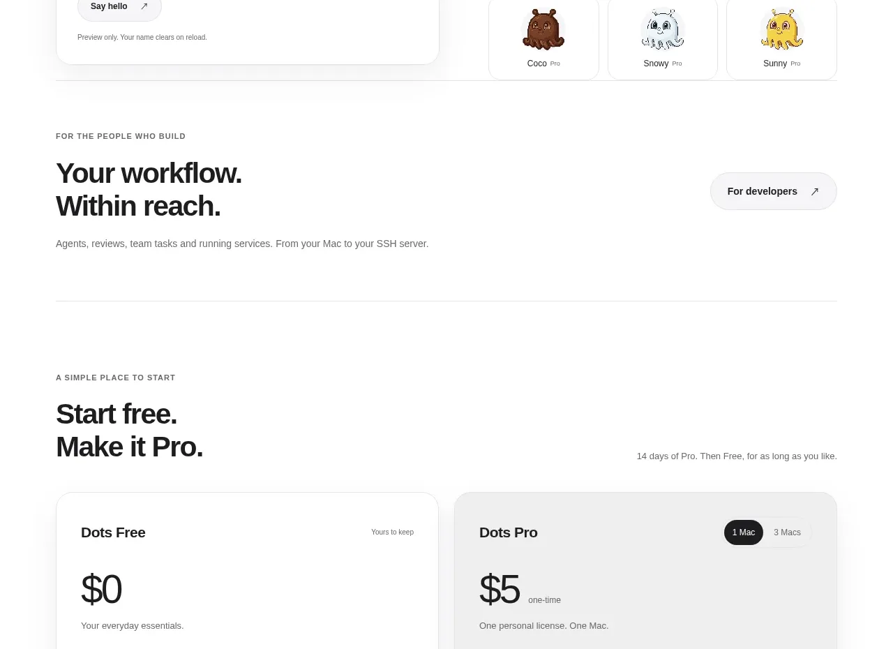
 Free and pro pricing cards
Dots · Pricing table
Free and pro pricing cards
Dots · Pricing table
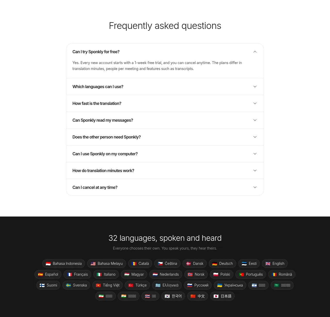
 Transparent multi-tier pricing
Sponkly · Pricing table
Transparent multi-tier pricing
Sponkly · Pricing table
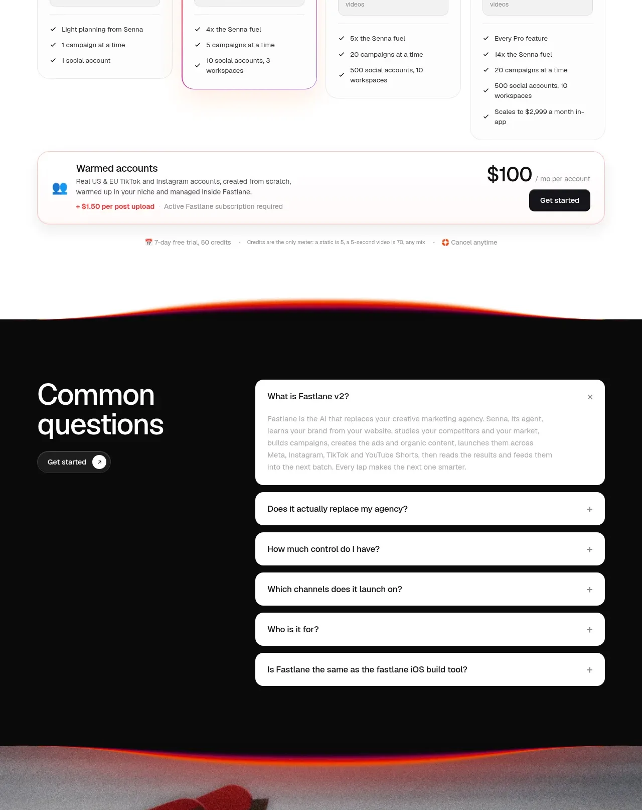
 Four-tier pricing table
Fastlane 2.0 · Pricing table
Four-tier pricing table
Fastlane 2.0 · Pricing table