kage
kage
stripe.com

Design analysis
This section pairs a centered customer proof block and logo rail with a dark, editorial infrastructure narrative. Its strongest move is the progression from credibility to capability: concise benefit statements, clear CTAs, and a technical ecosystem diagram that makes complex connectivity feel structured and approachable.
Prompt preview
## Reference images

Study these alongside the description below: hierarchy, rhythm, spacing, colour. Build for the product you are asked about, using this design language.

- Component: https://kage-design-assets.t3.tigrisfiles.io/components/stripe-com/f883ce83-9776-477f-9170-0bb4400c0ec7-1789067514-7.webp
- Full page it was cut from: https://kage-design-assets.t3.tigrisfiles.io/screenshots/stripe-com/f883ce83-9776-477f-9170-0bb4400c0ec7-1789060217-full.webp
- Component on Kage: https://kage.design/component/stripe-card

## Before you start
Ask the user what their product does, who it is for, and what visual brand they want to use. Then apply the principles below to create an original section for that product—not a copy of the reference.

## Build this section
Create a full-width marketing section that transitions from a light customer-proof area into a deep navy infrastructure showcase. The section should communicate trust first, then explain how the product connects to an existing technical ecosystem and scales reliably.

### 1. Customer proof panel
- Use a clean white or near-white background, with generous vertical padding.
- Center a concise testimonial across a restrained max-width of roughly 760–850px.
- Make the quote the visual focus: approximately 28–32px on desktop, 1.1–1.2 line-height, medium weight, and muted slate text such as `#596579`.
- Put the attribution beneath it. Emphasize the person’s name with a darker weight and keep the role/company in slate gray.
- Add a centered text link below the attribution. Use the product’s accent color, around `#635BFF` or an appropriate brand equivalent, with a subtle arrow or chevron.
- Below the quote, create a horizontal logo/name rail separated by a thin top border. Use four evenly distributed items, subdued gray treatment, and a small accent rule above or near the active item. If real logos are unavailable, use neutral text placeholders or abstract geometric marks rather than invented brand logos.
- On smaller screens, allow the rail to wrap or become horizontally scrollable while preserving equal visual weight.

### 2. Dark infrastructure showcase
- Transition into a deep navy background, approximately `#0B1738` to `#111D45`. Keep the section full bleed.
- Divide the dark area into vertically stacked feature rows using very subtle borders, around `#1D2A50`, rather than cards with obvious shadows.
- Each row should have a generous inner gutter, approximately 32–64px, and a centered content container around 1180–1280px.
- Begin with a headline-and-CTA row. Use a large 30–40px heading with tight line-height. In each statement, make the first benefit phrase bright near-white, around `#F5F7FF`, and the supporting phrase a desaturated blue-gray, around `#91A3C7`. This contrast creates hierarchy without adding extra labels.
- Place two adjacent buttons below the copy: one filled accent button using a vivid violet/indigo gradient or solid color around `#635BFF`, and one transparent or dark button with a 1px blue border. Use 14–16px semibold text, 10–12px radius, and a compact arrow icon where useful.

### 3. Connection ecosystem row
- Add a second feature row explaining how the product connects to existing systems. Keep the copy left-aligned and constrained to roughly 680–760px.
- Use the same bright-first / muted-second sentence treatment as the first row. Keep the supporting paragraph readable rather than overly decorative.
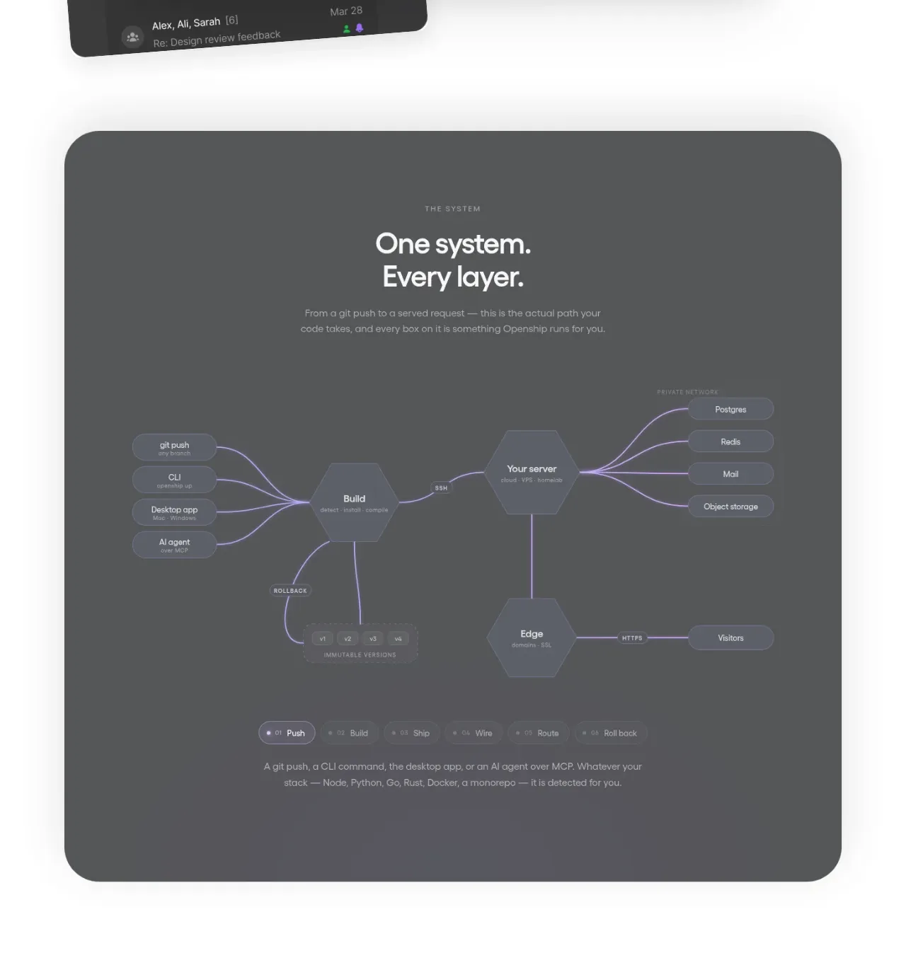
- Under the copy, build a visual systems map instead of using a generic illustration:
  - Place a central product node in the middle.
  - Arrange categories, connectors, adapters, destinations, and provider nodes around it in a clear hierarchy.
  - Use small pill or rectangular nodes with violet/indigo fills, subtle gradients, and light text.
  - Connect nodes with thin blue-violet lines. Prefer right-angle or gently curved paths that make the flow understandable.
  - Add a very subtle dotted grid behind the map, using low-opacity blue dots on the navy background.
  - Give the central node slightly more emphasis with a brighter fill, glow, or larger size, but keep the diagram restrained and technical.
- Treat the map as explanatory UI, not decoration: maintain alignment, readable labels, consistent node sizes, and enough spacing for relationships to be understood.

### 4. Scale row
- Continue the visual rhythm with another bordered feature row focused on reliability or scale.
- Use the same typographic hierarchy and bright/muted sentence treatment.
- If adding a background flourish, keep it abstract and low contrast—such as a faint violet contour, wave, or gradient entering from one corner. It must never compete with the copy.

## Design language
- **Layout:** Full-width bands with a centered max-width container. Use strong left alignment for dark-section copy and centered alignment for the testimonial. Maintain a deliberate vertical rhythm between rows.
- **Typography:** Use a modern sans-serif. Headings should feel compact and confident; body copy should be approximately 18–22px with 1.25–1.4 line-height. Avoid excessive weights and keep the contrast between primary and supporting text intentional.
- **Spacing:** Use broad section padding, approximately 72–120px vertically on desktop. Keep 16–24px between heading, supporting copy, and CTAs; use 48–80px before a diagram. Reduce padding and type sizes proportionally on mobile.
- **Colour:** Light area: `#FFFFFF`, `#F7F9FC`, slate text around `#596579`, border around `#E5EAF1`. Dark area: navy around `#0B1738`, elevated navy around `#111D45`, primary text `#F5F7FF`, secondary text `#91A3C7`, borders `#1D2A50`, accent violet around `#635BFF` and brighter indigo around `#7C5CFF`.
- **Borders and radius:** Use 1px low-contrast dividers. Buttons and diagram nodes can use 8–12px radius; avoid excessive rounded cards. Keep the overall section architectural and editorial rather than bubbly.
- **Interaction:** Links should shift color or underline subtly on hover. Buttons should brighten slightly and lift by 1–2px. Diagram nodes may reveal a tooltip, highlight connected paths, or increase border glow on hover/focus. Preserve keyboard focus states and provide a reduced-motion mode; never rely on animation to explain the diagram.
- **Responsive behavior:** Stack testimonial content and CTAs naturally on mobile. Let the systems map scale down, scroll horizontally, or simplify its peripheral nodes without making labels illegible. Keep the central relationship visible at every breakpoint.

## Never
- Never reuse the reference’s logos, product names, company names, testimonial copy, or exact labels.
- Never reproduce the reference illustration, node arrangement, wording, or pixel-level composition.
- Never use copied imagery, branded marks, or recognizable third-party logos from the reference.
- Never make the diagram an inaccessible image; use semantic HTML/SVG, readable labels, and an accessible text summary.
- Never sacrifice legibility with low-contrast text, excessive gradients, or decorative motion.