kage
kage
stripe.com

Design analysis
A high-trust metrics section that pairs a calm, oversized statement with four evenly distributed proof points. Thin dividers, restrained colour, and concise supporting labels make the numbers feel authoritative without turning the section into a dense dashboard.
Prompt preview
## Reference images

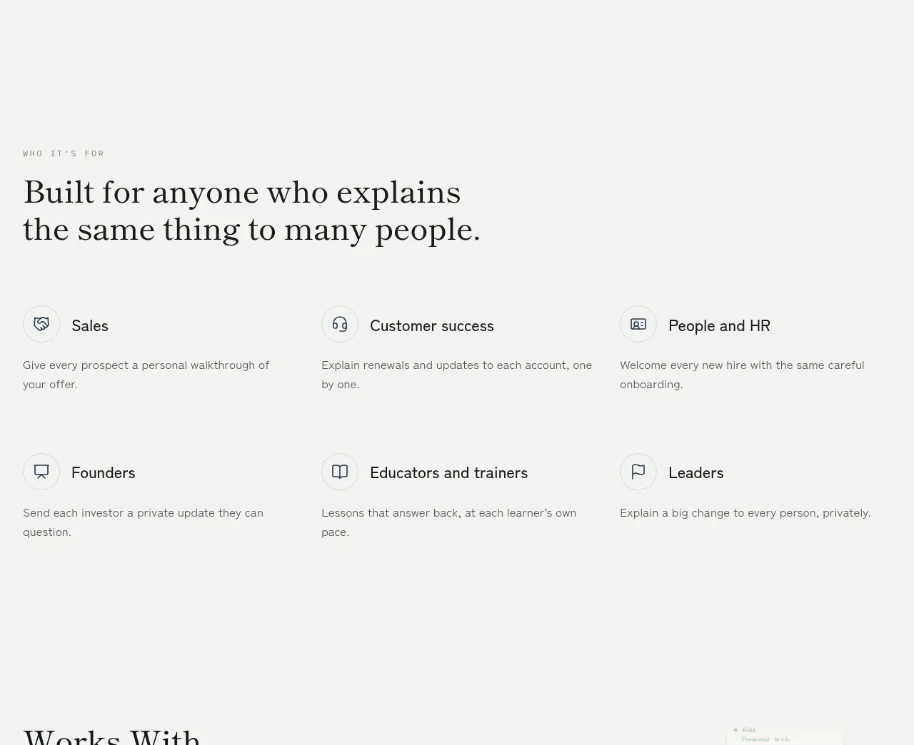
Study these alongside the description below: hierarchy, rhythm, spacing, colour. Build for the product you are asked about, using this design language.

- Component: https://kage-design-assets.t3.tigrisfiles.io/components/stripe-com/f883ce83-9776-477f-9170-0bb4400c0ec7-1789067512-4.webp
- Full page it was cut from: https://kage-design-assets.t3.tigrisfiles.io/screenshots/stripe-com/f883ce83-9776-477f-9170-0bb4400c0ec7-1789060217-full.webp
- Component on Kage: https://kage.design/component/stripe-stats

# Build a centered stats section for a modern product website

## Before you start
Ask me what my product does, who it is for, and what its brand personality, colours, typography, and key proof points are. Then apply the principles below to create a version tailored to my product—not a copy of the reference.

## Goal
Create a wide, editorial-style stats section that communicates category importance and business credibility. The section should feel calm, precise, spacious, and trustworthy. It consists of a centered introductory headline followed by a four-column metrics band.

## Structure
- Use a full-width section inside the site’s main content frame, with a very light cool background such as `#f8fafc` or white `#ffffff`.
- Keep a subtle 1px outer or horizontal rule system using a pale blue-gray such as `#dbe4ea`.
- Add a generous headline area above the metrics: approximately 120–180px vertical padding on desktop, reduced to 72–96px on mobile.
- Center a short, two-line headline with a maximum width of roughly 520px. The line break should be intentional, but allow it to reflow naturally at smaller widths.
- Place the metrics in a separate horizontal band beneath the headline, divided from it by a thin rule. Add another rule beneath the band if it helps establish clear section boundaries.
- Use four equal-width metric cells on desktop. Each cell should be vertically centered and aligned consistently, with generous horizontal padding.
- On smaller screens, switch to a 2×2 grid or a single-column stack depending on content length. Preserve clear separators without creating a visually heavy table.

## Alignment and layout logic
- Center the headline and all metric content; do not left-align individual cells unless the product’s brand system strongly calls for it.
- Use a centered max-width container, typically 1200–1280px, with 24–32px side gutters.
- Make each metric cell the same visual width and give all primary values the same baseline treatment.
- Keep the value-to-label relationship tight, while leaving noticeably more space between the headline and the stats band.
- Avoid cards, shadows, decorative charts, or excessive UI chrome. The strength comes from scale, rhythm, and credible information.

## Typography
- Use the product’s brand sans-serif or a clean contemporary grotesk.
- Headline: large, dark, and compact; approximately 52–64px on desktop with 0.95–1.05 line-height and slight negative tracking. Use 36–44px on mobile.
- Metric values: approximately 42–52px on desktop, with medium or regular weight. Use tabular numerals if available so columns feel aligned.
- Metric labels: approximately 15–17px, regular weight, 1.3–1.45 line-height, and a muted tone. Keep labels to two or three short lines.
- Use sentence case and concise, specific descriptions. Avoid all-caps labels unless that is an established part of the brand.

## Colour
- Primary text: deep blue-black, approximately `#0b1f2a` or `#102a43`.
- Secondary labels: muted slate, approximately `#6b7c8f` or `#718096`.
- Rules: very pale blue-gray, approximately `#d9e3e8`.
- Surface: white or an almost-white cool tint, approximately `#f8fafc`.
- If one metric needs emphasis, use a restrained brand accent rather than making the entire band colourful. Maintain accessible contrast for all text.

## Borders, radius, and surface treatment
- Prefer square or very lightly rounded section boundaries; use a radius of 0–4px if the surrounding design system requires it.
- Use 1px rules rather than boxed cards.
- Do not use drop shadows, gradients, glass effects, or floating panels in the stats band.
- If the surrounding page uses a framed layout, keep the section’s border treatment continuous with adjacent sections.

## Content behaviour
- Support variable-length values such as percentages, currency abbreviations, plus signs, and large quantities without breaking the grid.
- Keep labels descriptive enough to establish context, including a time period or scope where relevant.
- Do not invent impressive claims. Use the user’s verified product data, and provide sensible placeholder tokens when data is not yet available.
- Ensure the component remains useful with two, three, or four metrics; redistribute columns gracefully.

## Responsive and accessibility requirements
- At widths below approximately 768px, reduce typography and padding while keeping strong hierarchy.
- Prevent long values from colliding by allowing controlled wrapping or reducing the value size responsively.
- Use semantic HTML: a section with a heading and a list or grouped set of statistics.
- Provide sufficient colour contrast, visible focus styles for any interactive elements, and logical reading order.
- Respect reduced-motion preferences. The stats should not require animation; if count-up effects are added, make them subtle and accessible.

## Never
- Never use the reference site’s logo, product name, company name, or brand-specific wording.
- Never copy the exact headline, metric values, labels, or claims from the reference.
- Never reuse the reference’s imagery, illustrations, decorative graphics, or visual assets.
- Never reproduce the surrounding page sections; build only a reusable stats component for my product.
- Never make unsupported numerical claims or imply verification that the user has not provided.
- Never turn the section into a dense analytics dashboard with charts, filters, or unnecessary controls.