kage
kage
together.ai

Design analysis
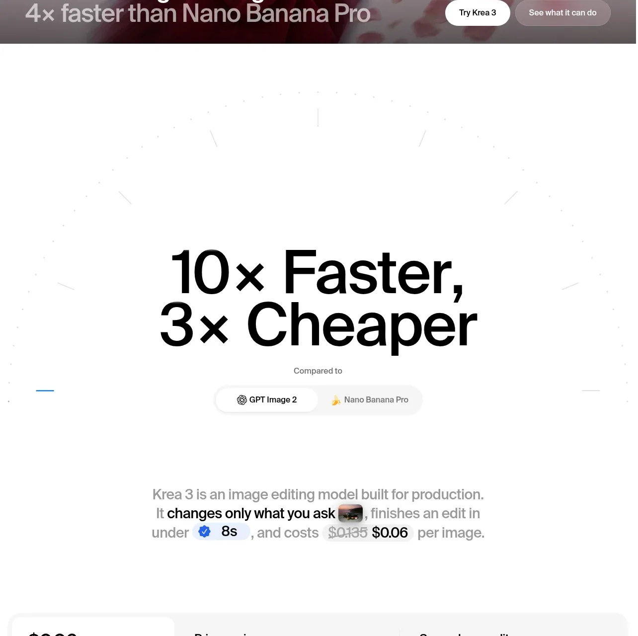
A centered section heading introduces three oversized metric cards, each using a distinct pastel surface, compact directional label, dominant value, and understated supporting line. The cards are unified by a precise three-column grid and small connector accents that make the row feel like one connected performance story.
Prompt preview
## Reference images

Study these alongside the description below: hierarchy, rhythm, spacing, colour. Build for the product you are asked about, using this design language.

- Component: https://kage-design-assets.t3.tigrisfiles.io/components/together-ai/60591018-8706-471e-a3f2-ad3109f52987-1789073939-3.webp
- Full page it was cut from: https://kage-design-assets.t3.tigrisfiles.io/screenshots/together-ai/60591018-8706-471e-a3f2-ad3109f52987-1789073908-full.webp
- Component on Kage: https://kage.design/component/together-stats

## Before you start
Ask what the user's product does, who it is for, and what its brand personality, colours, typography, and key proof points are. Then apply the principles below to create an original stats section for that product rather than reproducing a reference section.

## Build this section
Create a responsive, editorial-style performance stats section for a modern software or AI product. It should communicate three concise proof points as a connected row of large metric cards.

### Layout and alignment
- Use a full-width section with a pale, almost-white background and generous vertical breathing room.
- Center a narrow intro block above the cards: a strong one-line heading followed by a quieter explanatory sentence.
- Place three equal-width cards in a single row on large screens, with a small consistent gap between them. Use a centered max-width container around 1180–1240px with side padding of roughly 32–44px.
- Each card should have a fixed visual rhythm: compact label at the top, oversized metric below it, and supporting sentence anchored near the bottom.
- Add short horizontal connector bars between adjacent cards, vertically aligned around the lower part of the metric area. They should visually link the cards without becoming a separate diagram.
- On smaller screens, stack the cards vertically or use a single-column flow; hide or reposition connector bars so they never overlap content.
- Keep all card content left-aligned. Make the section feel spacious and calm rather than dense.

### Typography hierarchy
- Use the product's own font or a clean contemporary sans-serif.
- Section heading: bold, dark, approximately 36–42px on desktop with tight line-height around 1.05–1.15; scale to 28–34px on mobile.
- Intro sentence: muted medium-weight sans-serif, approximately 16–18px with comfortable line-height.
- Metric value: very large, light-to-regular weight, approximately 56–68px desktop and 44–54px mobile; use tight tracking and avoid decorative styling.
- Card label: compact uppercase or small-caps text, around 10–12px, medium weight, with slight letter spacing. Include a simple text arrow or directional cue only when it clarifies the metric.
- Supporting text: small, readable 12–14px text with relaxed line-height and enough contrast against the card surface.

### Colour and surfaces
- Start with a near-white page background such as #FFFFFF or #FCFCFB.
- Give each card a distinct, low-saturation pastel surface. For example: cool powder blue #B9D9F2, soft blush pink #F5D9F0, and warm peach #F9D7C3. Adapt these hues to the user's brand rather than copying them literally.
- Use near-black typography such as #090909 for headings and metrics, with muted gray #8C8C8C for the intro and deep gray #3E4650 for supporting copy.
- Labels may use a slightly darker translucent tint of their card colour, with a fine low-contrast outline.
- Connector bars should use a pale lavender or another brand-compatible accent, approximately #B8B1F4.
- Maintain strong text contrast and do not rely on colour alone to communicate meaning.

### Borders, radius, and spacing
- Keep cards nearly square or only subtly rounded: use 0–2px radius unless the user's brand calls for more softness.
- Avoid heavy borders. If needed, use a 1px translucent white or neutral border that gently separates cards from the page.
- Card height should feel substantial, approximately 245–270px on desktop.
- Use around 16–18px internal padding on the label area and 18–20px horizontal card padding overall; place the supporting line close to the lower edge while preserving a comfortable inset.
- Give the intro-to-card transition approximately 52–64px of space. Use consistent grid gaps and align card tops precisely.
- Use subtle horizontal rules or reserved whitespace below the row only if they support the surrounding page structure; do not add unnecessary decoration.

### Interaction and motion
- The section can remain static, but cards may receive a very restrained hover treatment: a 1–2px upward shift, slight surface brightening, or a soft shadow.
- Keep transitions fast and subtle, around 180–240ms ease-out. Do not make metrics bounce, count aggressively, or distract from the proof points.
- If the cards link to deeper product evidence, make the entire card or a clear label interactive and provide keyboard focus styles.
- Respect reduced-motion preferences.

### Content guidance
- Use three genuinely useful, easy-to-scan metrics relevant to the user's product. Keep each value short and visually dominant.
- Pair each metric with a compact directional label and one sentence explaining the source or benefit.
- Avoid unsupported claims; allow the user to replace placeholder values with verified data.

### Accessibility and implementation
- Use semantic section, heading, and list/grid structure.
- Preserve readable contrast across every pastel surface.
- Keep text selectable and responsive; do not render metrics as images.
- Ensure the mobile layout remains legible without horizontal scrolling.

## Never
- Never copy the reference's logos, product names, brand language, exact copy, or exact metric values.
- Never reuse illustrations, imagery, icons, or decorative artwork from the reference.
- Never reproduce the reference pixel-for-pixel; translate the layout and communication principles into the user's product and brand.
- Never use pastel colour as a substitute for accessible contrast or clear information hierarchy.