 kage
kage
tonebird.ai
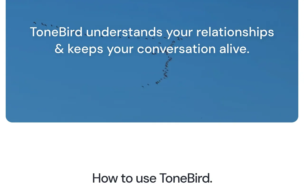
Design analysis
A single oversized rounded panel interrupts the white page with a confident relationship-focused statement and a restrained abstract visual treatment.
Prompt preview
## Reference images

Study these alongside the description below: hierarchy, rhythm, spacing, colour. Build for the product you are asked about, using this design language.

- Component: https://kage-design-assets.t3.tigrisfiles.io/components/tonebird/16d0d272-e4c0-4394-9450-270e8dcbe6b2-1790229837-2.webp
- Full page it was cut from: https://kage-design-assets.t3.tigrisfiles.io/screenshots/tonebird/16d0d272-e4c0-4394-9450-270e8dcbe6b2-1790229760726-full.webp
- Component on Kage: https://kage.design/component/tonebird-banner

## Before you start
Ask for the user's product positioning, emotional promise, and brand colors. Translate that promise into an original visual statement.

Create a wide, inset statement banner with a strong solid or subtly textured background, large centered light text, and ample breathing room. Use a 20–24px corner radius and keep the panel narrower than the viewport so its rounded silhouette is visible. The statement should be two lines at most, approximately 28–36px, with supporting visual texture kept low contrast behind it. For a calm technology brand, consider a deep desaturated blue such as #3479aa with white text #f8fbfc; adapt the hue to the user's brand. Avoid extra controls unless the product needs one. On small screens, reduce type size and preserve the panel's generous padding.

Never: copy logos, product names, copy, illustrations, or imagery from the reference.
More components

 Launch and limited-time offer banners
Hola AI · Banner
Launch and limited-time offer banners
Hola AI · Banner
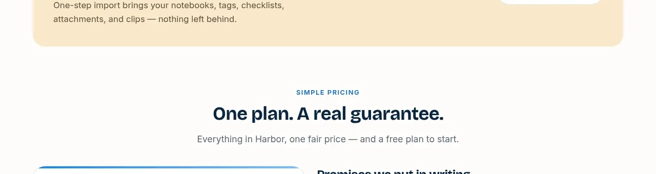
 Migration reassurance banner
Harbor · Banner
Migration reassurance banner
Harbor · Banner

 Readability guidance banner
Image to ASCII · Banner
Readability guidance banner
Image to ASCII · Banner
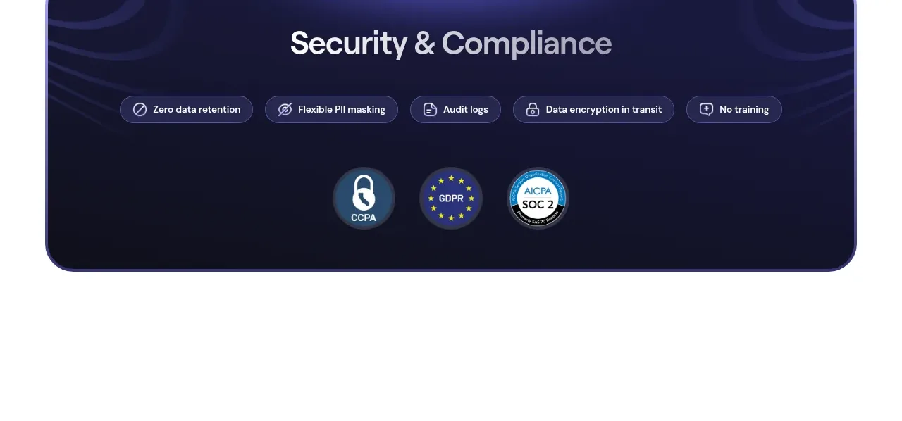
 Security and compliance banner
Web Search Agents by Nimble · Banner
Security and compliance banner
Web Search Agents by Nimble · Banner
 Statement image banner
DockFix 5.0 · Banner
Statement image banner
DockFix 5.0 · Banner

 Growth statement banner
Cadenya · Banner
Growth statement banner
Cadenya · Banner