kage
kage
tonebird.ai

Design analysis
A quiet white page carried entirely by a warm serif for statement headlines, with small gray sans-serif doing the utilitarian work; the only saturated accent is a lime-green brand mark. The rhythm alternates airy centered sections with mockup-heavy storytelling — pastel-tinted panels framing simplified product UI cards, an annotated callout layout around one large app mockup, and a full-bleed blue gradient band that interrupts the white with a single serif sentence. Density shifts down the page into a 3×3 testimonial grid, four pricing cards built around grayscale photo collages that scale with the tier, an accordion FAQ, and a vivid multicolor gradient CTA that closes the page.
Prompt preview
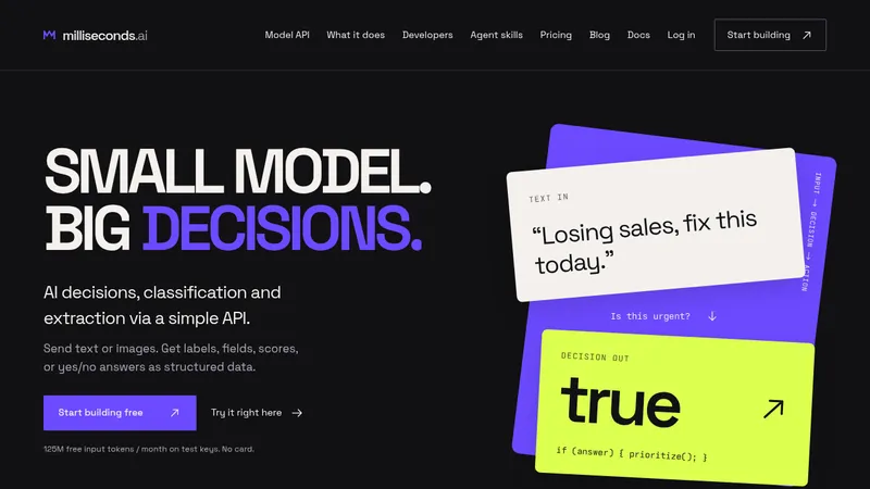
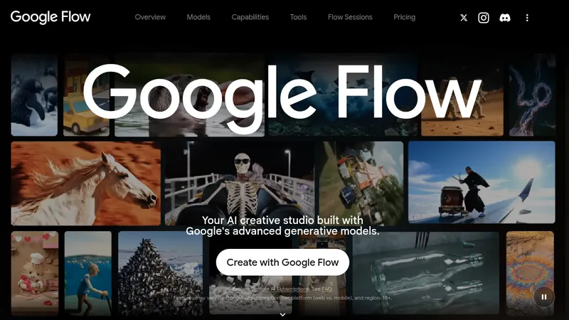
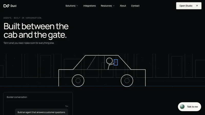
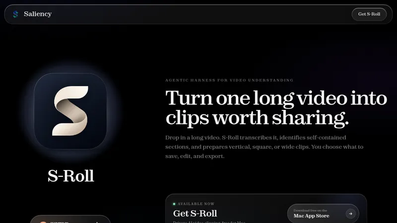
## Reference images

Study these alongside the description below: hierarchy, rhythm, spacing, colour. Build for the product you are asked about, using this design language.

- Full page: https://kage-design-assets.t3.tigrisfiles.io/screenshots/tonebird/16d0d272-e4c0-4394-9450-270e8dcbe6b2-1790229760726-full.webp
- Above the fold: https://kage-design-assets.t3.tigrisfiles.io/screenshots/tonebird/16d0d272-e4c0-4394-9450-270e8dcbe6b2-1790229755562.webp
- Design on Kage: https://kage.design/designs/tonebird-landing-page

## Before you start
Ask the user what they are building, who it is for, and what brand assets they already have (name, logo, colours, typeface, tone of voice). Wait for the answers. Everything below is applied to their product, not to the reference site.

## Page structure
Build one long-scroll marketing page in this exact order:

1. **Sticky nav** — logo + wordmark left, four or five text links centered-right, one pill CTA button far right. White background, hairline bottom border.
2. **Hero** — centered: a two-line serif statement headline, one short gray paragraph, two pill buttons (one per platform). Below, a large rounded mockup card showing the product working inside a familiar chat app: dark app sidebar, message thread, and the assistant's drafted reply in a composer with a "Tweak / Insert" row. A row of small pill chips (partner app names + "More") sits under the mockup.
3. **Statement band** — full-bleed deep-blue gradient panel with one large white serif sentence and a subtle dotted-path illustration. Pure brand statement, no UI.
4. **How-to** — centered serif heading + one-line subcopy, then three equal cards on tinted panels, each holding a miniature UI mockup of one step; below each card a short bold title + one-line caption.
5. **Context features** — centered serif heading, then three feature rows alternating text and mockup sides: line icon + short bold label + two-line gray copy on one side; on the other, a pastel-gradient panel holding a white product card (a recalled-knowledge note, a file-sourced reply, two tone variants of the same reply).
6. **Voice section** — one large product mockup with three annotation callouts placed around it (right, left, bottom-right): small bold heading + short gray paragraph tied to a specific UI detail.
7. **Follow-up section** — serif heading, two subsections. First: heading + copy, then two mockup cards side by side on gradient panels (chat reply + calendar event). Second: heading + copy, then a grouped tasks card (to-do rows with app icons) next to a chat snippet card with highlighted phrases.
8. **Integrations** — left serif heading + short copy; right a grid of rounded tiles with partner app icons; below, four language pills.
9. **Privacy** — simple flat illustration (speech bubble + padlock) left, serif heading + short copy + text link right.
10. **Testimonials** — centered serif heading, then a 3×3 grid of small bordered cards: avatar, name, handle, short quote. Vary quote lengths so the grid feels organic.
11. **Pricing** — left serif heading, right short intro; Monthly/Annual pill toggle centered below. Four cards (2×2 on mobile): plan name + price at top, daily-usage line, a grayscale photo collage that grows with the tier, contact count at the bottom.
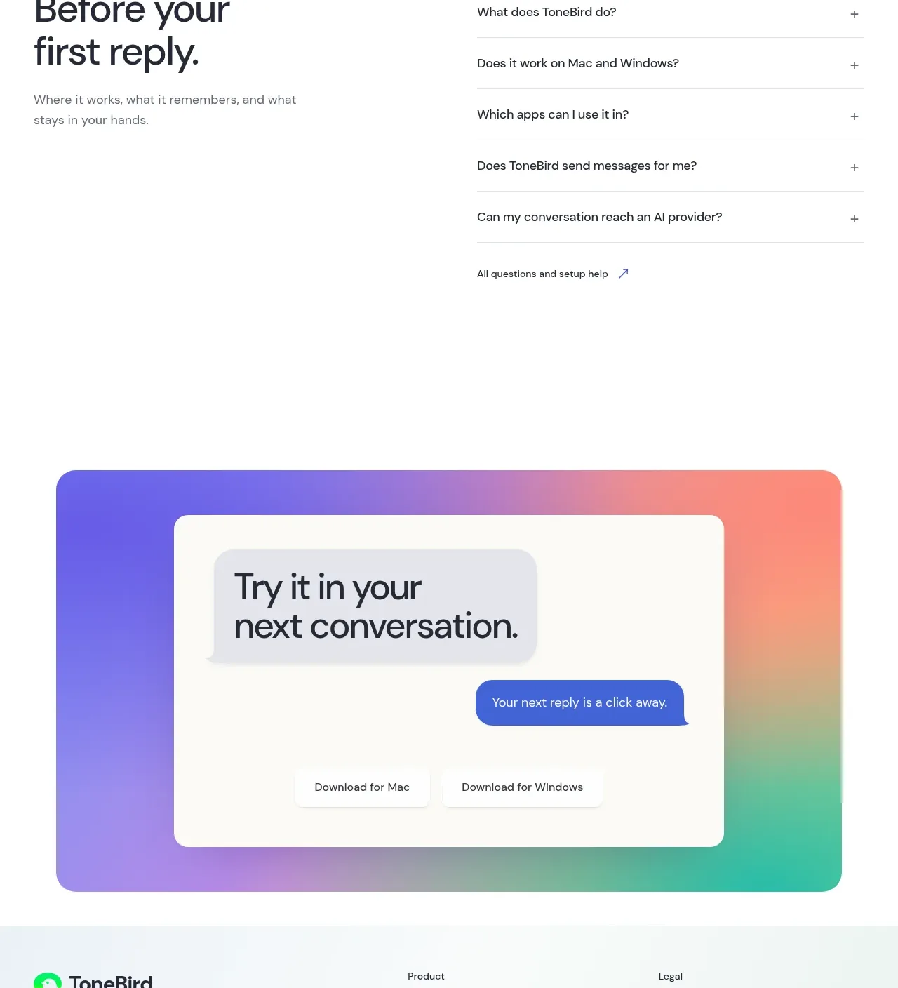
12. **FAQ** — left serif heading + one-line subcopy; right an accordion of five or six questions with plus icons and hairline dividers.
13. **Final CTA** — full-width card with a vivid multicolor gradient (violet → coral → teal), a white pill holding the serif headline, small chat-bubble chips, two download pill buttons.
14. **Footer** — logo + tagline + social icons left; Product and Legal link columns right; copyright line at the bottom.

## Design language
- **Type pairing**: a modern serif (Tiempos/Fraunces/Source Serif 4 character) for every statement headline and section heading — sentence case, tight leading (~1.1), slight negative tracking; a neutral grotesque sans (Inter-like) for body, labels, and all mockup UI text. Hero ~56–72px, sections ~36–44px, body 14–16px.
- **Hierarchy**: serif carries the argument, small gray sans carries the explanation. Every section opens with a heading plus at most one supporting line — never more.
- **Rhythm**: alternate airy text-led sections with mockup-led ones; after two white sections insert a full-bleed coloured band to reset the eye. Generous section padding (~96–120px vertical).
- **Colour**: white/off-white page (#FFFFFF–#FAFAF8), near-black text (#17181A), secondary gray (#6B7280). One saturated brand accent — lime green (~#7ED957) — used sparingly for the logo mark, dots, and small highlights. Deep-blue gradient band (#2E6E9E → #55A7CE) for the statement. Pastel tinted panels frame mockups: mint (#E3EEE2), lavender (#CBD2EC), sand (#EAE6DA), mist blue (#D9E2EC). Close with a vivid multicolor gradient (violet #7C6CF0 → coral #F2997A → teal #5FC9B2).
- **Cards & mockups**: white cards sitting on tinted panels, radius 16–24px, hairline borders, very soft shadows (low opacity, large blur). Mockups are simplified HTML/CSS UI — dark app sidebar, light chat pane, composer with suggestion pills — not screenshots.
- **Buttons & chips**: everything is pill-shaped (999px radius). Primary = dark/near-black or brand accent; secondary = white with a hairline border. Small chips carry brand-coloured dots or icons.
- **Imagery**: flat geometric illustrations in brand colours; grayscale/duotone photography only inside the pricing collages. No stock-photo banners.
- **Motion**: restrained — subtle hover lift on cards, accordion expand, gentle fade-in on scroll; no parallax or heavy animation.

## Never
- No reference brand: no bird logo, no "ToneBird" wordmark, no copy such as "You don't have to be stuck on words again".
- No real third-party logos (Slack, Gmail, WhatsApp, Messenger, Discord, LinkedIn, X, iMessage) — use generic placeholder names and icons for integrations unless the user owns the rights.
- No photography, illustrations, avatars, or testimonial text taken from the reference; invent neutral examples for the user's product.
- Never present the result as the reference product.
Components from this page
All components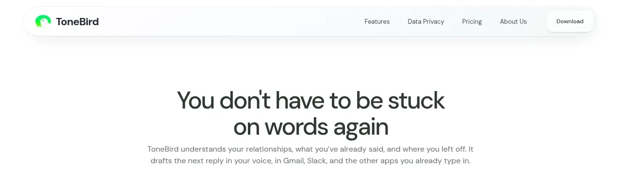
 Minimal product navigation
ToneBird · Navigation
Minimal product navigation
ToneBird · Navigation
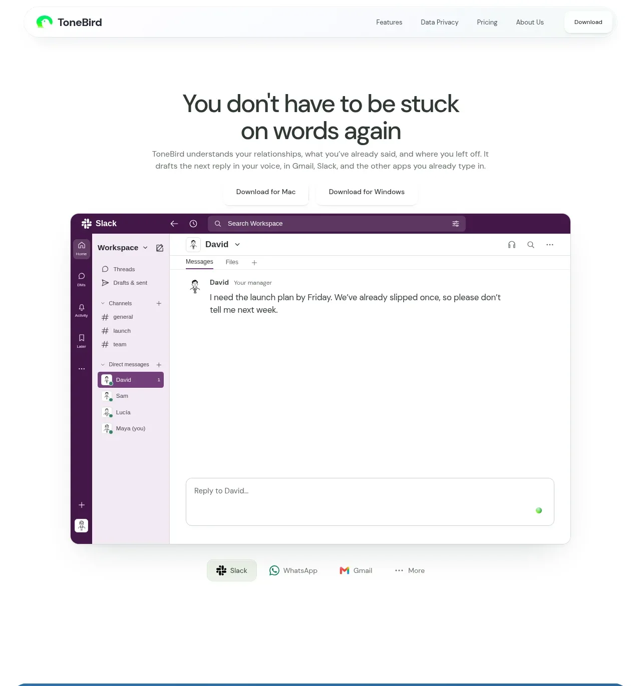 Product promise and app preview
ToneBird · Hero
Product promise and app preview
ToneBird · Hero
 Brand promise banner
ToneBird · Banner
Brand promise banner
ToneBird · Banner
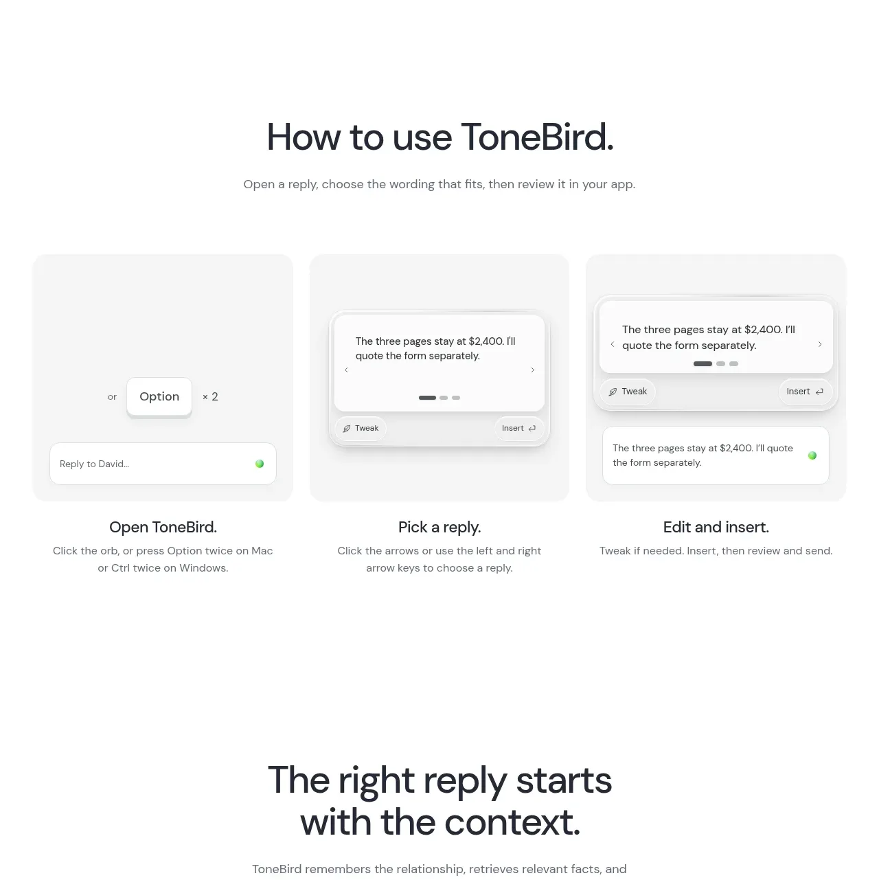 Three-step workflow
ToneBird · Feature grid
Three-step workflow
ToneBird · Feature grid
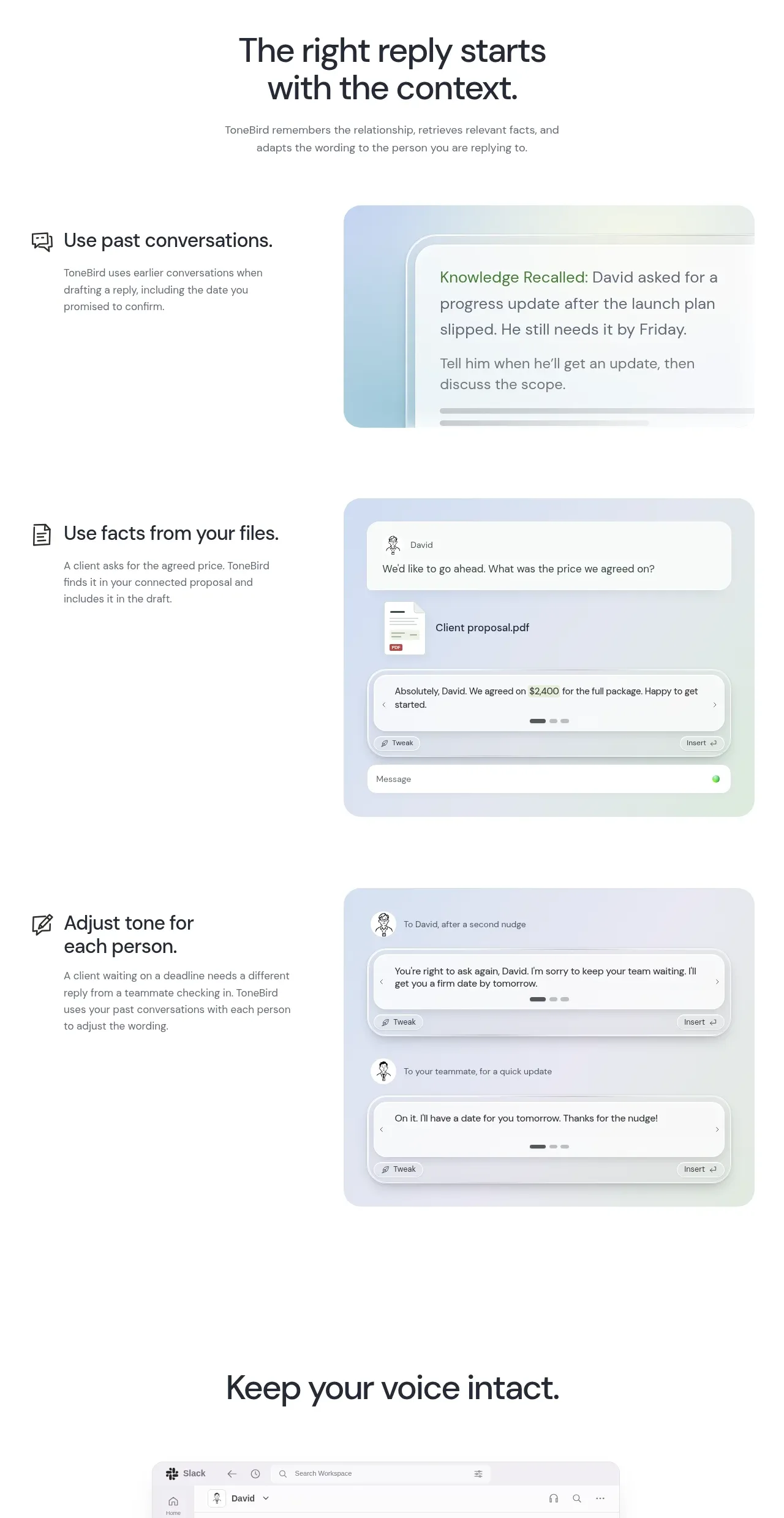 Context-aware feature rows
ToneBird · Feature grid
Context-aware feature rows
ToneBird · Feature grid
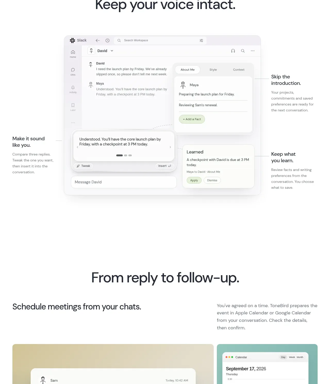 Voice preservation showcase
ToneBird · Feature grid
Voice preservation showcase
ToneBird · Feature grid
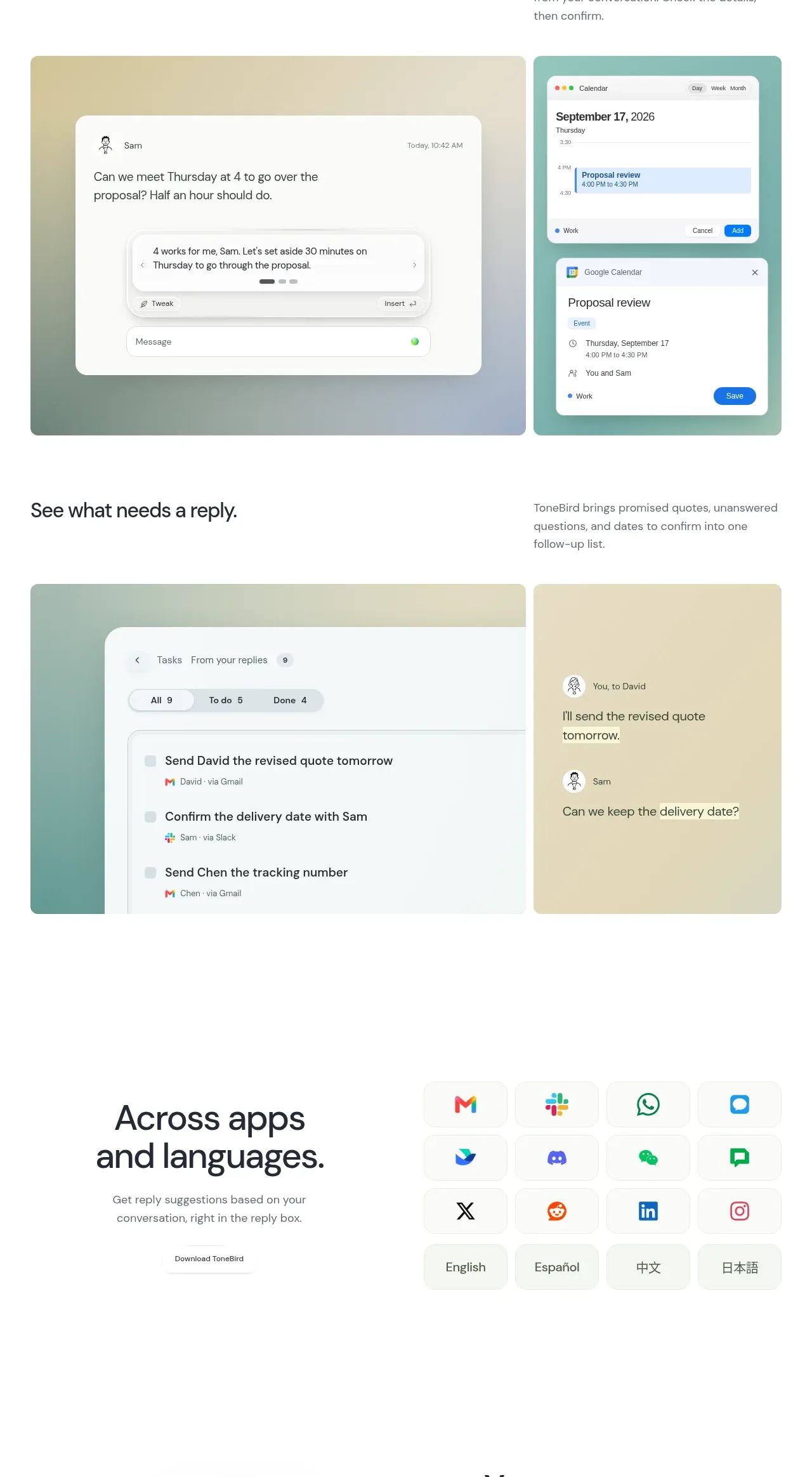 Reply-to-follow-up workflows
ToneBird · Feature grid
Reply-to-follow-up workflows
ToneBird · Feature grid
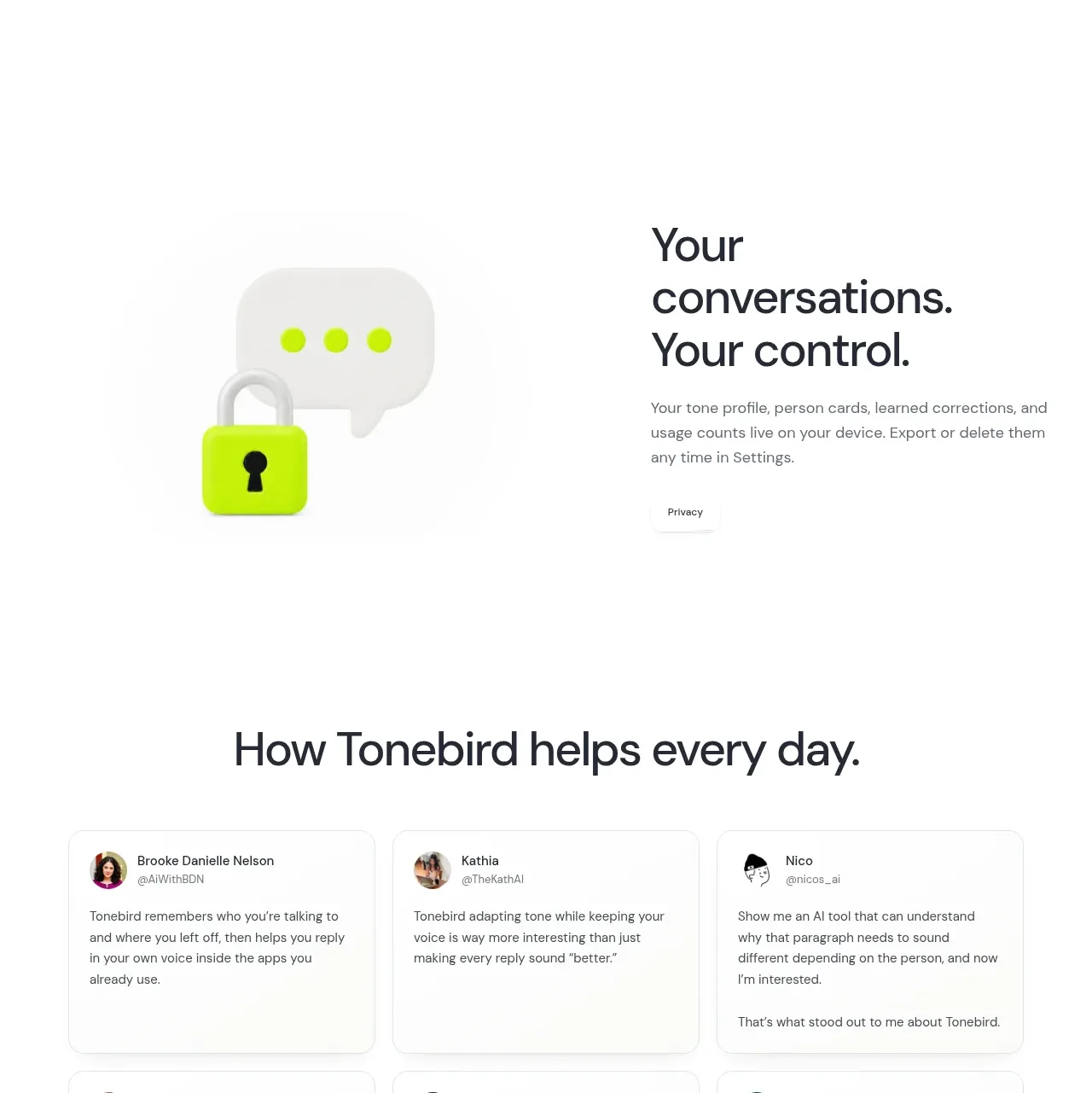 Cross-app and language support
ToneBird · Feature grid
Cross-app and language support
ToneBird · Feature grid
 Privacy and control statement
ToneBird · Card
Privacy and control statement
ToneBird · Card
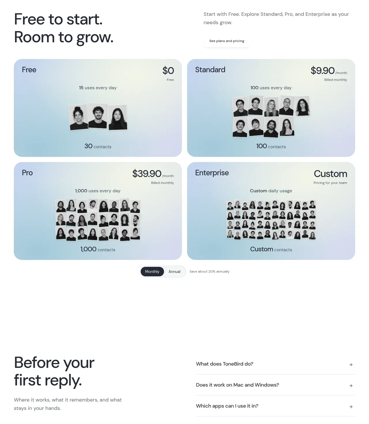 Customer voice grid
ToneBird · Testimonials
Customer voice grid
ToneBird · Testimonials
 Four-tier pricing table
ToneBird · Pricing table
Four-tier pricing table
ToneBird · Pricing table
 Pre-purchase FAQ
ToneBird · FAQ
Pre-purchase FAQ
ToneBird · FAQ