kage
kage
typewise.app

Design analysis
This section works by pairing a compact, high-contrast comparison table with a generous transition into audience-specific choices. Restrained blue emphasis, clear row labels, and large selectable cards make the decision path feel premium without overwhelming the user.
Prompt preview
## Reference images

Study these alongside the description below: hierarchy, rhythm, spacing, colour. Build for the product you are asked about, using this design language.

- Component: https://kage-design-assets.t3.tigrisfiles.io/components/typewise-nova/b4948f23-79f3-4392-9236-ca27a7b6b602-1789106478-7.webp
- Full page it was cut from: https://kage-design-assets.t3.tigrisfiles.io/screenshots/typewise-nova/b4948f23-79f3-4392-9236-ca27a7b6b602-1789106444891-full.webp
- Component on Kage: https://kage.design/component/typewise-nova-card

## Before you start
Ask the user what their product does, who it is for, and what its brand personality and visual identity are. Then apply the principles below to create an original version for that product rather than reproducing the reference.

## Build this section
Create a dark, premium comparison-and-segmentation section for a modern software product. It should first establish a concise side-by-side comparison, then guide visitors into choosing the audience or use case that best describes them.

### Layout and alignment
- Use a near-black page background, approximately `#07070A` or a colour derived from the user's brand.
- Center the content in a responsive container with a maximum width around `800–1040px`.
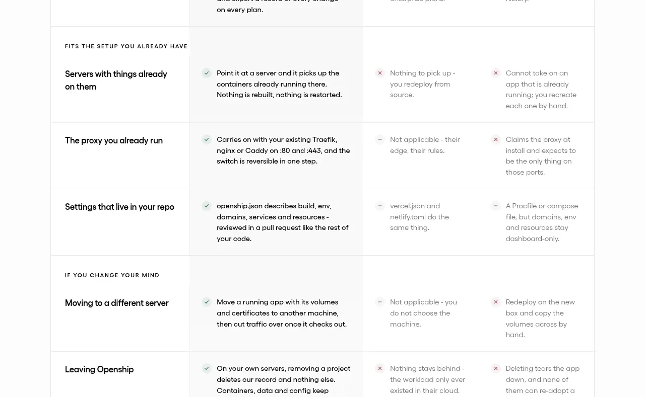
- Place a compact comparison table near the top, with three columns: a wider descriptor column, a comparison column, and a highlighted product column. On small screens, allow horizontal scrolling or stack the comparison into readable rows rather than forcing cramped text.
- Use a consistent column grid: left labels aligned to the left, values aligned centrally or to the left depending on readability, and the product column visually distinguished across all rows.
- Add generous vertical separation between the table and the audience selector. Introduce the next section with a small uppercase eyebrow, followed by a large centered question-style heading.
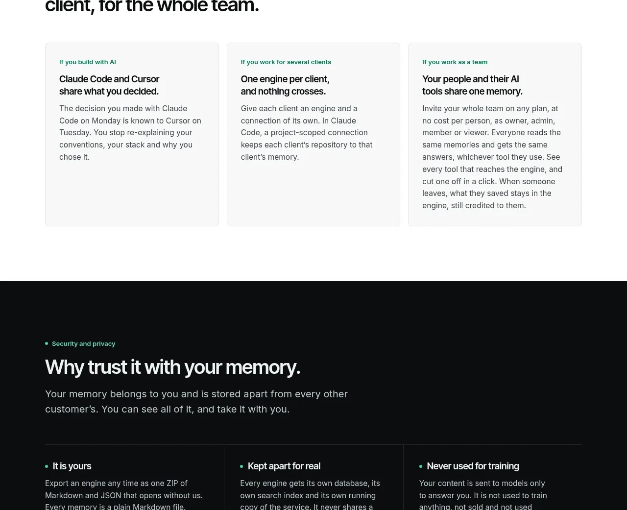
- Below the heading, use a two-column card grid for audience or use-case options. Collapse to one column on narrow screens.
- Keep the section visually calm: large negative space, limited content per row, and no unnecessary decorative elements.

### Typography hierarchy
- Use a clean contemporary sans-serif with slightly tight tracking for headings.
- Table column headings: medium weight, approximately `15–17px`.
- Row labels: uppercase, muted, letter-spaced, approximately `11–12px`, with strong readability.
- Table values: `16–18px`; emphasize the highlighted product values with a brighter colour and semibold weight.
- Eyebrow: uppercase, blue-accented, letter-spaced, approximately `11–12px`.
- Main selector heading: bold but not oversized, approximately `42–52px` on desktop and `32–38px` on mobile; keep line-height around `1.05–1.15`.
- Audience card eyebrow: uppercase and blue-tinted; card title should be prominent, around `22–28px`, with supporting copy below if needed.

### Colour and emphasis
- Page background: near-black, approximately `#07070A`.
- Table surface: subtly lighter black, approximately `#0B0B10`.
- Borders and dividers: very low-contrast blue-gray, approximately `#252631` or `rgba(170,190,230,.16)`.
- Highlighted product column: a deep indigo-black tint, approximately `#101426` or a brand-derived equivalent.
- Primary text: soft white, approximately `#F1F1F5`.
- Secondary text: cool gray, approximately `#A6A7B2`.
- Accent text: restrained electric/periwinkle blue, approximately `#86AEEF`; use it for eyebrows, selected states, and product emphasis rather than large fills.
- Maintain accessible contrast and make the highlighted column distinguishable through both colour and typography, not colour alone.

### Borders, radius, and surfaces
- Wrap the comparison table in a thin one-pixel border with a moderate corner radius around `14–16px`.
- Use horizontal dividers between table rows; avoid heavy vertical rules except where needed to clarify columns.
- Keep the highlighted column as a continuous tinted surface, including its header and body cells.
- Give audience cards a dark indigo-black surface, approximately `#101321`, with a subtle border around `#282D3D` and a radius around `16px`.
- Use generous card padding, roughly `32px` desktop and `24px` mobile.
- Avoid strong shadows; if used, keep them broad, soft, and nearly invisible.

### Interaction and states
- Make audience cards clearly selectable or clickable. On hover, slightly raise or brighten the border and shift the surface toward the accent hue without introducing a flashy animation.
- Add a visible keyboard focus ring using the accent blue.
- If the comparison table represents a selected product or plan, reinforce the selected state with a persistent tinted column, stronger text weight, and an optional subtle top or bottom accent line.
- Keep transitions short and restrained, around `150–220ms`, using ease-out timing.
- Preserve the reading order and interaction model on mobile; do not rely on hover-only cues.

### Content behavior
- Use short, parallel comparison labels and values so rows scan quickly.
- Make the audience options feel like clear next steps, not generic feature cards.
- Write copy for the user's product and audience. Keep labels concise and ensure each option is meaningfully distinct.

## Never
- Never use the reference product's logos, product names, brand names, or exact copy.
- Never copy the reference table values, audience labels, wording, or layout-specific content verbatim.
- Never reuse illustrations, imagery, icons, or decorative artwork from the reference.
- Never make the section a pixel-perfect clone; adapt the grid, type scale, colours, and content to the user's product and brand.
- Never sacrifice mobile readability for maintaining the desktop table proportions.