 kage
kage
uini.io

Design analysis
A calm, editorial pricing section that makes the free plan feel welcoming while clearly increasing value across paid tiers. Strong column alignment, restrained colour, equal-height cards, and a compact comparison expansion keep the decision simple without hiding detail.
Prompt preview
## Reference images

Study these alongside the description below: hierarchy, rhythm, spacing, colour. Build for the product you are asked about, using this design language.

- Component: https://kage-design-assets.t3.tigrisfiles.io/components/uini-io/ef5b466a-1fe9-4cb6-9300-79049ee31244-1789059863-9.webp
- Full page it was cut from: https://kage-design-assets.t3.tigrisfiles.io/screenshots/uini-io/ef5b466a-1fe9-4cb6-9300-79049ee31244-1789059824-full.webp
- Component on Kage: https://kage.design/component/uini-pricing-table

## Before you start
Ask what the user's product is, who it serves, and what its brand personality and visual identity are. Then apply the principles below to create an original pricing section for that product—not a copy of the reference.

## Build a responsive pricing-table section
Create a polished SaaS pricing section with a short heading and supporting paragraph above a billing-period switcher, followed by three pricing tiers and a collapsed feature-comparison row. The section should feel confident, spacious, practical, and easy to scan.

### Layout and alignment
- Constrain the section to a centered max-width of roughly 1120–1180px with generous horizontal gutters.
- Use a two-column intro on desktop: a large left-aligned heading on the left and a compact explanatory paragraph aligned to the right. Stack and left-align them on smaller screens.
- Place a monthly/annual segmented control beneath the intro, aligned to the left. Include a small savings badge inside or beside the selected annual state.
- Display three equal-width pricing columns in one bordered container on desktop. Use subtle vertical dividers, a shared outer border, and a consistent internal padding of about 24–26px.
- Keep all cards the same height and align plan names, prices, feature lists, and CTAs across columns. Use flexible spacing rather than arbitrary per-card offsets.
- On mobile, stack the plans vertically or use a horizontally scrollable comparison layout only if the product has many tiers; preserve readable widths and never compress feature text excessively.
- Add a full-width collapsed “compare features” control beneath the cards, with a clear chevron and an accessible accordion interaction.

### Typography hierarchy
- Use a clean modern sans-serif with a slightly editorial feel; use the product's own font if available.
- Set the section heading large and compact, around 48–60px on desktop with tight line-height around 0.95–1.05; scale to 36–44px on mobile.
- Use 15–17px body text with relaxed line-height around 1.45–1.6.
- Make plan names approximately 20px and medium weight.
- Make prices visually dominant at roughly 44–52px, with the currency and billing unit treated as secondary inline text.
- Use 13–14px feature text and short, scannable phrases. Give supporting billing notes and helper text a quieter 12–13px treatment.
- Use semibold text for buttons and avoid excessive uppercase lettering.

### Colour
- Start with a warm near-white page background, approximately `#FAFAF7` or `#FBFBF9`.
- Use near-black text around `#1C1C1A` and muted supporting text around `#66645E`.
- Use a soft neutral card surface around `#FFFFFF`; optionally tint the free tier very subtly with `#F5F6F0` to distinguish it without making it look disabled.
- Use a dark charcoal primary button around `#1D1D1B` for paid plans.
- Give the free-plan CTA a warm coral/orange accent around `#EE714A`, with white text.
- Use a pale warm peach badge background around `#FFF0E5` and a burnt-orange label around `#AA5C3F`.
- Keep feature bullets small and understated, using the accent colour rather than icons or heavy checkmarks.
- Ensure all text and controls meet accessible contrast standards.

### Borders, surfaces, and radius
- Use thin, low-contrast borders around `#E2E2DC`; avoid shadows or keep them nearly imperceptible.
- Give the overall pricing container a radius of approximately 8–10px and clip its internal dividers to the same radius.
- Use compact pill radii for the billing toggle and savings badge, approximately 999px.
- Use button radii around 4–6px, with generous height of roughly 50px.
- Keep the visual language flat, tactile, and understated rather than glossy or card-heavy.

### Content and interaction
- Make the annual/monthly switch actually update displayed prices, billing notes, and any savings messaging. Clearly indicate the selected state with a dark filled segment and a visible focus state.
- Give each tier a concise value proposition, price, billing cadence, feature list, and primary action. Keep feature-list lengths balanced so the CTA row aligns.
- Use simple square or rectangular accent bullets for features, sized around 4px; do not rely on decorative icons to communicate plan differences.
- Make the primary buttons full width within each card and include a subtle arrow or directional affordance only if it suits the product's brand.
- On hover, slightly change button brightness or translate the arrow by 1–2px; avoid dramatic motion.
- Make the comparison row keyboard accessible. Expand it inline with a smooth but restrained transition, revealing a structured feature matrix or grouped details.
- Include visible `:focus-visible` states for the toggle, buttons, accordion trigger, and any links.
- Respect reduced-motion preferences and ensure the layout works with longer translated copy.

## Never
- Never copy the reference's logos, product names, plan names, pricing, feature copy, or calls to action.
- Never reuse its exact illustrations, imagery, icons, or branded symbols.
- Never assume the user's product is a customer-interview or support product; invent content appropriate to the user's product and audience.
- Never hide essential pricing information behind the comparison accordion.
- Never make one tier visually overwhelming with gradients, badges, or oversized promotional styling unless the user's brand explicitly calls for it.
- Never sacrifice accessibility, responsive behaviour, or semantic HTML for visual similarity.
More components
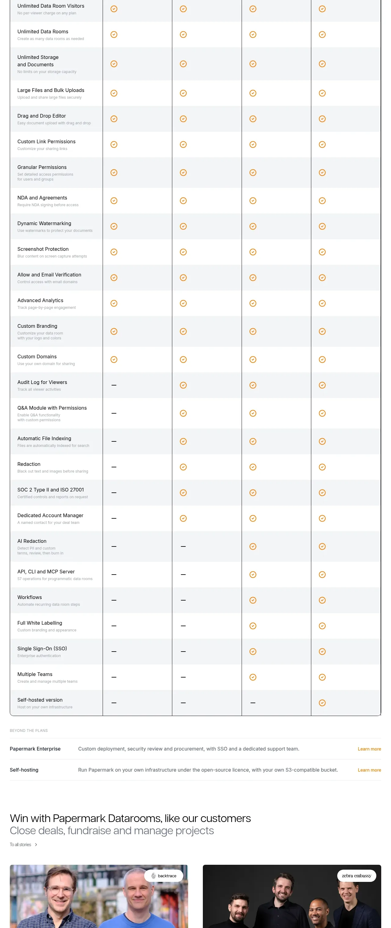
 Plan comparison table
Papermark Data Rooms · Pricing table
Plan comparison table
Papermark Data Rooms · Pricing table
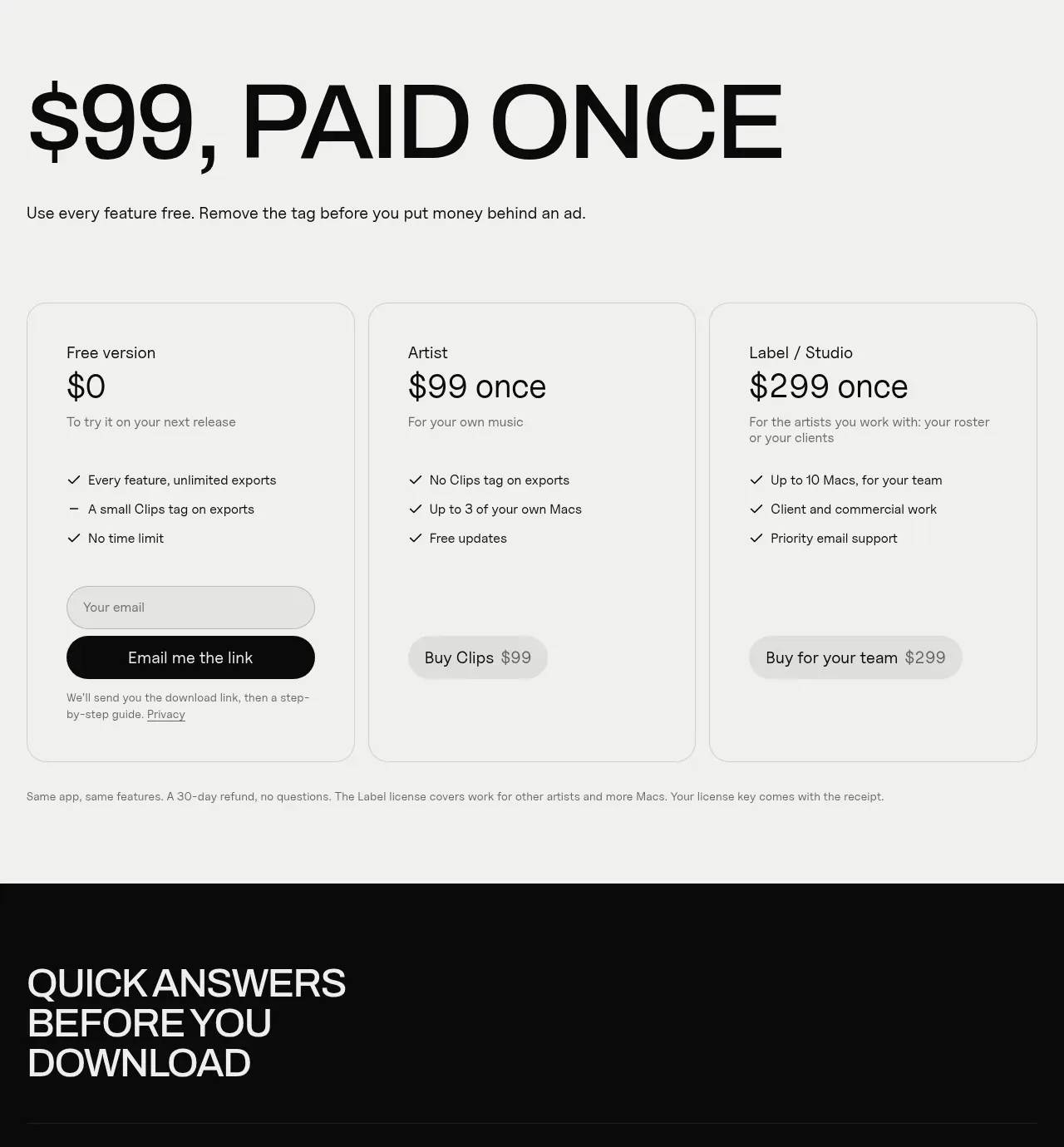
 One-time purchase pricing
Clips by Plastic · Pricing table
One-time purchase pricing
Clips by Plastic · Pricing table
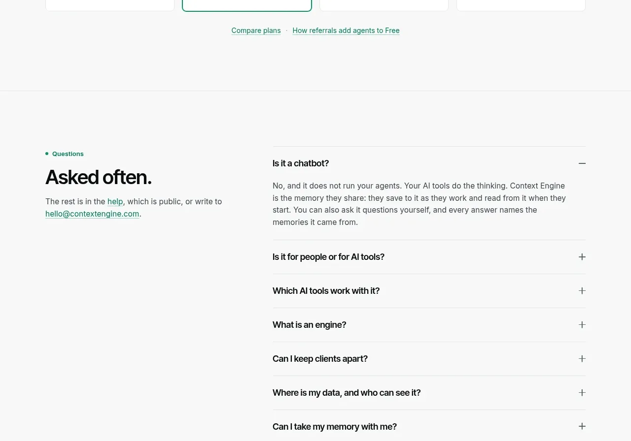
 Per-unit pricing table
Context Engine · Pricing table
Per-unit pricing table
Context Engine · Pricing table
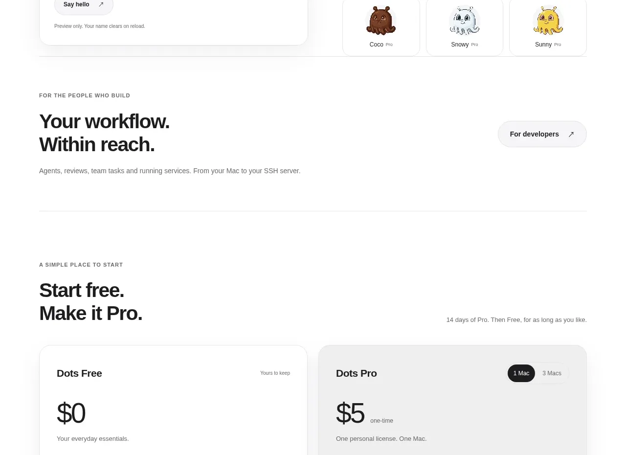
 Free and pro pricing cards
Dots · Pricing table
Free and pro pricing cards
Dots · Pricing table
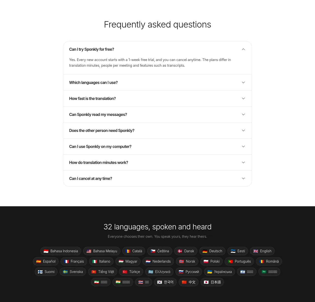
 Transparent multi-tier pricing
Sponkly · Pricing table
Transparent multi-tier pricing
Sponkly · Pricing table
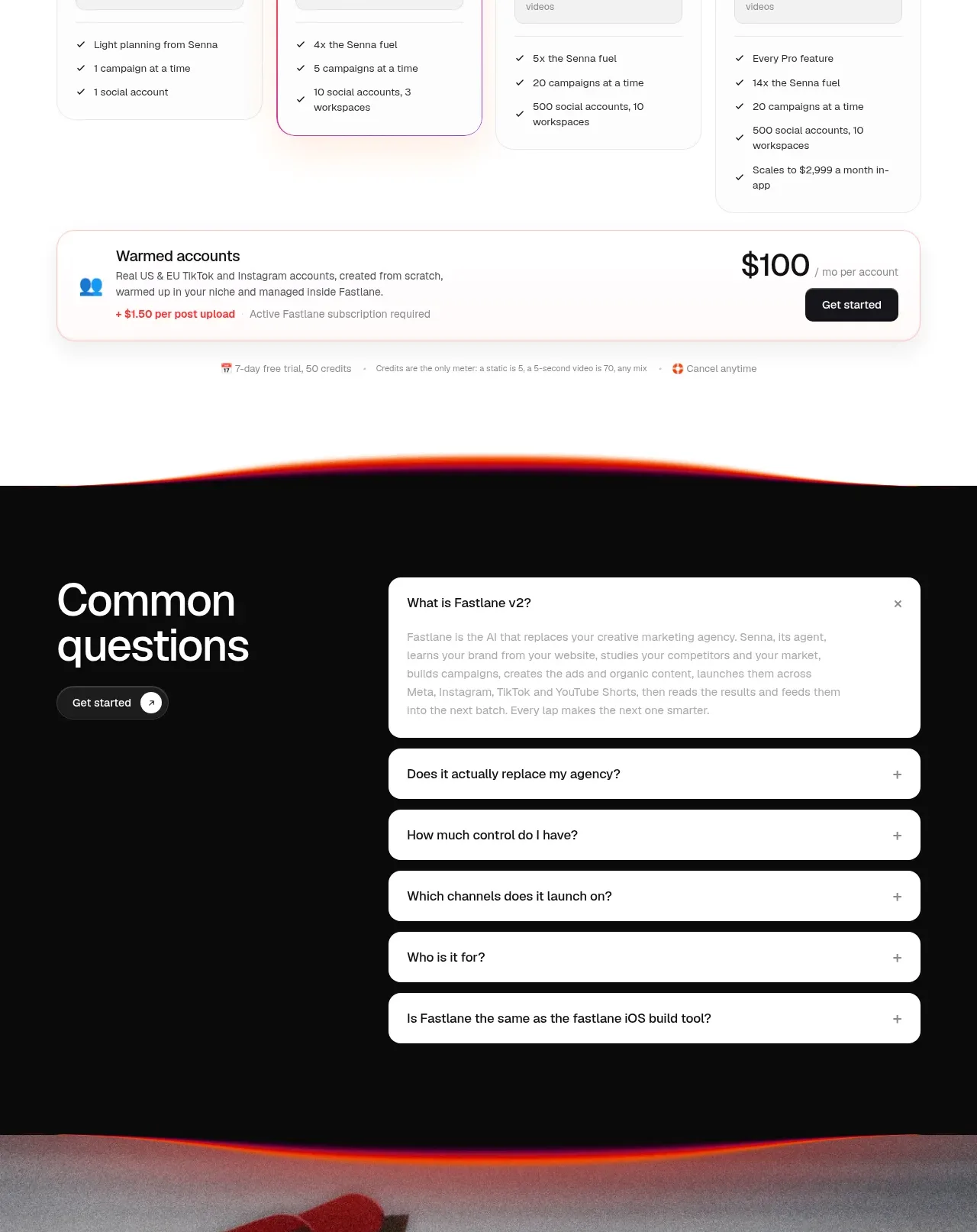
 Four-tier pricing table
Fastlane 2.0 · Pricing table
Four-tier pricing table
Fastlane 2.0 · Pricing table