kage
kage
ultracite.ai

Design analysis
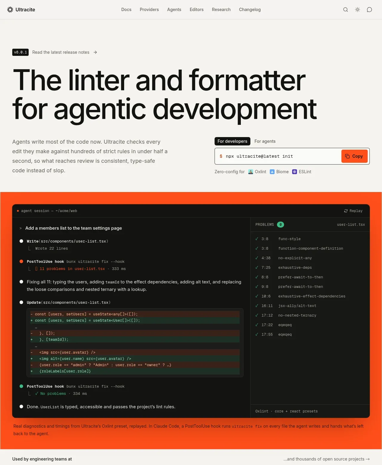
A restrained, near-white landing page uses oversized black sans-serif headlines, compact gray body copy, thin gray rules, and monospace labels to create a technical editorial feel. The rhythm moves from a spacious hero into a vivid orange product demonstration, logo grid, code diagnostics, benchmark bars, agent workflow cards, configuration panels, testimonials, and a second orange CTA before resolving into a dense black footer; orange is reserved for demonstrations, status accents, and the final conversion band.
Prompt preview
## Reference images

Study these alongside the description below: hierarchy, rhythm, spacing, colour. Build for the product you are asked about, using this design language.

- Full page: https://kage-design-assets.t3.tigrisfiles.io/screenshots/ultracite-v8/2cfe6d77-9aac-44fd-bb06-05dad12091d2-1792303236925-full.webp
- Above the fold: https://kage-design-assets.t3.tigrisfiles.io/screenshots/ultracite-v8/2cfe6d77-9aac-44fd-bb06-05dad12091d2-1792303233737.webp
- Design on Kage: https://kage.design/designs/ultracite-v8-landing-page

## Before you start
Ask the user what they are building, who it is for, and which brand assets they already have (name, colours, typefaces, logo, and product imagery). Wait for their answers before designing. Apply the system below to their product, not to the reference product, and replace all example content with their own.

## Page structure
1. **Persistent top navigation** — Use a slim, pale header with a small brand mark at left, compact text links across the centre, and search, theme, and utility icons at right; separate it from the page with a one-pixel rule.
2. **Hero introduction** — Create a large, generous text block with a small version/update chip above an oversized two-line headline, followed by a muted explanatory paragraph and a compact command/demo control with tabs and a copy button.
3. **Primary product demonstration** — Place a full-width saturated accent band beneath the hero, containing a large dark terminal/editor mockup with session output, code changes, and a diagnostics column. Add a small caption below the mockup explaining what is being shown.
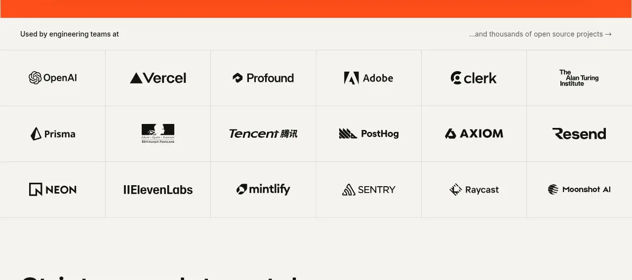
4. **Social proof logo matrix** — Introduce the customer section with a narrow line of copy, then show a multi-column, multi-row grid of monochrome customer/project marks separated by fine rules.
5. **Rules and code-quality section** — Use a spacious heading and paragraph to frame the product’s strictness, followed by a large light code editor panel with highlighted problem lines and inline diagnostics. Under it, add a row of narrow feature columns naming rule families and examples.
6. **Speed section** — Add another spacious heading and short paragraph, then a horizontal benchmark/timeline graphic showing the agent turn versus the product check. Finish with three large metric columns and a small methodology note.
7. **Agent-loop integration section** — Introduce the workflow with a large heading and explanatory copy, then use a two-column by two-row grid of alternating terminal/configuration panels and explanatory text blocks. Label each step with a small numbered monospace eyebrow.
8. **Engine choice and ecosystem section** — Present a heading and paragraph, then split the content into a broad left configuration/code area with engine tabs and code samples and a narrower right capability list covering presets, editors, and pre-commit options.
9. **Testimonials** — Add a spacious heading, then a ruled multi-column quote grid with varied column widths, short quotes, and small avatar/name metadata at the bottom of each quote.
10. **Sponsor strip** — Include a compact horizontal sponsor row with a small label, several monochrome sponsor names/marks, and a right-aligned sponsorship link.
11. **Final conversion band** — Use a large orange section with a bold dark headline, short supporting copy, developer/agent tabs, and a dark command field with a light copy button. Add a large abstract radial sunburst graphic on the right, using only geometric shapes.
12. **Footer** — End with a dense black footer containing a light brand lockup and short description on the left, several columns of small uppercase category labels and links, and restrained monochrome utility/social marks.

## Design language
- Build hierarchy with a very large black grotesk headline, short supporting paragraphs, and small uppercase or monospace eyebrows; let whitespace around section introductions create the main pacing.
- Shift rhythm deliberately: spacious editorial introductions alternate with dense evidence areas such as code panels, metric rows, logo grids, and workflow cards.
- Use a warm near-white canvas around `#f7f7f5`, near-black text and panels around `#111210`, soft gray rules around `#deded9`, muted body text around `#666762`, and one vivid orange accent around `#ff4b1f` for product demonstrations, status highlights, and the final CTA.
- Pair a clean modern sans-serif for headlines and UI with a compact monospace for commands, code, labels, measurements, and diagnostic output. Scale display headings aggressively, use medium-sized section headings, and keep body copy narrow and readable.
- Prefer one-pixel borders, square or very lightly rounded containers, minimal shadows, and flat surfaces. Use orange sparingly so it remains a functional signal rather than a general decoration.
- Treat code examples as real interface content: use dark terminals for active execution, light editor panels for diagnostics/configuration, colored additions and removals, inline issue labels, and clear copy controls.
- Use grids with visible rules and unequal column widths to make the page feel like a technical document. Keep logos, sponsor marks, and metadata monochrome and optically centred.
- For the radial graphic, use simple oversized geometric rays rather than illustration or photography. If adding motion, keep it subtle: hover color changes, copy confirmation, tab switching, and a restrained reveal of code/metrics; never add noisy animations.
- Ensure the layout collapses cleanly on small screens: stack code and text panels, preserve horizontal scrolling for code, turn logo grids into fewer columns, and keep the CTA command field usable.

## Never
- Do not reuse the reference product’s logo, wordmark, product name, tagline, copy, customer names, screenshots, code, illustrations, photography, or icon set.
- Do not present the result as Ultracite or imply affiliation with it.
- Do not turn the design into a generic SaaS gradient page; preserve the restrained editorial grid, technical evidence, monospace details, and deliberate orange accent while adapting the content to the user’s product.
Components from this page
All components
 Minimal documentation navigation
Ultracite v8 · Navigation
Minimal documentation navigation
Ultracite v8 · Navigation
 Agentic development hero with live terminal preview
Ultracite v8 · Hero
Agentic development hero with live terminal preview
Ultracite v8 · Hero
 Teams and open-source adoption grid
Ultracite v8 · Logo cloud
Teams and open-source adoption grid
Ultracite v8 · Logo cloud
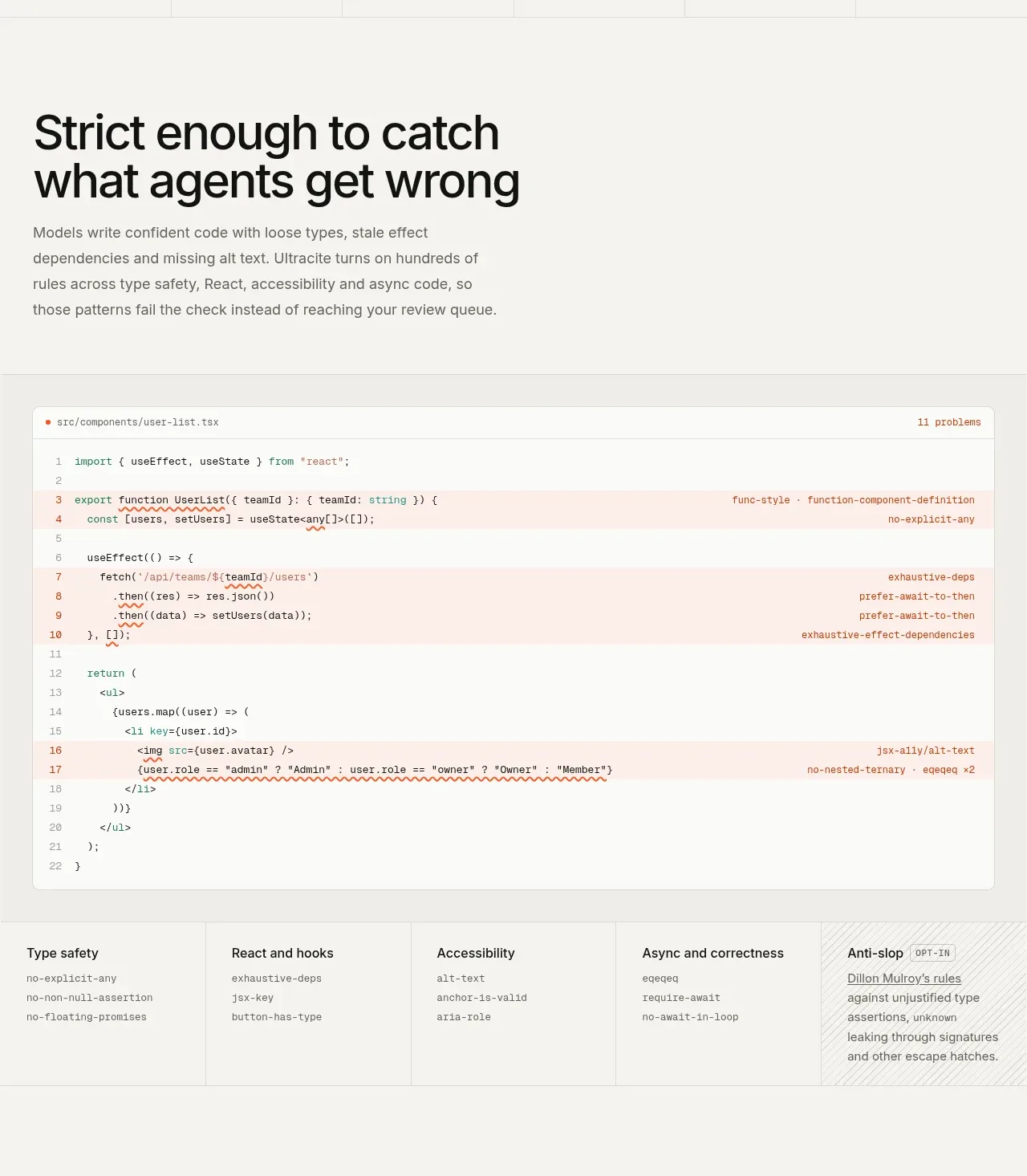 Rules caught before review
Ultracite v8 · Feature grid
Rules caught before review
Ultracite v8 · Feature grid
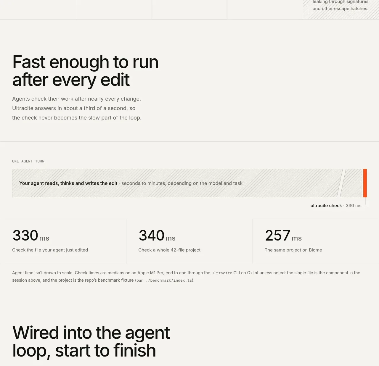 Fast feedback timing comparison
Ultracite v8 · Chart
Fast feedback timing comparison
Ultracite v8 · Chart
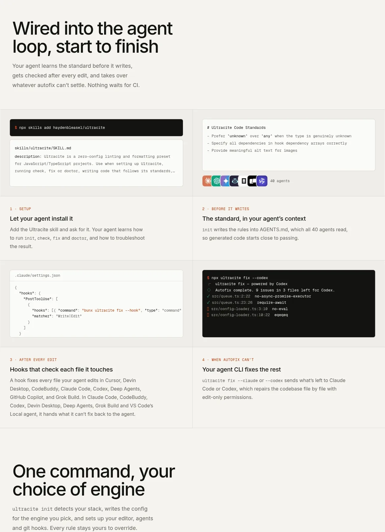 Tooling wired into the agent loop
Ultracite v8 · Feature grid
Tooling wired into the agent loop
Ultracite v8 · Feature grid
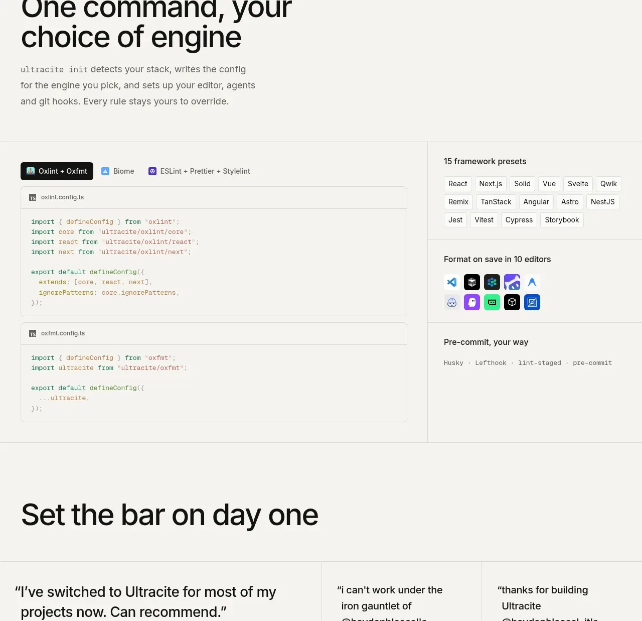 One command, many integrations
Ultracite v8 · Feature grid
One command, many integrations
Ultracite v8 · Feature grid
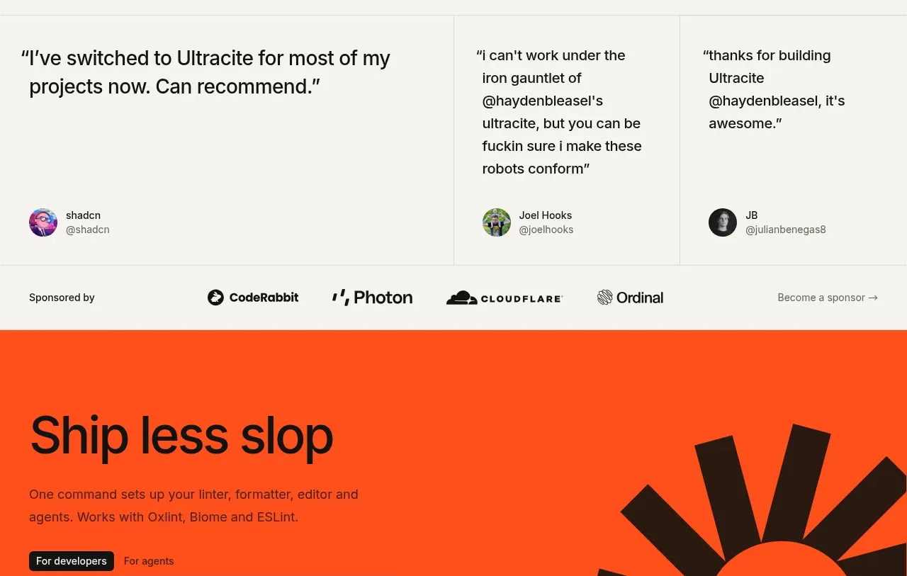 Developer testimonials and sponsor strip
Ultracite v8 · Testimonials
Developer testimonials and sponsor strip
Ultracite v8 · Testimonials
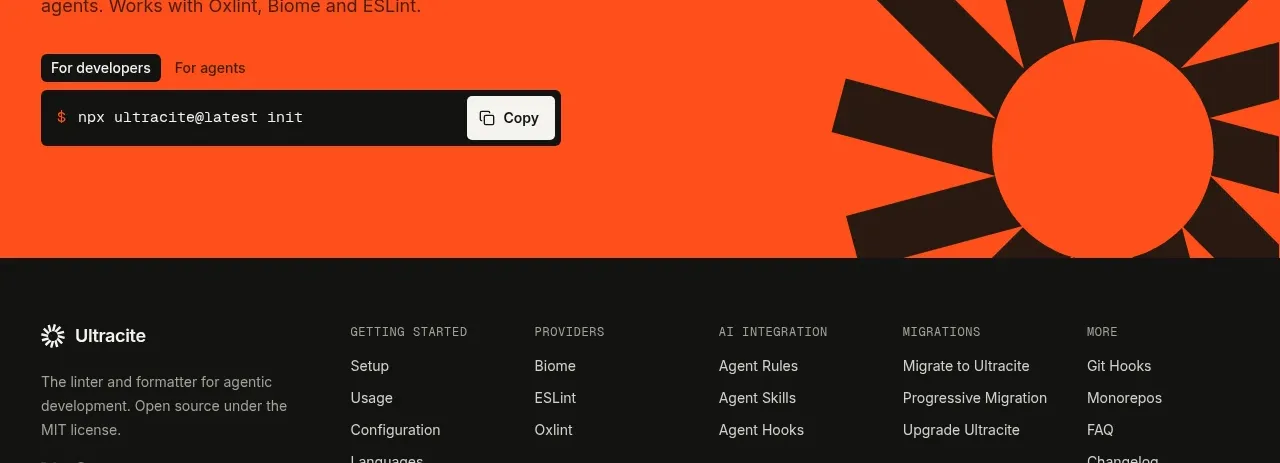 Bright installation call to action
Ultracite v8 · Call to action
Bright installation call to action
Ultracite v8 · Call to action
 Documentation footer
Ultracite v8 · Footer
Documentation footer
Ultracite v8 · Footer