kage
kage
nimbleway.com
Design analysis
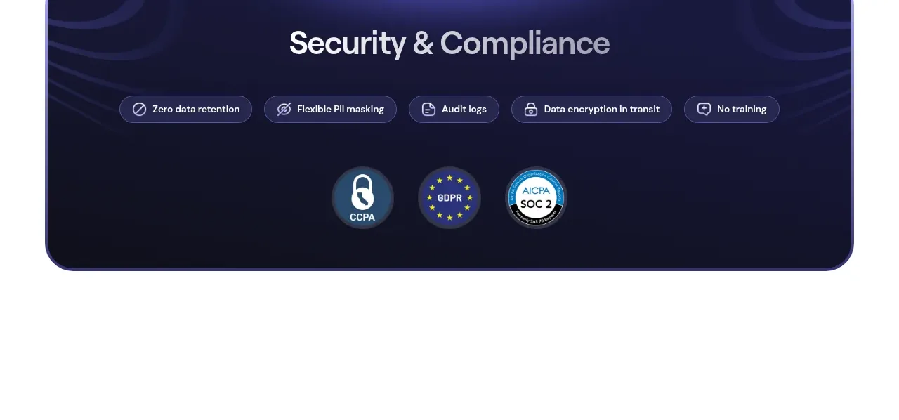
A dark, softly patterned rounded panel creates a visual pause and combines a strong security heading, feature pills, and certification badges.
Prompt preview
## Reference images

Study these alongside the description below: hierarchy, rhythm, spacing, colour. Build for the product you are asked about, using this design language.

- Component: https://kage-design-assets.t3.tigrisfiles.io/components/web-search-agents-by-nimble/b9f88c51-9261-49a4-af5a-25ccd481000c-1789452129-7.webp
- Full page it was cut from: https://kage-design-assets.t3.tigrisfiles.io/screenshots/web-search-agents-by-nimble/b9f88c51-9261-49a4-af5a-25ccd481000c-1789452077081-full.webp
- Component on Kage: https://kage.design/component/web-search-agents-by-nimble-banner

## Before you start
Ask what the user's product, audience, and brand identity are, then apply the principles below to that product rather than reproducing the reference.

Build a centered security/compliance banner inside a white page with a wide max-width and a dark navy panel around #11132E. Use a 28–36px rounded radius, a subtle blue-violet radial glow or abstract wave texture, and generous 48–64px padding. Center a bold 32–42px heading in #F7F7FF, followed by a horizontal row of small translucent pills describing security capabilities. Pills should use rgba(120,125,220,.2), a fine lavender border, 12–14px text, and small neutral icons. Place three or more circular or compact certification badges beneath with consistent sizing and spacing. Make the arrangement wrap gracefully on smaller screens and preserve strong contrast and visible focus/hover treatment.

Never use the reference product name, exact security claims, badge artwork, certification names, icons, or imagery.