kage
kage
Design analysis
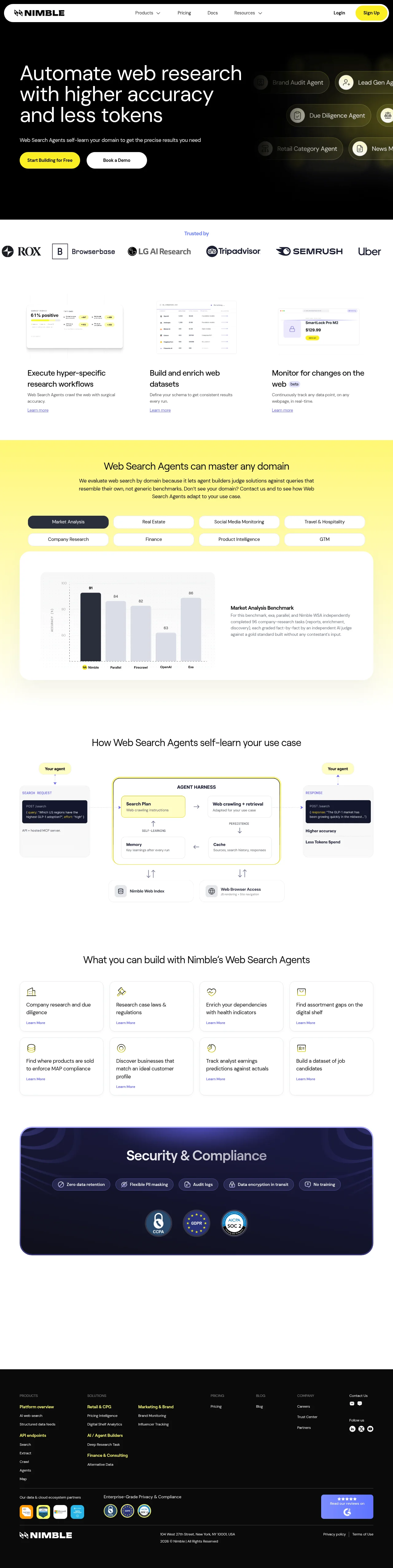
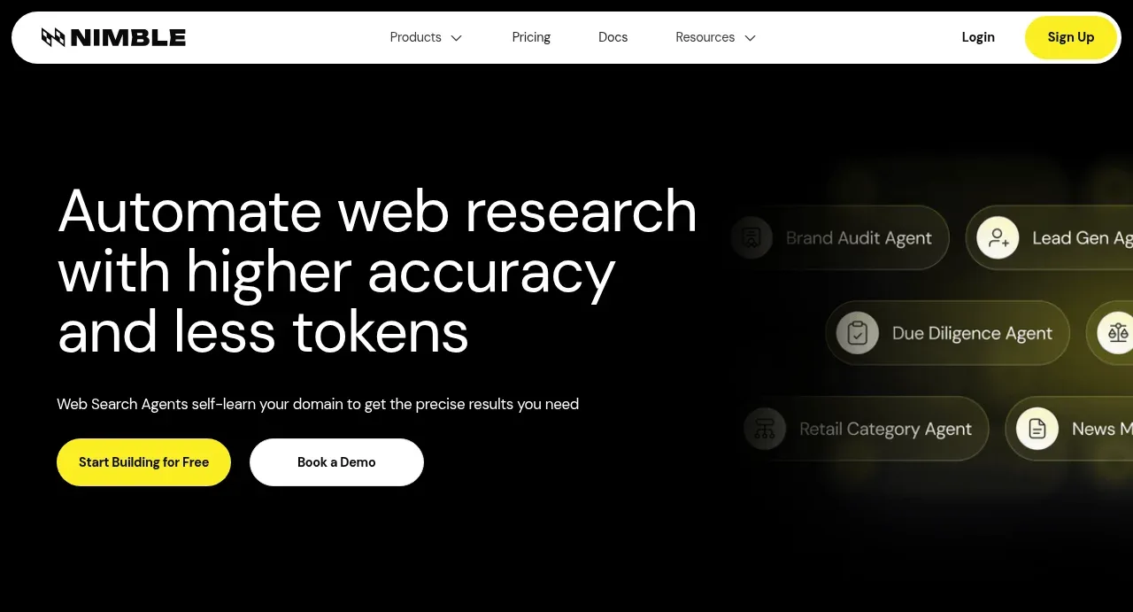
A dark-to-light landing page built almost entirely on three values — near-black, white and one saturated yellow — with a grotesque sans scale running from a ~64px hero headline down to 11px letterspaced diagram labels. The hero spends its darkness on floating, half-blurred agent chips over a yellow glow, then the page settles into a disciplined white rhythm: a monochrome logo strip, three product-screenshot columns, a full-bleed yellow benchmark section with pill tab filters and a flat bar chart, a bordered three-stage architecture diagram with dark code chips, a 4×2 outlined use-case grid, and a rounded navy compliance panel before the black footer. Hierarchy comes from scale contrast, pill-shaped controls, hairline-bordered cards and yellow reserved strictly for CTAs, active states and highlighted links.
Prompt preview
## Reference images

Study these alongside the description below: hierarchy, rhythm, spacing, colour. Build for the product you are asked about, using this design language.

- Full page: https://kage-design-assets.t3.tigrisfiles.io/screenshots/web-search-agents-by-nimble/b9f88c51-9261-49a4-af5a-25ccd481000c-1789452077081-full.webp
- Above the fold: https://kage-design-assets.t3.tigrisfiles.io/screenshots/web-search-agents-by-nimble/b9f88c51-9261-49a4-af5a-25ccd481000c-1789452067358.webp
- Design on Kage: https://kage.design/designs/web-search-agents-by-nimble-landing-page

## Before you start
Ask the user what they are building, who the product is for, and what brand assets they already have (name, logo, colours, typeface). Wait for the answers before writing any code — everything below is applied to *their* product, not to the reference site.

## Page structure
1. **Sticky top nav** — white bar: wordmark left, centred links with dropdown chevrons, Login link plus a yellow pill
Components from this page
All components
 Floating pill navigation
Web Search Agents by Nimble · Navigation
Floating pill navigation
Web Search Agents by Nimble · Navigation
 Dark web-research hero
Web Search Agents by Nimble · Hero
Dark web-research hero
Web Search Agents by Nimble · Hero
 Trusted-by logo strip
Web Search Agents by Nimble · Logo cloud
Trusted-by logo strip
Web Search Agents by Nimble · Logo cloud
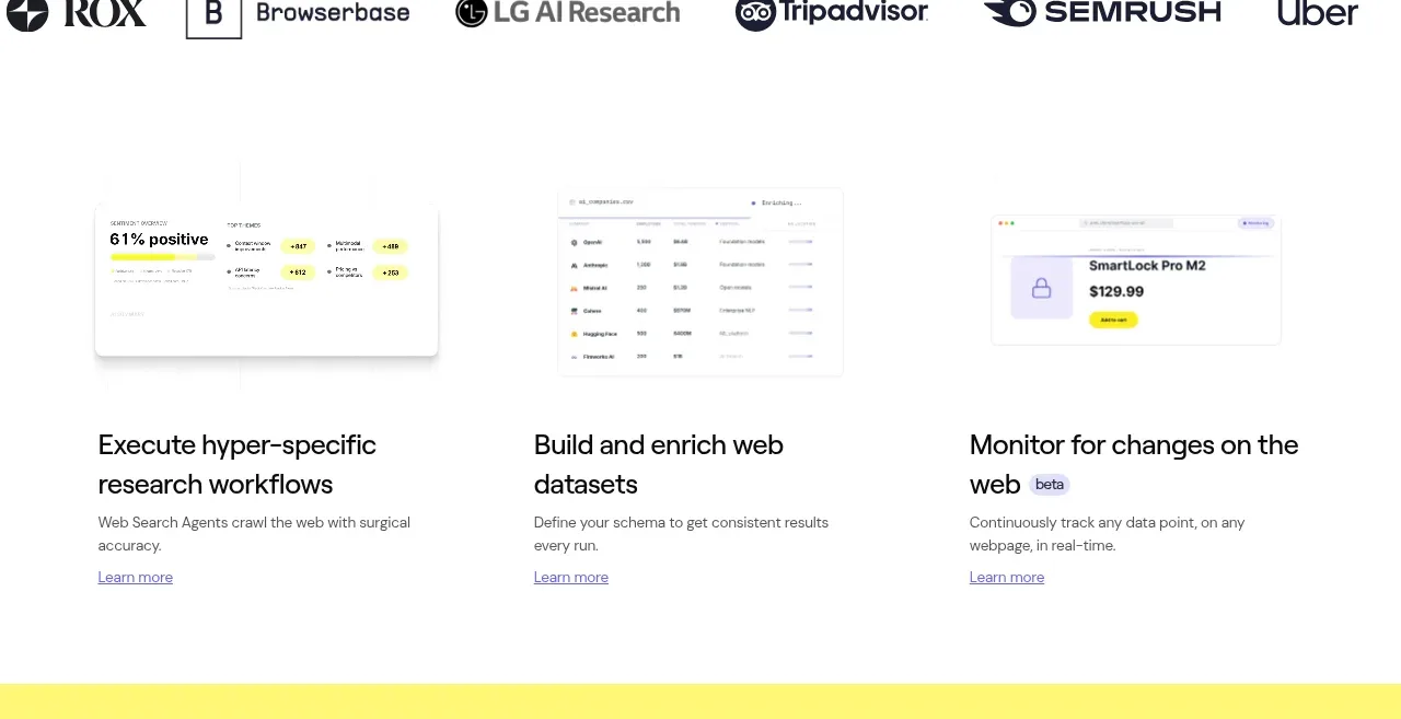 Three workflow capabilities
Web Search Agents by Nimble · Feature grid
Three workflow capabilities
Web Search Agents by Nimble · Feature grid
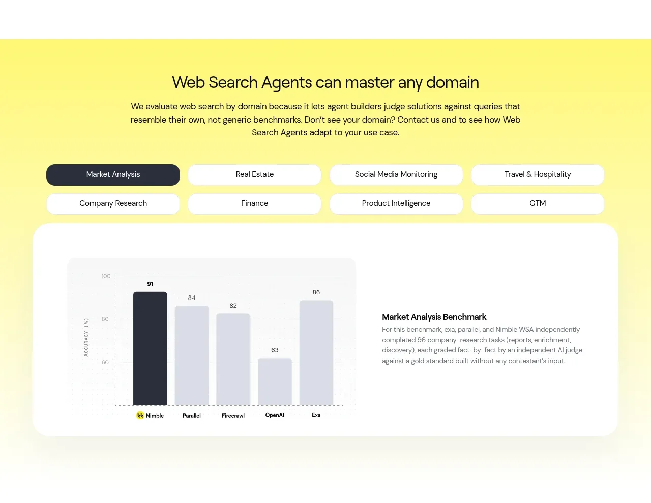 Domain benchmark and tabs
Web Search Agents by Nimble · Chart
Domain benchmark and tabs
Web Search Agents by Nimble · Chart
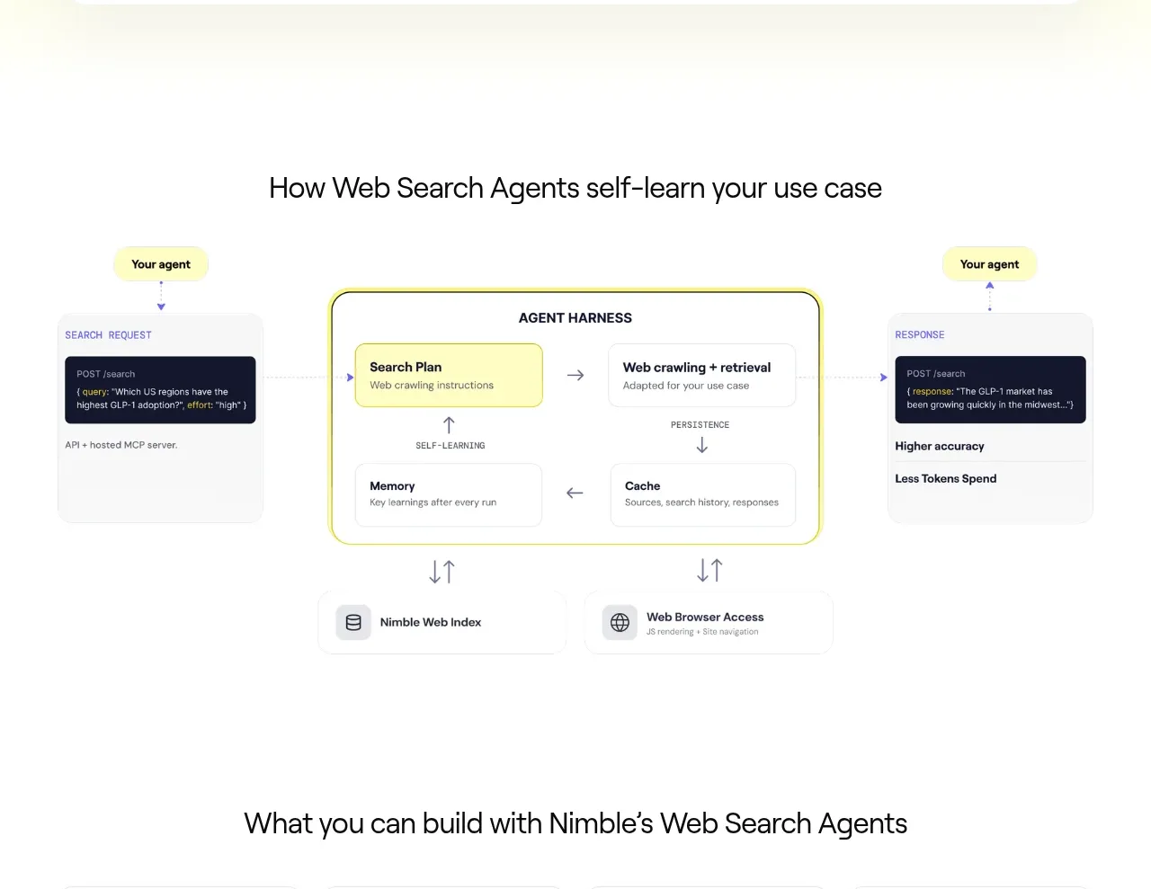 Self-learning agent workflow
Web Search Agents by Nimble · Feature grid
Self-learning agent workflow
Web Search Agents by Nimble · Feature grid
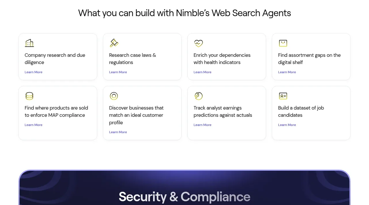 Use-case card gallery
Web Search Agents by Nimble · Feature grid
Use-case card gallery
Web Search Agents by Nimble · Feature grid
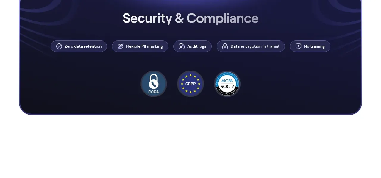 Security and compliance banner
Web Search Agents by Nimble · Banner
Security and compliance banner
Web Search Agents by Nimble · Banner
 Dark multi-column footer
Web Search Agents by Nimble · Footer
Dark multi-column footer
Web Search Agents by Nimble · Footer