kage
kage
adant.ai
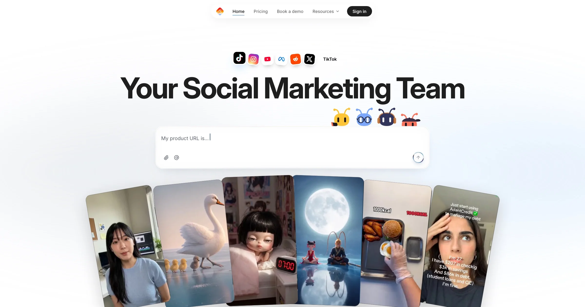
Design analysis
A 1200×630 share card composed like a miniature landing page: a floating white pill nav and a strip of glossy platform-icon tiles frame the top, an ~100px near-black grotesque headline owns dead-center, and a mascot cluster plus a wide 'My product URL is…' prompt input sit directly beneath. The bottom third is a fanned hand of six rotated 9:16 UGC-style video cards, cropped by the canvas edge, supplying all the photographic energy and colour. Contrast does the work: a near-monochrome canvas (white, #17171A type, soft blue gradient floor) against saturated icon tiles, mascots and card imagery, with an ~8:1 type-scale jump between the headline and 13px UI labels.
Prompt preview
## Reference images

Study these alongside the description below: hierarchy, rhythm, spacing, colour. Build for the product you are asked about, using this design language.

- Screenshot: https://kage-design-assets.t3.tigrisfiles.io/screenshots/adant-2-0/cdbbb74c-80d7-4637-93e9-e20c3d2ab3db-1792044248877.webp
- Design on Kage: https://kage.design/designs/adant-2-0-og-image

# Build a 1200×630 OG social card (mini landing-page composition)

## Before you start
Ask the user what product the card is for, who it is for, and what brand assets they already have (name, logo, colours, typefaces). Wait for the answers before styling. Everything below is a composition system from a reference — apply it to the user's brand with placeholder copy, never reproduce the reference's brand, mascots or imagery.

## Deliverable
Produce ONE image, exactly 1200×630, no interactivity:
- Easiest: a single self-contained HTML file whose `<body>` is a fixed 1200×630 stage with `overflow: hidden`, then screenshot to PNG at 1200×630 (e.g. Playwright `page.screenshot({ clip: { x:0, y:0, width:1200, height:630 } })`).
- Or an SVG with `viewBox="0 0 1200 630"`.
Everything is static art: nav links, cursor and buttons are drawn, not wired.

## Page structure (top → bottom)
1. **Background** — near-white canvas (#FAFAF9) with a soft blue glow rising from the bottom (#D8E4F4 → #C7D8EE), strongest behind the card fan; keep the top half almost pure white.
2. **Floating pill nav** (centered, ~y 20, ~36px tall) — white rounded-full bar with hairline border and soft shadow: tiny logo dot, 3–4 placeholder links at ~13px, and a solid near-black pill button on the right end.
3. **Platform icon strip** (centered, ~y 115) — 5–6 rounded-square app-style tiles, ~30px, 8px radius, subtle gloss; use abstract coloured tiles plus one plain text label, never real platform logos.
4. **Headline** (dead-center, ~y 160–235) — one line, ~96–110px, weight 700–800, letter-spacing −0.03em, #17171A. A 3–4 word placeholder promise for the user's product.
5. **Mascot cluster** — 3–4 small (~44px) playful character marks tucked right-of-center under the headline's end; simple SVG blobs/emoji stand-ins are fine.
6. **Prompt input card** (centered, ~y 280–365, ~620×88px) — white card, 16px radius, soft shadow; placeholder prompt text top-left with a trailing cursor bar, two 16px ghost icons bottom-left, and a 34px circular arrow submit button bottom-right.
7. **Card fan** (bottom third, cropped by the canvas edge) — 6 vertical 9:16 cards ~205×340px laid out like a hand of cards: outer cards rotated ∓10–14° and pushed down, center cards nearly upright and highest, 8–14px overlap. Fill each with a distinct abstract gradient placeholder (portrait / food / nature / product moods); give 1–2 cards small white caption text with a dark outline.

## Design language
- Hierarchy: one giant headline > input card > nav; every other element is small supporting detail. Keep all non-headline text ≤14px so the headline-to-UI scale gap stays around 8:1.
- Composition: strict vertical centering and symmetry for the top 60%; only the mascot cluster (right-leaning) and the card fan break symmetry, and the fan's crop at the bottom edge implies continuation beyond the frame.
- Colour: canvas and type stay monochrome (white surfaces, #17171A text); one soft blue gradient zone anchors the bottom (#D8E4F4 → #C7D8EE); all saturation comes from small accents — icon tiles, mascots, card imagery. Never colour the headline, nav or input card.
- Type: one neo-grotesque sans family throughout — heavy tight-tracked display for the headline, regular/medium for UI labels and placeholder text.
- Surfaces: white cards with 12–16px radius, 1px rgba(0,0,0,0.06) borders, layered soft shadows (0 8px 24px rgba(0,0,0,0.08)); 999px pill radius for the nav and buttons.
- Legibility: the card must read as a static thumbnail at ~600px wide — no thin type, no low-contrast text, no fine detail smaller than ~10px.

## Never
- No real platform logos (TikTok, Instagram, YouTube, X or any other brand icon) — abstract coloured tiles only.
- No reference product name, logo mark, mascot designs, headline copy, UGC screenshots or caption text from the reference.
- Do not present the card as the reference product; it carries the user's placeholder branding and copy.