kage
kage
rtrvr.ai
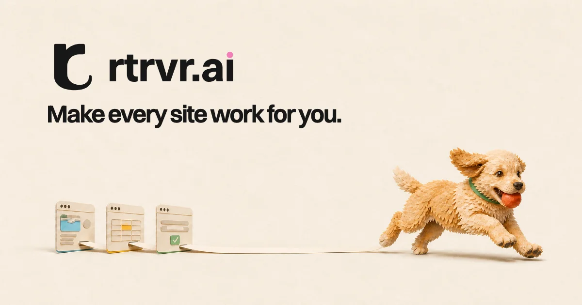
Design analysis
A 1200×630 social card on a warm cream field with all type pushed to the top-left: a black glyph plus lowercase wordmark (with a single pink tittle as the only accent in the type), and the tagline set in the same heavy geometric sans directly beneath. The lower half is a soft clay-style 3D vignette — three miniature browser windows spool a thin ribbon that a golden puppy runs off with, ball in mouth — so the product story is told entirely by the scene rather than by supporting copy. Hierarchy reads brand → headline → illustration, and the large empty centre keeps the card legible at thumbnail size.
Prompt preview
## Reference images

Study these alongside the description below: hierarchy, rhythm, spacing, colour. Build for the product you are asked about, using this design language.

- Screenshot: https://kage-design-assets.t3.tigrisfiles.io/screenshots/retriever-ai/975e1578-6066-43b5-b1e5-1a42fbbd8ea0-1792044105110.webp
- Design on Kage: https://kage.design/designs/retriever-og-image

## Before you start
Ask the user what product this social card is for, who it is for, what one-line headline the card should carry, and which brand assets they already have (name, logo/mark style, colours, typeface, mascot or illustration style). Wait for the answers before designing — everything below is applied to *their* brand, not to the reference product.

## Canvas structure
Produce a single Open Graph image at exactly **1200×630** — build it as a fixed-size HTML/CSS page (or inline SVG) and export/render to PNG at 1200×630. Layout, top to bottom:

1. **Brand lockup (top-left, ~8% left margin, ~10% top margin):** a simple black logo mark and the brand name set lowercase on one baseline, followed by a small coloured dot as the final accent (e.g. the tittle of an "i" or a full stop).
2. **Headline (directly beneath the lockup):** one short sentence in the same heavy sans, sentence case, left-aligned to the same margin. No subcopy, no buttons, no URLs.
3. **Narrative scene (lower ~45% of the canvas):** 2–4 small illustrated objects representing the product's surface (e.g. generic browser windows, cards, documents) standing on an implied floor line at the bottom-left, each with a tiny hint of UI inside (image block, grid, form with a checkmark).
4. **Mascot in motion (right side):** a single illustrated mascot/character moving rightward and slightly upward, exiting toward the open corner, physically connected to the objects by one thin light ribbon or line so the whole lower band reads as one story ("the character takes the work with them").
5. **Negative space:** keep the centre and upper-right of the canvas empty background — at least 25% of the total area untouched.

## Design language
- **Canvas:** one warm cream background across the full bleed (≈ `#F3EEE1`), no border, no gradient, no vignette. Text in near-black (≈ `#1B1B1B`).
- **Colour discipline:** only one accent inside the type (the small pink dot, ≈ `#EE6FA0`); all other colour lives inside the illustration (one warm pop like red ≈ `#D8452F`, one cool counterpoint like teal ≈ `#3E8F7E`). Never colour whole words or add UI chrome to the card.
- **Type:** a single heavy geometric/grotesque sans does everything — wordmark and headline share family, weight and left edge. Lowercase wordmark, sentence-case headline, tight leading and slightly tight tracking. At 1200px wide, roughly 72–84px for the wordmark and 56–64px for the headline; nothing smaller.
- **Hierarchy:** brand lockup largest → headline second → illustration third. The card must be readable as brand + one line even when scaled to a 300px thumbnail.
- **Illustration style:** soft clay/felt 3D or flat shapes with soft gradients and blurred elliptical contact shadows under every object, so items feel grounded on the same floor plane. Rounded, toy-like proportions; no hard outlines, no photorealism.
- **Composition rule:** type top-left, scene bottom, motion vector pointing out of the lower-right toward open space; the connecting ribbon gives the eye a path from product → character.
- **No motion:** this is a static asset — all expression comes from pose, shadow and colour, not animation.

## Never
- Do not use the name "rtrvr.ai", its glyph, the golden retriever puppy, or the copy "Make every site work for you." — use placeholder branding and headline supplied by the user.
- Do not clone the reference illustration; rebuild the *composition* (lockup top-left, scene below, character fleeing with the output) with generic shapes and the user's own mascot or a neutral placeholder character.
- Do not add extra text, badges, borders, logos of other products, or drop shadows on the type.
- Never present the result as the reference product.