kage
kage
naise.ai
Design analysis
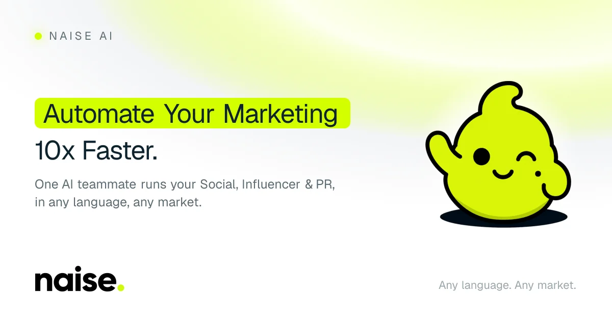
A 1200×630 social card uses a mostly white canvas with a soft yellow-green glow across the upper center. The focal hierarchy is left-aligned: a small spaced wordmark at top, a large two-line headline with its first line contained in a vivid lime rounded highlight, and a compact gray supporting sentence; a cheerful lime mascot with a heavy black outline balances the right side. Small footer marks at the lower corners create a quiet frame, keeping the card airy while pairing friendly rounded typography with bold graphic contrast.
Prompt preview
## Reference images

Study these alongside the description below: hierarchy, rhythm, spacing, colour. Build for the product you are asked about, using this design language.

- Screenshot: https://kage-design-assets.t3.tigrisfiles.io/screenshots/naise-ai/b504e511-9b53-4697-8e53-0c43efabf7ed-1790229705559.webp
- Design on Kage: https://kage.design/designs/naise-og-image

## Before you start
Ask the user what they are building, who it is for, and what brand assets they already have, including the brand name, colours, typefaces, logo or wordmark, and preferred copy. Wait for their answers before designing. Apply the directions below to their product, not to the reference brand.

## Page structure
- **Canvas:** Produce a 1200×630 social card image, implemented as an SVG or as HTML/CSS rendered to PNG; keep all important content inside generous safe margins.
- **Top-left brand marker:** Place a small placeholder wordmark or brand name near the upper-left corner, optionally preceded by a simple coloured dot; use restrained tracking and a light visual weight.
- **Main headline:** Set a large, left-aligned two-line headline in the left half of the canvas. Put the most important phrase on the first line inside a rounded, vivid highlight bar, then place the shorter continuation directly underneath without a highlight.
- **Supporting copy:** Add one or two concise lines of smaller muted text below the headline, with a comfortable line height and a width that ends well before the central/right artwork.
- **Right-side focal image:** Reserve the right third for one friendly, high-contrast product-relevant illustration or abstract mascot. Keep it large enough to balance the headline, with a dark grounding shape or shadow beneath it.
- **Footer frame:** Add a small secondary brand mark or product label at bottom-left and a short muted positioning phrase or metadata line at bottom-right. Keep both subtle and aligned to the same horizontal margins.

## Design language
- **Hierarchy:** Build the composition around a clear left-to-right scan: small brand marker, oversized headline, supporting sentence, then the right-side visual. Use one highlighted phrase as the main focal cue rather than multiple competing accents.
- **Canvas and rhythm:** Use a bright near-white base such as `#FAFBF8` or `#FFFFFF`. Leave broad open space between the top marker, headline block, artwork, and footer so the card remains legible when rendered as a small link preview.
- **Colour:** Use an acid-lime or yellow-green accent around `#D9FF00` to `#E7FF00` for the headline pill and small brand details. Use near-black `#071018` for primary type and outlines, and cool gray around `#687277` for supporting copy. Add a very soft, low-opacity lime-to-warm-yellow glow across the upper middle background, never a heavy full-bleed gradient.
- **Typography:** Pair a friendly rounded sans or clean geometric sans with strong legibility. Use a large headline around 56–72px at 1200×630, regular-to-medium weight rather than an ultra-bold display face; use generous line-height and slightly tighter tracking only where needed. Set the wordmark and footer smaller, with modest letter spacing.
- **Shapes and edges:** Make the headline highlight a rounded rectangle with a radius around 12–18px and enough horizontal and vertical padding to feel intentional. If the artwork includes a mascot or icon, use thick near-black contours and simple filled colour blocks. Avoid complex cards, panels, or decorative borders.
- **Depth:** Keep shadows sparse and graphic: a soft dark oval or compact grounding shadow under the right-side artwork is acceptable. Do not use glass panels, realistic lighting, or elaborate 3D effects.
- **Interaction and motion:** This is a static social card, so provide no interactive controls or animation. Ensure the SVG/PNG export preserves crisp type, strong contrast, and safe cropping at thumbnail sizes.

## Never
- Do not reuse the reference product's logo, wordmark, product name, tagline, mascot, copy, exact illustration, or icon set.
- Do not present the result as Naise AI or imply affiliation with it.
- Do not copy the exact text placement or artwork; use placeholder branding, original copy, and a new product-relevant visual while retaining the airy social-card composition and highlighted-headline idea.
- Do not add photography, dense UI screenshots, or unnecessary decorative elements unless the user's product specifically requires them.