kage
kage
tryfigo.com
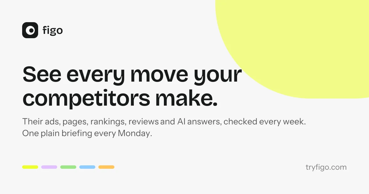
Design analysis
A 1200×630 social card built on an off-white canvas with a strict top-left text block: a compact black rounded-square logo lockup, a two-line ultra-bold black headline with tight leading, and a two-line gray supporting sentence. A large organic pale-lime blob bleeds off the top-right corner to add colour without competing with the type, while a row of five pastel pills (yellow, lilac, green, blue, orange) anchors the bottom-left and the domain sits quietly bottom-right. The design works through extreme scale contrast between the ~90px headline and small footer elements, with generous symmetric margins and only three shapes doing all the visual work.
Prompt preview
## Reference images

Study these alongside the description below: hierarchy, rhythm, spacing, colour. Build for the product you are asked about, using this design language.

- Screenshot: https://kage-design-assets.t3.tigrisfiles.io/screenshots/figo/3df8876d-555c-4a1e-ad10-6085c1fdcca5-1789711270836.webp
- Design on Kage: https://kage.design/designs/figo-og-image

# Product social card (Open Graph image)

Produce a **1200×630 social share card** for the user's product — an Open Graph image for X, Slack, LinkedIn and iMessage previews. Deliver it as a single self-contained `og-card.html` (1200×630 fixed canvas, ready to render to PNG via a headless browser screenshot) **or** as a standalone SVG. Use placeholder branding and copy; do not reference the example product this composition is inspired by.

## Before you start
Ask the user what they are building, who it is for, and what brand assets they already have (name, wordmark/logo, brand colours, typeface). Wait for the answers, then apply everything below to *their* product: their logo lockup, their headline, their domain.

## Page structure
A single fixed 1200×630 canvas, no scroll, nothing outside it. All content sits inside ~80px margins on all sides.

1. **Background**: one flat off-white/light-grey fill covering the full canvas. No gradient, no texture, no border.
2. **Colour shape (decorative, top-right)**: one large organic blob — an oversized ellipse or squircle with very soft corners — in a single pale accent tint, anchored so it bleeds off the top edge and right edge of the canvas. Roughly 40% of canvas width, positioned behind nothing and in front of nothing (the headline stops short of it). This is the card's only large colour mass.
3. **Logo lockup (top-left)**: the user's logo as a small rounded-square mark (~56px) plus wordmark set at ~30px, on one baseline, roughly 12px apart. Top-left corner inside the margins.
4. **Headline (upper-middle-left)**: the main value proposition, left-aligned, set extremely large (~92–100px), bold/heavy weight (700–800), near-black, tight line-height (~1.05), broken into exactly two lines with a manual break so the second line is shorter. Max width ~55–60% of the canvas so it never collides with the colour blob.
5. **Supporting line (below headline)**: one or two short lines at ~28–30px, medium grey, regular weight, line-height ~1.5, same left edge as the headline, ~40px below it. This states what the product actually does, plainly.
6. **Bottom-left footer detail**: a horizontal row of 5 small rounded pills/capsules (~56×12px each, ~16px gap) in five distinct but muted pastel accent colours — the brand's palette at a glance. Aligned to the same left margin.
7. **Bottom-right footer detail**: the product's domain (e.g. `yourdomain.com`) at ~28px, light grey, right-aligned to the margin. Same baseline as the pills.

## Design language
- **Hierarchy is pure scale contrast**: tiny top and bottom elements (logo, pills, domain, ~28–30px) frame one enormous headline (~95px). Nothing else competes. Keep it that way — one hero line, everything else whispers.
- **Composition**: strict left-aligned text column on the left ~60%; the right ~40% is reserved for the decorative blob, which the text block deliberately avoids. Vertical rhythm: logo → big gap → headline → small gap → supporting line → big empty space → footer row pinned to the bottom.
- **Colour**: near-white background (~`#F2F1EE`), near-black text (~`#111111`), mid-grey supporting text (~`#6B6B6B`), light-grey domain (~`#9C9C9C`). One pale accent tint for the blob (~`#EDF287`-like pastel, substitute the user's tint). Five pastel pill accents (lilac ~`#DDB8F2`, green ~`#9FE59B`, blue ~`#96D2F7`, orange ~`#F5BE62`, yellow ~`#EFF04D`-like — remap to the user's palette, keeping all of them soft/desaturated so the black headline stays the loudest element).
- **Type**: a single geometric-grotesque sans family throughout; headline in its heaviest weight with slightly tight letter-spacing (−0.01em) and tight leading; supporting text in regular weight of the same family. No serif, no second typeface, no italics.
- **Shapes**: everything rounded — blob with very large radii, pills fully rounded, logo mark a rounded square. No sharp corners anywhere, no strokes, no shadows, no outlines. Flat colour only.
- **Motion/interaction**: none — this is a static image. Ensure it also reads at small sizes: check the headline is still legible when the 1200×630 canvas is scaled to a 320px-wide chat preview, and that no text falls within ~60px of any canvas edge.

## Never
- No logos, wordmarks, product names, taglines, copy, illustrations, photography or icon sets from the reference product; never present the result as that product.
- No stock photography, no gradients, no drop shadows, no 3D, no badge/ribbon decorations, no QR codes.
- No more than one headline, one supporting line and one domain line — resist adding extra text to fill space.