kage
kage
pancake.ai
Design analysis
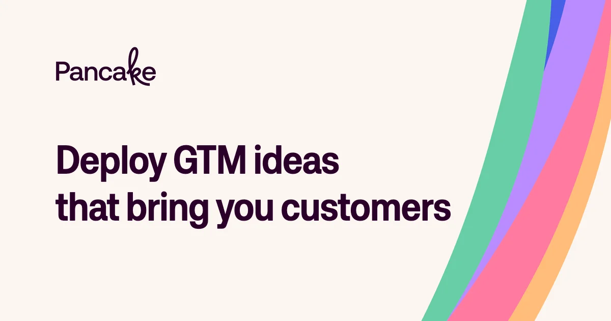
A 1200×630 social card uses a warm off-white canvas with a strong left-aligned hierarchy: a small wordmark sits above an oversized two-line headline in near-black purple. The right edge is occupied by broad, flowing diagonal bands in green, blue-purple, pink, and orange, creating a playful counterweight while keeping the text area calm and highly legible.
Prompt preview
## Reference images

Study these alongside the description below: hierarchy, rhythm, spacing, colour. Build for the product you are asked about, using this design language.

- Screenshot: https://kage-design-assets.t3.tigrisfiles.io/screenshots/pancake/0c064c5b-f9c2-4c57-b9fd-33fc0bf31a8d-1792044072505.webp
- Design on Kage: https://kage.design/designs/pancake-og-image

## Before you start
Ask the user what they are building, who it is for, and what brand assets they already have—especially the brand name, colours, typefaces, and any approved visual marks. Wait for their answers before designing. Apply the reference composition to their product, using placeholder branding and copy until those details are provided.

## Page structure
- **1200×630 social-card canvas:** Create a fixed Open Graph image with a warm off-white background and generous inset margins.
- **Upper-left brand area:** Place a small placeholder wordmark or brand label in the upper-left quadrant, aligned to the same left edge as the headline.
- **Primary headline:** Add a large, bold, left-aligned two-line headline in the middle-left of the canvas; keep it short enough to retain clear line breaks and leave open space around it.
- **Right-edge artwork:** Fill the far-right portion with several wide, smooth, curved diagonal colour bands that enter from the top-right and sweep toward the lower-right edge, acting as the only major image-like element.
- **Output:** Implement the card as HTML/CSS rendered to PNG, SVG, or another deterministic image format suitable for social sharing. Ensure the final exported image is exactly 1200×630 pixels.

## Design language
- **Build hierarchy through scale and position:** Use a small brand label, then a headline roughly 64–78px at the 1200px width; make the headline the dominant element through weight and size rather than decoration.
- **Keep the composition asymmetric:** Reserve approximately 70–78% of the width for quiet text space and let the colourful artwork occupy the rightmost 22–30%; do not center the content.
- **Use a soft neutral base:** Start with a warm ivory/off-white background near `#F8F4EE`, and use a very dark plum near `#19001F` for the wordmark and headline.
- **Treat colour as one bold accent system:** Use 4–5 pastel-to-bright bands, approximately mint `#62CBA7`, blue `#3E5BDD`, lavender `#A77BEF`, pink `#F2659A`, and apricot `#F6B96F`. Keep the background and text restrained so the bands provide the visual energy.
- **Use confident modern typography:** Pair a clean contemporary sans-serif with a heavy display weight for the headline; use tight tracking and compact line-height around 0.95–1.05. Keep the placeholder wordmark smaller and lighter, with optional subtle custom lettering rather than a generic icon.
- **Make the artwork organic but controlled:** Build the right-side stripes from large rotated rounded shapes, SVG paths, or clipped Bézier curves. Their edges should sweep smoothly and remain visually parallel, with no gradients, texture, shadows, or photographic detail.
- **Keep surfaces flat:** Avoid cards, borders, corner radii, drop shadows, and UI chrome. The social card should read as a single printed composition.
- **Preserve thumbnail legibility:** Maintain generous padding, strong contrast, and a clear headline silhouette when reduced in a social feed. Keep all important text inside a safe margin of at least 80–100px.
- **Use restrained motion only during generation:** If building with HTML/CSS, animation is unnecessary; render a static frame. Any export process must produce deterministic geometry and colours.

## Never
- Do not copy Pancake’s logo, wordmark, product name, tagline, exact headline, or branded artwork.
- Do not reuse the reference copy, illustrations, or exact stripe geometry; use placeholder branding, placeholder headline text, and an original arrangement of similarly broad curved bands.
- Do not add unrelated logos, wordmarks, product names, photography, icon sets, UI screenshots, or extra interface elements.
- Never present the result as Pancake or imply affiliation with it.