kage
kage
agibot.sh
Design analysis
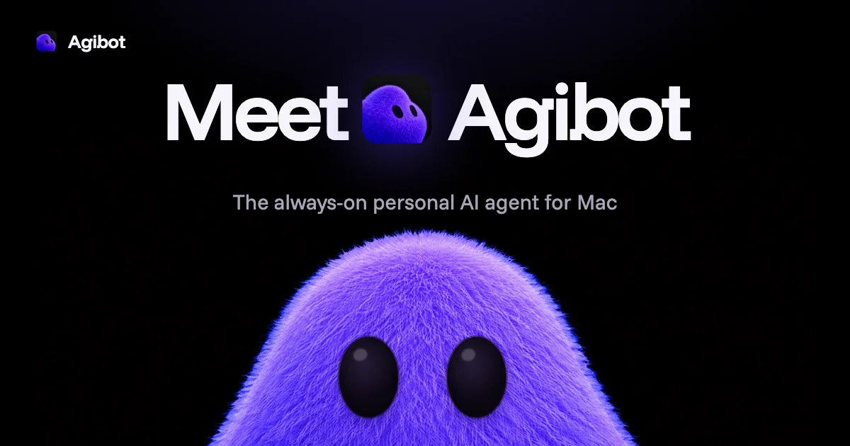
A roughly 1200×630 social card uses a near-black canvas with a compact brand lockup in the upper-left, then a large centered headline reading “Meet [mascot] Agibot.” The white geometric type creates the primary focal point, while a smaller gray subtitle sits beneath it and a large fuzzy purple mascot rises from the bottom edge, creating depth through scale, texture, and violet glow.
Prompt preview
## Reference images

Study these alongside the description below: hierarchy, rhythm, spacing, colour. Build for the product you are asked about, using this design language.

- Screenshot: https://kage-design-assets.t3.tigrisfiles.io/screenshots/agibot/c201dfac-4cd5-4bef-9b17-553682d56263-1791784893770.webp
- Design on Kage: https://kage.design/designs/agibot-og-image

## Before you start
Ask the user what they are building, who it is for, and what brand assets they already have, including the brand name, colours, typefaces, logo or mark, and preferred social-card copy. Wait for their answers before proceeding. Apply everything below to that product, not to the reference.

## Page structure
- **1200×630 canvas:** Produce a social card image at exactly 1200×630 pixels, using HTML/CSS rendered to PNG or an SVG that can be rasterized cleanly.
- **Brand lockup:** Place a small placeholder logo mark and placeholder brand name in the upper-left with generous inset padding; keep it secondary to the headline.
- **Primary headline:** Center a short placeholder headline across the upper-middle of the card, using one very large line of type and optionally a small abstract placeholder mark between words.
- **Supporting line:** Add a centered, smaller one-line description beneath the headline in a muted light-gray tone.
- **Hero visual:** Fill the lower portion with a large abstract placeholder product visual or mascot-like form that is cropped by the bottom edge; make it the strongest image element without competing with headline legibility.

## Design language
- Use a near-black background, approximately `#050506` to `#0A080F`, with subtle violet atmospheric glow behind the central mark and hero visual.
- Build hierarchy through scale and alignment: a small upper-left brand lockup, an oversized centered headline, a restrained subtitle, then a dramatically oversized cropped hero form.
- Use a clean, bold geometric sans-serif for the headline, roughly 76–100px at 1200px width, with tight line height and strong white contrast around `#F5F4FA`.
- Set supporting text around 24–30px in soft gray-lavender such as `#B5B1C2`; keep tracking modest and avoid dense copy.
- Use a vivid purple-to-violet accent, approximately `#5B16FF`, `#7A35FF`, and `#B48CFF`, for the abstract mark, glow, and hero imagery. The hero may use fuzzy, organic, or softly textured rendering, but it should remain an original placeholder visual.
- Keep composition centered and spacious, with large negative areas around the headline. The upper-left lockup should have roughly 50–60px inset; the hero should extend below the canvas to create an intentional crop.
- Avoid visible cards, grids, heavy borders, or decorative UI chrome. Use soft bloom and subtle shadow only where they help separate purple imagery from the black field.
- Keep the exported image crisp at social-card scale: check text margins, contrast, and safe cropping, and ensure the headline remains readable in link previews.
- Use only minimal motion if previewing the source before export—such as a slow glow or floating hero texture—but deliver a static 1200×630 PNG or SVG image.

## Never
- Do not copy the reference’s logo, wordmark, product name, tagline, mascot, exact copy, or distinctive imagery.
- Do not use the reference brand identity, assets, or illustrations; use placeholder branding and user-provided assets only.
- Do not present the result as Agibot or imply an affiliation with it.