kage
kage
strshrt.xyz
Design analysis
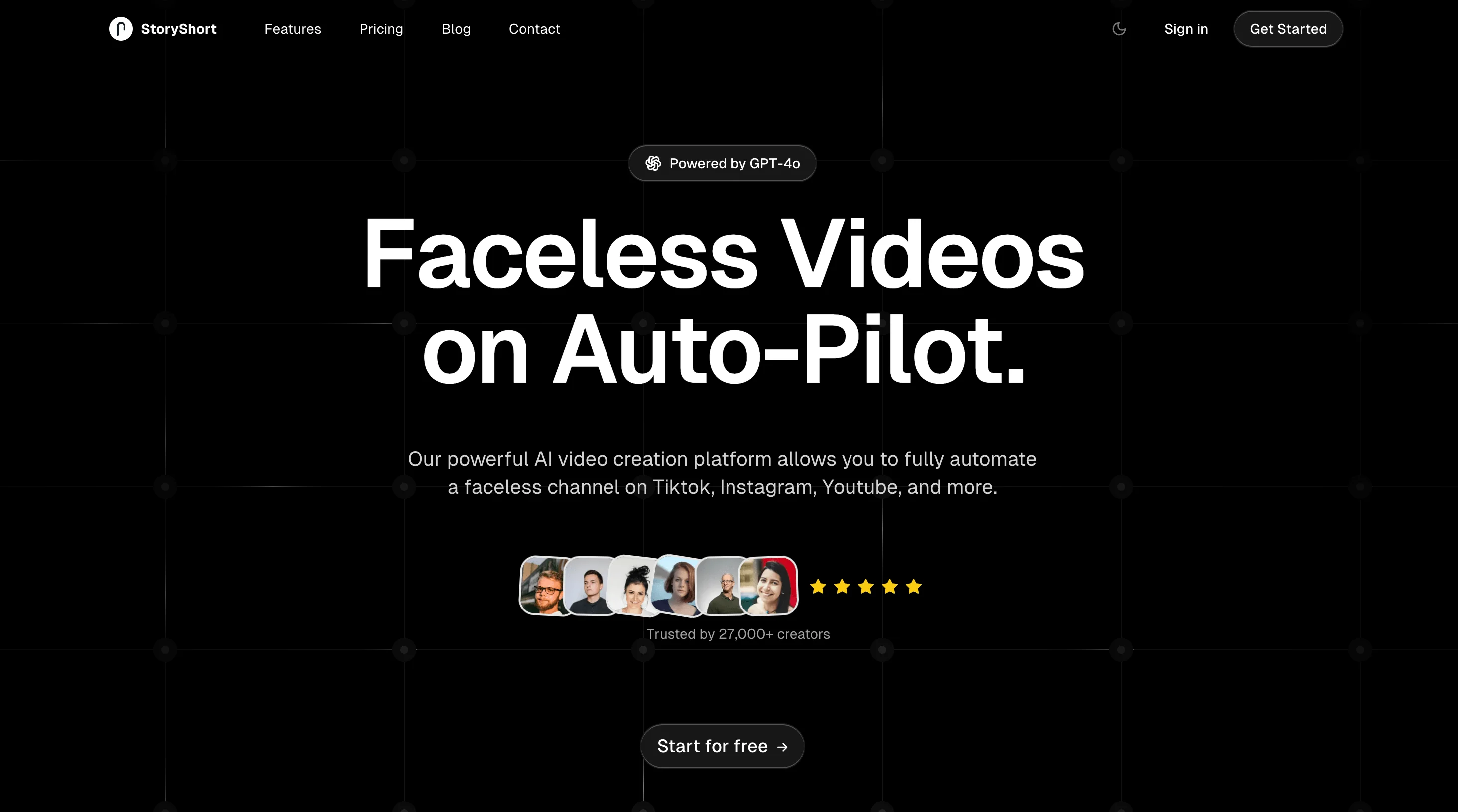
A near-black social card whose depth comes entirely from a faint hairline grid with node dots rather than imagery. Focal hierarchy is a strict centred stack: a bordered "Powered by" badge pill, a two-line display headline in heavy white sans at extreme scale, two lines of gray subcopy, then an overlapping avatar cluster with five yellow stars and a trust caption, closing on a single dark pill CTA. The palette is almost fully monochrome — yellow stars and one red avatar tile are the only saturation, both reserved for social proof — while the wordmark stays small in the top-left so the headline owns the frame.
Prompt preview
## Reference images

Study these alongside the description below: hierarchy, rhythm, spacing, colour. Build for the product you are asked about, using this design language.

- Screenshot: https://kage-design-assets.t3.tigrisfiles.io/screenshots/storyshort-ai/5bf27f62-4d25-4b0d-8ae3-35913870c7f1-1791551914415.webp
- Design on Kage: https://kage.design/designs/storyshort-og-image

## Before you start

Ask the user what they are building, who it is for, and what brand assets they already have (brand name, colours, typeface). Wait for the answers before writing any code. Everything below is applied to *their* product — the reference only supplies the composition and visual language.

## Goal

Produce a **1200×630 social share card** (Open Graph image) as a single self-contained HTML file sized exactly 1200×630 (or an SVG), intended to be rendered to PNG. Use placeholder branding and placeholder copy throughout.

## Page structure

Work top to bottom as a single centred column on one dark canvas:

1. **Canvas (1200×630)**: near-black base with a faint hairline grid and small node dots at intersections; a subtle radial glow behind the headline area. Keep ~64px safe margins on all sides.
2. **Top strip**: small logo mark + wordmark at top-left in one line (~14px, semibold, white). Optionally two or three tiny nav-like labels beside it to echo a landing-page hero, plus a small pill button at top-right.
3. **Badge pill**: centred, sitting above the headline — a small rounded-full chip with a 1px border, a 14px icon, and 12–13px label text (e.g. a one-line capability claim).
4. **Headline block**: the focal point. Two short lines of display type, centred, white, extremely large (76–88px) with tight leading. The second line can carry a punchier clause ending in a period.
5. **Subcopy**: two lines, centred, 16–17px, muted gray, max-width ~640px.
6. **Social proof row**: a horizontally overlapping cluster of 5–6 circular avatar tiles (44–48px), immediately followed by five stars and a short trust caption ("Trusted by N+ …") beneath at ~13px muted gray.
7. **CTA**: one pill button, centred, dark fill with a 1px border, white 15px label plus a small arrow glyph.

## Design language

- **Canvas**: `#0A0A0A` base; grid lines `#171717` at ~90–100px spacing; 3–4px dots `#262626` at intersections; optional very faint radial highlight `rgba(255,255,255,0.04)` behind the headline. Depth comes from the grid pattern, never from photography or illustration.
- **Hierarchy by scale alone**: exactly one dominant element — the headline. Everything else is 6–8× smaller. Headline: weight 700–800, line-height ~1.05, letter-spacing −0.02em, pure `#FFFFFF`.
- **Colour discipline**: monochrome everywhere. One saturated accent only, spent on the social-proof stars (`#FFC53D`). Subcopy `#9E9E9E`, captions `#8A8A8A`, borders `#2E2E2E`. No gradients beyond the faint glow.
- **Type**: one neo-grotesque/geometric sans for the entire card (e.g. a neutral grotesk). No serif, no mixed families; contrast is created purely through size and weight steps.
- **Components**: everything is a pill — badge, CTA, top-right button — `border-radius: 999px`, 1px border `#2E2E2E`, fill `#141414`, white text. Avatar circles overlap −10px with a 2px ring in the canvas colour so they read as one object.
- **Spacing rhythm**: vertical stack order badge → headline → subcopy → proof → CTA with roughly even gaps (~24–32px), generous air above and below the headline block; nothing touches the edges.
- **Crop safety**: keep all text within the central ~70% width; the wordmark is the only element allowed near a corner.

## Never

- No logos, wordmarks, product names, taglines, copy, avatar photographs, or icon sets taken from the reference. In particular: no OpenAI mark, no "StoryShort" name, and no "Faceless Videos on Auto-Pilot" wording.
- Use a placeholder brand name, invented headline copy for the user's product, and neutral placeholder avatars (e.g. simple coloured circles or initials).
- Never present the result as the reference product; it is the user's brand rendered in this composition.